Printable Version of Topic
Click here to view this topic in its original format
Unmanned Spaceflight.com _ Cassini general discussion and science results _ New colour maps of Saturn's icy moons
Posted by: ngunn Nov 7 2014, 10:07 AM
New colour maps by Paul Schenk have now appeared in the Ciclops maps section. The Dione map is today's APOD. The link there goes to all the maps.
ADMIN: http://www.ciclops.org/maps.php. http://apod.nasa.gov/apod/astropix.html.
Posted by: DrShank Nov 7 2014, 12:38 PM

ADMIN: http://www.ciclops.org/maps.php. http://apod.nasa.gov/apod/astropix.html.
Hi!
the direct links to all the maps and videos are here:
http://www.lpi.usra.edu/icy_moons
https://www.youtube.com/user/LPIUSRA
http://stereomoons.blogspot.com/2014/11/mooning-saturn-maps-are-out.html
Posted by: 4th rock from the sun Nov 7 2014, 02:09 PM
Great work. 
I like that you can tell right away that it's false color, but it's not psychedelic or too confusing.
Really informative of the global surface features and differences.
These will be extremely useful for Celestia, Orbiter and other free simulators / planetarium software (with some desaturation to bring them closer to visible color).
Posted by: machi Nov 7 2014, 02:38 PM
Fantastic work!
Posted by: DrShank Nov 7 2014, 03:55 PM
I like that you can tell right away that it's false color, but it's not psychedelic or too confusing.
Really informative of the global surface features and differences.
These will be extremely useful for Celestia, Orbiter and other free simulators / planetarium software (with some desaturation to bring them closer to visible color).
Yes they, and they are formatted for easy use in those systems.
I wouldn't call them false. the colors are real, they are beyond the human range and are 'enhanced'. perhaps we can come up with a better word?
Posted by: machi Nov 7 2014, 04:24 PM
Shifted or translated colors is possibly good term.
Here is http://astronomyviz.wordpress.com/2013/07/23/the-frightful-fallacy-of-false-color/ about "false" colors and some criticism of this term.
Posted by: Bjorn Jonsson Nov 7 2014, 08:22 PM
Looks great, thanks for making these maps available. If I want true color maps it's probably easier and more accurate for me to simply process these maps (probably mainly by reducing the color saturation) rather than create my own maps from R/G/B images.
Yes, "false color" is not an accurate description of the color of these maps. Perhaps enhanced or exaggerared color is more appropriate? I suspect the color of these maps is not unlike what one would get by increasing the color saturation of a true color map.
Several years ago I created a map of Rhea from relatively low resolution, low phase RGB images. I wanted to show Rhea's color without topographic shadows. There are some inaccuracies, in particular there weren't any good images available of the north polar region when I did the map. The map can be seen http://www.mmedia.is/bjj/data/rhea/index.html (and I *really* need to update/move my website to something more modern...).
Posted by: ngunn Nov 7 2014, 08:52 PM
How about "scaled colour", as in shrinking the frequency range and stretching the amplitude, but without other distortion or arbitrary colour coding.
(I'm thinking here of the very effective red-green-blue scaling of three infrared wavelengths in Cassini VIMS images and similar constructs from space telescope data outside the visible spectrum.)
Posted by: stevesliva Nov 7 2014, 08:54 PM
"Translated color" is ponderous. It's even more ponderous when used as an adjective (...in this translatedcolorimage [deep breath]...), rather than as a noun in the discussion of what the best term should be. And it's not like "translated" cannot imply the loss of information or loss or original meaning any more than "false" can.
Maybe bandmapped would work for freq mapping. I just made it up. In any event it's most precise to describe everything that's being mapped, and that will likely require more than one adjective.
Posted by: DrShank Nov 7 2014, 09:14 PM
Maybe bandmapped would work for freq mapping. I just made it up. In any event it's most precise to describe everything that's being mapped, and that will likely require more than one adjective.
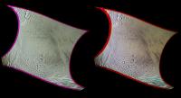
Ive been using "superman" colors which isn't quite correct as these aren't X-ray colors . . . but in any case, here is a comparison of an enceladus map in actual RGB vs IGU colors using the actual filters. There has been some contrast enhancement as well.
|
Posted by: ngunn Nov 7 2014, 09:49 PM
Agreed. That's why I think "scaled" is better. It avoids those pitfalls whilst allowing transformations other than moving sideways.
Posted by: 4th rock from the sun Nov 8 2014, 01:56 PM
When I first studied about "color compositions" (from single color band images) they were called "false color".
Agreed that things like IR/R/G used for earth observation with the SPOT satellites are quite different from IR/G/UV.
I'd go for enhanced colors.
Translates well into other languages, gives the impression that "bluer" or "redder" are real effects and should be visible to a person standing there.
I don't like superman colors since for that you'd need x-ray vision. Perhaps that's more appropriate for Titan where you see through the clouds.
Posted by: ngunn Nov 8 2014, 09:47 PM
I'm going to have another go at posting the link I should have put in post 1. Goodness knows what will happen but here goes: http://photojournal.jpl.nasa.gov/targetFamily/Saturn
Wow! It worked. Looking at all the maps together what strikes me at once is that the darkening on Iapetus is the opposite way around to the rest.
Posted by: djellison Nov 8 2014, 10:04 PM
As more things are added to the saturn category at the photojournal - that link will no longer have the maps on it.
Posted by: ngunn Nov 8 2014, 10:20 PM
OK. Any other way to assemble them for comparison? (Help appreciated.) Meanwhile, grab the page while you can.
Posted by: Bjorn Jonsson Nov 9 2014, 09:31 PM
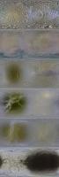
Here is a small (512x256 pixels per satellite) montage of the maps for anyone interested in comparing them globally. The order from the top is by distance from Saturn.
|
Posted by: Explorer1 Nov 10 2014, 01:26 AM
Strange how Enceladus pops out in that montage pretty quick; its the only one without a trailing/leading hemisphere dichotomy. Or maybe not strange at all, given the geysers!
Posted by: tanjent Nov 10 2014, 02:54 AM
Ok Explorer1, now that you mention it, I thought I understood the reasons for Iapetus' dark leading hemisphere.
It sweeps up some kind of slower-moving particulate matter
But until now I had never noticed that for Tethys, Rhea and Dione, the other satellites with dark/light contrasts, the trailing hemisphere is a little bit darker.
Is this because the particulates move faster than the moons, in these tighter orbits?
Maybe this hints at some kind of tidal influence, associated with Titan?
Posted by: Explorer1 Nov 10 2014, 05:45 AM
I read a while back that the main theory is that Iapetus sweeps up material falling in from Phoebe (the stuff making up its ring). The particles that miss are scooped up in turn by Hyperion and especially Titan, so the inner moons must have a different source for their markings. I wouldn't rule out Titan for anything...
Posted by: Gsnorgathon Nov 10 2014, 05:48 AM
I thought the basic idea was that Saturn's magnetosphere swept up charged particles and deposited them on the moons' trailing hemispheres, since Saturn rotates more quickly than the moons orbit.
Posted by: DrShank Nov 10 2014, 12:17 PM
this is essentially correct tho we still don't know the mechanism that darkens things (alteration vs implantation?). meanwhile, the front sides are all getting plastered by E-ring dust from Enceladus (except Mimas, where it is the backside being hit. Iapetus doesn't get any of those as it is too far out, and "far out". I have an article in 2011 in Icarus that discusses all the color effects in some detail but also they are described in my blog, from about the same time. http://stereomoons.blogspot.com/2010/10/colors-published.html There are several other posts on these topics too.
You guys are also giving me ideas and I'm working on some comparative charts for these bodes for the blog . . .
Powered by Invision Power Board (http://www.invisionboard.com)
© Invision Power Services (http://www.invisionpower.com)