Printable Version of Topic
Click here to view this topic in its original format
Unmanned Spaceflight.com _ Messenger _ MESSENGER takes a family portrait of the solar system
Posted by: Stu Feb 18 2011, 03:53 PM
http://www.nasa.gov/multimedia/imagegallery/image_feature_1868.html
Posted by: tedstryk Feb 18 2011, 04:38 PM
What happened to Mars?
Posted by: tasp Feb 18 2011, 04:43 PM
Extreme right edge.
Posted by: Stu Feb 18 2011, 04:43 PM
Too small? Too near the Sun? Good question!
Posted by: tedstryk Feb 18 2011, 05:39 PM
What is odd is that they make clear that Uranus and Neptune are in the frames but invisible, while the absence of Mars isn't even acknowledged (Mercury too).
Posted by: djellison Feb 18 2011, 05:42 PM
Mars is in it...
Full size version from that link from Stu
http://www.nasa.gov/images/content/517613main_solar_system_full.jpg
Better link is probably Messengers own page
http://messenger.jhuapl.edu/gallery/sciencePhotos/image.php?gallery_id=2&image_id=399
Posted by: centsworth_II Feb 18 2011, 05:51 PM


Posted by: tedstryk Feb 18 2011, 06:11 PM
Ah, much better.
Posted by: ElkGroveDan Feb 18 2011, 06:13 PM
What abut Pl....
never mind.
Posted by: Explorer1 Feb 18 2011, 06:38 PM
Very pretty!
It's like the reverse of Voyager 1's last look, except before the main mission begins instead of the end.
They probably won't get another chance once in orbit, so best to do it now.
Posted by: ilbasso Feb 18 2011, 06:42 PM
Also nice to see the Milky Way and dust lanes to the left of Mars.
Posted by: brellis Feb 18 2011, 06:52 PM
My god -- it's full of stars!
Posted by: elakdawalla Feb 18 2011, 06:52 PM
Very cool!!!
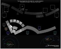
I'm putting together a poster containing both family portraits. Here's a first draft without any caption yet (working on writing that now). Anybody have any comments or suggestions for improving it?
|
Posted by: nprev Feb 18 2011, 06:55 PM
Sweet idea, Emily! Looks good, but it's a bit of a problem to get all that data in one coherent instantly-obvious form...obviously!  I'll look at it again.
EDIT: To a casual not-familiar observer, it's hard to determine which set is from Messenger & which is from Voyager. Is there room to put the orbital sketches adjacent to their respective sets, perhaps at opposite corners diagonally?
Posted by: ZLD Feb 18 2011, 07:03 PM
Heres the link to the actual full resolution version (non-annotated): http://messenger.jhuapl.edu/images/family_portrait_wac.png (warning:22mb)
Quite an awesome picture.
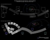
Posted by: elakdawalla Feb 18 2011, 07:33 PM
Is this better?
|
Posted by: nprev Feb 18 2011, 07:40 PM
Stick a fork in it; it's done! Perfect, Emily!
Posted by: ZLD Feb 18 2011, 09:51 PM
That's a great comparison Emily; really puts both in perspective very nicely.
Posted by: ugordan Feb 18 2011, 10:33 PM
Pretty cool mosaic and they get extra points from me for catching the Milky Way.
Posted by: ngunn Feb 18 2011, 10:46 PM
What a great idea! But the orbit of Neptune looks a bit out of kilter in the lower diagram. Shouldn't it be fairly circular and concentric with the others?
Posted by: ugordan Feb 18 2011, 10:49 PM
Nothing wrong with that. Voyager 1 didn't look at the solar system from an infinite distance so this perspective effect is normal. Unlike the MESSENGER graphic which shows the solar system from "above". It's the upper diagram that's technically meaningless.
Posted by: elakdawalla Feb 18 2011, 10:50 PM
It's because of the perspective; it widens toward the viewer. http://space.jpl.nasa.gov/cgi-bin/wspace?tbody=699&vbody=-31&month=2&day=14&year=1990&hour=00&minute=00&fovmul=1&rfov=90&bfov=30&porbs=1&showsc=1
Posted by: ngunn Feb 18 2011, 11:05 PM
OK, thanks. 
The (small) inclinations and eccentricities of the orbits must be conspiring with the perspective too. Simplistically I'd expect Saturn-Uranus-Neptune to be approximately evenly spaced on any radius but that's clearly not the case from this viewpoint, even allowing for the perspective.
Posted by: nprev Feb 18 2011, 11:17 PM
The educational value of the poster is becoming rapidly evident from the discussion! 
Posted by: ngunn Feb 18 2011, 11:42 PM
Yes. Clearly I must spend more time on the simulator before I'm allowed on the away team.
Posted by: nprev Feb 19 2011, 12:57 AM
I'm with ya, Nigel!  Heck, the only way I know where I am at any given time is through sensing an acceleration of 9.8 m/sec on the soles of my cheap dolomite feet...
EDIT: Not to be a smartass, and I apologize if it came off that way at all. This poster stimulates discussion, and thus is inherently educational.
Posted by: lyford Feb 19 2011, 03:37 AM
That is very awesome Emily! I was just wishing someone would make that....
Posted by: nprev Feb 19 2011, 03:50 AM
I actually never dreamed I'd see something similar in my lifetime.
We are quite lucky, you know... ...there will be many, many others after us to see such things, and in more detail, but we are the first.
Powered by Invision Power Board (http://www.invisionboard.com)
© Invision Power Services (http://www.invisionpower.com)