Printable Version of Topic
Click here to view this topic in its original format
Unmanned Spaceflight.com _ Venus _ Magellan EDR/RAW Data
Posted by: Brian Swift Sep 11 2020, 09:03 PM
Just curious, has anyone gone spelunking in the Magellan SAR EDR (raw) dataset?
https://pds-imaging.jpl.nasa.gov/data/magellan/edr/
Looks like a set of 9-track mag tapes were copied to CD-ROMs for preservation,
and at some point the CD files were put online in PDS.
In starting to look at it, I realized that lack of knowledge of
mag tape volume/label/file/record structure and terminology may impede
younger explorers of this dataset.
Posted by: Phil Stooke Sep 11 2020, 10:38 PM
I have used the mosaicked (tiled) data, not the raw 'noodle' data (long strip from one orbit). But I completely agree that much better access is needed, beginning with a good map-based search tool. I haven't checked for quite a while, though. Must be 10 years since I worked on Venus. I used to think I could do an atlas of Mercury and Venus exploration and I made a good start, but a lifetime isn't long enough to do everything I want to do.
One thing I did notice: USGS's Map-a-planet, which I used to use all the time until it was revamped and made less convenient, had 3 global mosaics corresponding to radar image cycles 1, 2 and 3. One mosaic often helped fill a gap in another. But where a gap still remained, occasionally on those CD-ROMs a later version of a mosaic would include a bit of extra coverage and fill the gap. But searching for that magic tile was a real pain. That's where a fully updated dataset with good map search capabilities would really help - show all products within the selected box.
Phil
Posted by: mcaplinger Sep 11 2020, 11:31 PM

The recollections of a recovering Magellan data processor: The noodle data came in two flavors: the really raw data that Brian is talking about, and the so-called F-BIDR (Full resolution basic image data record, https://pds-geosciences.wustl.edu/missions/magellan/fbidr/dataset.cat -- map-projected noodles). Even during the mission, I didn't know anyone brave enough to look at the EDRs, and even using the F-BIDRs was considered pretty hard-core; not sure if going back to the EDR would really confer much benefit, but it would require a detailed knowledge of SAR processing.
Posted by: JohnVV Jan 31 2022, 12:23 AM
this is an old thread but
For about the next week i will have on my G-drive a massive C1 Venus map
it is 131072 x 65536 pixels and 8 Gig's in size
see the celestia forum post on this
https://celestia.space/forum/viewtopic.php?f=5&t=21899
Posted by: kymani76 Jan 31 2022, 10:29 AM
|
I get this result when using https://astrogeology.usgs.gov/search/map/Venus/Magellan/Venus_Magellan_LeftLook_mosaic_global_75m at 225m/px with 600m/px stereo-derived DEM overlayed.
This version is 168976x76983 px weighing 13 GB.
There is also a version at 75m/px available, but i haven's tried it yet. It's a huge download at 109 GB! And you need lots of RAM to open it.
As you may noticed, I prefer white to black rendering of Magellan's data, which renders the surface in much more "photographic" way.
Posted by: Phil Stooke Mar 15 2023, 09:27 PM
Hot off the press:
https://twitter.com/ThePlanetaryGuy/status/1636066117344014343
Volcanic eruption/surface changes seen on Venus in old Magellan data.
If you wonder why it took so long, this is a very small area on a big planet. It also points to the fact that there is no convenient way to get into Magellan data now the fine old USGS Map-a-planet has been replaced by the clumsy Map-a-planet 2. If Venus science is going to prosper it really really really needs a kind of Quickmap interface to all 3 cycles of Magellan data, plus earth-based radar imaging and the ability to add new mission data as it arrives.
Phil
Posted by: mcaplinger Mar 15 2023, 09:44 PM
https://www.science.org/doi/10.1126/science.abm7735
"We therefore cannot exclude the possibility that the flows were present when the Cycle 1 image was taken, but were not apparent in the image, perhaps because the surface texture makes the flows more distinguishable at the lower incidence angle of Cycle 2."
Seems like this is most likely a radar artifact to me.
Posted by: Phil Stooke Mar 15 2023, 11:56 PM
That does indeed apply to the putative lava flow, but the change in the 2 km-wide caldera is, I think, incontestable.
Phil
Posted by: mcaplinger Mar 16 2023, 12:11 AM
Hmm. Well, I don't know. Google for "SAR layover". I worked on Magellan just enough to be very skeptical of changes in SAR data acquired with much different geometries. I would hope that the reviewers knew more about it than I do.
Posted by: Phil Stooke Mar 16 2023, 12:40 AM
I know about layover, but the changes don't look like layover to me. But we will see.
Phil
Posted by: StargazeInWonder Mar 16 2023, 04:18 AM
What seems to be brightening marking both sides of the smaller, earlier version of the caldera do seem to be real topographical features that are substantially different in the later image. Of course, there's no possible limit to the weird interactions that could make terrain look different from different radar angles, but this would be a really insidious artifact if it is an artifact. I guess for anyone to evaluate it fully they'd have to add a study of what sorts of other apparent differences have been seen elsewhere on Venus to see how unique this apparent difference is.
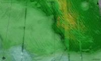
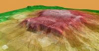
Posted by: kymani76 Mar 17 2023, 08:32 AM
|
For a little visual aid here is 3D view of the Maat Moons rendered at 4x vertical exaggeration , looking towards southeast, the area from the article is in the front. The Magellan DEM is really rough and blocky, producing kind of an artificial bench that is not really there, but it could possibly be a downward movement of lava that we are seeing. Unfortunately it will be a long wait until we get 250m/pixel DEM planned by the VERITAS mission for a better view.
Posted by: StargazeInWonder Mar 18 2023, 02:35 AM
And after a few years' more wait, EnVision will provide 60m spatial resolution topography.
However, if there was any significant change during just a year of Magellan's mission, it seems likely that some more significant change will be there to be discovered after ~35 years, unless, improbably, there's just one location on Venus where change occurs.
Posted by: JohnVV Mar 19 2023, 12:45 AM
" The Magellan DEM is really rough and blocky"
and that is a major under statement
i have been able to clean it up a little bit bit not to much
Posted by: StargazeInWonder Mar 19 2023, 07:16 PM
The radar maps in Fig. 2 A and B are annoyingly misaligned, something that is easy to miss with the eye, but longitude lines offered as references above Fig. 2A don't even remotely align with the un-labeled lines that appear between 2A and 2B. When I try to overlay the figures in Photoshop and "blink" them, the differences are apparent and cannot be resolved in any way with a mere translation between them. It feels like the text talks past this issue, saying that "the black box in © indicates the extent of the unrectified images in panels A and B," but it is clear that those panels, while obviously matching approximately, differ by more than the sizes of the features being discussed. It's strange. I can't tell if the work is sloppy or if the artifacts produced by the different geometries is simply enormous, but one or the other seems to be in play.
Posted by: Antdoghalo Mar 19 2023, 10:32 PM
A lot of the USGS products with Venus are a mess. From reprojection artifact filled maps to maps with misaligned stripes of data to uncredited Venera data.
Posted by: StargazeInWonder Mar 20 2023, 02:29 AM
It's a mess indeed. I don't know what bearing this has on the conclusions of the paper, but it certainly looks like the data is not in a good state.
Blink gif attached.
It seems like forcing the three main features below and to the left of center to correspond in the two images would require a significant re-projection. If the "expanded" caldera is a widening of the original one, it's hard to interpret in which direction(s) it expanded.
|
Posted by: Brian Swift Mar 26 2023, 08:26 AM
FWIW, the paper's 2nd author, Dr Hensley, isn't a SAR noob. He developed SRTM's strip image processor (and I think Cassini's too).
Honestly, when I saw his name on the paper, I was a bit disappointed the result wasn't found by reprocessing the raw signal data.
Posted by: dtolman May 28 2024, 12:34 AM
https://www.nytimes.com/2024/05/27/science/venus-volcanoes-lava.html?unlocked_article_code=1.vU0.LnEH.FuMn-vdUJtw7&smid=url-share - they found bright, riverlike patches on Sif Mons and Niobe Planitia in later Magellan survey images that werent present in earlier data.
Powered by Invision Power Board (http://www.invisionboard.com)
© Invision Power Services (http://www.invisionpower.com)