Printable Version of Topic
Click here to view this topic in its original format
Unmanned Spaceflight.com _ Earth Observations _ DSCOVR
Posted by: ljk4-1 Jan 6 2006, 08:55 PM
ADMIN NOTE: Please note that this topic was unavoidably poltical before the 'No Politics' rule. Please restrict future comments to the mission/spacecraft/news updates etc.
WHAT'S NEW Robert L. Park Friday, 6 Jan 06 Washington, DC
DEEP SPACE CLIMATE OBSERVATORY KILLED.
http://bobpark.physics.umd.edu/index.html
Posted by: BruceMoomaw Jan 7 2006, 12:15 AM
Actually, as I recall, Gore's original plan was simply to "inspire schoolchildren" with continuous video views of Earth -- the climate instruments were added at the insistence of NASA's science advisors and the National Academy of Sciences (which did an official appraisal of Triana's sciencce value in its revised form). While Gore's original idea strikes me as moronic, those other experiments ARE important, and I hope they're added as piggybacks to the other solar astronomy satellites scheduled to be hung soon at the L-1 Sun-Earth point. In fact, I think it's time for us to start raising hell on the subject, since otherwise this is unlikely to be done under this stinkbomb of an administration.
Posted by: gpurcell Jan 7 2006, 12:26 AM
Repeat After Me:
TRIANA
MUST
FLY
ON
SHUTTLE
There is NO way given the state of the fleet that the scientific returns of the mission justify a shuttle flight under the post-Columbia, post-RTF situation. That's not to say the individual instruments shouldn't fly...but as long as they were on this platform, they were going to be doing nothing but provide a continuous view of a (cough) University of Maryland clean room.
I'm a heck of a lot more agitated about the LANDSAT disaster than this mercy killing.
I'm sorry, but Bob Park is letting his partisanship get in the way of his reason.
Posted by: Bob Shaw Jan 7 2006, 12:37 AM
It seems a bit, well, daft, to have a 100% built spacecraft and then just not to fly it. If Phoenix can fly after MPL, then surely Triana could be flown. After all, there are lots of developmental flights which have concrete rather than spacvecraft aboard. Or there's even Russia, or ESA, or China, or Japan... ...or Mr Musk.
Bob Shaw
Posted by: ljk4-1 Jan 7 2006, 02:53 AM
TRIANA MUST FLY ON SHUTTLE
According to this document, it is apparently illegal to fly Triana on the Space Shuttle:
http://oig.nasa.gov/old/inspections_assessments/g-99-013.pdf
But I agree with those who say that the satellite has real scientific and educational merit and having it sit in a warehouse collecting dust is a waste.
Posted by: gpurcell Jan 7 2006, 03:25 AM
You misunderstand that document. That is the OIG report designed to highlight the false accounting NASA was engaged in, not a finding of law. In essence, Gore was trying to commandeer a launch of the Shuttle for a campaign event in the 2000 election.
If you actually READ the report, you'll see what a boondoggle this thing was from the beginning. Check out Table 4, in particular.
In any event, Triana AS BUILT was designed to fly on Shuttle, in part to maximize the PR value to Gore from the mission. (Ah, the days of the "All Woman Crew" and Triana...magical!)
NASA has far, far, FAR better things to use $150 million on than Gore's vanity satellite.
Posted by: Richard Trigaux Jan 7 2006, 09:07 AM
There are two distinct issues about this satellite:
-to fly it as a political campaigning argument by Gore is questionable.
-to refuse to fly it by Bush administration to degegate climate change is criminal.
It is also clear that the first issue is used as an argument to support the Bush's views, but at a cost which is not acceptable.
We should not speak of politics in this science forum, but when bad politics comes muddling into science....
Posted by: djellison Jan 7 2006, 11:07 AM
A short study should be made to see if it can be launched and operated under a small budget from, say, a Falcon I or as a secondary payload on a larger vehicle.
If it can be launched and operated for say, $25m - then I think it would make sense to fly it and use it. If it would be mroe than that, then probably not.
Doug
Posted by: ljk4-1 Feb 1 2006, 08:32 PM
An interesting bit of trivia I just learned from the FPSPACE list: Triana was scheduled to fly on STS-107, which has its sad third "anniversary" today.
See here:
http://www.sts107.info/putting%20the%20mission%20together/together.htm
Posted by: Richard Trigaux Feb 2 2006, 09:44 AM
What I think is that, even before sad or stupid political pressures, a mission should be completed, or not begun at all. A mission which is built but don't fly, a mission which flies but is stopped while still usefull (like Magellan Venus mapping, Pioneer effect data which was about to be discarded, SETI funding abandonned...) are all waste.
So, once a mission is started, it should be continued until its end (unless of course there are unforeseen problems, like the Hermes shuttle, which already very high cost doubled in some months, leading to a sad but necessary stop).
So all must be discussed, budget and eventual politic stake, before starting real expenses. And after, any project must be guaranted to be fulfilled until its end (last useable data).
Posted by: djellison Feb 2 2006, 09:53 AM
But - if you have the promise that a mission will always be completed once started - you'd have people proposing at way under the actual expected budget, getting started and then saying "ahh - we need another $400m, hand it over as we've GOT to complete it"
You have to hang the threat of 'the chop' over missions realistically to get them to propose at a sensible budget, and stick to it. Make a promise that they'll fly no matter what and you'll soon be looking down the back of the sofa for cash 
Doug
Posted by: dtolman Jul 24 2009, 07:44 PM
This project might have a future after all. Nasawatch has an article up about the Air Force/Homeland Security/NOAA interested in having it launched for space weather observation from L1 (found in a budget item in the National Defense Authorization Act for FY2010)
http://www.nasawatch.com/archives/2009/07/goresat_is_back.html
Posted by: tedstryk Jul 24 2009, 08:13 PM
That would be great! As an image junkie, I was really bummed about that mission's fate.
Posted by: ugordan Jul 24 2009, 09:31 PM
Well, there's always http://www.youtube.com/watch?v=JvR5zLmArok&feature=channel in the meantime.
Posted by: Paolo May 6 2011, 07:22 PM
I apologize for resurrecting this topic: http://www.aviationweek.com/aw/generic/story.jsp?id=news%2Fasd%2F2011%2F05%2F06%2F10.xml&headline=Triana+Sat+Eyed+For+Competitive+Test+Launch&channel=space
it looks like the "Goresat" may fly after all...
Posted by: Explorer1 Jan 3 2013, 02:53 AM
Just found this while looking for spacecraft already built and just collecting dust (from the future exploration thread):
http://www.spacex.com/press.php?page=20121205
Looks like Triana is finally on track to actually get a ride up! No firm date though, or what modifications it may have. It's already been renamed, so the possibility exists.
Posted by: Eyesonmars Jan 4 2013, 01:01 AM
It is not clear if a real time full color feed of earth will still be made available on the web. If it is i think it might be a PR bonanza for NASA and planetary science in general.
Posted by: Explorer1 Jan 4 2013, 03:51 AM
Yes, the technology has gotten a lot smaller and more efficient that it was ten years ago. Too bad we still know so little about the current payload.
Posted by: scalbers Apr 18 2014, 06:20 PM
Here's an update from late last year at the link below. This is similar to the Triana concept, specifically the Earth Polychromatic Imaging Camera (EPIC) from what I hear. It also has a radiometer on it for accurate visible and IR radiation budget measurements (NISTAR). So these Earthward looking instruments will supplement the ones looking at space weather.
http://www.nasa.gov/content/goddard/dscovr-mission-moves-forward-to-2015-launch/#.U1FsW2RdW9c
Additional information on the instruments can be found here:
http://space.skyrocket.de/doc_sdat/triana.htm
Posted by: Explorer1 Oct 1 2014, 04:42 PM
Early 2015 launch (finally):
http://spaceref.com/earth/dscovr-is-finally-poised-for-liftoff.html
Has there ever been another case like this where a finished spacecraft lay in storage for so long? Even Galileo wasn't held for over a decade...
Posted by: djellison Oct 1 2014, 06:49 PM
Whole spacecraft? No. But some of the RapidScat hardware is approaching 20 years old. It was built with the rest of the SeaWinds program in the 90's. The spare Voyager optics in Stardust and Cassini are another example.
Posted by: katodomo Oct 1 2014, 10:19 PM

It's an "early FY2015" launch. FY2015 started today.
SpaceX has it on its launch manifest as a payload for 2014...
Posted by: djellison Oct 2 2014, 01:45 AM
Currently scheduled for Jan 19th.
http://spaceflightnow.com/tracking/index.html
Posted by: Dan Delany Nov 21 2014, 07:12 PM
http://spaceflightnow.com/2014/11/21/deep-space-climate-observatory-arrives-at-florida-launch-site/
Launch now scheduled for Jan. 23rd.
Posted by: Dan Delany Jan 24 2015, 07:30 PM
http://spaceflightnow.com/launch-schedule/ Following the launch, SpaceX will make their second attempt to land the Falcon 9 first stage on their Automated Spaceport Drone Ship, which has been named https://twitter.com/elonmusk/status/558665265785733120 by Elon. The previous attempt reportedly failed due to a shortage of hydraulic fluid, so the DSCOVR flight will carry an increased hydraulic fluid reserve so https://twitter.com/elonmusk/status/556105370054053889 I've seen speculation that they are using pressurized RP1 for hydraulic fluid, though I don't think this has been confirmed anywhere.
Posted by: Explorer1 Feb 8 2015, 04:04 AM
https://www.youtube.com/watch?v=TOSLdVOGAIc.
Question at 27:00 about the Earth images and release. They will be publicly available, though with a 1 day delay.
EDIT: launch scrubbed; they'll try again tomorrow.
Posted by: scalbers Feb 10 2015, 06:13 PM
The Deep Space Climate Observatory (DSCOVR) now is scheduled to launch at 6:03 p.m. EST Wednesday, Feb. 11 (after a scrub on Feb 10th due to upper level winds).
http://www.nasa.gov/press/2015/february/nasa-tv-coverage-set-for-noaa-dscovr-launch-feb-10/#.VNpJWbDF87g
Halfway down this page is more information on the EPIC, the Earth pointing camera, along with NISTAR, the radiometer.
https://directory.eoportal.org/web/eoportal/satellite-missions/d/dscovr
Posted by: Explorer1 Feb 11 2015, 11:17 PM
And it's up. Weather prevented a barge landing for the 1st stage though.
Next up is the escape burn and cruise to L1.
P.S. Two pages over nine years: what a speedy thread! 
Posted by: djellison Feb 12 2015, 01:15 AM
Seems like a healthy spacecraft - showed up on DSN Now pretty quick!

|
Posted by: Astro0 Feb 12 2015, 02:33 AM
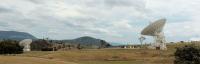
At CanberraDSN, DSS45(left) and DSS34 (right) at the start of tracking DSCOVR.
DSS35 (far right) is tracking Voyager 2.
|
Posted by: Explorer1 Feb 12 2015, 04:01 AM
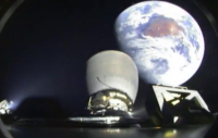
http://www.spacex.com/news/2015/02/11/spacex-launches-dscovr-satellite-deep-space-orbit

Second image from the bottom... shades of Chang'e 2's view after the translunar injection.
That's Australia for sure; did you wave, Astro0?
Posted by: Astro0 Feb 12 2015, 05:46 AM
Wow, that's an awesome image. 
|
Cloud cover in Canberra but our dishes had a clear view
Posted by: monty python Feb 12 2015, 07:00 AM
And what a beautifull launch. In the launch video, just after staging, you could see thrusters firing on the first stage to begin orienting it for landing. Luv those evening and morning launches.
Posted by: scalbers Feb 12 2015, 05:05 PM
Looks like a high altitude already in the impressive image two posts up, more than the 200km "parking orbit".
Posted by: Ron Hobbs Feb 13 2015, 04:33 AM
Yes, it is already a favorite. For the first time a Falcon second stage looks back at Earth as it departs for heliocentric orbit. I doubt it will be the last time.
Posted by: gndonald Apr 18 2015, 01:39 AM
Has there been any further news from this one?
Posted by: Explorer1 Apr 18 2015, 02:09 AM
Still going to L1, I assumed. Last update was in February:
http://www.nesdis.noaa.gov/DSCOVR/
Early June arrival.
Posted by: gwiz Jun 8 2015, 11:17 AM
Should have got there today, but no news so far.
Posted by: gwiz Jun 8 2015, 02:14 PM
It's got there:
http://www.nesdis.noaa.gov/news_archives/DSCOVR_L1_orbit.html
Posted by: Explorer1 Jun 9 2015, 05:51 AM
This article has more info about the Earth-imaging:
http://spaceflightnow.com/2015/06/08/dscovr-space-weather-sentinel-reaches-finish-line/
The imager will take a full-color picture of the sunlit side of Earth every four-to-six hours, and NASA plans to post the imagery on a public website.
Still no link to where they will appear; presumably there will be an announcement once they start coming down?
Posted by: katodomo Jun 9 2015, 05:00 PM
NOAA hosts "daily Earth images" from its satellites on this site:
http://www.nesdis.noaa.gov/imagery_data.html
For DSCOVR there's still a standby diagram instead.
Posted by: Explorer1 Jul 20 2015, 04:06 PM
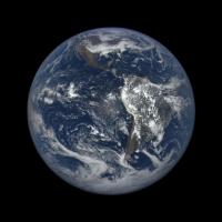
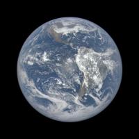
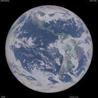
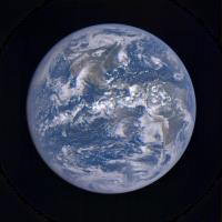
Test image released:
http://www.nasa.gov/image-feature/nasa-captures-epic-earth-image
Worth the wait, I'd say! It even catches the forest fire haze blanketing my home province at the time...
Posted by: ugordan Jul 20 2015, 04:51 PM
Nooooo
 That's what makes images look realistic and not like yet more CGI...
Posted by: scalbers Jul 20 2015, 05:16 PM
Yes there is good information on aerosols and the like by seeing the true color of the Earth. I wonder if they could make both original and processed imagery available? There might be separate data or products for example that show the original radiances and processed images showing Earth's surface albedo (with atmosphere removed). I might be able to check with the folks at NOAA/NESDIS, as I have a research interest for this in my image simulations.
http://laps.noaa.gov/albers/allsky/outerspace.html
Posted by: Explorer1 Jul 20 2015, 05:40 PM
Would it go through the PDS eventually, or does NOAA use a different method for data release? It's starting to get traction on social media...
Posted by: scalbers Jul 20 2015, 09:25 PM
"EPIC makes images of the sunlit face of the Earth in 10 narrowband spectral channels. As part of EPIC data processing, a full disk true color Earth image will be produced about every two hours. This information will be publicly available through NASA Langley Research Center in Hampton, Virginia, approximately 24 hours after the images are acquired."
http://www.nesdis.noaa.gov/DSCOVR/
Posted by: elakdawalla Jul 20 2015, 10:04 PM
That's what makes images look realistic and not like yet more CGI...http://www.planetary.org/blogs/emily-lakdawalla/2015/07201148-dscovr-epic-globe-earth.html Although, to be clear, they're all processed at some level. Not sure about PDS (or PDS-like) release schedule.
Posted by: scalbers Jul 20 2015, 10:08 PM
Thanks Emily for the update and blog post. It's possible the raw data could be archived in NOAA's CLASS system if it is handled like some of the polar orbiter weather satellite data (e.g. NPP SUOMI).
Nice that we (and the rest of Earth's inhabitants) will then be able to see the realistic color views of Earth, complete with the air we breathe. I suppose we can also experiment with tweaks to the methods of making RGB images. The simulated imagery I linked to in post #44 has some similarities in that the 3 narrowband radiances can be convolved with the solar spectrum, then processed by determining tri-color stimulus values and using an RGB transformation matrix to produce the RGB image.
Posted by: Vultur Jul 21 2015, 02:54 AM
I like seeing the real (well... closer to "real") colors.
The Caribbean is incredible... the shallows there are almost emerald-colored.
Posted by: scalbers Jul 22 2015, 05:03 PM
I now understand raw data will be available this fall via the Science Team web server.
Posted by: Explorer1 Jul 29 2015, 06:59 PM
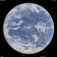
In the meantime, the other hemisphere:
http://www.nasa.gov/image-feature/africa-and-europe-from-a-million-miles-away

Posted by: hendric Jul 29 2015, 07:34 PM
We do live on a beautiful world. I expect Aliens will come to visit just for the aesthetics.
Posted by: Ron Hobbs Aug 5 2015, 02:49 PM
This is so very cool! I have been waiting to see this; didn't realize they would capture it so soon.
We live in a very beautiful system!
http://www.nasa.gov/feature/goddard/from-a-million-miles-away-nasa-camera-shows-moon-crossing-face-of-earth
Posted by: mcaplinger Aug 5 2015, 03:10 PM
I wonder what the source of the fringe around the Moon is? Color channel misregistration?
Posted by: Floyd Aug 5 2015, 03:24 PM
Time lag between different color images--doesn't matter as earth rotates little--bigger problem for moon flying past.
Posted by: Ian R Aug 5 2015, 04:45 PM
My attempt to correct for the motion of the Moon, in addition to whatever processing caused blue filter signal to leak into the red and green channels:
http://postimg.org/image/6j1xbyua7/full/
Posted by: Explorer1 Aug 5 2015, 05:24 PM
Wow! I was actually wondering if being at L1 would allow transits to happened regularly. Apparently this is twice a year (plus the Moon being occulted two weeks before/after).
Posted by: lars_J Aug 5 2015, 06:02 PM
Fascinating... This image does give a layperson such as myself an idea of the brightness/albedo of the moon compared to earth. It is darker than I expected!
Posted by: scalbers Aug 5 2015, 06:09 PM
Good find on the transit. Neat that we are seeing the far side of the moon. I wonder how the lunar occultation will look in late September, when we are also having a total lunar eclipse? Will we see any of the penumbra (or even umbra) on the moon? This might depend on the fact that DSCOVR varies a bit from being exactly along the Sun - Earth line.
Posted by: centsworth_II Aug 6 2015, 04:38 PM
I liked this headline.

|
http://www.bloomberg.com/news/articles/2015-08-06/moon-ruins-perfectly-good-photo-of-earth-by-running-in-front-of-the-camera
Posted by: hendric Aug 6 2015, 06:24 PM
I found a reference that DSCOVR's L1 orbit varies the Sun-Earth-DSCOVR angle by 4-15*. I assume like Soho the ellipse is mostly East/West. September's eclipse is a partial in the southern hemisphere. I expect it will be difficult to notice since it will be over mostly dark water, far from the subsolar point. The March 8th total solar eclipse next year should be very noticeably, since it will cross the central Pacific. Since the umbra will stay on Earth's surface for over 3 hours, I think we should get a couple of pics of it.
http://www.timeanddate.com/eclipse/list.html
Posted by: JRehling Aug 6 2015, 06:56 PM
The difference between Earth-Moon albedo can also be seen in person when a gibbous Moon rises in the afternoon or sets in the morning and can be compared to distant hills, clouds, etc. on Earth, although there are many factors that can ruin the comparison.
Posted by: scalbers Aug 6 2015, 07:57 PM
The gibbous moon is an interesting comparison. The land surface of the Earth can be relatively close to the lunar albedo, compared with the clouds. When looking at specific locations relative to the sun, we can consider the reflectance since the albedo is more of an averaged quantity. At some point I may test my rendering software to show the DSCOVR view with the moon included.
Posted by: Explorer1 Oct 7 2015, 12:49 AM
No news on the proposed daily 'pipeline'? There haven't been any images released in September at all (not trying to sounding ungrateful, just wondering about what the holdup is!)
Posted by: ZLD Oct 20 2015, 02:02 PM
Just noticed the DSCOVR website had a http://www.nesdis.noaa.gov/DSCOVR/ yesterday. More or less it talks about the camera on board and mentions that a new website was created to host the available data.
http://epic.gsfc.nasa.gov/
Doesn't seem to be able to finish loading for me at this moment in time however.
Posted by: dvandorn Oct 20 2015, 02:41 PM
It took me three tries to load the website yesterday, but when it finally loaded I found that I could pull up whole-Earth images from two days prior -- which happened to be my 60th birthday. It lets you scroll through images taken a few hours apart throughout a given day.
I was able to capture the image of the western hemisphere, featuring my home continent, as it appeared in the middle of my birthday. Kewl! I now have it as my desktop.
-the other Doug
Posted by: ZLD Oct 20 2015, 03:01 PM
Yeah, it finally loaded for me as well. Probably took 10m to load the page. Either they are getting pounded with site hits or they dug up a clunker from the basement to host the site. 
Posted by: Explorer1 Oct 20 2015, 04:43 PM
At least! Very nice, and apparently archives going back a few months. Nice to see things like the distance information and angle from the sun too.
Eventually the Moon will pass behind/in front of our blue marble again....
Posted by: Astroboy Nov 20 2015, 02:30 AM
The timing of the pictures seems really random, and the Moon transit sequence isn't included. Are we only going to get handfuls of images for the time being?
Posted by: scalbers Nov 20 2015, 06:46 PM
Does the moon always transit as seen from DSCOVR? There's enough deviation of DSCOVR from the Sun - Earth line, and the moon's orbital inclination effect that could cause a miss.
The timing of the pictures seems to be every 2 hours or a bit less. Maybe some days they aren't downlinking as many.
The website has an email contact that may help with some of our questions.
Posted by: Explorer1 Nov 20 2015, 06:50 PM
I think they mentioned in the first press release on the lunar transit that it doesn't happened very often (think of eclipse frequencies). All three (Earth, Moon, DSCOVR) have to be on the same plane, so it's about twice a year.
None of the images show the Moon setting behind the Earth either, however; it might be a matter of timing the image to get the Moon in frame before and after it passes behind Earth's disc....
Posted by: elakdawalla Nov 20 2015, 08:18 PM
I don't have direct answers to the questions being asked here, but I do have a little information that might be useful to people. When they first launched the website, I sent this inquiry to the media contact:
My inquiry was forwarded to Adam Szabo, who replied:
The API URL is:
http://epic.gsfc.nasa.gov/api/images.php
This gets you a list of the latest day's images & metadata.
OR
http://epic.gsfc.nasa.gov/api/images.php?date=YYYY-M-D&w=X&e=Y
The second form's optional parameters allow you to focus in to geographical regions that were in view (technically, longitudinal bounding points) on a given date.
For instance: Using North America's boundaries of east = -53.034, and west = -170.859 and choosing August 24, 2015, the URL would look like this:
http://epic.gsfc.nasa.gov/api/images.php?date=2015-8-24&w=--170.859&e=-53.034
The date parameter is unpadded(e.g. 2015-9-1, vs. 2015-09-01 for September 1, 2015), and optional. Leaving the date off will default to the latest image set.
Leaving out the coordinates gets you every image for whatever date is returned.
Adding either longitudinal parameter returns all images for the given date, for which the supplied longitude is in view of the camera.
The JSON data looks like this:
ImageData object:
{
"image": "epic_1b_20150826231708_00", // image name sans extension.
"caption": "About an image", // Will contain a caption
"coords": "{}", // Contains a JSON string representing a Coordinates object.
"date": "2015-08-26 23:17:08" // The date the capture sequence for the image was initiated
}
ImageData notes:
For the image field to be useful, it has to be added to a URL. Image URLs differ depending upon purpose.
Given an image name of "epic_1b_20150901205648_00" (taken Sept 1, 2015, with the camera aimed
at 3 typhoons in the pacific (my favorite)), we have:
For compressed JPG thumbnails, the path would be
http://epic.gsfc.nasa.gov/epic-archive/thumbs/epic_1b_20150901205648_00.jpg
For full-size, compressed JPG previews, the path would be
http://epic.gsfc.nasa.gov/epic-archive/jpg/epic_1b_20150901205648_00.jpg
For full-size original PNG images, the path would
http://epic.gsfc.nasa.gov/epic-archive/png/epic_1b_20150901205648_00.png
Coordinates object
{
"centroid_coordinates": { // Geographical coordinates that the satellite is looking at
"lat": 4.076132,
"lon": -169.648562
},
"dscovr_j2000_position": { // Position of the satellite in space
"x": -1439710.750000,
"y": 659227.437500,
"z": 113316.414062
},
"lunar_j2000_position": { // Position of the moon in space
"x": 153199.062500,
"y": -319797.531250,
"z": -104905.093750
},
"sun_j2000_position": { // Position of the sun in space
"x": -134918656.000000,
"y": 62555808.000000,
"z": 27119770.000000
},
"attitude_quaternions": { // Satellite attitude
"q0": 0.976360,
"q1": -0.212080,
"q2": -0.039540,
"q3": 0.013750
}
}
Posted by: Explorer1 Nov 28 2015, 08:22 PM
The seasons are changing; yesterdays image (November 27th at 12:00 GMT) is giving a sense of deja vu....
http://epic.gsfc.nasa.gov/epic-archive/png/epic_1b_20151126081200_00.png
A little over a week until the anniversary of the Blue Marble that started it all.
Posted by: Explorer1 Dec 17 2015, 07:18 AM
Apparently the lunar eclipse images were saved for AGU 2015, so they weren't on the website (makes sense; the craft had to track the Moon, not Earth, so it would have been a confusing sequence).
http://www.bbc.com/news/science-environment-35076402
Posted by: scalbers Dec 17 2015, 08:52 PM
Yes, this was shown yesterday here at AGU in a panel discussion including Al Gore, Adam Szabo and several additional science team members. It was suggested by the panel that the images from DSCOVR would look much nicer with some motion interpolation applied to make a continuous movie. Sounds right up UMSF's alley
Also being discussed are followup missions with improved cameras.
Posted by: Dan Delany Jan 6 2016, 05:00 PM
I'd love to try some motion interpolation with these... However, I can't seem to find the actual images from the eclipse anywhere - the EPIC site still shows no images for 2015-09-27. Has anyone else been able to locate them?
Posted by: elakdawalla Jan 6 2016, 05:48 PM
I haven't, either. I just sent an email and also asked about PDS release plans.
Posted by: elakdawalla Jan 6 2016, 07:12 PM
That was quick!
At the top level menu, select "Galleries" and "Lunar Transit". All 20 full resolution images are there
for downloading.
The September 27 images will appear shortly at the same location.
We are serving all of the EPIC RGB images through the http://epic.gsfc.nasa.gov site and will continue to update as new
images become available. The single wavelength, Level 1b images will be made publicly available through the Langley
Atmospheric Science Data Center (https://eosweb.larc.nasa.gov) our official archival site, starting in late February.
Adam Szabo
NASA DSCOVR Project Scientist
Posted by: scalbers Jan 7 2016, 06:03 PM
I'm curious whether there is any possibility of improving the downlink capability. I understand that the red and blue channels are being reduced to 1K x 1K pixels prior to transmission to Earth. The net result is that the images we see are the equivalent of a Bayer filtered color image, even though the original images onboard are 2K x 2K RGB.
Posted by: scalbers Feb 23 2016, 07:39 PM
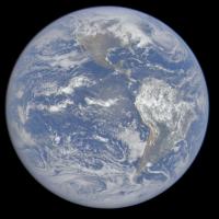
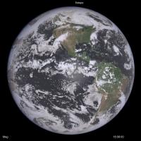
I've been doing some renderings of the Earth from increasing altitudes (up to 40000km so far), and comparing with DSCOVR imagery. I'm starting to think the DSCOVR images (have insufficient gamma correction or are too contrasty) as the ratio of green counts between bright clouds and ocean is about 6. This is between the linear and gamma corrected values. Same with blue with about a 3 or 4 ratio in the DSCOVR images. Thus the images are too contrasty between clouds & oceans compared with reality. Here is a DSCOVR image I'll elaborate on in the next post.
|
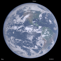
Posted by: scalbers Feb 24 2016, 09:48 PM
Next we can look at the modified DSCOVR image, though only with a 0.70 gamma adjustment instead of the 0.45 I thought would be needed to generate fairly realistic results:
|
This can be compared with a rendering I did using 3-D cloud hydrometeor gridded data, surface albedo derived from NASA Blue Marble, and other atmospheric assumptions. The time and geometry should be pretty close. I'm still refining things like the sun glint, cloud phase function for single & multiple scattering, and atmosphere near the limb.
|
Posted by: Stratespace Feb 27 2016, 10:00 PM
Using the automated server containing the json file of all images (here: http://epic.gsfc.nasa.gov/api/images.php, it appears that the images containing the lunar transits are not present there. Considering Emily's post, I'm not sure what it does mean. Does the folder http://epic.gsfc.nasa.gov/epic-archive/png/XXX.png contain only the non-lunar transit images ? Only featured images ? I am a bit confused, I could download more that 1800 EPIC images automatically except the most dramatic ones...
In the meantime I struggle a bit with the quaternion of the spacecract. According to it, the image should be oriented like this:
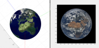
|
But when forcing the "up" of the image to "North" in earth frame, the image becomes inconsistant with the given quaternion but oriented as expected:
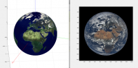
|
Any idea if the images were post-processed to make them point north ?
Posted by: scalbers Feb 28 2016, 05:46 PM
When I click on the first link above, I can see the 'json' file for just the most recent day's images. Generally the images I've seen are all pointing north. I wonder if they are also being centered in the frame?
Posted by: Stratespace Feb 28 2016, 07:43 PM
No, they are not centred and the quaternion clearly lacks of precision : the centre of the earth according to the quaternion is usually several dozens of pixels off-centre from the actual centre of the earth.
To get the json files for other dates, you just need to add the date in your query, e.g. http://epic.gsfc.nasa.gov/api/images.php?date=2016-1-12
My conclusion is that the provided quaternions are almost useless, I needed to recalculate my own.
Posted by: scalbers Feb 28 2016, 08:25 PM
Thanks for the updates. I can note that the longitude range as per this example simply shows if the box is in view. Is it possible to extract for when the centroid longitude lies within a certain range?
http://epic.gsfc.nasa.gov/api/images.php?date=2015-8-24&w=--170.859&e=-53.034
Posted by: mcaplinger Feb 28 2016, 10:23 PM
Have you tried contacting the EPIC team about what errors you are seeing in the quaternions?
Posted by: Stratespace Feb 28 2016, 10:31 PM
No. I could recreate my own with a precision better than 1 pixel, so I don't need to bother them.
Posted by: mcaplinger Feb 29 2016, 05:08 AM
If you're going to say that their product is "almost useless" it only seems fair to give them an opportunity to fix it or at least explain what the issue is.
Posted by: Stratespace Feb 29 2016, 01:37 PM
It's almost useless to me, I don't want to make them think that what they propose is "bad" or anything like this. The rest of the metadata is pretty good and useful to me.
As long as I could find absolutely no documentation on the quaternion (frame definition, where is the scalar and the vector, etc) I had to guess everything by my own. I finally found what I thought is correct, then I deduced that I was not useful to me... I am very far to question the intrinsic value of the quaternion they propose, maybe for example it is not supposed to represent directly the orientation of the image.
Anyway, I don't feel the "right" nor the confidence to contact people that have other things to do that being bothered by someone from the other side of the planet, who speaks poor english, who just plays a bit with the data they are very kind to propose and who maybe doesn't understand what is proposed to him due to lack of information. If you feel well doing it, please feel free to do it.
Posted by: nprev Feb 29 2016, 02:14 PM
Stratespace, I think that the EPIC team might actually appreciate the inquiry. I don't think that you would offend them (and it's obvious that's not your intent at all), and feedback from users of their products would doubtless be valuable.
Posted by: elakdawalla Feb 29 2016, 05:10 PM
I checked https://eosweb.larc.nasa.gov/project/dscovr/dscovr_table and it looks like they've shifted the date for the availability of the archival data from "end of February" to "spring 2016". https://eosweb.larc.nasa.gov/newsletter/subscriptions to be notified of project status.
Posted by: scalbers Feb 29 2016, 08:23 PM
Yes I think this leap day qualifies as the end of February
Generally I think it's difficult for spacecraft attitude information to be accurate enough to navigate image position to the pixel level. I also end up simply fitting empirically (and somewhat automatically) to the limb within the image. Might be nice though for them to know about our discussions in general.
Posted by: Stratespace Feb 29 2016, 11:05 PM
For the first images in particular, the quaternion attitude error is much more than 1 pixel, even sometime more than 1 Field of View !
My observations are:
- The "Earth north is toward image top" is roughly true, but not exactly. There is always are ~1° to 5° typically (with peaks at more than 15°) error between real north and image "up".
- The latest the images, the best their orientation wrt north.
- Some images a completely black, for some reason.
- There are long missing periods in the data that we know exist.
- There is uncorrected or residual image distortion. I could struggle estimate the polynomials, but it would be a lot of effort for a faint effect (~1 to 2 pixels).
I could re-calculate the quaternion according to what is visible in the images, update the image "up" toward a more accurate "north", and when corrected everything seems much prettier. I'll try to post a video showing this result.
Posted by: Stratespace Mar 1 2016, 08:31 PM
Here we are:
https://www.youtube.com/watch?v=V5YZnXZs_v4
This is not intended to be beautiful nor pleasant to see, but just to provide an idea of what is possible in terms of projection after the metadata has been a bit "improved".
Posted by: elakdawalla Mar 1 2016, 09:43 PM
Wacky. Sort of like passing by time on a subway train. But a cool start to something; I'm looking forward to where you go with this.
Posted by: Explorer1 Mar 1 2016, 09:46 PM
Yes, very cool! The gradual season change is so clearly evident, as are individual storm systems. Keep it up!
Posted by: Stratespace Mar 1 2016, 11:55 PM
Ok, I've just put a bit of persistence on the map, so you won't need no aspirin when watching this.
But there is so much work yet to do to calibrate both the extrinsic and intrinsic parameters of each image, it is a bit discouraging... particularly considering all the processing already applied on the image. I find it much easier to play with classical raw PDS images !
https://youtu.be/7N63ucC1lXY
I'll need to find those parameters, and then tune some image morphing algorithms. I've already tested some of them on those images, and they provide poor result.
Posted by: Stratespace Mar 4 2016, 02:07 AM
As the morphing software didn't give me what I wanted, I designed an algorithm (based on some publications) dedicated to image temporal interpolation for planetary images (understand: it can deal with clouds warping, tearing and whirling).
The next video is based on only 2 images, processed in a fully automatic way (not a single command nor help brought to the algorithm, except "run"):
- Image 1: http://epic.gsfc.nasa.gov/epic-archive/png/epic_1b_20150807130002_00.png
- Image 2: http://epic.gsfc.nasa.gov/epic-archive/png/epic_1b_20150808130501_00.png
Result is this video (Watch in HD): https://youtu.be/M2CiR4WCaPo
Please tell me if you find it satisfactory... or not.
Posted by: scalbers Mar 4 2016, 07:11 PM
Interesting to see, though a day is a long time to interpolate clouds for. I wonder how the Butterflow algorithm that Dan Delany has been showing us would do with this? This can somewhat be validated by comparing the interpolated DSCOVR frames with actual DSCOVR or Himawari frames that were remapped. Will be interesting to see how the time interpolation in post #98 can be applied to the movie shown earlier, including between frames just an hour or two apart.
BTW, a bit of a gap in real-time DSCOVR images, so we'll see when they can start to get some updates.
Posted by: Stratespace Mar 4 2016, 08:18 PM
Yes, obviously the objective is to run it on the map with all frames. But the 1-day gap seemed to be a good benchmark as a worst case scenario.
Posted by: scalbers Mar 5 2016, 03:00 PM
Yes this makes sense - thanks for clarifying. Quite the project to bring all the frames together into an evolving map of the Earth, and nice to take the subway ride. Perhaps you've considered this, as I would imagine that the cylindrical projected version could be converted into a rotation movie. The animated map could be reprojected into the viewpoint of DSCOVR, and we would then see a uniformly rotating Earth with the jumps removed. This is what was talked about at the AGU conference panel discussion.
Posted by: Explorer1 Mar 11 2016, 11:12 PM
The solar eclipse sequence is up on the main site today. I just figured out that you can animate the image by using the left and right arrow keys (on Firefox, at least)!
Posted by: scalbers Mar 23 2016, 08:25 PM
I'm continuing to think about the most realistic brightness/contrast adjustment for the DSCOVR imagery. One line of reasoning is that in green light the oceanic areas (with overlying atmosphere) should be about 12% reflectance. The brightest clouds would be about 100% reflectance. So that is a ratio of 8.5 in brightness and a gamma corrected ratio of 2.62. In other words, if the bright white clouds are 255 counts, the oceanic areas near the center of the image (though outside of sun glint) should be about 97 counts. This means I should try a greater contrast reduction for the DSCOVR imagery than I had done previously (in post #81). I have posed a question to the DSCOVR team somewhat along these lines.
It's also interesting to note that the brightest clouds are found near the center of the Earth. Near the limb they are paler looking. Some of this is related to there being more intervening atmosphere above the clouds with the more grazing path. However it also seems to be related to a reduction of backscattering when light hits the cloud at a glancing angle and/or on the side. This can be compared with limb darkening on other cloudy planets and moons in the Solar System.
Posted by: scalbers Mar 26 2016, 03:01 PM
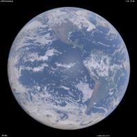
Here is an updated version of a synthesized Earth image using land and 3-D weather data (left) and the correponding DSCOVR image (right). I did tweak the color & intensity a bit on the DSCOVR image.
|
|
It's interesting that one can get a handle on what the Earth colors should be by considering that over the ocean, most of the signal is actually light scattered from the sky instead of from the water. We are in essence looking down at the sky (with its attendant Rayleigh scattering) and that is the main reason the Blue Marble is blue. There's also evidence the DSCOVR imagery (as posted on their web site) is contrast stretched since the recent solar eclipse has an oversized region around the umbra where all the details disappear.
Posted by: Explorer1 Mar 26 2016, 05:55 PM
Wow, that really does look much more like the Apollo imagery. I did a side-by-side comparison of the blue marble in December, when the views were almost identical, and the differences between the images was clear.
Posted by: scalbers Mar 26 2016, 09:27 PM
Thanks Explorer1. One thing with the synthetic image (2 posts back) is that the clouds near the limb look too bright. One of the reasons turns out to be that ozone absorption of the light rays interacting with clouds and terrain was left out. So here's an update with this effect mostly included, along with some aerosol adjustments.
|
(Edited Mar 27 1640UTC)
Posted by: scalbers Apr 30 2016, 06:46 PM
More details on these synthesized Earth images can be found in my inaugural Planetary Society http://www.planetary.org/blogs/guest-blogs/2016/0420-synthesizing-dscovr-like-images.html
There are a series of comments to this post. I was cutting my two comments a bit short to fit in the character limit. Thus to be more complete I would insert the following paragraph in between these two comments:
..........................................
The question about brightness and contrast relates in part to step (3) in my post. One way to check this is to consider that the brightest clouds have a reflectance of about 100%. The cloud-free ocean regions with the Rayleigh scattering (and a slight augmentation from aerosols) should have a reflectance of around 12% in green light (550nm). If the bright white clouds are set to a pixel value of 255, then the green component of the the ocean regions should be 255 * (0.12 ^ 0.45) or 98 counts. The 0.45 power is the gamma correction I'm using to account for the non-linear brightness relationship between pixel count and displayed intensity on a typical computer monitor.
..........................................
I might also add that the question of how to set brightness, contrast, and color saturation applies just as much to everyday photography as in spacecraft imagery. I'm following the notion that it's good to have the displayed image be as linearly proportional as possible to the actual scene, with the same color saturation.
(Edited May 31, 2016)
Posted by: Explorer1 Jun 28 2016, 08:32 PM
Space weather instruments are done commissioning, finally: http://spaceflightnow.com/2016/06/27/new-and-improved-space-weather-observatory-goes-live-next-month/
Is it just me, or does the embedded image of the eclipse looks different from those on the EPIC page, a lot brighter/less muted?
Also first I'm hearing of a successor to launch in 2022!
Posted by: scalbers Jul 8 2016, 04:40 PM
I like the URL and where they are going with the imagery:
http://blueturn.earth/
https://vimeo.com/173723357
On another note pertaining to the character of the blueness of the Earth, I can offer the notion that the ground view of the overhead sky with thin scattered clouds (and the sun at a moderately low altitude) is rather similar (with a bit of imagination) to the space view looking straight down at the ocean. If you have a lot of imagination you can get a sense of vertigo looking up such a sky - and think you're really looking down.
Thus I'd consider the contrast between the darker blue and brighter white should be less than what we see in the videos above, assuming we want the display to be linearly proportional to the actual brightness.
Posted by: Explorer1 Jul 20 2016, 05:03 PM
One year highlight video is as good as I hoped: https://www.youtube.com/watch?v=CFrP6QfbC2g
Posted by: scalbers Jul 29 2016, 05:13 PM
Here is the Blueturn version with a somewhat smoother presentation: https://vimeo.com/175935487
Posted by: Michael Boccara Sep 13 2016, 07:20 AM
Thanks Steve for pointing at my videos.
A word about the technique: this is a simple interpolation of EPIC images based on orthographic projection on a 3D sphere, and linear blending in the geodesic space.
The results are good enough to provide a new earthgazing experience, like in this video of the week around the summer solstice:
https://vimeo.com/172956335
The less time between each images, the better the quality. Note that EPIC images are separated by around 1 hour around summer time, and by 2 hours around winter time. But for some exceptional occasions, like the March, 9th eclipse, NASA granted us with only 20 minutes between images, which led to the best interpolation results:
https://vimeo.com/170798080
Some work remains to fix quality issues, like the artifacts on the limbs and the lighting correction in interpolated images.
Note that the interpolation runs in real-time (30fps) in an interactive app, provided the images are already downloaded from NASA and uploaded into the GPU texture memory. So a lot of the effort is about paging the textures efficiently to provide a smooth video experience.
One may find it difficult to see the movement of the clouds, because their speed is very slow comparing to the rotation of the Earth. But you can see them better if you keep looking at the same geographic point, like in this video of a sandstorm in Egypt:
https://www.instagram.com/p/BHKDx8RDobB/
Posted by: scalbers Oct 13 2016, 06:10 PM
Thought I'd mention that I'm attempting to resolve a discrepancy in the geometry contained in the metadata. For a case that I'm simulating, the image at 18:04 UTC on September 20 states that the SEV angle is 9.2 degrees (on the website). If I use the subpoint (centroid) of the spacecraft from the json file (4.3N and 102.6W) though I come up with a solar elevation angle consistent with an SEV angle of about 10.4 degrees. My simulated image also shows a bit more limb shading than the actual image. Judging from my simulated image the sub-point looks OK since the continents line up pretty well. Thus I wonder if the stated time of the image could be off by a few minutes and is actually about 18:08?
Posted by: Explorer1 Oct 13 2016, 06:49 PM
Any idea what the bright yellow spot in this image around Ecuador (a much more amateur question!) http://epic.gsfc.nasa.gov/epic-archive/natural/png/epic_1b_20161012163939_01.png
Cosmic ray hit, downlink issue, something else?
Strange how hurricanes look harmless, even cute, at such a distance...
Posted by: john_s Oct 13 2016, 09:06 PM
Looks to be in about the right place on the disk to be a specular reflection from a lake, which would be cool.
John
Posted by: ngunn Oct 13 2016, 10:08 PM
There is a place called Lagunas on the Amazon tributary Maranon in about the right place. However my atlas also shows that another tributary the Ucayali has wide reaches not too far away. (Both locations are in Peru.)
Posted by: scalbers Oct 22 2016, 05:20 PM
Here's an advance simulated animation (click on MP4 link) of next year's eclipse from the DSCOVR perspective. This is without clouds.
|
http://stevealbers.net/albers/allsky/4ld_polar.mp4
|
And while I'm here, this is a http://stevealbers.net/allsky/cases/dscovr/dscovr_blink_162641808.gif recent DSCOVR view as a blinking animation. Some improvements have been made since my description of this in the http://www.planetary.org/blogs/guest-blogs/2016/0420-synthesizing-dscovr-like-images.html The case is from September 20.
Posted by: fredk Oct 29 2016, 02:28 PM
Nice, Steve. You mentioned before the interesting fact that when you are looking at the ocean most of the light is scattered up in
the atmosphere above the water, rather than a reflection of the sky (or diffuse scattered sunlight, ie extended opposition surge) in the water.
This makes me wonder what the disk would look like if the atmosphere were gone. So no scattered light in the air or reflection of sky in water. Ie, what is the colour of the water itself, and how dark would it be? Presumably the land would also be quite a bit more contrasty. Is it easy for you to remove the air from a simulation?...
Posted by: scalbers Oct 30 2016, 03:17 PM
Thanks fredk. The funny thing is that once I inadvertantly ran this without air and the ocean indeed looked darker. This was a goofy accidental run (image below) with Mars atmospheric pressure and Earth aerosols. The display looks somewhat reasonable, though the water looks too gray and thus would need more work. The ocean (outside of sun-glint areas) should be around a factor of 10 darker for the case of few aerosols in the sky and sediment in the water, though it could be a smaller ratio otherwise. The color would also vary depending on sediment content and the like, ranging from blue-green to sometimes more brown.
|
Note that sun-glint over water is different from the opposition effect that happens over the land. The sun-glint region is controlled by wave action, though I suppose this could be extended a bit depending on forward scattering by atmospheric aerosols then reflecting off of the water, diffused again by wave slopes.
Posted by: Michael Boccara Oct 31 2016, 04:36 PM
Hi Steve,
I also have a weird discrepancy when confronting the ephemeris data provided on the EPIC website against the images themselves.
See this video I generated from my Blueturn app, of the last July 5th Moon photobombing, when I also represent a virtual Moon model at the location provided in the ephemeris. I just don't understand the difference. I double checked and couldn't find any error in my perspective projection matrix. It looks like either the Moon position is wrong, or the DSCOVR position (all in J2000), or the time stamp itself. Or, maybe this is because my rendering engine is OpenGL-based and is in floating precision.
What do you think ? I saw your nice simulation of the future eclipse across the US, so maybe you could also re-simulate the July 5th, 2016 Moon crossing, and tell me if you see the same difference as I do...
See the video, or a direct deep link to my WebGL app (the virtual ephemerid-based Moon is right-most) :
https://vimeo.com/189285144/6916063e34
http://blueturn.earth/app/EarthPlayer/?date=2016-07-05_03-23-43&play=True&timeScale=300&orthoSize=8.278089&cameraX=0&cameraY=0
(Press 'm' to show the virtual Moon)
Posted by: fredk Oct 31 2016, 05:02 PM
Thanks a lot, Steve. This is very cool: Earth without air. Comparing your with and without air views, I can certainly see your point about the oceans being dominated by light from the sky - the Earth is the blue planet because our sky is blue. Apart from the continents, I can almost imagine these views as fish-eye views of the sky with patchy clouds from the ground.
I'm still curious about one detail: switching off the air makes the oceans much darker, but how much of that darkening is due to the removal of scattered light in the air above the water, and how much is due to the removal of sky light reflected back up from the water's surface (ie, the removal of a sort of wide-angle "sky glint")? My guess would be that the former would dominate, since the water's surface is not a very good reflector (apart from large angles of incidence).
Posted by: scalbers Oct 31 2016, 11:35 PM
Indeed it's interesting to imagine the aspects of symmetry between looking up at the sky and looking down from space - I can almost get dizzy looking up and imagining this.
If we assume no aerosols, then I agree the scattered light upward by the sky is much more. This is because the Rayleigh phase function is pretty similar upward and downward, and the downward diffuse light only has about 8% reflected by the water. If aerosols are present the scattered/reflected ratio may vary some (considering the asymmetry factor), though probably not change the main conclusion for most cases.
A fun example to help illustrate some of this is to note that Lake Titicaca is much darker than the ocean areas, due to the high altitude and less air present.
Posted by: fredk Nov 1 2016, 03:29 PM
The symmetry of the Rayleigh phase function tells us one more interesting thing. Neglecting the subdominant light scattered or reflected from the water, the intensity of the ocean (near the centre of the disk but away from the sun glint) seen from space with the sun roughly behind your back would be similar to the Rayleigh-scattered intensity of the sky (away from the horizon) from the ground (near sea level) when the sun is high. Of course getting into the (mainly forward-scattered) Mie regime spoils this and will make the sky from the ground generally brighter than the ocean from above.
But basically the intensity of the sky near noon on the clearest, least dusty day would be similar to the intensity (and colour) of the ocean when viewing the full Earth from above. For those of us who aren't going to make it into space, at least we can imagine a bit more quantitatively now!
Posted by: JRehling Nov 1 2016, 05:20 PM
The question of what Earth would look like without its atmosphere is potentially ambiguous, it could mean:
1) What would the view from space be if the light reflecting off the surface/ocean were not altered on its path up to the camera.
2) What would the surface/ocean itself look like if it had a black sky above it.
3) Both (1) and (2).
A related example: In towns/cities when there is snow on the ground and cloud cover overhead, night can be astonishingly bright because streetlights reflect off the clouds, and that light reflects off the snow, in what is effectively a damped infinite feedback loop.
The situation looking at normal, natural surfaces from above has some degree of this, with the sky altering how the surface looks and the surface, surely, altering how the sky looks.
If you wanted to address (1), an "easy" way to do it would be to ground-truth the DSCOVR images by taking images of isotropic surfaces (e.g., the ocean, snow, certain deserts). Compare your camera's color values with DSCOVR pixels of the same surface unit and determine the function that relates the two. Then apply the inverse function to DSCOVR images of the whole planet.
FWIW, I recently did something like this with images of Mercury that I took in a daytime sky. I subtracted the R, G, and B values of the background sky from the whole image, including the portions containing Mercury. The result gives a black sky and a brownish-grey Mercury approximating the colors seen by Messenger. That is the "up looking" version of what (1) would be the "down looking" version of.
Posted by: Stratespace Dec 9 2016, 10:49 PM
I begin to be a bit desperate about the DSCOVR images.
I've first worked with the PNG images provided by their server, associated with their metadata. After days of work, I still couldn't understand what I was seeing: when projected on a map with Spice kernels, the data did not seem very well registrated, and there were slight shifts changing depending on the local view angle. I contacted NASA that nicely replied that the PNG images were not scientifically accurate in terms of localization, and that I should work with the L1B calibrated data instead.
To make it short, those L1B data are calibrated and include all bands registred in a common reference frame. In other terms, for each image you have the gray level for each band, as well as the local latitude/longitude corresponding to each pixel, or map of coordinates if you prefer.
But after hours of play with those data, it appears the problem is even worse than before: those L1B data are even wrong-er and it's impossible as it to project properly the images on a map.
As a short demonstration, I projected a "true" coastline map onto the images according to their lat/long maps. Here is the result:
After a bit of investigation, I finally understood where the problem is in those raw calibrated data. Unfortunately, the maps associated to the images have been generated very roughly, the DSCOVR EPIC team have considered all "non-null" pixels as "the Earth", and the darkness of space as "not Earth". As a result, the atmosphere of the Earth is considered as being the ground, and ten pixels outside the Earth the maps still indicate different latitudes and longitudes !
You can see this fact on the following images, where I show a portion of Earth's limb and the same portion with the size of the Earth uncorrectly given by the metadata overimposed on it:

As a consequence, when you project your coastline map on the images for debug, you see the coast floating up into the upper atmosphere:
I think we can all agree it is clearly off-target...
I've already tried different techniques to correct for this issue, such as detecting the "true" size of the Earth in the images and to shrink all the lat/long maps accordingly, but this is very hard in practice, as you need to make the difference between lit portions of the limb that are clearly visible and barely visible portions of the limb that are already into the night. Remember that DSCOVR is orbiting around L1 and not on L1, thus shadows are visible.
I've implemented alternative techniques as well, such as clouds removal and recognition of different patterns on the Earth to morph the metadata they provide to a more correct geometry, but it is very hard to make it 100% automated with high confidence without spending weeks and weeks of effort.
As a last chance, I've tried working with the L1A data (uncalibrated), but it fails for the same reason.
My conclusion so far is: I'm done with those data, they lack of reliable metadata to work with them at pixelic resolution with an automated process, to make animated maps for example. It's okay to make movies on the original images themselves (no transformation needed), it's okay to transform one of those images, but it's pointless working on them for a smooth transformed animation. At least without days and days of work. The optical flows and other filtering techniques I've implemented to guess automatically what should be the correct lat/long grid for each image are quiet complex, but still insufficient to do the job. That's a shame, the outcome would have been awsome...
Posted by: scalbers Dec 10 2016, 06:13 PM
Indeed it's tricky to get accurate mapping. Here is a somewhat empirical fit used in my recent blinking comparison of synthetic vs DSCOVR:
|
http://stevealbers.net/allsky/cases/dscovr/dscovr_blink_162641808.gif
I did have some success in simulating the limb shading to help with the fitting. There is still some extra atmosphere appearing in the actual image for some reason.
It's interesting to consider how thick the atmosphere appears from this vantage point, and where the (often invisible) limb of the solid Earth is located. The simulations may provide useful estimates of the distance between the limb and the first "non-zero" pixel based on the atmosphere and on limb shading relating to the phase angle.
Posted by: Phil Stooke Dec 10 2016, 08:14 PM
How about... don't use the limb detection routine to locate the limb, use it plus a limb-fitting routine to get a best fit and use that to establish the central (sub-spacecraft) pixel. Use that central point plus a calculated radius based on range and geometry to fit the 'true limb' to the image. You can adjust some of the geometry parameters until they give optimum results.
More simply, you could use your existing routine but multiply by the fraction necessary to shrink the coastline map to fit the image. Once established that fraction should be fairly constant, or at least can be varied as a function of range.
Phil
Posted by: Stratespace Dec 10 2016, 09:21 PM
The limb detection is largely impacted by the uncertainties associated with the terminator. In some images, the pixels disapear when the sun is locally 10° above the horizon; and in other images they disapear when the sun is virtually 0° above the horizon !
In addition, it appears that a shrink/translate transform is not enough to compensate for all of the errors in the metadata, this is why I switched to optical flow that tried to fit the coastlines and other salient features (not an affine transformation).
It somehow works, but requires significant tuning to run on a batch of several images. I can't afford to spend too much time to make it work on thousands of images with a very low error rate.
I other words:
I'm really curious to know how the scientists can actually work with such errors. Do they do the same kind of corrective process (with hopefully more time than 2 hours during the week-end like us) ? Could we expect that they correct their calibrated data accordingly one day ?
Posted by: scalbers Dec 10 2016, 10:00 PM
Maybe the scientists are doing something like this: https://ntrs.nasa.gov/archive/nasa/casi.ntrs.nasa.gov/20160011149.pdf
Posted by: Stratespace Dec 10 2016, 10:25 PM
You are right, thank you very much for the link !
Posted by: Floyd Dec 11 2016, 02:32 PM
Here is a maybe crazy, maybe not so crazy idea. Could interested scientists or institutions set up 1 to 3 dozen lasers around the globe that point at DSCOVR during daylight and act as fiduciaries. The images would all have a set of hot pixels for perfect alignment. I'm sure a few universities across the globe would be happy to operate a facility to put themselves on the map as reference points. Laser frequencies could be chosen to blind only one channel of one pixel for each fiduciary laser.
Posted by: Stratespace Dec 11 2016, 04:24 PM
Considering they already have very precise pre-image registration for scientific purpose (called "navigation" precision in their paper), it's very unfortunate they don't update the L1B data with those corrected lat/lon values...
Posted by: scalbers Dec 11 2016, 06:08 PM
It seems in the reference I linked that the image correlation is being done mainly in areas near the center of the disk. Even when I do this manually, there seem to be discrepancies that show up when we go very close to the limb. I suppose this relates to what was mentioned above about the EPIC team's decision on where the limb is when registering and combining the images from the various channels. It sounds like I might get better results with my the blinking comparison if I would work with the raw data, rather than the web imagery.
Posted by: Explorer1 Dec 21 2016, 07:58 PM
Big changes to the public website interface, plus an 'enhanced colour' option:
http://epic.gsfc.nasa.gov/
Posted by: Michael Boccara Jan 24 2017, 09:45 AM
Following the previous discussion with Stratespace about DSCOVR data inacuracies, I have some new information from the DSCOVR team: they finally recognized having an error in their ephemeris, at least on the lunar position, because they were using geodetic coordinates instead of geocentric. It caused an absurd "rosette-shaped" path for the Moon around the Earth, as shown in the video below (sorry for the very artisanal screen capture - showing my Unity3D development environment):
https://drive.google.com/file/d/17C7FVMH5oUc1Ukc3bGHCWGx5y9hZKnTlLg/view
This same error is also the cause behind a problem I had with the famous "Moon photobombing" images of July 5th, 2016, when the Moon passed through EPIC's lens. Here's an article for those who missed it:
https://www.nasa.gov/feature/goddard/2016/nasa-camera-shows-moon-crossing-face-of-earth-for-2nd-time-in-a-year
Now see the video I made from my Blueturn app, that shows interpolated EPIC images of July 5, together with a 3D model of the Moon (rightmost) based on their ephemeris:
https://vimeo.com/189285144/6916063e34
I am now waiting for the EPIC team to fix their database, and hopefully I'll be able to integrate correct 3D model of the Moon, and fix the above video.
I am currently in discussion with the DSCOVR team to find out whether this error also applies to DSCOVR's position and attitude, in which case there is some new hope of being able to have an accurate orthophoto calibration of the images in 3D.
Posted by: JRehling Jan 24 2017, 06:11 PM
If I were to try to build a robust solution to this, I think I'd try the following. In large part, I think this follows more or less the algorithm that we people use in inspecting an image of the Earth.
Preparatory indexing:
1) Make an index of the shapes of coastlines at the resolution of ~ 5km/pixel. In particular, index segments where coastlines change orientation such as the Strait of Hormuz, the east coast of Somalia, the Baja peninsula, Gibraltar, southern Italy, Tierra del Fuego, Newfoundland, Michigan, etc.
Processing a single image:
2) At the time the image was taken, make a list of the coastline segments that are located within ~60° of the sub solar point. Perform a transformation to adjust them to how they should appear from the direction of the Sun, which will approximate the geometry of DSCOVR.
3) Run edge detection on the image, excluding any edges that are bounded by white regions, which are probably clouds.
4) Match the detected segments against the projected indexed segments from (2).
5) If three or more segments are matched (possibly two that are far apart), you now have a good registration between the image and the Earth.
Probably the tricky step is (4), but there's research on this.
Posted by: scalbers Jan 24 2017, 07:53 PM
Interesting to consider this procedure. I wonder how this solution would work at the limb. I've been able to match the coastlines and other features fairly well. Clouds in my matching were also useful to check. However the extreme limb is where things appeared to drift off, possibly due to the setting of the reference limb in the atmosphere as mentioned earlier. It seems this might work OK with the raw data (however that would be available) and less well with the displayed web images or L1B image data. It's also helpful to consider the actual position of DSCOVR that can be around 10 degrees from where the sun is located.
http://stevealbers.net/albers/allsky/outerspace.html
Posted by: JRehling Jan 25 2017, 05:30 PM
I wonder how possible it is to capture the limb. We know that we can see stars and the Sun when they would, on an airless globe, be below the horizon. That means, conversely, that vantage points in space have a view of points on the surface beyond the literal horizon, which means that other points must be projected to other locations. In principle, this means something very messy is happening at the limb. And a small displacement near the limb corresponds to a large difference in position on the map. The devil is in the details as to the magnitude of that effect, or if it affects such a tiny boundary around the disk as to be negligible.
Posted by: scalbers Jan 25 2017, 06:20 PM
Using my simulated imagery (link 2 posts above) as an example, it seems possible to determine how far the (often obscured solid surface) limb is located below the top of the visible atmosphere. With a non-zero phase angle, the shading effects can also be considered. This is the more significant aspect I think with the visible atmosphere extending perhaps 30-60km above the limb.
Refraction is also of interest as you note. The actual lateral displacement of the limb (and locations nearby) from refraction is only about 1km, smaller than the camera resolution. This small amount can still allow another 100km or so of land to be squeezed into theoretical visibility near the limb.
Posted by: Michael Boccara Mar 7 2017, 03:13 PM
Hi
Sharing some nice results I had with interpolating EPIC images and projecting then on a planar map (equirectangular).
https://vimeo.com/207296528/b9b8eee67c
The video is at its optimal quality, in 4K resolution and 120Hz..
The images are generated in real-time as I stream the EPIC images (and their metadata) from the NASA website.
Interpolation is made by simple blending of perspective projection on a 3D ellipsoid model of the Earth, executed in the GPU via a custom fragment shader. Good enough to look almost like optical flow.
The conversion from 3D ellipsoid model into equirectangular map is also done in real-time, via a vertex shader on the GPU.
Here is another video from my Blueturn app (freely available on all platforms), that shows better the transition between spheric and planar.
https://vimeo.com/207296473/28f01f0807
Enjoy!
Posted by: scalbers Mar 9 2017, 12:25 AM
Looks really nice to see the smooth changes in the clouds - interesting to see how much they evolve during the course of a day. It's a fun challenge to try and perceive this with a vertical perspective view where the Earth is rotating.
As a quick note I often like to suggest a bit lower contrast between the blue ocean/sky and the white clouds to have a more linearly proportional displayed brightness.
Posted by: Michael Boccara Mar 9 2017, 06:44 AM
Thanks Steve.
This is indeed a nice global view on the clouds motion without any collage artifact.
And taking note of your remark about the blue/white contrast: aren't you suggesting to rather increase it ?
My next plan for the default sphere view is to indeed add some 3D navigation to pivot around the Earth beyond the L1 viewpoint. It's a simple thing to do with Unity. A geosynchronous view from above the pole (one with constant daylight) would indeed be an interesting vantage point to see the dynamics or the Coriolis force on the clouds. Maybe soon on the SOS ?
Posted by: scalbers Mar 9 2017, 07:51 PM
For the contrast I was thinking of reducing it, by increasing the brightness and having more of a sky blue color in the clear sky areas over the ocean. The bright clouds would then stay about the same. Here's an updated version of my earlier blog post on the Planetary Society site with a http://stevealbers.net/albers/allsky/tpsblog.html. Another example of this is ugordan's very nice https://www.flickr.com/photos/ugordan/5672792247/. Even this one appears though to have some contrast enhancement.
|
One current thing I'm doing is improving the sun glint so it looks more accurate for a crescent Earth (maybe for a future version of DSCOVR) as well as when fully lit. Here is an animation of the http://stevealbers.net/outerspace/animated_phases.gif of the Earth.
Indeed SOS will be fun to look at this with. It's easy to change the viewpoint then to see a polar view. I'll try this out with both geosynchronous and sun synchronous. Note that SOS Explorer can also do the 3D navigation. There is a tradeoff to the versatility of various viewpoints in that we wouldn't then be properly seeing the hazier looking limb.
Posted by: Stratespace Mar 13 2017, 07:43 PM
Posted by: Michael Boccara Mar 22 2017, 05:41 AM
Thanks Stratespace.
I had dramatic improvements after calculating the enclosing ellipse of the Earth instead of the enclosing circle. Plus I had a bug in the optimal enclosing circle.
But the funniest is that after I did that, my resulting ellipse always had its normalized center rounded at (0.500,0.500) (yes zeros until the 3rd decimal), and the axis sizes being constantly at (0.777,0.776), accounting for the ellipsoid polar squeeze. It means that the images were originally aligned by NASA's EPIC team. In other words, the image is centered to the Earth center at 1 pixel precision. In other word, I worked hard for nothing
That was not so a few months ago, but seems like a late refresh of the data brought this calibration improvement.Bottomline, you can proceed with your work and use the EPIC metadata as-is.
Note that I'm using the L1B data from the EPIC website(https://epic.gsfc.nasa.gov/), not from the ASDC archive (https://eosweb.larc.nasa.gov/project/dscovr/dscovr_table).
I don't think it makes much of a difference. However please note this explanation I once had from a member of the EPIC team:
The level 1B (L1B) data is the science data product. This has the raw calibrated data that the scientists use. It also includes the complete geolocation information (per pixel lats/lons/angles, etc) and the astronomical/geolocation values required to do the calculations. The complete astronomical/geolocation metadata has been added to the images.
Michael
Posted by: Michael Boccara Aug 29 2017, 07:08 AM
Hi
This is my version of the eclipse of last week, based on 13 DSCOVR images separated by 20 minutes each. NASA tuned DSCOVR specially for the occasion:
https://vimeo.com/230632867
Also as an interactive video via the online app:
http://app.blueturn.earth/?date=2017-08-21_15-17-45
Enjoy
Thanks
Michael
Posted by: monty python Aug 30 2017, 07:50 AM
Thank you. This is the kind of video my friends with little astronomy knowledge can appreciate. At my location in Iowa we had 90% eclipse and eclipse glasses sold out fast!
Posted by: Michael Boccara Sep 13 2017, 08:26 AM
Hi,
I released a new version of my app Blueturn. It is online as a web app, and also available on Android. iOS update will arrive in a few days.
Besides improving the basic feature of browsing and interpolating DSCOVR/EPIC images into a smooth interactive video, the app now allows to switch vantage points (DSCOVR, L1, Moon), and access geostationary views in 3D or in 2D maps (Mercator and Plate-Carree).
Also worth zooming out to see the Lissajous path of DSCOVR around the L1 point.
I also added an enhanced view by applying transparency on darker pixels, and using a CG illuminated Blue Marble model underneath.
Enjoy :
http://app.blueturn.earth
(Click the down-arrow in the top-right corner for advanced features)
Michael
Posted by: scalbers Sep 13 2017, 06:29 PM
Nice to see this more flexible version of the app is now available. As we were talking about offline there is now the "SWIM" option in the advanced features. This is a color enhancement to produce colors and contrast more similar to the simulated DSCOVR images I've been making.
Posted by: Michael Boccara Sep 14 2017, 05:46 AM
Yes, and as a shortcut I just made this quick little video with SWIM mode enabled:
https://drive.google.com/file/d/0B0fW3eqrNrIAaWFyeDloaXJ0bDA/view?usp=sharing
Posted by: scalbers Jan 3 2018, 09:49 PM
Here is our "DSCOVR Transcendance" poster from AGU, highlighting Blueturn and the Simulated Weather Imagery. The authors included Michael Boccara, Jay Herman, and Zoltan Toth.
https://agu.confex.com/agu/fm17/meetingapp.cgi/Paper/232523
https://agu.confex.com/agu/fm17/mediafile/Handout/Paper232523/DSCOVR%20Transcendance.pdf
Posted by: scalbers Mar 1 2018, 12:20 AM
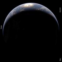
I've recently made some fixes to the handling of Rayleigh scattering in making simulated Earth images. This makes the simulated blue sky (over ocean areas) somewhat darker than previously. As a result less color adjustment to the DSCOVR web images is need to make a match. Hopefully this is now a more realistic color and contrast.
|
The left is simulated (ray-traced) from global 3-D weather and land surface data, right is a DSCOVR/EPIC image at the same time. In general my simulations come up a little short on the brightest cloud reflectance values. This can be partially addressed by adjusting the anisotropic reflectance factor for the bright cloud tops.
Posted by: scalbers Mar 3 2018, 06:09 PM
Also for comparison, here is an image constructed from the DSCOVR calibrated counts data, converted to reflectance and then using my color processing algorithms to calculate the RGB values. The blue color looks somewhat brighter than in the DSCOVR web page images. This should be close to a true color / contrast astronaut view. The brightness is set to minimize clipping of the brightest white clouds. There's really an interesting variety of whiteness to the clouds with the deepest most opaque ones near the center being the brightest. Some additional processing would be needed to register the individual narrowband image locations better, considering the Earth's rotation.
|
Posted by: scalbers Jul 20 2018, 07:23 PM
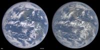
With some further adjustments I get this comparison that is hopefully a bit closer, including a slightly darker blue over the oceans. The land is now brighter relative to the scattered light in the atmosphere.
The ocean/sky blue is brighter in the image one post above for perhaps multiple reasons. One way to characterize this gap is to note that the simulated 551nm reflectance in the darkest ocean areas is about 4.4% compared with 5.0% observed. The blue channel and color saturation are also higher in the above post. The same dark ocean areas are observed to have ~12.4% reflectance at 443nm and the simulation has a lower value. This gap can be bridged by considering reflected sunlight from beneath the water surface, and also checking the reflected skylight from the surface.

|
Posted by: scalbers Jul 21 2018, 04:40 PM
With this refinement to increase the reflected light from beneath the water surface we can see the comparison below.

|
The simulated image on the left is a closer match to the observed color processed version in post #153. The image on the right is from the DSCOVR website with an empirical color adjustment.
Posted by: scalbers Sep 3 2018, 01:14 PM
To help with rendering the Earth, a guideline I've come across is that the chromaticity of the blue sky (due to Rayleigh scattering) should be about x=0.23 and y=0.23. This helps quantify the relative values of RGB in the clear sky portion of Earth images. This is assuming that the standard CIE color matching functions are correct in describing how this color is perceived.
A relation that I hadn't before known is that this "Rayleigh Blue" color is about the same color a star would have with an infinite (or very high) blackbody temperature. Thus on an imaginary planet orbiting a very early type O star a water cloud there would be about the same color as a haze free blue sky on Earth, instead of white.
Posted by: scalbers Aug 12 2019, 10:14 PM
DSCOVR has been in safe mode since June 27th: https://spacenews.com/dscovr-spacecraft-in-safe-mode/
I wonder if an archive of L1B files is stil available in NetCDF or HDF format?
Posted by: scalbers Oct 3 2019, 09:46 PM
A fix is being worked on: https://spacenews.com/software-fix-planned-to-restore-dscovr/
Posted by: scalbers Apr 1 2020, 10:07 PM
DSCOVR has been back in operation now, already for a few weeks. The color processing for the web images is also now more accurate than it was before the hiatus.
Posted by: bkellysky Apr 4 2020, 11:27 AM
Thank you for your reports on DSCOVR!
In case anyone needs a link to the whole-earth photos: https://epic.gsfc.nasa.gov/
bob k
Posted by: scalbers Apr 23 2020, 10:02 PM
Sounds good bkellysky! I'm attaching a relatively recent comparison (still before the hiatus) with a simulated Earth image from real-time (independent) 3D cloud / aerosol fields with land surface data. DSCOVR is on the right. This version underestimates the dust aerosols off the West Africa coast near the right limb, though I'm presently testing some improvements.

|
More info is here: http://stevealbers.net/albers/allsky/outerspace.html
Posted by: threadworm Jan 21 2022, 04:59 PM
DSCOVR also caught the start of the eruption:
https://epic.gsfc.nasa.gov/archive/natural/2022/01/15/png/epic_1b_20220115042159.png
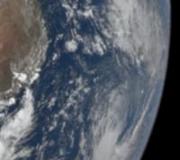
|
Taken at 04:21:59 GMT
Posted by: Michael Boccara Oct 29 2022, 01:44 PM
This is October, 25th, 2022, and the time is 11:19UTC.
Two cosmic events are happening at the same time, involving the 3 main celestial bodies. In one sentence:
The Sun is smiling while looking at the Moon cast its shadow onto the Earth.
Two pictures shot at the exact same moment:
1. Left: Almost total sun eclipse over Russia. See the Earth "eaten" at the North-East. Picture by DSCOVR satellite around L1. What the Sun sees of us...
2. Right: a smile draw on the Sun surface by its coronal holes. As if it liked the show smile.gif. Picture by NASA SDO satellite, also on L1, but looking the other way.

|
Posted by: bkellysky Oct 27 2023, 03:19 PM
DSCOVR image including the darkness over western North America from the annular eclipse of Oct 14.
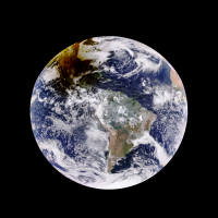
|
Posted by: john_s Oct 27 2023, 03:28 PM
Nice image, but something must be off with the colors- the shadow looks brown but should be neutrally colored, as the moon will block all wavelengths equally.
John
Posted by: bkellysky Oct 27 2023, 04:31 PM
John
There's a lot of discussion upthread of DSCOVR images from the 2017 eclipse. The colors produced by the way they combine the data from different wavelengths makes a difference from what the human eye would see. Even the GOES visible wavelength photos showed a very dark area along the path when the Sun wasn't totally eclipsed at any point in this annular eclipse.
Posted by: fredk Oct 27 2023, 07:11 PM
That image is the "enhanced" version. The "natural" version doesn't look quite as bad:
https://epic.gsfc.nasa.gov/archive/natural/2023/10/14/png/epic_1b_20231014165817.png
Looking at the pixel values the blue channel drops to precisely zero in the penumbra, giving the brown hue. I suspect somewhere in the processing (combining the raw channels into the colour version) they've clipped the low end of the blue (and green) channels. Their processing probably wasn't designed for such dark levels since the Earth is normally (almost) fully sunlit from L1!
Actually limb darkening of the sun is wavelength dependent, with shorter wavelengths more attenuated than long near the rim. So around annularity the illumination should actually be shifted to the red. But most of the visible penumbra is still lit by some of the central area of the sun's disk, so I wouldn't expect a noticable effect in these images.
But near the narrow path of annularity the illumination should be shifted somewhat to the red. It would be interesting to quantify that. Sometimes people report a change in the "character" of the light near annularity - maybe the colour shift contributes to that. I didn't notice a colour shift at either the 2023 or the 2012 annular eclipses, just the dimming. Of course the eye would adapt to such a slow colour shift.
Posted by: scalbers Oct 28 2023, 02:01 AM
Nice analysis by fredk. The DSCOVR Team reportedly did make some color improvements to the natural color web images a few years ago, though this eclipse image shows some improvements could still help. Perhaps looking at the https://opendap.larc.nasa.gov/opendap/DSCOVR/EPIC/L1A/2023/10/contents.html would give some further insight. As mentioned it's unusual for DSCOVR to have to deal with color of low intensity regions except right near the limb at times. Sometimes I like to look for colors of clouds along the barely visible terminator. Hopefully scattered light doesn't vary with wavelength in the camera system.
The various effects including limb darkening of various wavelengths are somewhat accounted for (and something I hope to improve) in my simulated sky and Earth images. Just subjectively I think the redder color shows up visually when experiencing a deep partial eclipse. If it didn't the combination of bluer color and dimmer light would look more unnatural and different from a normal sunset sequence of lighting.
In this GOES animation the land looks a bit redder, more than the clouds though here also it isn't a perfectly true color processing.
https://col.st/4fqw2
Posted by: StargazeInWonder Oct 28 2023, 03:10 AM
All very interesting. For what it's worth, this is the second or third eclipse that I experience as relatively deep but not total (77% in this case) under cloudy skies and subjectively, there was no noticeable color shift to the red.
Posted by: fredk Oct 29 2023, 05:59 PM
Thanks for the links. Yeah the raw epic data are 32-bit floating-point, and have no problem seeing deep into the penumbra. Here's an example during the eclipse - this is the 443nm channel, clipped on the fully-lit clouds to show detail in the shadow:
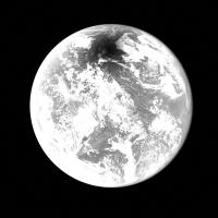
|
But converting three visible channels to a colour image is non-trivial, unless the team has laid out the details for their procedure somewhere.
Do you mean by "limb darkening" the extra absorption/scattering near the Earth's limb as viewed from the sun?
Interesting thought. I'll have to pay more attention to colours if I make it to the path of April's eclipse...
Posted by: scalbers Oct 29 2023, 07:22 PM
Nice to see there's a good presentation in the blue channel of the DSCOVR image data. I'm unsure if the details of the DSCOVR processing are widely available. I've done my own version of this processing in the past and some approaches can be a bit tricky. The image below is such a past case. I'd be happy to expound upon this in further detail as for example from http://www.unmannedspaceflight.com/index.php?s=&showtopic=1992&view=findpost&p=238753.
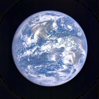
|
Presently I'm trying out my https://stevealbers.net/albers/allsky/tpsblog.html for this eclipse case, ironing out some software wrinkles on that front.
The limb darkening color dependence is related to the color of the sun's limb. The limb is redder due to the slant paths when viewing into the incandescent solar atmosphere. One reaches opacity at a higher photospheric altitude near the limb. The effective radiating temperature is thus cooler, producing a redder black body color and lower intensity. Of course the limb color becomes predominant when we are illuminated by a crescent sun.
Looking at the limb of the Earth during a solar eclipse would make a double effect and hopefully will be accounted for
Posted by: fredk Oct 29 2023, 09:52 PM
There are some details on the production of colour images from EPIC raw data in https://asdc.larc.nasa.gov/documents/dscovr/DSCOVR_EPIC_Geolocation_V03.pdf
For the level 1b data here:
https://opendap.larc.nasa.gov/opendap/DSCOVR/EPIC/L1B/2023/10/contents.html
the channels are transformed to the same viewpoint so you won't get the colour fringing due to the Earth's rotation.
I was wondering about why you were treating limb darkening because I would've guessed you would simply use some standard illuminant for the sun. I guess you meant you were actually trying to incorporate the colour shift due to limb darkening because you are simulating eclipses?
Posted by: scalbers Oct 29 2023, 10:05 PM
Interesting to see this document that seems to be associated with their color processing improvements from a few years ago. Good to see they mention the CIE color processing. In the past the H5 file images weren't corrected yet for Earth's rotation as can be seen in the image from two posts up. I wonder if this is newly being done in the H5 file or in another version of the files shown, or simply later on in their processing for the L1b and web images?
The "brown eclipse" issue may stem from a lack of eclipse support in Rayleigh corrections employed with both DSCOVR and GOES image processing. An alternative to the Rayleigh correction the DSCOVR team is using could be a logarithmic interpolation between the observed bands to construct the full spectrum as I've been considering in the context of sky simulations.
Yes I try to account for solar limb darkening when simulating eclipses, from space-based and https://stevealbers.net/albers/allsky/eclipse.html views. The DSCOVR perspective view simulation is something I'm ironing out at present - here is a first look based on land surface and 3D atmospheric analysis data fully independent of DSCOVR.
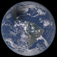
|
Posted by: scalbers Nov 4 2023, 09:16 PM
Animated comparison of simulated Earth (left) and actual DSCOVR images over several hours for the annular eclipse:
https://stevealbers.net/allsky/cases/dscovr/20231014_annular_eclipse/animation.png
Posted by: fredk Nov 6 2023, 07:02 PM
Nice simulation. No obvious reddening in the penumbra in your simulation, as you'd expect with areas of the central sun's disk contributing significant illumination except very near the centreline.
Powered by Invision Power Board (http://www.invisionboard.com)
© Invision Power Services (http://www.invisionpower.com)