Printable Version of Topic
Click here to view this topic in its original format
Unmanned Spaceflight.com _ Jupiter _ Voyager and Galileo Images of Ganymede
Posted by: Bjorn Jonsson May 18 2007, 09:43 PM
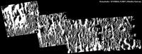
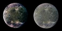
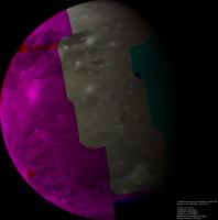
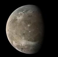
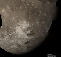
I've been processing some of the high resolution Galileo Ganymede images recently. As far as I know the two mosaics below have not appeared at the official websites (at least not in this form) so in a sense they are 'new'.
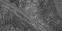
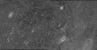
The first one was obtained during the G1 flyby in 1996. It covers a part of Memphis Facula which is centered at roughly 15°N, 132°W. The images were obtained at a distance of approximately 5000 km from Ganymede's center.
|
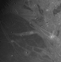
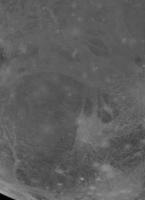
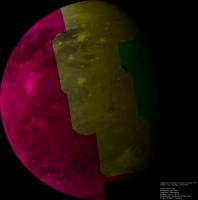
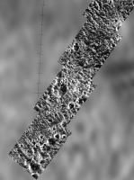
The second one was obtained during the G28 flyby in May 2000. It is centered near 14.5°S, 319.7°W. The images making up the mosaic were obtained at a distance of roughly 4500 km from Ganymede's center.
|
I will probably post more Ganymede mosaics later this month or next month.
Posted by: nprev May 19 2007, 03:56 AM
Bjorn, honored to be the first to complement you on this remarkable work! 
Interesting that Ganymede seems to have its own 'look' on this scale. The crater rims seem to be quite rounded, almost eroded in appearance...I'm at a loss to explain this, unless they are truly ancient and this is the result of micrometeoroid action over the ages as we see on the Moon. However, this conflicts with the existence of very prominent fracture/faulting features...odd indeed.
Posted by: edstrick May 19 2007, 08:51 AM
One of the things that seems to happen on Ganymede and even more so on Callisto is the sublimation of ice by "dirty" regolith. Icy dirt gets hot enough in the afternoon to sublimate ice and darken itself. That accelerates the process. At the same time it can tend to creap downslope, tending to thin and expose more ice on elevations and slopes, lightening those surfaces and slowing the ice evaporation process. That seems to be very important in the highest resolution images, from what I've read (and also speculated myself). Callisto high-rez images show the resulting topography best.
Posted by: tedstryk May 19 2007, 03:49 PM
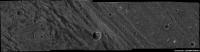
Great work! It really is amazing how many good Galileo mosaics/images never became public release products. Here is one from G-2 (use the link for a higher resolution version).
http://www.strykfoto.org/g2-1a.jpg
Posted by: ElkGroveDan May 19 2007, 04:26 PM
Thank you Bjorn. That was a real treat.
Too bad it's such a cliche now, but the term "alien landscape" would be most appropriate here.
Posted by: Bjorn Jonsson May 20 2007, 01:58 AM

From the G2GSPLMPST01 imaging sequence it seems.
I have noticed this too. Sublimation is probably significant. However, in some cases the very high contrast between the bright and dark material plays tricks on one's eyes and makes the relief appear greater than it really is.
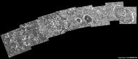
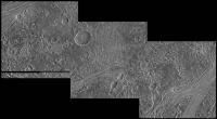
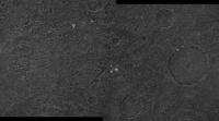
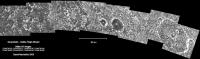
Finally, here's a new one. This is a mosaic of 16 images from the Ganymede 2 G2GSLTDKBD01 imaging sequence obtained on September 6, 1996. The images show an area at ~61°N, ~170°W and were obtained at a distance of ~4300 km from Ganymede's center. North is up and a bit to the left. Many of the images were heavily compressed aboard the spacecraft (several by a factor of more than 20) so compression artifacts are clearly visible. This also significantly reduces the resolution (by a factor of roughly 2-4). This is also apparent in Ted's mosaic above.
|
|
Posted by: nprev May 20 2007, 05:38 AM
Wow!  Thanks yet again, Bjorn!
Temperature-dependent selective erosion aside as Ed correctly mentioned...this is odd. The 'hummocks' clearly are more recent than the craters, and actually seem to be destroying them over geologically recent time scales. Ganymede seems to be far more active than I thought....
Posted by: Exploitcorporations May 20 2007, 09:40 AM
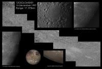
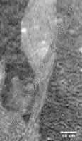
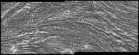
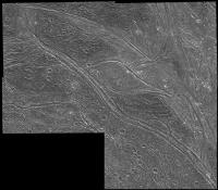
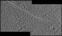
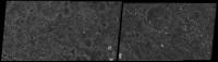
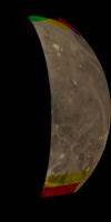
Can't help but toss my hat in the ring with this obscure observation from the E12 orbit in December 1997. Galileo passed within 20,000km of Ganymede and took this hard-to-decipher oblique pan across the floor of the giant Gilgamesh basin. The fractures scale all the way down to the limit of resolution in the right-hand portion of the mosaic.
|
Posted by: edstrick May 20 2007, 09:43 AM
Apparently we're seeing similar temp controlled sublimation at Iapetus and Hyperion. There's very un-intuitive feedbacks going on in the processes, I suspect, and quick-and-dirty arm-waving analysis can only go so far. These terrains will look *STRANGE* when we finally get some hard lander down on these objects. The fractured and faulted ice terrains of Europa and volcanic terrains of Io (not the S02/Sulfer etched terrains and the like) will look positively familiar, I suspect.
Posted by: MarcF May 20 2007, 12:15 PM
Thanks a lot to all of you for these great mosaics !
These pictures were taken 10 years ago, and there is still a lot to do with them.
Did anybody try to assemble the very high resolution pictures taken during G1 over Xibalba Sulcus ?
Due to their "bad" quality, it might be difficult. I even don't know if they really overlap !
I also did not find any mention about the G29 images.
What about the regional and color polar cap boundary mosaic near Perrine Regio ?
Finally, there were these pictures taken when Ganymede was in Jupiter shadow in order to look for aurora events :
http://pdsimg.jpl.nasa.gov/outdir/4846r.img.gif
I never heard about them in any publication.
As you can see, my "frustration" is still quiet high ten years later, and that's why I really enjoy your posts.
Marc.
Posted by: tedstryk May 20 2007, 06:57 PM
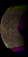
Well, I have this color mosaic I put together a few years ago from G29. I will say that because I made it years ago, I used relatively crude methods compared with what I use now, but at any rate, here it is.
|
Posted by: volcanopele May 20 2007, 07:02 PM
I might as well join the fray too:
Both of these are from a non-targeted encounter during orbit C9.
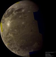
http://pirlwww.lpl.arizona.edu/~perry/C9GSSULCUS01.jpg
C9GSSULCUS01
Distance to planet center: 84379 km
This four-image mosaic covers portions of Xibalba Sulcus (roughly N-S set of grooves and ridges at the center of the mosaic) and Nineveh Sulcus (the roughly E-W set of grooves and ridges on the right-hand side of mosaic). This mosaic is roughly centered near 28 N, 82 W. Xibalba Sulcus seperates Galileo Regio on the left and Perrine Regio on the right.
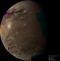
http://pirlwww.lpl.arizona.edu/~perry/C9GSGLOBAL01.jpg
C9GSGLOBAL01
Distance to planet center: 201468 km
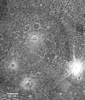
This seven-image global mosaic is centered on Ganymede's leading hemisphere, with Galileo Region on the limb at upper left, Perrine Regio near the terminator at upper right. The bright ray crater Cisti can be seen near the bottom.
Posted by: tedstryk May 20 2007, 09:01 PM
Here is a montage of Galileo Callisto and Ganymede views I did. I could swear I have a version of the Ganymede image somewhere without the horribly saturated whites, but I am not sure (it was a victim of my crash a few years ago, but I could swear it was backed up). In both cases, the color data is filled in from other orbits and Voyager.
Click the link for full resolution (keep in mind that full resolution is keyed to the Callisto image, which is much smaller).
http://www.strykfoto.org/calgan.jpg
Posted by: ElkGroveDan May 20 2007, 11:16 PM
Me too. Since the advent of Photoshop I have saved a fortune on tape and razor blades. You can hardly see the scars on my fingertips any more.
Posted by: tedstryk May 21 2007, 03:11 AM
I have now completed my earlier post with an improved Ganymede and added Europa and Io.
http://www.strykfoto.org/calgalileans.jpg
Posted by: ElkGroveDan May 21 2007, 05:06 AM
That one's going on the wall of my office. Is that the highest res you have Ted?
Posted by: mchan May 21 2007, 08:36 AM
Striking view, Ted!
Posted by: MarcF May 21 2007, 10:53 AM
Thanks Ted. really nice.
The color mosaic of Perrine Regio is exactly what I was looking for.
However, the polar cap boundary is not really obious.
Marc.
Posted by: tedstryk May 21 2007, 11:36 AM
It is the highest resolution I made it. The Ganymede and Europa mosaics are much larger, and the Io mosaic is slightly larger, but the Callisto mosaic is at full size.
Ted
Posted by: Bjorn Jonsson May 21 2007, 06:56 PM
These pictures were taken 10 years ago, and there is still a lot to do with them.
Did anybody try to assemble the very high resolution pictures taken during G1 over Xibalba Sulcus ?
I decided to try but I couldn't identify any common features when examining these images visually so I don't think they overlap (if anyone can prove me wrong please post here!). To check this further I reprojected them to simple cylindrical projection using the viewing geometry information in the IMG files. I then assembled the result into a single map. This resulted in overlap but the images do not match, meaning the viewing geometry information is inaccurate. The map looks like this:
|
Not exactly a high quality map. In addition, there are several problems with the Xibalba Sulcus images: No context images are available, the exact location of the image footprints is unknown and the bright, sunlit slopes are severely overexposed.
The color mosaic of Perrine Regio is exactly what I was looking for.
However, the polar cap boundary is not really obious.
Marc.
The polar cap boundary isn't obvious, the change is gradual. "Can't see the forest because of the trees" is a further problem - when I made my 7200x3600 pixel global map of Ganymede the polar cap wasn't obvious enough in the initial version of the map because it wasn't made from global images. I had to post process the map to make the polar caps bright enough, using global images as a guide.
PS Lots of great images of Ganymede here
.
Posted by: MarcF May 21 2007, 07:57 PM
It's surely the most difficult mosaic to construct (if not impossible !). At least you tryed. Thank you Bjorn.
Indeed, the four images may not overlap. The same happened with the G1 Uruk Sulcus high resolution mosaic, but in that case, there were nice Voyager 2 context images.
Even if the four pictures do not really match, the mosaic anyway gives a better idea about the fine structure and topography of this terrain at high resolution.
Concerning the polar cap boundary, I did not expect to see something really sharp, but at least less gradual !!
Ganymede is still one of my favourite "worlds", and it's really a pleasure for me to follow this thread.
Marc.
Posted by: JRehling May 21 2007, 08:51 PM
Tour de force, Ted. I use the screensaver on my computer to teach my son the major worlds of the solar system. At 16 months, he calls Io "eddy", Europa "opa", Ganymede "bop" (you figure it out), and Callisto "toe". I'll split your mosaic into four and make those the images for these colorful worlds.
Posted by: nprev May 22 2007, 02:34 AM
...very cool, JR! Quite the budding planetary scientist you have there!
I tried getting my daughter interested in this back in the 80s, but, alas, pictures in books didn't have the same allure as computers do to children nowadays (to say nothing of wonderful, detailed images like Ted's!) She knew how to say "Louis Vuitton" long before she could say "Mars", so I knew it was a lost cause... 
Posted by: Exploitcorporations May 22 2007, 03:29 AM
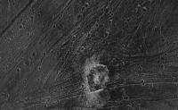
These stories are adorable...my four-year old says that I play with moons and make puzzles with them, but no names are known to him but Saturn's. Kudos to Ted for a magnificent montage and Bjorn for assembling some of the fugliest images in planetary exploration history into something vaguely comprehensible.  I'm tossing in a context scene of the Memphis Facula mosaic from the first post...those Voyager images make things far easier to understand where available.
|
Posted by: vexgizmo May 26 2007, 08:48 PM
Hey... Ganymede could never be fugly!

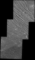
This shows the context for the light-dark boundary observation. These images, and others that overcompressed, actually look pretty good as soon as they are resampled by reprojection. By the way, every other frame contains a central "truth window"--a 96x96 pixel area where there is no compression at all.
|
Posted by: vexgizmo May 26 2007, 08:56 PM
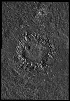
http://www.strykfoto.org/g2-1a.jpg
Here is the context for this G2 palimpsest observation (this palimpsest is now named Epigeus). Every other frame of this observation, too, contains truth windows. This one is a nice complement to the Memphis Facula observation--each shows a transect across the various palimpsest facies.
|
Posted by: nprev May 26 2007, 08:59 PM
Thanks, Vex! Long time no see, welcome back!
Posted by: OWW Nov 13 2007, 11:30 PM
Excellent mosaics! I browsed through the Planetary Photojournal to see what other Galileo observations were either 'forgotten' or incomplete.
Here are some mosaic-attempts of mine:
G7GSKITTU_01 Kittu Crater
On the PPJ this observation was merged with G7GSKITTU_02 color:
http://photojournal.jpl.nasa.gov/catalog/PIA01611
Here is the original G7GSKITTU_01 without color:
|
Posted by: OWW Nov 13 2007, 11:32 PM
G2GSURUKSL01 Uruk Sulcus. Stereo companion to G1 Uruk observation
|
Posted by: OWW Nov 13 2007, 11:38 PM
G7GSNEITH_01 Neith Crater.
Same as this PPJ image: http://photojournal.jpl.nasa.gov/catalog/PIA01658
But at full-resolution.
|
Posted by: OWW Nov 13 2007, 11:49 PM
G2GSNIPPUR01 Nippur Sulcus
At the PPJ:
http://photojournal.jpl.nasa.gov/catalog/PIA00497
http://photojournal.jpl.nasa.gov/catalog/PIA01086
Full resolution:
|
Posted by: tedstryk Nov 13 2007, 11:59 PM
And for a different angle, an distant J0 crescent (sorry, I couldn't resist).
|
Posted by: OWW Nov 14 2007, 12:00 AM
G2GSTRANST01 Marius Regio
PPJ:
http://photojournal.jpl.nasa.gov/catalog/PIA01087
http://photojournal.jpl.nasa.gov/catalog/PIA01091
Full mosaic:
|
Posted by: OWW Nov 14 2007, 12:06 AM
G2GSGRVLNS01 Byblus Sulcus
PPJ:
http://photojournal.jpl.nasa.gov/catalog/PIA01088
a wider view:
|
Posted by: OWW Nov 14 2007, 12:30 AM
G8GSCALDRA01 Sippar Sulcus calderas
http://photojournal.jpl.nasa.gov/catalog/PIA01614
http://photojournal.jpl.nasa.gov/catalog/PIA03214
|
Posted by: OWW Nov 14 2007, 12:35 AM
G8GSFRACDK01 Southern border of Galileo Regio
http://photojournal.jpl.nasa.gov/catalog/PIA01616
For some reason this already small image was made even smaller. The original:
|
Posted by: OWW Nov 14 2007, 12:38 AM
G8GSREGCON01 Marius Regio / Nippur Sulcus
http://photojournal.jpl.nasa.gov/catalog/PIA01618
Same here.
|
Posted by: OWW Nov 14 2007, 12:48 AM
G7GSNICHOL01 Nicholson Regio / Arbela Sulcus
http://photojournal.jpl.nasa.gov/catalog/PIA01612
http://photojournal.jpl.nasa.gov/catalog/PIA01613
|
Posted by: OWW Nov 14 2007, 12:53 AM
G8GSANSHAR01 Anshar Sulcus
|
Posted by: OWW Nov 14 2007, 12:57 AM
G8GSRNGBAS01
|
Posted by: OWW Nov 14 2007, 12:58 AM
Great composition. I especially like the colors.
I guess this one is even more spectacular:
E6GSGLOBAL01 Global view centered around 330 longitude.
|
Posted by: OWW Nov 14 2007, 04:42 PM
28GSNICHOL02 Nicholson Regio context
28GSNICHOL01 Nicholson Regio High resolution
PPJ: http://photojournal.jpl.nasa.gov/catalog/PIA02571
|
|
Posted by: tedstryk Nov 24 2007, 02:08 PM
Here is a set that shows the problem with relying on one filter sent at full resolution combined with color data with 2x2 binning. To the left is a photojournal release, and to the right is my version. I used all data available for the larger features, and an overlay from the full resolution frame to bring in fine detail.
|
Posted by: machi Nov 10 2009, 08:21 PM
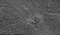
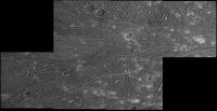
And here is something from my earliest works (i think that this is actually my first better mosaic). Galileo Regio mosaic.
|
Posted by: machi Oct 1 2010, 03:11 PM
Ganymede's south pole region from Voyager 2. All images resampled to resolution 500 m/pix. Real resolution is around 550 m/pix.
Color is from wide angle images (orange, green and violet filter).

|
Posted by: Hungry4info Oct 1 2010, 03:53 PM
That's very nice!
Posted by: tedstryk Oct 1 2010, 04:41 PM
Superb work!
Posted by: Juramike Oct 1 2010, 06:11 PM
Beautiful!
Posted by: Bjorn Jonsson Oct 1 2010, 06:44 PM
One more example of what can be done with the Voyager images using modern computers and software. This is one of the best Voyager mosaics I have seen of Ganymede and of course much better than any of the official stuff produced back in 1979.
Posted by: machi Oct 1 2010, 07:16 PM
Thanks!
Yes, new reprocessed images from Voyagers are mostly better than old official versions, but I have great respect to people who made this old images.
With much slower computers and not very user friendly software, it must have been really damn difficult.
Posted by: tedstryk Oct 1 2010, 08:11 PM
Many were processed using a VAX. I can't even imagine it.
Posted by: jasedm Oct 1 2010, 08:23 PM
Very impressive Machi.
The terrain in the far south near the terminator is incredibly similar to Enceladus' south polar terrain (on a much larger scale of course)
Posted by: Ian R Oct 2 2010, 09:01 AM
Brilliant work, Daniel! 
I'm beginning to think that a website based upon the NASA Planetary Photojournal site, but dedicated solely to 'amateur' image products, might be a good way of collating the ever-growing portfolio of great work produced by people on here. We could even call it the 'UMSF Photojournal'.
Oh, Ted: I used to own a VAX. It was the best darn vacuum-cleaner I've ever had... 
Posted by: machi Oct 2 2010, 06:18 PM
Ian, I have actually similar idea and in fact it's partially on the way. Because I haven't my own server, I must use public server with 300 - 500 MB data storage.
So I suppose, that in first phase I will create simple gallery with my images (png's) and then (second phase) I will be using only thumbnails with location reference to full image or page with image.
There is minor problem with my programming skills, so I will plan only simple html gallery with thumbnails and basic informations about every image.
Posted by: EDG Oct 18 2010, 03:36 AM
This is a colour global view of Ganymede, taken using Orange, Blue and Violet images (in the RGB channels respectively) from Voyager 2. I made it using ISIS around 1998 or 1999, it's an orthographic reprojection of a mosaic of the antijovian hemisphere. I don't think I stretched the histograms in the component images at all.
I wish I could remember what specific images I used (I'm reasonably sure that I was using the images that http://pds-rings.seti.org/browse/VG_0025/BROWSE/GANYMEDE/C2063XXX/). Annoyingly I can't find my notes on it - I'm lucky I actually managed to find the image itself! . I think there were around 39 images in total (about 13 for each filter)?
I do remember that I had to manually match the images - I didn't have IDL or any of that other fancy stuff, working in a UK university that didn't have the funds to buy it. I looked at each adjacent/overlapping image pair in a given filter, looked for a minimum of three match points between the images, and noted down the pixel locations for all of them in a little black book and in a text file that ISIS would read, and then did that several times for each overlapping image pair - it took weeks to find all the match points, and sometimes ISIS would still just not match the darn thing properly and so I had to go back and find different ones. As it is it nearly broke the computer I used to make it (which of course was great for the time and completely laughable by modern standards), and I think the end mosaic (in original .cub format) was over a gigabyte in size! I'd have to leave the ISIS script to take it from level 0 to level 4 running overnight and hope it all worked. I also used updated SPICE data for Voyager that I got from Tim Colvin at RAND Corporation (that IIRC wasn't in ISIS at the time). The resolution of the mosaic is 2 km/pxl.
Probably not awesomely useful for science, but I'm pretty proud of it considering the effort it took to make it - hope you like it .
|
Posted by: DrShank Oct 18 2010, 01:35 PM
>>I wish I could remember what specific images I used (I'm reasonably sure that I was using the images that http://pds-rings.seti.org/browse/VG_0025/BROWSE/GANYMEDE/C2063XXX/). Annoyingly I can't find my notes on it - I'm lucky I actually managed to find the image itself! . I think there were around 39 images in total (about 13 for each filter)?
yep those are the numbers. it was a 3-color 6-frame mosaic (18 total). i dont know why it didnt cover the poles. the basic color patterns of ganymede are in this mosaic: the reddish color of dark terrain, the different colors of the dark rays, even the bluish polar caps in a few spots. i used it in the Atlas to fill certain areas but used lower resolution Galileo color because that included IR data globally.
Posted by: tedstryk Oct 18 2010, 04:28 PM
One of my Ganymede mosaics uses that set with wide angle data for the poles.
Posted by: EDG Oct 18 2010, 06:17 PM
Only 18 images? Seemed like a lot more! (maybe I'm thinking of how many overlapping pairs there were, or something).
So barring the slight difference that using OBV filters instead of RGB ones would make, is this actually close to the colours that Ganymede would have if we were there looking at it with our own eyes? There doesn't seem to be much of a colour/brightness difference between "bright" and "dark" terrains (the ejecta around Osiris is much more noticeably brighter though).
Posted by: ugordan Oct 18 2010, 06:41 PM
It's pretty close, I'd say. FWIW, I ran your image (great mosaic, btw!) through some code to interpolate the entire visible spectrum (linearly between OBV wavelengths) and convert to sRGB:
|
The brightness is due to gamma-correction, the actual color is similar to yours, only less reddish/brownish.
Posted by: EDG Oct 18 2010, 07:23 PM
Very nice! Thanks for doing that, I've often wondered if there was any software that could interpolate between the filters.
Posted by: DrShank Oct 18 2010, 11:46 PM
its about as close to natural color (at high resolution) that we can get right now. kind of a pale milk chocolate. The moons not made of green cheese after all. we could sell land parcels on the chocolate moon!
Posted by: EDG Oct 19 2010, 08:10 AM
Hooray! I just managed to find all my old Galileo and Voyager image mosaics and notes (I thought I'd lost them all)! I even have the scripts I used to make some of them in ISIS too (complete with matchpoints)!
So I may be posting a few more mosaics here, if they'll fit (and the scripts, if people want them) .
Posted by: tasp Oct 19 2010, 05:32 PM
Thanx!!
Posted by: elakdawalla Oct 19 2010, 06:26 PM
Since the scripts are just text files and shouldn't take up too much space, I say post 'em. I have fantasies that I'll get back into using ISIS for image processing but I'll have to get myself a Mac first...
Posted by: Bjorn Jonsson Oct 19 2010, 06:48 PM
Great mosaic, especially when keeping in mind that it was made more than 10 years ago. Reminds me of when I made my first 'real' (and big) planetary map towards the end of the 20th century - it was of Ganymede. My computer was completely swamped, a lot of time was spent on calculation runs and it crashed several times. Now I could make a *much* bigger map with ease and much more quickly.
Needless to say, seeing the scripts would be interesting. There are some ISIS users here.
Posted by: EDG Oct 19 2010, 07:10 PM
Yeah, me too (well, the getting back into ISIS part, not the Mac part!). Unfortunately I then remember how horribly painful installing Linux and trying to get ISIS to work with it is... I had a quick look for the (old) versions of Linux that ISIS claims to be compatible with and I can't even find the installers for those anywhere anymore (and it sounds like it has problems running in the newest versions of SuSE).
So, the attached zipfile contains the script for the mosaic I posted. The "colourRAND.txt" in the zip file is the script itself - I'd advise that you have a look through it and check that it's all good, as I'm not sure if it's still compatible with the current version of ISIS. I also do some housekeeping in the script (deleting files) so make sure that's OK too. The zipfile also contains three input.txt files which are used in the "noseam" step of the processing. And there's also the RANDganymede.rmb file, which is a SPICE file that I got from Tim Colvin at RAND used in the "spicelab" step - I'm not sure if this is still necessary, but at the time it was better than the SPICE data in ISIS.
The script will take the original Voyager 2 IMQ format images, turn them into .cub format, update the labels with the SPICE data, remove the reseau marks (lvl 1), reproject them to sinusoidal (lvl 2) centred on 170° longitude with a resolution of 2.3 km, run noseam to make global orange, blue, and violet mosaics, output raw files of the mosaics, and then make global mosaics centred on the leading, trailing, and antijovian hemispheres.
You'll need the following Voyager images, available from http://pds-rings.seti.org/vol/VG_0025/GANYMEDE/C2063XXX/ :
c2063105.imq
c2063113.imq
c2063121.imq
c2063123.imq
c2063131.imq
c2063101.imq
c2063109.imq
c2063111.imq
c2063119.imq
c2063127.imq
c2063129.imq
c2063059.imq
c2063107.imq
c2063115.imq
c2063117.imq
c2063125.imq
c2063133.imq
I'd be interested to see if this works on other peoples' machines
(EDIT: Oh yeah, and make sure all the imqs and the text files are in the same folder, and that you are running the script from the same folder too).
Posted by: EDG Oct 19 2010, 07:11 PM
Funnily enough, I still have some email correspondence with you about making those maps
 .
.
Posted by: EDG Oct 19 2010, 07:17 PM
This is the global mosaic of Ganymede's trailing hemisphere that the script makes (at least I hope it's trailing, I get leading and trailing mixed up!) - note that this doesn't include any other images, it's just a reprojection of the antijovian mosaic:
And here's the leading hemisphere mosaic (huh. Interesting. I thought I did this in a separate post but it seems to have combined them - the one on the left is the trailing hemisphere, the one on the right is leading):
|
|
Posted by: EDG Oct 20 2010, 07:37 AM
I was going to start a new thread for this but I think for now I'll keep posting my stuff here.
I also made a global colour mosaic of the sub-jovian hemisphere of Ganymede from the Voyager 1 images, but that proved more problematic, largely because some of the blue filter images were blurry. I made global mosaics using orange, green, blue, violet and UV filters, and here's what I came up with (details are all in the captions within the images).
The OBV (Orange/Blue/Violet) is the same filter combination as my Voyager 2 mosaics posted above, but you can see the issue with the blurry blue filters in the top left part of the image.
|
Posted by: EDG Oct 20 2010, 07:40 AM
To correct the blurriness (aesthetically anyway), I cheated a bit - I took the Orange mosaic, fiddled with the brightness/contrast a bit (went into Photoshop > Adjust Brightness/Contrast, and set -10 Brightness, -5 Contrast) so it looked kinda like the Blue one, and put the modifed orange mosaic in the Green channel of the image to replace the blue one that was there. So technically this mosaic is Orange/Modified Orange/Violet in the R/G/B/ channels.
The result is that the blurriness isn't there anymore, but it's no longer accurate in appearance. Still, it doesn't look too bad IMO.
|
Posted by: EDG Oct 20 2010, 07:49 AM
The next attempt is actually as close to true colour as we're going to get here - a colour mosaic using Orange/Green/Blue in the R/G/B channels. Unfortunately I only could find a strip of Green filter images so the central part of Ganymede is the only part that's in (nearly true) colour. I really like how this one looks, it's just a shame that more of Ganymede wasn't covered by all three channels.
All this talk of filters makes me wonder - why did they not include a red filter in the ISS, so at least we could get some true colour pictures? (that said, looking at the filters here - http://pds-rings.seti.org/voyager/iss/inst_cat_na1.html#filters - it looks like Orange extends into the red a bit too. Though "Green" actually seems to be more like yellow?)
|
Posted by: EDG Oct 20 2010, 07:52 AM
And finally, just for kicks I tried an OGU image (Orange/Green/Ultraviolet), which wouldn't really look like true colour at all and doesn't actually have that much overlap between all three filters (the only part that does is a thin strip on the left of the Green, but it blends in somewhat with the yellow overlap so it's hard to make out).
I'll see if I can dig up the scripts for these. Anyone manage to get the Voyager 2 script working at all?
|
Posted by: ugordan Oct 20 2010, 08:13 AM
The vidicons were blind to longer wavelengths. Even with the "orange" filter (which does sample some red color), the dropoff curve is most likely driven by detector sensitivity, not filter bandpass. Potentially a bigger problem with using Voyager OGB images directly as RGB is that the "green" filter actually skirts close to orange color (slightly less the case with Cassini). Since most objects are spectrally red, this causes their color in the direct RGB representation to have an excessive green tint if you don't compensate with channel mixing or interpolation. See for example some of the Voyager OGB Jupiter images.
Posted by: tedstryk Oct 20 2010, 05:20 PM
Cool. That looks like the set I used in this one.
|
Posted by: tedstryk Oct 20 2010, 05:22 PM
I often try to compensate when possible by mixing green with blue (or, if I must, violet).
Posted by: EDG Oct 20 2010, 05:52 PM
|
|
Very nice! What filters did you use for that? I thought I'd used all the available images in those filters in mine, but maybe I ran out of steam and missed a few.
Posted by: ugordan Oct 20 2010, 06:20 PM
EDG, any idea why you have color shifting in the 3-color footprints near the terminator? It looks to me the green and blue filters are darker there than their neighboring footprints, causing some reddening there. For fun I tried coaxing your O+UV color near the left limb to the OGB in the center and I can get them to match more closely than the actual OGB footprints agree.
Posted by: EDG Oct 20 2010, 06:47 PM
Are you referring to what looks like some of the component images near the terminator being different brightness/contrast to the others? (e.g. the voyager image on the bottom right of the green mosaic looks darker than the surrounding images)? I'm not sure why that's like that - I think the images might not have been calibrated properly relative to eachother? I'll see if I can find my scripts for this one and see if there's any clue to what's going on in there.
Posted by: ugordan Oct 20 2010, 06:51 PM
Yes. I assume all the frames were taken at roughly the same time so the terrain illumination as well as phase angle are pretty much constant? It looks like a calibration thing. I guess I didn't expect to see that much calibration uncertainty with ISIS, although I've never really worked with it or Voyager images in general.
See the red strip near the terminator and a yellow-green bit below it - the part of the terminator that looks ok is a synthetic red channel.
|
Posted by: tedstryk Oct 20 2010, 07:27 PM
I am trying to find my notes...I did that image three or four years ago. I'm pretty sure I used OG(B+UV) where I could. Where I couldn't, I used whatever was available and shifted it to match the color in wide angle shots.
Posted by: EDG Oct 20 2010, 08:34 PM
See the red strip near the terminator and a yellow-green bit below it - the part of the terminator that looks ok is a synthetic red channel.
|
|
Yeah, I see that... I wonder if Ted ran into the same issue when he made his mosaic? I don't see the same problem in his image. I'm still looking for my script for this one, maybe that'll reveal an explanation.
Posted by: tedstryk Oct 20 2010, 08:37 PM
I didn't notice that problem.
Posted by: tedstryk Oct 21 2010, 01:44 AM
Here is my latest version of Galileo's E6 mosaic (with help from other orbits).
|
Posted by: elakdawalla Oct 21 2010, 03:29 AM
That is lovely. Is the shift from reddish tones to more gray (or more blue) colors from mid-northern latitudes to northern polar latitudes real or a result of some boundary between image coverage?
Posted by: tedstryk Oct 21 2010, 03:34 AM
Toward the poles, it definitely seems grayer.
Posted by: EDG Oct 21 2010, 05:24 AM
I've found the scripts for the Voyager 1 mosaics, but they are broken down into individual filters. It also looks like I did it as a two-stage process - I have one script that updates the SPICE labels with the RAND data using spicelab, and then I have the script that makes the mosaic (which refers to the rmb file created in the first part of the process). Each filter's zipfile contains a RAND#.rmb that's already been generated. Does anyone know if this is even necessary anymore, or has the SPICE data been updated to something more accurate in the years since I did this?
So here's the scripts for each filter. The randcolour.zip file is the SPICE label updater but for all the images involved in all the filters that I use here - it just puts the updated data into a single file called RAND.rmb, instead of separate rmb files for each filter. Unfortunately I don't have a single script file that you can edit to make all the mosaics at once.
As before, I'd advise looking through these files and checking that they'll work in your system (e.g. the cd2isis command in RANDcolour.txt script refers to IMQ files mounted locally, so that won't work without being changed). You'll also have to look at the scripts to see what IMQ files you'll need (easiest way is to check the input2.txt files) And use the scripts at your own risk .
 globalblue.zip ( 5.88K )
: 338
globalgreen.zip ( 4.5K )
: 349
globalorange.zip ( 4.75K )
: 365
globalUV.zip ( 3.8K )
: 346
globalviolet.zip ( 5.9K )
: 335
randcolour.zip ( 6.31K )
: 392
globalblue.zip ( 5.88K )
: 338
globalgreen.zip ( 4.5K )
: 349
globalorange.zip ( 4.75K )
: 365
globalUV.zip ( 3.8K )
: 346
globalviolet.zip ( 5.9K )
: 335
randcolour.zip ( 6.31K )
: 392Posted by: ugordan Oct 21 2010, 07:41 AM
It's supposed to be an irradiation thing - the boundaries roughly match the latitude where magnetic field lines transition from closed (equatorial region) to open (polar) so charged particles can spiral down there and pepper the surface. Or so I've read.
Posted by: DrShank Oct 21 2010, 01:17 PM
thats right, those are the aggregate effects of small scale deposits within the two polar caps. well documented. also very visible in the Atlas in global views and at high resolution, where it is seen as pole-facing bright deposits
|
Posted by: tedstryk Oct 21 2010, 08:30 PM
Here is an alternate color mix.
|
Posted by: ngunn Oct 21 2010, 10:35 PM
Titan has veiled wonders and Io suppurates, but to my eye from a distance Ganymede is just the most beautiful moon in the solar system. Thanks to all for the magnificent images.
Posted by: EDG Oct 22 2010, 07:06 AM
Yeah, I quite like how it looks too
.
Posted by: Decepticon Nov 23 2010, 05:59 AM
EDG Have you done other moons?
Europa maybe?
Posted by: Bjorn Jonsson May 23 2016, 09:19 PM
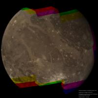
Here is a new global mosaic of Ganymede from Voyager 1 images:
|
There are versions of this mosaic earlier in this thread that aren't as carefully processed and also they are not completely global. This is the biggest global mosaic of Ganymede I've seen, a 17 frame mosaic. The source images were obtained by Voyager 1 on March 5, 1979 over a period of about 2 hours. During these 2 hours Voyager 1's distance from Ganymede dropped from 305,000 to 180,000 km. As usual I reprojected the original images to simple cylindrical projection, did all of the color and mosaicking work there and then rendered the resulting map with 3D software using a typical viewing geometry. Most of the 17 cylindrical maps that I created and then mosaicked are in GBV or OBV color. From this I created synthetic R, G and B color, resulting in approximately true color (the color difference between the equatorial and polar areas should probably be more pronounced though). Somewhat unexpectedly, when making the R, G and B color it didn't seem to make any difference if the source images were OBV or GBV. In a few small areas only one or two colors were available. I colorized these areas by taking the color from nearby areas.
A significant problem when making this mosaic is that some of the source images are smeared. This happened because the intense radiation in Jupiter's magnetosphere affected Voyager 1's computers and clock. As a result some of the images were taken when the instrument scan platform was moving. It's difficult to make a full color global mosaic without using some of these smeared images. Following very useful information from machi it turned out that these images can be successfully deconvolved, making it possible to use them. Discussion on this can be found here:
http://www.unmannedspaceflight.com/index.php?showtopic=8091
This is very useful because in addition to the Ganymede images some of Voyager 1's images of Io and Callisto are smeared as well.
Posted by: Floyd May 23 2016, 09:50 PM
Bjorn that is incredibly good. Thank you for your amazing work!
Posted by: jccwrt May 25 2016, 04:48 AM
That's spectacular work, Bjorn! Well worth the time invested in it!
I've started assembling some of the various Voyager 2 mosaics of Ganymede. Since this was a relatively close flyby and I'm not skilled in reprojection techniques, I'm just working on small submosaics that I can hand-assemble without too much difficulty.
https://flic.kr/p/HonZMc
https://www.flickr.com/photos/132160802@N06/27163882121/sizes/o
https://flic.kr/p/HuCFK8
https://www.flickr.com/photos/132160802@N06/27234647105/sizes/o
I love this moon's landscapes. These images almost make me feel like I'm flying over it in person.
Posted by: EDG May 25 2016, 10:03 PM
Od's tonsils, Bjorn, that is amazing!
Posted by: jccwrt May 26 2016, 02:37 AM
Voyager 2 got a great mosaic of the ~600 km wide Gilgamesh Crater, which was sitting near the sunset terminator around the time of the flyby. With normal image processing it's pretty easy to see the ~300 km inner basin, as well as the scarp surrounding hummocky terrain that marks the edge of the main crater at a diameter of 590 km. To the south of the crater, there is a hint of some smoother terrain, but it's hard to interpret.
https://flic.kr/p/H6ZoBw
https://www.flickr.com/photos/132160802@N06/26978407420/sizes/o
When I was processing this, I accidentally pasted in another copy of this photo in a difference blending mode. As it turns out, a slight offset highlights the surface roughness pretty well, and the smoother terrain really pops out:
https://flic.kr/p/GAHrPU
https://www.flickr.com/photos/132160802@N06/26647118054/sizes/o
http://www.lpi.usra.edu/meetings/LPSC98/pdf/1949.pdf, this zone is interpreted as a continuous ejecta sheet, which extends out about 1,100 km from the crater's center.
Posted by: JRehling May 26 2016, 06:50 PM
This is all fantastic. Ganymede is truly one of the more beautiful worlds. As I've gotten into astrophotography over the last year, I've learned quite a bit about deconvolution; it may be more accurate to say that I've used deconvolution. I have found myself saying, "This is where the magic happens" as I watch blurry images suddenly become wonderful through processes I can only partially explain.
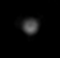
This goes a bit off the title subject, but I obtained the following image of Ganymede using a NexStar 6se and deconvolution, with the single aim of seeing if I could resolve surface features, and it worked better than I expected. I imaged Ganymede when Galileo Regio was centrally aligned, and I certainly succeeded in resolving it. This image is with a green filter: The color image I got from RGB was not so good, so I'll just offer the green version alone. I'm not sure I know of anyone else getting surface details with a telescope of this size.
|
Posted by: scalbers May 26 2016, 07:03 PM
Bjorn's global view has an intriguing crystalline look to it. I would guess that a global cylindrical map around 8K in size might look nice with these new mosaics.
Posted by: Bjorn Jonsson May 26 2016, 10:21 PM
I'm working on a 20000 x 10000 pixel simple cylindrical map of Ganymede which corresponds to a resolution of 830 m/pixel. This oversamples much of the available coverage - there's significant coverage from Voyager 2 and Galileo at comparable resolution or slightly better though.
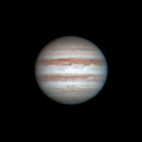
This looks awesome. It would be interesting to see what Jupiter looked like, the seeing must have been very good.
Posted by: 4throck May 27 2016, 01:43 PM
That darker detail, so well centered on the disk, seems a bit like a processing artifact. Or your secondary mirror ;-)
Extreme processing on images so small (compared to the theoretical resolution) can be tricky.
The limb's contrast with the dark background can be enough to create a "doughnut" or ring effect.
But if you can get more images and do a rotation movie, I'd be convinced ;-)
Posted by: JRehling May 27 2016, 05:37 PM
Here's what Jupiter looked like the same night. That was indeed the best result I ever got for Jupiter.
I'm also attaching a demonstration of the power of digital refinement. These are from the red channel.
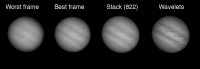
Panel #1: A particularly bad single frame.
Panel #2: A particularly good single frame.
Panel #3: The result of stacking >800 frames.
Panel #4: The result of wavelet processing (performed by the program Lynkeos) on the image in Panel #3.
I did some reading on how others used wavelets and then played with the parameters on my own to arrive at my personal favorite settings; they depend on the target and the night, but I have a favored starting point to get me going.
|
|
Posted by: JRehling May 27 2016, 05:42 PM
Healthy skepticism, but I'm quite sure that it's real. I timed the image for when Galileo Regio was perfectly centered, so that is to be expected, and it was not centered in the vertical direction at all – very clearly in the north. This was also absent from previous efforts in imaging Ganymede with different central meridians.
Here was an image of Ganymede taken about a day earlier, and a comparison image generated from maps. Galileo Regio is over where it should be – faint, but definitely not simply an artifact appearing dead center.
I've tried and failed to get surface details on Io. I have probably gotten details on Mercury, but they're smudgy. Ganymede is an interesting challenge, but I don't think many astrophotographers even think of it.
|
Posted by: jccwrt May 27 2016, 08:29 PM
I've finished going through the Voyager 2 narrow-angle data set. The main prize is this 87-frame clear filter mosaic.
https://flic.kr/p/Htr5CZ
I really want to recommend checking out https://www.flickr.com/photos/132160802@N06/27221066281/sizes/o, because it's like getting to see the New Horizons MVIC image of Pluto for the first time all over again!
It looks like the imaging team broke down imaging into multiple smaller mosaics with a little bit of overlap. At the rate that Voyager was approaching the moon, I don't think taking the entire mosaic in a single go would have been possible with the huge change in viewing geometry over the three hours it took to acquire all of the imaging data. I started by assembling all of the submosaics, then warping them so that they aligned with one another. This process didn't require too much warping, although it was getting more difficult by the later mosaics. The image resolution is stopped down to the resolution of the first submosaic on Ganymede's limb, and I need to check the ephemerides to calculate what that resolution was. https://www.flickr.com/photos/132160802@N06/albums/72157653881252815 so you can view them all at full resolution - the later mosaics appear to have 2-3x the image resolution.
There are a couple other images that didn't fit neatly into this mosaic. There was a UVIS drift sequence, for which ISS rode along to take support imaging. I've tracked down the locations of these frames and written a short description of the terrain in the FOV.
https://flic.kr/p/GCPbfd
Finally, as Voyager 2 began to recede from Ganymede it looked back and took an 11-frame mosaic of the south pole, which is on the terminator about halfway up the image.
https://flic.kr/p/HyCeei
I really need to figure out how to do better geometric control on these images, because it'd be great to try my hand at colorizing these
Posted by: JRehling May 27 2016, 10:09 PM
WOW! That blew up to a much larger size than I expected.
Posted by: Bjorn Jonsson Jun 9 2016, 06:12 PM
Awesome mosaics. The huge global mosaic is probably a bit distorted though but is a great overview of Ganymede's anti-Jupiter hemisphere. It's easy to see from these mosaics that the Voyager 2 Ganymede coverage is really good and the data quality is much higher than in the Voyager 1 data set (in particular there are no smeared images). The only 'missing' thing is really hi-res images - Voyager 2 got no closer to Ganymede than about 60,000 km, corresponding to a resolution of 600 m/pixel.
Here is a new 4000x3800 pixel color mosaic of a large area around Osiris from Voyager 2 images:
|
North is up and the color should be fairly accurate - possibly a bit too reddish and saturated but Ganymede's color from Voyager images is a complicated subject and I'm still working on it. This mosaic is composed of 21 clear filter images obtained by Voyager 2 at a range of 91,000 to 118,000 km (resolution 0.9 to 1.2 km/pixel). Its northern half has been colorized using a three frame color mosaic obtained at a range of a little over 300,000 km (resolution 3 km/pixel). The southern half (starting from just south of Osiris) has been colorized using a single wide angle color composite obtained when Voyager 2 was ~75,000 km from Ganymede (resolution ~5.6 km/pixel). Some of the lower resolution color coverage is included in the mosaic outside of the area covered by the higher-res clear filter images. I mosaicked everything in simple cylindrical projection and also did all of the color processing there and then rendered the resulting map using the viewing geometry Voyager 2 had when it obtained its best image of Osiris (image C2063759).
Ganymede exhibits big albedo differences and this can complicate the image processing. I took great care not to overexpose/saturate any parts of the brightest terrain (Osiris in particular). This preserves every detail but makes the terminator area a bit dark.
A huge variety of interesting terrain can be seen in the mosaic. With the benefit of hindsight I can safely say that there are clear hints of the extreme roughness of some terrain types covered by some of the higher resolution Galileo images but there is also terrain that looks smooth in the Voyager mosaic. I look forward to seeing Osiris in hi-res JUICE images and also the bright smooth-looking terrain around the bright crater SSW of Osiris.
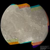
I'm going to end this with yet another version of a well known global Voyager 2 image. This version should be of slightly higher quality than my earlier versions of it.
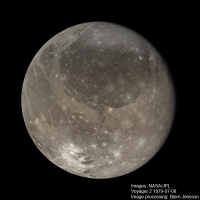
|
Posted by: Ian R Jun 9 2016, 07:01 PM
Stunning Bjorn!  Can't believe this imagery came from a TV camera!
Posted by: JRehling Mar 6 2017, 03:42 AM
Extreme processing on images so small (compared to the theoretical resolution) can be tricky.
The limb's contrast with the dark background can be enough to create a "doughnut" or ring effect.
But if you can get more images and do a rotation movie, I'd be convinced ;-)
This challenge sat in the back of my mind for 9 months, until Jupiter opposition came back around. I had good seeing three nights in a row last week, when Galileo Regio happened to rotate into and out of view My animation, paired with Solar System Simulator plots, is attached.
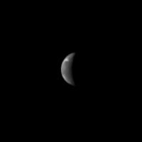
These are images taken with my 150mm NexStar 6se and a broad blue filter, stacking 1500 frames. Images taken with a green filter look quite similar. Images taken with a red filter, however, do not show Galileo Regio. I've now noticed this on four different dates one last year and three this year. After examining Cassini images of Ganymede, I find no reason for that in terms of Ganymede's actual color/terrain. Here's my conclusion: I have just enough resolution to capture Galileo Regio in shorter wavelengths. In red wavelengths (~40% worse diffraction-limited resolution), I can't capture it, so my color image shows Galileo Regio as red, which is a total artifact.
Nevertheless, I feel assured now that I have imaged Galileo Regio, which pretty much maxes out the resolution I can hope for with my gear.
|
Posted by: algorimancer Mar 6 2017, 08:59 PM
Resolving Galileo Regio with an amateur scope is surprisingly feasible. Back in the mid-80s, on a dark West Texas night with amazing seeing, I resolved Ganymede as a disk with a 6" reflector with added Barlow lens (680X is popping into my head-- pretty ridiculous magnification) . I noticed a smudge on one portion of the disk, and sketched it, then later verified based upon Voyager maps and Ganymede's orientation that the smudge was Galileo Regio. Just about my single toughest observation. I've recently seen some rather amazing astrophotography of it with amateur scopes, but I haven't done anything serious myself since 1990.
What you've shown here is quite persuasive.
Posted by: TrappistPlanets Oct 11 2021, 07:34 PM
(staff team, sorry if this may be considered necroposting)
is there any Callisto DEMs using the stereo imagery?
I know there is stereo imagery bc of fig 5 in this short paper
https://www.hou.usra.edu/meetings/lpsc2021/pdf/2228.pdf
but i can't seem to find any Dem maps or dem chunks (i can use chunks to compile a global dem map with the available data like i did with triton's dem)
Posted by: stevesliva Oct 11 2021, 08:22 PM
The paper mentions it's 'PC DEM' where PC == photoclinometric == shape-from-shading.
Posted by: TrappistPlanets Oct 11 2021, 09:05 PM
PC DEM would also work too (used this kind of dem for Triton as that is what was available for Triton in the new Triton topography article)
so is there any already made (in published PDF research papers) that i can get my hands on to compile a full texture mosaic
Posted by: antipode May 12 2022, 03:18 AM
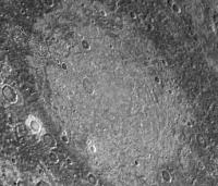
Incredibly interesting paper on the ArXiv regarding the existence of a giant impact palimpsest on Ganymede.
https://arxiv.org/ftp/arxiv/papers/2205/2205.05221.pdf
Seems rather convincing! Confirmation to follow with JUICE and the Clipper.
P
Posted by: owlsyme May 13 2022, 05:48 PM
Here is Voyager 1's Ganymede approach - 
Full video here, better quality - https://www.youtube.com/watch?v=q8fp5Tku1Dc
Made with PyVoyager, which I am in the process of de-mothballing... I'm trying to get it ready so people can contribute manual alignments, if interested - https://github.com/bburns/PyVoyager.
Powered by Invision Power Board (http://www.invisionboard.com)
© Invision Power Services (http://www.invisionpower.com)