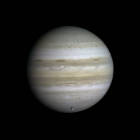
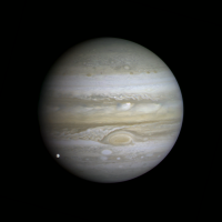
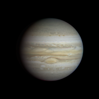
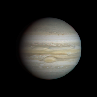
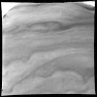
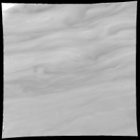
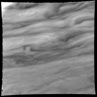
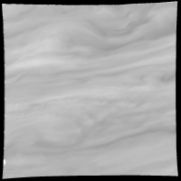
Printable Version of Topic
Click here to view this topic in its original format
Unmanned Spaceflight.com _ Jupiter _ Voyager mosaics and images of Jupiter
Posted by: Bjorn Jonsson Aug 20 2010, 05:47 PM
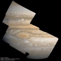
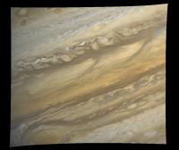
Thanks to modern computers and software the old, 'official' Voyager Jupiter images can be reprocessed into something much better. There is also a lot of Voyager data there that was never processed into color composites and/or mosaics (or at least it has not appeared on the WWW). With proper processing the apparent image quality approaches the quality of the Cassini images but needless to say the wavelength coverage is (vastly) inferior.
I have recently been taking a close look at the high resolution Voyager 1 images, i.e. the images obtained in early March 1979. This is going to result in some new and/or reprocessed mosaics. The first one is now complete and I'm working on another one.
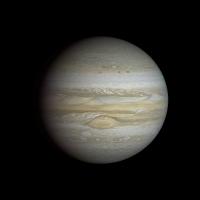
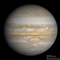
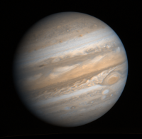
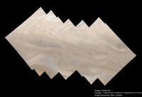
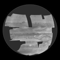
The image below is a 12 image mosaic (12 orange + 12 violet + 12 synthetic green images). The images were obtained on March 2, 1979 at a range of 4.3 million km. The first image (C1629045.IMQ) was obtained at 05:09:23 and the last one (C1629131.IMQ) at 05:46:11. The resolution is roughly 43 km/pixel.
The raw images were calibrated, reprojected to simple cylindrical projection, mosaicked and then rendered using a typical viewing geometry (there is no such thing as a "correct viewing geometry" because the images were obtained over a 37 minute period with Jupiter rotating). I then fixed the color balance. I still haven't 'standardized' how I process the Voyager color. I wasn't completely satisfied with the color I got using an approach similar to what's described http://www.unmannedspaceflight.com/index.php?s=&showtopic=5876&view=findpost&p=162551 but I think the color could be improved a bit. The final step was to sharpen the resulting image a bit, mainly to compensate for all of the resampling that the previous processing steps required.
This image shows lots of features: The Great Red Spot and one of the three white ovals present during the Voyager flybys, smaller spots, scallopped belt/zone boundaries, gravity waves, a bright equatorial plume and the dusky south polar region.
I don't think I'm bragging by saying that this is probably the best Voyager 1 Jupiter mosaic that I know of, mainly because of its size (12 images).
I will be posting more Jupiter stuff in this thread in the coming days/weeks, both mosaics and interesting images (and needless to say, others are welcome to post images and mosaics as well).
Posted by: Drkskywxlt Aug 20 2010, 05:50 PM
Fantastic pic! Did you use ISIS? If so, what were your processing steps?
Posted by: ugordan Aug 20 2010, 06:00 PM
You have every right to brag as this is the best Voyager Jupiter product I've seen. The resolution and image quality reminds of New Horizons LORRI images and yet the colors remind of Cassini. With the filter set you had to work with, I think the color looks great.
Jealous mode = ON
Posted by: CAP-Team Aug 20 2010, 07:54 PM
Wow! That's stunning!
Posted by: Decepticon Aug 20 2010, 08:02 PM
This is wonderful stuff!
Its so nice to see these images processed with today's technology.
The Images from the 70s and 80s where always over saturated.
Posted by: tedstryk Aug 20 2010, 10:08 PM
Awesome. Voyager images are quite good once you remove the gunk.
Posted by: PDP8E Aug 20 2010, 11:51 PM
Bjorn,
S T U N N I N G
thank you!
Posted by: machi Aug 21 2010, 06:12 AM
Fantastic result Bjorn! I think, that it's biggest published mosaic of Jupiter.
Posted by: tasp Aug 21 2010, 02:39 PM
You're throwing meat in the tiger cage.
We want MORE!
![]()
If you're looking for ideas for more work; were there any mosaics shot on the departure side from either Voyager? A big enhanced crescent/dark side shot might be pretty dramatic.
Posted by: antipode Aug 21 2010, 11:10 PM
Golly. I spent a good 15 minutes just wandering around the infinite complexities of that image.
Are we seeing cloud shadows new the top of the image?
P
Posted by: Juramike Aug 21 2010, 11:48 PM
Really nice job! This is beautiful!
Posted by: nprev Aug 22 2010, 12:24 AM
Absolutely hypnotic. I've looked at it several times over the past two days, and Antipode's right: you see new things each time. Phenomenal, Bjorn.
Posted by: Juramike Aug 22 2010, 04:20 PM
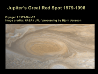
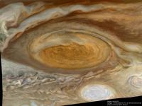
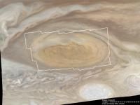
Taking Bjorn's awesome image above as "reference", I created a blink animation that compares it to a Galileo image of the Great Red Spot almost 20 years later.
The Galileo image had used a synthetic green channel, so I adjusted the colors to match closest to Bjorn's image. I also took some liberties with warping and resizing the Galileo image to match Bjorn's image. I wanted to highlight structural, not color or size differences.
[Animated GIF: click to animate]
In the Galileo 1996 image, the clear zone to the S of the GRS is much thinner. The S belt also seems less affected by the GRS. Interestingly, the thin red band to the SE (standing wave?) is present in both images. There is also much more chaos in the region to the NE. In the Voyager 1 image, the NE section shows a smoother transition between zones.
Posted by: Bjorn Jonsson Aug 25 2010, 03:39 PM
I didn't use ISIS. Voyager calibration isn't available yet in ISIS 3 and ISIS 2 doesn't work properly on my computer. I think I now know why but I didn't when I made the mosaic.
Yes, that's my experience as well. The problem is that this wasn't done carefully enough ~30 years ago so those old, 'official' color composites and mosaics really need to be reprocessed.
I don't think so. You need higher resolution and/or lower solar elevation angles (mainly the former) for cloud shadows/vertical relief to become apparent. Vertical relief (if one can speak of that in the context of gaseous planets) is visible in higher resolution images but it is usually not obvious unless the images are sharpened. Incidentally, the Voyager images are better than the Galileo images if you are interested in cloud shadows and vertical relief. The highest reolution Voyager images are of higher resolution than the Galileo images. In addition, compression artifacts can be an issue if you want to examine small scale features in the Galileo images.
Actually I now think (after taking a careful look at lots of Voyager images) that the Voyager dataset still is in some ways better than the Galileo dataset. While the Galileo images are more carefully targeted and the wavelength coverage is far better (near infrared filters) the Voyager images have no compression artifacts, there is a significant amount of images of higher resolution than anything Galileo obtained and the Voyager images are a better data source for atmospheric movies. So if you are interested in very small scale details in the Jovian atmosphere the Voyager 1 images are what you want.
I'm currently working on another 12 image mosaic that should be finished soon, possibly this week.
Posted by: tedstryk Aug 27 2010, 12:53 AM
Even when they did go through the proper steps, doing all the steps with the 8 bit data rather than converting to 16 bit, something beyond the capability of the vax computers they were using, really degraded the images.
Posted by: Ian R Aug 29 2010, 09:06 AM
Bjorn, I neglected to congratulate you on an absolutely staggering mosaic -- this is a sure-fire contender for APOD, if ever I saw one!
Posted by: Bjorn Jonsson Sep 1 2010, 10:21 PM
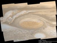
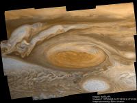
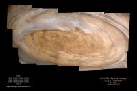
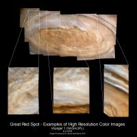
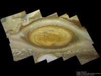
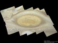
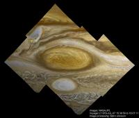
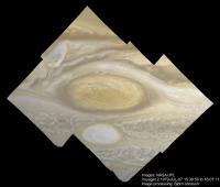
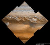
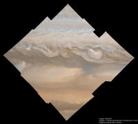
A new, big mosaic of Voyager 1 images, this time showing the Great Red Spot at high resolution. The first version has normal brightness and contrast and its overall color should be fairly accurate. Small scale features have been sharpened a bit. In the second one the contrast and sharpness have been greatly exaggerated:
This is a 4x3 mosaic of images. The processing is almost identical to the processing described in the first message of this thread so I'm not decribing it further here. One caveat though: There is probably some slight geometric distortion but it shouldn't be a problem in this case.
The images I used were obtained on March 4,1979 at a distance of about 1.85 million km. The first image (C1635314.IMQ) was obtained at 07:08:36 and the last one (C1635400.IMQ) at 07:45:24. The resolution is roughly 18 km/pixel.
Mosaics of some of these images have appeared before as 'official' image releases but interestingly, only 3x2 images were used in all cases. The offical mosaic can be seen at http://photojournal.jpl.nasa.gov/catalog/PIA00022 . There is a false color version (lots of blue color) that is better known: http://photography.nationalgeographic.com/staticfiles/NGS/Shared/StaticFiles/Photography/Images/Content/great-red-spot-103317-sw.jpg
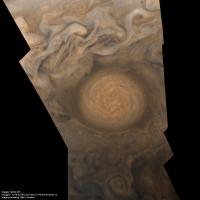
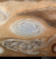
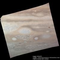
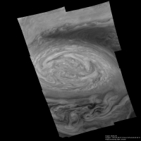
My new mosaic reveals an enormous amount of details, especially in the sharpened version. Some of these details I didn't know were visible in any images of Jupiter until relatively recently. The sunlight is coming form the east (right) and because the GRS is in the southern hemisphere it's really coming roughly from the ENE over the GRS and the regions south of it. With this in mind, vertical relief and cloud shadows are clearly visible at many locations around the GRS' periphery. A particularly good example can be seen near (2350,1600) and to the northeast of this location. There is another example near (2480,1080). The wind speeds are especially high there as the elongated appearance of these clouds may suggest. More examples can be seen near (600,980) and (370,920) and (540,1600) and possibly (925,550). These clouds have changed the appearance I imagine Jupiter would have from low altitude (1000 km or something like that). There are also some interesting clouds at (2270,605) and further east.
This is the highest resolution color mosaic completely covering the GRS that I have ever seen. Galileo didn't obtain GRS mosaics at this resolution and Cassini passed too far away from Jupiter. This image looks sufficiently different (and better!) from the old, official versions that in a way I feel like I'm processing stuff from a new planetary encounter when I see this. We will probably not be seeing anything comparable to this until EJSM (or some future spacecraft) starts orbiting Jupiter. Hopefully it will be carrying a camera capable of obtaining even higher resolution images than this from the distances it typically images Jupiter at high resolution.
Interestingly, the orange and violet images I used here were followed by a green filtered GRS mosaic ~40 minutes later. However, I couldn't used these instead of synthetic green because some of the clouds (especially in the GRS' northeast periphery) move so fast that the three color channels couldn't be properly aligned if I used the green images.
Posted by: elakdawalla Sep 1 2010, 10:41 PM
Wow.
Posted by: ElkGroveDan Sep 1 2010, 11:06 PM
Oh my.
Posted by: Hungry4info Sep 1 2010, 11:54 PM
Goodness O_o.
Posted by: nprev Sep 2 2010, 12:17 AM
![]()
Posted by: Juramike Sep 2 2010, 12:37 AM
Whoa! The detail in that is A M A Z I N G ! ! !
Beautiful!
Posted by: Stu Sep 2 2010, 05:20 AM
That's outrageously brilliant, Bjorn. That image deserves to be in astronomy textbooks for years to come.
Posted by: Explorer1 Sep 2 2010, 05:28 AM
Holy.... holy!
And I thought the Jupiter mosaic from Cassini post-flyby was good! (I cut it out of a calendar and hung it on my wall)
Posted by: Phil Stooke Sep 3 2010, 11:48 AM
Brilliant work!
Phil
Posted by: ilbasso Sep 3 2010, 01:51 PM
One gets the impression of a "wall of clouds" to the west of the GRS - it appears almost like one is looking down several hundred miles through an upper cloud deck and that the GRS is far below. This may entirely be an optical illusion, but with my screen completely filled with the image, it's hard for me not to see it that way!
Congratulations!
Jonathan
Posted by: jasedm Sep 3 2010, 09:59 PM
To echo comments above, this is astonishingly good. bravo Bjorn!!
Posted by: eoincampbell Sep 3 2010, 10:28 PM
Beautiful quality of detail. Congratulations!
My wife teaches 5th Grade and echoes Stu's textbook idea!
Posted by: Ian R Sep 4 2010, 01:03 AM
Good gravy! I now officially have Jupiter-envy... ![]()
Posted by: DrShank Sep 4 2010, 04:22 PM
beauty! would you call this close to natural color now?
the voyager cameras were quite good for the time and Ive gotten lots of mileage out of the images. the big difference was the lack of infrared capability, which allows you to look deeper into the atmosphere and see thermal updrafts and hot lavas (on io that is).
Posted by: Bjorn Jonsson Sep 5 2010, 11:01 PM
The upper one should be fairly close to natural color but this is subjective. It might be a bit too reddish but I'm not sure. After some channel mixing I processed it to make the oval SSE of the GRS roughly white.
A few notes on the mosaics and on images I have noticed in the Voyager dataset:
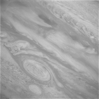
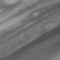
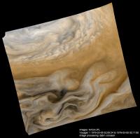
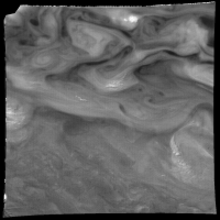
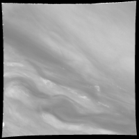
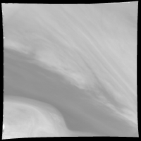
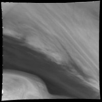
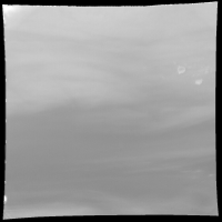
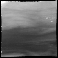
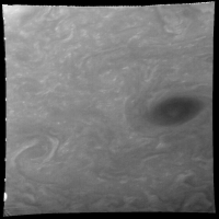
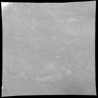
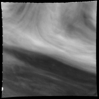
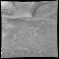
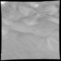
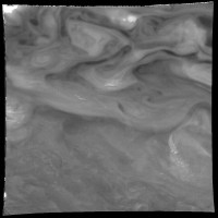
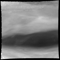
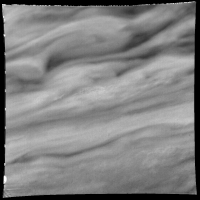
(1) As should be obvious I have been looking at lots of high-res Voyager images of Jupiter recently. When doing this I have come across several images that show interesting features that I had not noticed before. An example (processed to increase contrast and sharpness):
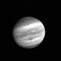
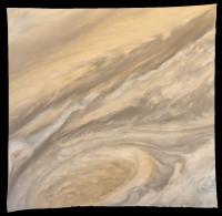
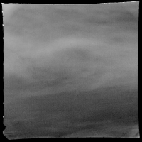
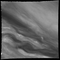
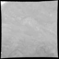
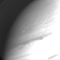
And a wide angle context image shuttered at the same time:
The features near the top of the image are interesting. These images where obtained on March 4, 1979 at a range of 1.3 million km from Jupiter's center.
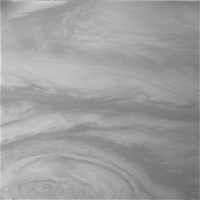
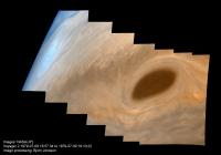
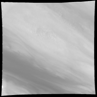
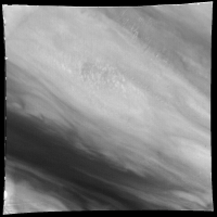
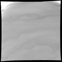
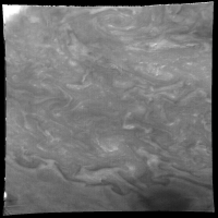
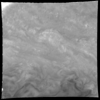
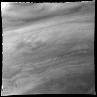
Another example (processed to increase contrast and sharpness):
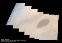
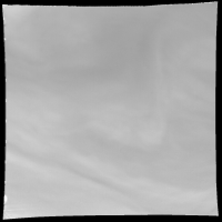
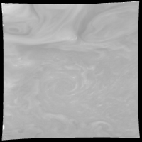
And a context image:
The features (clouds?) at upper right in the narrow angle image look somewhat weird. They are located near (435,375) in the context image. The images were obtained on March 5, 1979 at a range of 630,000 km from Jupiter's center.
(2) I noticed an interesting comment in several images in a brown barge imaging sequence. For example in image C1635958.IMQ:
"ATMOS DYNAMICS 3X2 NA GR MOSAIC OF BARGE, STEREOSCOPIC WITH 16359.50 - 60.07"
This seems to have been an attempt to image Jupiter in stereo - I don't think I'm misunderstanding anything here. However, I don't think imaging Jupiter in stereo using a single spacecraft would work due to cloud motions. Two spacecraft are a different story so here's today's crazy idea: Imaging parts of Jupiter in stereo if both NASA and ESA send spacecraft there simultaneously. I'm not sure it would work though - it requires high resolution and I'm not sure ESA's JGO spacecraft is going to be capable of that due to its distance from Jupiter and maybe due to its camera as well.
(3) I haven't been able to confirm that it is indeed vertical relief and/or shadows that is visble in my mosaic. I've been looking for scientific papers and I haven't found any but I haven't searched very carefully. I also did some simple 3D test renders to see which cloud thickness and altitude might reproduce the appearance of the clouds in the mosaic but the results are inconclusive. Still this looks a lot like vertical relief and it should be noted that cloud shadows are visible in high-phase Voyager images of Jupiter. It would be interesting if someone here knew something about this topic. Also see the http://www.unmannedspaceflight.com/index.php?showtopic=6684 which has a hi-res image showing what might be shadows or vertical relief.
(4) I'm in the early stages of starting work on yet another mosaic and it's going to be a bit different from the ones I have posted here because OGV is available, not just OV. Actually there is a huge amount of Voyager stuff I'd like to process but this takes a lot of time if high quality results are desired. In particular, the lack of accurate camera pointing angles is a constant source of frustration and requires me to reverse engineer this information for every image. Fortunately, the spacecraft location is available and that data seems accurate - without it this would be even more time consuming.
Posted by: tedstryk Sep 6 2010, 01:48 AM
So true. When I was at the New Horizons team meeting in December, I was asked if I used the camera pointing information for my work. I had to be honest - only in situations where I could not ascertain the pointing by studying the image. When it could be done, determining the pointing from the image was significantly more accurate (though much more time consuming).
Posted by: DrShank Sep 10 2010, 10:19 PM
i spend far more time accurately controlling all the images than i do anything else!
Posted by: tedstryk Sep 11 2010, 01:04 AM
I found the pointing information for the Neptune images to be limited.
Posted by: DrShank Sep 11 2010, 01:10 AM
yeah, all the published data are predicts based on the original pointing commands. Ive had to update all the pointing
vectors iteratively for all the satellites to get the images to properly mosaic. but then, thats my job!
Posted by: tedstryk Sep 11 2010, 01:14 AM
OK, so you do have to correct the data somewhat. That makes sense.
Posted by: elakdawalla Sep 11 2010, 03:08 AM
Paul, I hope you realize how many people reading this forum wish "iteratively updating Voyager 2 spacecraft pointing vectors" was a part of their job description
Posted by: volcanopele Sep 11 2010, 03:29 AM
Substitute Cassini for Voyager 2, and that's half my job...
Posted by: Phil Stooke Sep 11 2010, 02:14 PM
Perhaps the most important question here is, will those corrected numbers get into the public record somewhere?
Phil
Posted by: DrShank Sep 12 2010, 06:59 AM
all my work, especially the stereo stuff requires precise pointing, so every cassini release is spent 2 weeks or more calibrating and geometrically registering and revising the pointing vectors for all the new satellite images (altho the past year has been rather a dry spell!). what fun. but then i get to make mosaics like these.
release of the pointing info is a bit more complicated. my Galileo pointing is now public in the form of the Atlas, at least in labeled image map format. beyond that Im not sure yet . . .
Posted by: Bjorn Jonsson Sep 13 2010, 12:15 AM
This is great, I have always found the lack of accurate pointing info a bit strange. It means that everyone working on images with inaccuarate (or missing) pointing info must either obtain it from someone else or spend lots of time determining the correct pointing. So I suspect the same thing sometimes gets done by more than one person/team when it seems a lot of work could be saved by doing it only once.
Even the spacecraft position can be a source of problems. Today I wanted Voyager 1's position in late January 1979 but my software responded with a SPICE error so I tried the Jupiter Viewer at the PDS Rings Node but got similar results. I suspect that SPICE kernels containing Voyager 1's position aren't available for dates before 6 February but I need to check this more thorougly. I'm working on a Voyager 1 atmospheric movie by the way.
Posted by: Ian R Sep 13 2010, 09:08 AM
I'm also fiddling with some of the Voyager 1 movie data, Bjorn -- it goes without saying that I'm sure your work will be superior to mine, but here's what I've done so far, in any case:
Jupiter Voyager 1 Approach Movie - Green Filter Only:
http://www.youtube.com/watch?v=4jBir5hix6g
Jupiter Voyager 1 Approach Movie - Color / Rotated:
http://www.youtube.com/watch?v=jZrJ0D8IfB8
Jupiter Voyager 1 Atmospheric Features Movie - Color:
http://www.youtube.com/watch?v=YVMc5PTChwE
I really am a glutton for punishment - at various points during this process, I have resisted the urge to put my fist through the monitor, and throw the tower out of the window!
Posted by: Bjorn Jonsson Sep 13 2010, 09:41 AM
Only time will tell - at the moment my 'movie' consists of exactly one image...
Posted by: tedstryk Sep 13 2010, 02:15 PM
Paul, I'm really glad to hear you are doing this. To clarify my earlier comment, I was talking about desmearing images and aligning images for stacking purposes. As it stands, the current pointing data that is publicly available isn't adequate.
Posted by: DrShank Sep 13 2010, 03:05 PM
Ted,
typically, one or two active team members (Cassini is an example) do their own pointing updates as well, sometimes on an as need basis, but sometimes also for cartography. That is how the satellite maps they published are done. I do not know if they do all images or only those that are required for the global maps. I do just about everything because i do a lot of stereo and mapping work (I have a late DPS abstract in on this topic) and require a lot of images. I cant wait for any team releases (i dont know if a mechanism even exists for that) so I do my own! There are a few others out there who do it on as need basis but I may be the only non-team-member doing the whole bunch of it.
cheers
paul
Posted by: tedstryk Sep 13 2010, 03:41 PM
How do you reconstruct it then? The only way I have found is, like I said, clues within the image.
Posted by: Ian R Sep 13 2010, 05:41 PM
These versions are only 'early drafts', mind you - the final movie should (hopefully) consist of stills that look similar to these:
Posted by: ugordan Sep 13 2010, 05:46 PM
Nice, both the images and the videos. I can appreciate how labor intensive a video with that many frames can be, you had to have a *lot* of will power to do that I imagine.
Do you use calibrated or raw data?
Posted by: machi Sep 13 2010, 09:22 PM
IanR:
Wonderfull job! It looks very promisingly.
Posted by: Bjorn Jonsson Sep 14 2010, 12:01 AM
My movie now consists of exactly two frames that look like this:
This is an approach movie that has the GRS at a 'constant' location and starts in early January 1979. This looks fairly promising but I don't think I'll finish the movie this year - it's going to be (probably) almost 100 frames. The two frames above really require more careful processing but time is not unlimited so I don't know how much time I'm going to spend processing each frame. As usual the lack of accurate pointing greatly increases the amount of work per frame - in this case probably by a factor of 5 at least.
Jupiter's size will stay constant throughout the movie. This is accomplished by reprojecting the images to simple cylindrical projection and then rendering the resulting maps.
Posted by: elakdawalla Sep 14 2010, 01:56 AM
Can't wait for the other 98 frames ![]()
Posted by: Stu Sep 27 2010, 02:13 PM
Woah... BA's picked up on your GRS image! Great stuff, Bjorn! ![]()
http://blogs.discovermagazine.com/badastronomy/2010/09/27/the-great-red-spot-almost-true-size/#more-20537
Posted by: Bjorn Jonsson Sep 28 2010, 12:59 AM
Here is a preliminary version of a Voyager 1 movie showing the rotation of the Great Red Spot and a lot of other interesting cloud motions. It consists of 16 frames but the final version is going to consist of 66 frames (or something close to 66). jup_vgr1_sharp.avi ( 198.5K )
: 2868
This should be the most interesting part of the movie because this really is what will be the end of the final version so this part is of somewhat higher resolution than the start of the imaging sequence I'm using for the movie.
This movie is different from similar Voyager movies because I'm keeping Jupiter's size constant. This is accomplished by reprojecting the source images to simple cylindrical projection and then rendering everything using the same viewing geometry. I also sharpened the images a bit to better reveal various details.
One possible problem is that for some features there are slight changes in latitude from frame to frame. This is especially obvious in the polar regions. I suspect this is not a real feature but a consequnce of small errors in the camera angles I had to reverse engineer for all of the source images. Another problem is that I also had to reverse engineer the spacecraft position because the available SPICE kernels only contain Voyager 1's position from 6 February 1979 and onward and these images were obtained in January.
The source images where obtained on every Jovian rotation on January 23 to 29, 1979. During that interval Voayger 1's distance from Jupiter dropped from 42 to 36 million km. The images were obtained through orange, green and blue filters. Satellite and shadow transits have been removed using Photoshop.
Note: If playing the animation does not work the reason is probably that you don't have an H.264 codec installed. For the animation to work you need to have an H.264 codec installed (if you are using Windows you can find one http://www.google.is/url?sa=t&source=web&cd=2&ved=0CB8QFjAB&url=http%3A%2F%2Fsourceforge.net%2Fprojects%2Fx264vfw%2Ffiles%2Fx264vfw%2F22_1629bm_23430%2Fx264vfw_22_1629bm_23430.exe%2Fdownload&ei=UWpITKqbAoX94AaJ8vm8DA&usg=AFQjCNEPHJwTszIm24w696DxJbgM7Cgo-w for example).
As a sample, here is a typical frame from the movie:
Posted by: nprev Sep 28 2010, 02:11 AM
Utterly. Beautiful. ![]()
Posted by: tedstryk Sep 28 2010, 09:47 AM
Wow, that is truly amazing! I forgot just how much the clouds churn as Jupiter rotates..
Posted by: Ian R Sep 29 2010, 01:53 AM
Fantastic work, Bjorn! ![]()
As someone who has also dabbled with these images of late, I can appreciate the level of care you have taken assembling this sequence. For comparison, see a much more rudimentary version of the same movie that I put together a couple of months ago:
http://www.youtube.com/watch?v=YVMc5PTChwE
Voyager 1 actually took five sets of these 10-hour movies; each offset from another by 72 degrees of longitude.
Posted by: elakdawalla Sep 29 2010, 01:58 AM
Now the red spot mosaic has been http://www.wired.com/geekdad/2010/09/pictures-of-jupiters-eye-from-30-years-ago-put-together-in-stunning-new-image/, one of my fave non-space blogs!
Posted by: brellis Sep 29 2010, 03:29 AM
Every 1,000 times I see or read something amazing here, I feel compelled to say 'hooray'! Thanks so much
Posted by: Ian R Sep 30 2010, 03:21 PM
Here's another GRS-centred time-lapse movie of Jupiter -- this time taken by Voyager 2:
http://www.footagevault.com/clip/FTV-0001380/
Posted by: Ian R Sep 30 2010, 04:24 PM
This is a contemporary-produced version of the movie that Bjorn's working on notice the massive difference in quality, thanks to modern processing techniques and software (not to mention Bjorn's knack of eking out every smidgen of detail from this recalcitrant dataset):
http://www.footagevault.com/clip/FTV-0001415
Posted by: machi Oct 4 2010, 05:09 AM
GRS from Voyager 1.
Resampled at 5 km/pix, original resolution around 5.5 km/pix.
Color from wide angle images (violet, green and orange filters).
Posted by: Astro0 Oct 4 2010, 05:23 AM
OMG! ![]()
Posted by: Stu Oct 4 2010, 05:36 AM
No, sorry, I don't believe it. You've given yourself away this time.
Clearly you have a TARDIS, allowing you to travel back in time and photograph the GRS out the TARDIS door using a state of the art 21st century camera... ![]()
Seriously, that's a stunning image, well done!
Posted by: ElkGroveDan Oct 4 2010, 02:05 PM
Holy smokes. Maybe it's just my mind interpreting color shading as shadows. But that now really has the appearance of a vortex cutting deep into the upper cloud layers.
Posted by: Hungry4info Oct 4 2010, 04:33 PM
Wow. Nice!
That's very impressive!
Posted by: machi Oct 4 2010, 04:51 PM
Stu:
I think, that even with TARDIS, I would be cooked by radiation ![]() .
.
Dan:
If I remember correctly, then darker areas are widely recognized as deeper atmospheric layers (in some cases, it can be actually seen).
And I think that darker areas near small clouds are really their shadows.
Posted by: Ian R Oct 4 2010, 08:30 PM
Hot Diggity Dog! That's marvellous Daniel... another APOD-worthy effort! ![]()
Posted by: Ian R Oct 4 2010, 08:43 PM
Do you use calibrated or raw data?
Gordan,
I'm pretty capricious when it comes to projects like these, so I tend to start working on them purely on a whim, and then before I know it, I feel obliged to follow them through to their conclusion. Unfortunately, I'm using the raw data, which has proved to be troublesome, due to the geometric distortions that are present in the frames.
I originally started with the Green filter movie only. Then I figured out how to semi-automatically create colour frames using the Python macro/scripting feature in Paint Shop Pro. It works very well, and means that I can essentially create a fairly-well aligned colour frame with only a few clicks of a mouse:
http://www.youtube.com/watch?v=0XjW0vZZZXw
Posted by: ZLD Oct 6 2010, 03:58 AM
http://imgur.com/zreEw.jpg http://imgur.com/e8TPQ.jpg
I took the image and did my own processing on it; great work by the way Daniel. I was able to bring about a bit more depth and I would certainly have to agree that this image definitely makes the case for the GRS being deeper than I had ever imagined. The first image shows my processing and makes it clear the depth of the cloud layers. Most interesting is the white swooping layer at the far left of the image; it appears to even cast a shadow on a large portion of the GRS.
Am I just seeing things or is this really a many hundreds of miles in difference from that top layer to the ones next to it?
(admin note - it's best not to put images straight into a thread like that - we've changed them to links.)
-I apologize for the error. I hadn't meant for them to be fullsize thumbs.
Edit: I hadn't ever posted this one either. This is probably bordering on false-color but it shows greater depth to the GRS area from Bjorn's image.
http://imgur.com/44aHw.jpg
Posted by: Astro0 Oct 6 2010, 05:55 AM
ZLD, my take is that your 'shadow' is in fact the variance in brightness between several images that Machi has stitched together and not an effect produced by higher cloud layers as suggested by your red lines. I'm sure that Machi could confirm this. Also, I'd suggest that the light is coming from the 'right' of this image (of course by 'right', I mean a few hundred million miles/kilometres away). ![]()
Posted by: machi Oct 6 2010, 07:37 AM
ZLD, Astro0:
Yes, "shadow" is variance in brightness between images. Voyager took two complementary sets of images with green and violet filters.
I used green filter images for high resolution mosaic and violet images for filling remaining gaps. But violet images are really different from
green images, so this variance can be seen. You can actually see depths of layers in some cases, but this isn't one of them.
I'll try post some example.
Posted by: machi Oct 6 2010, 12:45 PM
It's possible use both green and violet images for high resolution color mosaic of GRS, but at the cost of limited coverage.
I create this image as demonstration, how good this can be (and how excellent is quality of 70's Voyager images).
Color is created from green, violet and synthetic images. Resolution is original (~5.5 km/pix). Contrast is exaggerated.
Interesting feature is something, what looks as entrance of horizontal tromb (horizontal funnel) in the left image.
Posted by: ZLD Oct 6 2010, 07:22 PM
That is quite impressive. Can you send me a link to the raw data you are using to output these images? I've looked several times in the past and come up empty handed. I'm somewhat new to processing space imagery but somewhat experienced in processing photos in other areas. Any tips and sources for photos, especially those from the voyager missions I'm interested in.
Posted by: elakdawalla Oct 6 2010, 07:50 PM
My favorite search tool for Voyager and other outer planets images is now http://pds-rings.seti.org/search/, but the http://pds-imaging.jpl.nasa.gov/search/search.html#QuickSearch is also good.
Posted by: machi Oct 7 2010, 09:48 AM
ZLD:
I have almost all image data from Voyager downloaded on CD's, which was perhaps my first activity, when I started with internet ![]() .
.
You can download (almost) all data from here:
http://pds-imaging.jpl.nasa.gov/resources/onlineData.html
These images aren't calibrated and geometrically corrected.
Some data are in calibration process and calibrated data are available from here:
http://pds-rings.seti.org/voyager/iss/calib_images.html
You can open original images (*.imq) with Voyager Image Viewer (which has browse capability), Nasaview or img2png.
Calibrated data are more difficult to opening. You can open them as raw data.
Posted by: Ian R Nov 8 2010, 07:03 PM
Here's a frame from the Voyager 1 approach movie that I'm (still) working on:
Io can be seen entering eclipse on the left.
Posted by: Ian R Nov 9 2010, 12:45 PM
Bjorn,
I hope you don't mind, but I decided to have a go at running your Voyager 1 movie through a frame rate conversion filter: the result is pretty darn good, I'm sure you'll agree!
http://planetary.s3.amazonaws.com/misc/jup_vgr1_sharp_MSU.avi
Posted by: dilo Nov 9 2010, 05:26 PM
Ian, could you upload a slightly compressed version directly in the forum? To me, access to megaupload site appear too complicated and boring... Thanks!
Posted by: elakdawalla Nov 9 2010, 05:28 PM
Here you go, I've hosted http://planetary.s3.amazonaws.com/misc/jup_vgr1_sharp_MSU.avi on our server. It looks pretty awesome.
Posted by: tedstryk Nov 9 2010, 08:45 PM
Wow!
Posted by: Bjorn Jonsson Nov 9 2010, 08:57 PM
I hope you don't mind, but I decided to have a go at running your Voyager 1 movie through a frame rate conversion filter: the result is pretty darn good, I'm sure you'll agree!
http://planetary.s3.amazonaws.com/misc/jup_vgr1_sharp_MSU.avi
Wow!!
Actually I was going to try doing something similar after seeing how machi processed his Hartley and Neptune animations using morphing but now it has been done for me
Posted by: machi Nov 9 2010, 09:58 PM
Fantastic!
Jupiter looks like if he's alive.
I have same question as Bjorn.
"What software did you use?"
Posted by: dilo Nov 10 2010, 02:28 PM
Thanks Emily, it is really! Nice work, Ian/Bjorn. What about real frame rate / timespan of this movie?
Posted by: elakdawalla Nov 10 2010, 05:15 PM
Well, since Bjorn started with 16 images with the red spot held still, I assumed that meant one image per Jupiter day. Ian's animation is 16 seconds long. So it's running at 1 Jupiter day per second, or 10 Earth hours per second.
Posted by: dilo Nov 10 2010, 08:07 PM
Thanks Emily! ![]()
Posted by: Ian R Nov 11 2010, 07:14 AM
Morning all! ![]()
I used the MSU Frame Rate Conversion Filter to 'tween' Bjorn's movie:
http://compression.ru/video/frame_rate_conversion/index_en_msu.html
(BTW, thanks for introducing that term to me, Emily - I'd never encountered it until now.)
After installing http://avisynth.org/mediawiki/Main_Page, I put together the following script, making use of the MSU filter:
Crop(0, 32, 0, -32)
ConvertToYV12().MSU_FRC(16, "slow")
ConvertToRGB24()
I then opened this script (basically just a notepad file with an 'avs' extension) in VirtualDub. All I did then was to change the frame rate from 128 fps to 20 fps.
Saving the movie as an Xvid AVI completed the process.
Posted by: Ian R Nov 19 2010, 04:13 AM
Here's a couple of 'fixed longitude' sequences, which I've culled from the 1100+ frame Voyager 1 approach movie, and 'tweened' using the method described in the previous post:
http://www.youtube.com/watch?v=RdIfnymd9Aw&fmt=22
Posted by: machi Nov 20 2010, 04:30 PM
Wonderfull animation Ian!
Finally I finished one of my Jupiter projects.
Animation from 9+1(synthetic) images (c1637840 - c1637928). Date 5.3.1979, time 3:28:36 - 4:07:00 UTC (timewarp 30×). Images are rotated by 90°.
http://planets.wz.cz/jupiter/juporig/jup_vg1_dam_004.avi
Posted by: Bjorn Jonsson Nov 23 2010, 10:08 PM
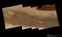
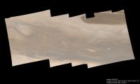
I have just finished a completely new mosaic of the Great Red Spot (GRS), this time based on Voyager 2 images. First an enhanced, sharpened version and then a version that should have approximately natural color and contrast:
This is a 5x3 mosaic of images obtained on July 8, 1979 when Voyager 2 was ~1.45 million km from Jupiter. The resolution of the original images is ~14 km/pixel. The resolution of this mosaic is similar. This is a slightly higher resolution than in the Voyager 1 GRS mosaic I posted earlier in this thread. Each of the 15 frames making up the mosaic is a color composite from orange, green and violet images. This results in more accurate color than in my earlier Voyager 1 GRS mosaic because in that case I had no green images I could use. Thanks to this the color variations in this mosaic seem more interesting.
As far as I know this is completely new stuff. Very few and possibly none of the images I used have appeared earlier in official image releases, at least not in color. There is a fairly well known Voyager 2 mosaic of the GRS but that one is composed from images obtained three Jovian rotations earlier at a range of 2.6 million km (see http://photojournal.jpl.nasa.gov/catalog/PIA00065 ). Thanks to modern computers and software the quality of this new mosaic is higher.
As usual the mosaic was created by reprojecting the source data to simple cylindrical projection and then rendering the resulting map using a 'typical' viewing geometry (there is no single correct geometry because the source images were obtained over a period of ~70 minutes).
Thanks among other things to improvements I've made to some of the processing steps required to create these mosaics the geometric accuracy of this mosaic is higher than for the earlier Voyager 1 mosaic.
This new mosaic contains lots of interesting stuff, including small scale details and interesting color variations. Cloud shadows are visible, in particular at (3040,2040) and nearby. The color variations seem more interesting here than in the Voyager 1 mosaic, probably because the color is more accurate. There is an interesting brownish/orange 'band' near (1180,615) for example. Also the color changes from brownish to whitish near (900,1300) without any obvious changes to the 'texture' of the image (the wind is northnortheasterly at this location). I could name at least 10 additional features that look interesting to me and where I wish I knew what was happening.
The Voyager 1 images of Jupiter (and not the least the GRS) are probably better known than the Voyager 2 images, mainly because Voyager 1 arrived earlier. So yet again in a way I feel like I'm looking at images from a new Jupiter flyby. The GRS region looks more 'Galileo-like' to me in the Voyager 2 images than it does in the Voyager 1 images.
Posted by: ilbasso Nov 23 2010, 11:14 PM
No words...should have sent a poet...
That is a stunning mosaic. There really aren't words to describe the beauty and complexity. You could get lost in that image for days. Congratulations and thanks for sharing!
Jonathan
Posted by: nprev Nov 24 2010, 12:50 AM
Stu surely would have volunteered! ![]()
Stunning, Bjorn. Of all the Jupiter images I've seen, yours make it look most like a place, if you know what I mean.
Posted by: tedstryk Nov 24 2010, 02:32 AM
Simply amazing! ![]()
![]()
![]()
![]()
![]()
Posted by: ilbasso Nov 24 2010, 04:17 AM
I had to put this up on my 42" HDTV to begin to appreciate the magnitude of the detail in this image. The swirls and eddies north of (above) the GRS reminded me of fractals. One gets the impression that you could zoom into this picture and see the swirls turn into infinitely more swirls. BTW, the Jupiter movies in this thread look pretty darned good on a 42" HDTV, too!
Posted by: Stu Nov 24 2010, 06:54 AM
Every time you post one of your images, Bjorn, it's like I'm seeing a picture taken during a whole new, top secret Jupiter mission. Thank you for taking us to Jupiter again. Just stunning.
Posted by: ZLD Nov 24 2010, 07:56 AM
Astounding Bjorn! I really love your work. I'd be really interested in hearing more about the process in creating these fantastic mosaics. I understand the basic jist of the layering techniques but to get everything lined up just right with the right shading must take forever.
I also ran your enhanced version through a couple filters to pull out a little more clarity.
http://i.imgur.com/yoKZg.jpg
I never cease to be amazed by the images that the Voyager probes produced. Far as I can tell, the only competition has been from Cassini which is disspointing.
Posted by: nprev Nov 24 2010, 08:21 AM
To be fair, Galileo did very well considering the challenges that mission faced.
But, man...Bjorn just pulls every detail out of this data; he's a wizard. Those 'curdles' to the SE of the GRS fascinate me; hard to believe we're looking at a laminar flow the size of some worlds...
Posted by: machi Nov 24 2010, 02:32 PM
Excellent (as always)! ![]()
Posted by: Juramike Nov 24 2010, 04:41 PM
Wow....that is awesome! Nice work, Bjorn!!
The comma-like details of the cute littlw swirls in the northern margin are so stunningly crisp. I'd never noticed how the pattern doesn't match staight-line coloring.... Hinting that some of the color must be from a higher atmospheric layer..
Each tiny section of this is a masterpiece. I could stare at this for days....
Well done!
Posted by: Juramike Nov 24 2010, 04:48 PM
The more I stare at this the more I see! (Like those "teeny"* little puffball clouds in the extreme NW corner)
*"teeny" = the size of a large metropolitan area on Earth.
Amazing! I want this as a tile floor or countertop!
Posted by: tedstryk Nov 25 2010, 03:34 AM
But, man...Bjorn just pulls every detail out of this data; he's a wizard. Those 'curdles' to the SE of the GRS fascinate me; hard to believe we're looking at a laminar flow the size of some worlds...
It really is sad. Having worked with a few tiny lossless/nearly lossless image fragments from that mission, its camera was spectacular. However, on most images, especially those of Jupiter itself, the JPEG-like artifacts are horrendous due to the compression that was necessary.
Posted by: Ian R Nov 25 2010, 04:37 AM
Brilliant Bjorn... just brilliant.
I've decided not to re-decorate the living room; instead, I'm going to cover the walls with posters of your amazing mosaics! ![]()
Posted by: ZLD Nov 25 2010, 05:39 AM
Thought I would clarify that I never meant to belittle the Galileo probe. It returned really fantastic data that actually benefited Cassini greatly. Had the main antenna extended, the images returned would have been phenomenal. The images that were returned were nothing to be really upset over either because many of them were great, especially those of Io. Galileo is a great reminder of the complexity in these missions and the absolute perfection that has to be maintained to have any success in them.
In my opinion, any human creation that is able to survive extreme G-forces while being lifted off this planet, to travel millions of kilometers to another planet, and then to be remotely operated by humans from millions of kilometers away, all the while being subjected to extremes in temperatures and radiation, is nothing short of mind boggling and a wonder of human achievement. Galileo was far from being a failure.
Posted by: EDG Nov 28 2010, 09:15 AM
If nothing else, NASA have hopefully learned never to build a probe with an unfolding 'umbrella' antenna again...
Well, it's good that it managed to send back something useful (at least, the stuff that wasn't horribly butchered by compression blocks), but I still think it's a crying shame that it couldn't take the images that were originally planned. The gravity data at least went some way to making up for it though IMO.
Posted by: djellison Nov 28 2010, 09:35 AM
Careful on the broad assumptions there EDG, that antenna had very high heritage from the TDRSS antenna design. It was a low risk, good flight heritage component. There are moving components in spacecraft. reaction wheels, antenna gimbals, solar array gimbals.... heck, it's thought the most recent Delta IV heavy launch contained a NRO spacecraft with an antenna of many TENS of metres as an in space deployable.
NASA far from learnt to never build a probe with an unfolding umbrella antenna again - they are on the TDRSS sats launch SINCE galileo - infact two on each spacecraft
http://en.wikipedia.org/wiki/Tracking_and_Data_Relay_Satellite
Six TDRS launches have taken place since Galileo - for a total of 12 very very similar antennae, all of which deployed without incident.
Posted by: tedstryk Nov 28 2010, 03:50 PM
NASA has learned never to build a probe with an umbrella antenna and leave it in waiting for a decade that included two truck rides across the country, all the while never checking to see if it was still lubricated or if it has been damaged.
Posted by: djellison Nov 28 2010, 06:01 PM
Bingo. The problem wasn't that the antenna moved, the problem was that it GOT moved.
Posted by: EDG Nov 28 2010, 06:47 PM
True, I forgot about that part.
Sorry, I'm still bitter about Galileo - so much data lost (well, not even acquired in the first place). It served well as a teaser for what was there, and while it did send back some good images that did clear up a few things, it also raised more questions without any possibility of getting answers from the current dataset because it was so limited. IMO we really need another probe up there at Jupiter doing what Cassini is doing around Saturn (which is what Galileo would have done had it worked properly). Maybe it's not a failure, but personally I don't call it a success either.
And ye gods, that image compression thing drove me nuts, at least in the early stages of the mission (pre-C10 ish) - it was so frustrating to see the most interesting parts of the image often obliterated by the blocks.
Posted by: ZLD Nov 29 2010, 02:01 AM
I wouldn't call it a success either. However, from mistakes, people are able to learn how to do better in the future.
NASA does what it can with the limited money available. Yet, they've still helped pave the way for a global internet, microwave communications, digital cameras, new materials and alloys and all sorts of other things.
So then, what impact did Galileo have on the world? Not a lot, really. But in the realm of science, we learned that Io is fantastically volcanically active, Europa is extremely likely to have a liquid ocean somewhere underneath the ice, a confirmation and extension on what was believed about Jupiter's atmosphere (which is really important when looking at Jupiter class exoplanets), a lot of information regarding Jupiter's magnetosphere and the interactions it has with the moons, and many other bits of information that will help pave the way for future probes and research within our solar system and beyond.
In light of that, I can't say that I'm not a little worried about JUNO and the massive solar array that it requires. Jupiter is a gravity well for all sorts of rocks, small and large. Increasing the overall size of the space probe also increases the chance for a collision and having it happen to one of the immense solar panels would be devastating. Here's to wishing that mission all the best.
I am truly excited to be living in a time where we as humans are able to explore so much and yet understand that it is still so little in the vastness of the cosmos.
Posted by: EDG Nov 29 2010, 05:52 AM
I've obviously missed something here, but why on earth would a Jupiter orbiter require a solar panel? RTGs would make much more sense, surely?
EDIT: Never mind, I found its page on wikipedia. Huh... well, it looks cool with the panels extended. Apparently it's because they can use solar panels out there, and RTGs are in short supply.
Though I'm somewhat horrified to see that there's no mention of imaging the satellites of Jupiter in the list of its objectives!
Posted by: Decepticon Nov 29 2010, 06:10 AM
EDG You might like to look at this thread.. http://www.unmannedspaceflight.com/index.php?showtopic=2548 Your worries about moon imaging are talked about and how this mission really is not designed to observe Jupiter's moons. Something that I was not happy to see to.
But we will get some amazing images and internal science of Jupiter. ![]()
Posted by: ZLD Nov 29 2010, 07:15 AM
Unfortunately JUNO likely will not be photographing too much of the moons of Jupiter in its primary mission. However, I'm still hopeful that some imaging will be done for the 4 or 5 inner satellites. I'm also hopeful for something in an extended mission though I'm not sure how much propellant JUNO would have left by then and how possible it would be to change the orbit to better reach the satellites. However, the camera isn't meant to last all that long. We'll have to wait and see (the most fun thing to do in UMSF of course!).
Best description of JUNO I saw was in the thread Decepticon mentioned:
http://www.unmannedspaceflight.com/index.php?s=&showtopic=2548&view=findpost&p=68873
"this is the sort of 'basic science' mission that needs to be carried out so that we can plan properly for the next major mission without any more incidents like dropping the atmosphere probe into the wrong region as happened with the Galileo's mission."
Posted by: elakdawalla Dec 1 2010, 04:41 AM
Juno will not likely survive long beyond its primary mission, because its orbit will rapidly evolve to take it deeply into Jupiter's radiation belts. It is expected to be fried not long after the primary mission ends.
Posted by: Bjorn Jonsson Dec 1 2010, 07:01 PM
Exactly three months ago I posted a big Voyager 1 mosaic of the Great Red Spot (GRS):
http://www.unmannedspaceflight.com/index.php?showtopic=6705&view=findpost&p=163698
Today I'm posting a slightly improved version. The first improvement is that I'm now using a significantly improved formula for creating synthetic green. This makes the color more realistic (it was too reddish) and also more similar to the color of the Voyager 2 mosaic I posted recently (actually I used the Voyager 2 mosaic to determine the new formula). Secondly, the new version is geometrically more accurate. When working on the earlier version, during one of the processing steps a software bug somehow caused me to mess up planetocentric latitude and planetographic latitude without noticing it until recently (I'm not sure why I didn't notice it earlier). The effect was to make the resulting mosaic very similiar to the view Voyager 1 would have had from a bit higher above the equatorial plane than it really was so it wasn't particularly serious.
The new mosaic, at the top an enhanced, sharpened version and then a version that should have approximately natural color and contrast:
Posted by: PDP8E Dec 2 2010, 02:38 AM
Bjorn,
Your work is stunning and humbling --- Thank you for my new background screen, you made my cleanup my desktop so I may see it !
Posted by: aventor.com Dec 28 2010, 09:07 PM
Bjorn, hope you don't mind.
I run your last enhanced & sharpened jupiter image through ImageJ's FFT filter to remove some noticeable artifacts (it is lossy though), I attach a crop of the original and the final result for comparison.
There's plenty of tutorials on how to use imageJ's FFT filter for patterned noise removal so I won't get into details.
Posted by: Floyd Dec 28 2010, 11:27 PM
Did you accidentally load the same image twice? I have stacked the images and jump back and forth and see no difference.
Posted by: ugordan Dec 28 2010, 11:54 PM
There's a difference in that the second image doesn't have the nearly-horizontal linear noise that's present for some reason.
Posted by: Stu Dec 29 2010, 12:20 AM
Bit like picking a greenfly wing off a huge bunch of roses, I'd say; I think Bjorn's pics are as close to perfect as it's possible to get.
Posted by: Hungry4info Dec 29 2010, 01:01 AM
I had to look *really* closely but the differences are there, and affect ~pixel-sized the image noise
Posted by: machi Dec 31 2010, 06:52 PM
It's prominent kind of noise in Voyager's images. It can be suppressed by calibration, but not completely.
Aventor:
Nice result, horizontal lines are gone and fine details remains.
Posted by: Ian R Feb 16 2011, 09:06 AM
This raw movie footage was taken by the Voyager 1 spacecraft as it raced towards Jupiter in February 1979. Clearly visible is the constantly changing attitude of Voyager's scan platform, which houses the narrow angle camera that took this particular sequence.
In total, 3531 frames were aligned to produce this film. The flickering is caused by the Blue filter frames, which are higher in contrast than the Green/Orange counterparts. It's best viewed at 720p (HD):
http://www.youtube.com/watch?v=9nf9nBtd2dM
Posted by: machi Feb 16 2011, 12:50 PM
Amazing work! Especially moons are fantastic.
I like when Jupiter is moving up and down. It's in fact imperfection, but it looks like some action documentary.
Posted by: tedstryk Feb 16 2011, 03:18 PM
Yes and no. The way it goes through filter cycles and spacecraft turns really give the viewer the feel of what the spacecraft was doing and of the dataset it was sending in a way that looking at individual frames or looking at a perfected movie focused more on how Jupiter appeared (i.e. color, corrected for spacecraft instability/turns/motion, etc.) never could. Thank you SO much for posting this.
Posted by: ElkGroveDan Feb 16 2011, 03:37 PM
That is just smokin cool! It must have been an incredible amount of work.
Posted by: nprev Feb 17 2011, 01:54 AM
Second that...whoa!!! ![]()
Posted by: Ian R Feb 21 2011, 01:18 AM
Thanks for the overwhelmingly positive feedback guys! I have done a colour version, using sequential G/O/B color frames:
http://www.youtube.com/watch?v=CPOrZvIZf08
I'm not entirely happy with it, because I can increase the frame rate by three if I use this sequence instead:
G/O/B
O/B/G
B/G/O
Stay tuned for further developments!
Posted by: Ian R Feb 21 2011, 01:30 AM
Here's a merger of all of the frames that feature a moon; Callisto, alas, is sadly absent:
Posted by: Ian R Feb 21 2011, 01:36 AM
It looks more daunting than it actually is, thanks solely to the ability to record macros in Paint Shop Pro, as seen here:
http://www.youtube.com/watch?v=0XjW0vZZZXw
Most of the frames for the B&W movie were rotated, resized and rendered in a similar fashion while I was busy doing the washing-up!
Posted by: Bjorn Jonsson May 15 2011, 09:19 PM
Here is what's probably the final version of the Voyager 1 approach movie that has the GRS at the center of the disk: jup_8x_30fps.avi ( 1.4MB )
: 1033
I posted a very early 16 frame version of this several months a ago but now I'm posting the entire approach movie. The movie is based on 58 orange-green-blue color composites obtained on every Jovian rotation from January 6 to January 29, 1979. Over this period Voyager 1's distance from Jupiter dropped from 58 to 36 million km so the resolution and sharpness of the frames increases from start to finish.
This version has been 'tweened' as http://www.unmannedspaceflight.com/index.php?showtopic=6705&view=findpost&p=166494. The parameters are slightly different though; I increased the number of frames by a factor of 8 and then changed the frame rate to 30 fps.
As described earlier when I posted a very early 16 frame version of this movie, the frames are processed to keep Jupiter's size constant. This is accomplished by reprojecting the source images to simple cylindrical projection and then rendering everything using the same viewing geometry. I also sharpened the images a bit to better reveal various details.
Because I didn't have any information on the viewing geometry and camera pointing I had to 'reverse engineer' all of that information. I was unable to do it to perfect accuracy but I still think the resulting geometric parameters are fairly accuarate. Another source of errors is that the images had to be corrected for geometric distortion and that correction probably isn't perfect, especially where Jupiter is close to the edge of a frame (or even partially outside the frame due to bad pointing). These errors manifest themselves as lots of features that appear to 'wobble' a bit and I'm pretty sure that motion is not a real feature. In fact this looks a bit like an earthbased telescopic video of Jupiter except that Jupiter appears very sharp.
Some minor but spurious color variations from frame to frame may be apparent. This is because in many cases the source frames had data dropouts and I had to use partially synthetic color. In some cases Jupiter was partially outside the frame due to pointing errors and in one case the pointing was so bad that none of the three images (OGB) could be used. To keep the apparent frame rate constant everywhere I used Sqirlz Morph to generate a totally synthetic frame from the two adjacent frames where this happened. This worked remarkably well and I think it may be almost impossible to spot where I did this.
An interesting fact I recently realized is that I have been using a large number of programs/software packages when doing this. I don't know if that's unique to my image processing. In addition to at least six programs and command line utilities written by myself I used these and maybe more (list in no particular order):
Photoshop
Paintshop
VideoMach
VirtualDub
AviSynth
Sqirlz Morph
MSU Frame Rate Conversion Filter
Excel
And also some simple programs that come with Windows, e.g. Calculator and Notepad ![]() .
.
Counting everything that's at least 16 programs and command line utilities.
Posted by: Floyd May 15 2011, 09:38 PM
Bjorn,
The movie is fantastic. Watched it many times watching different parts of the atmosphere swirl and twist. Really outstanding work as always.
Posted by: Bjorn Jonsson May 15 2011, 10:31 PM
Yes, that's one of the many interesting and fascinating things about Jupiter - something interesting is going on just about everywhere. Belts and zones moving at different speeds, cyclones and anticyclones of various sizes and colors, spots/clouds that enter the Great Red Spot area, circulating currents, and even the polar regions are interesting.
Posted by: machi May 15 2011, 11:16 PM
Excellent animation!
Definitely, it isn't.
I use normally between 8 to 16 programs + 2 internet programs for downloading data.
Posted by: Tom Tamlyn May 16 2011, 05:43 PM
>>Because I didn't have any information on the viewing geometry and camera pointing
I'm not familiar with using the PDS archives, but little googling reveals the following comment:
>Traditionally, the pointing information for the Voyager instruments was
>distributed in the form of Supplemental Experiment Data Record (SEDR)
>files. * * * Today, many of the SEDR tapes have been lost. The one major
>exception is Voyager's Imaging Science Subsystem, for which the SEDR files
>were later converted to Vax binary format and are still widely available. However,
>the ISS SEDR files only describe the camera direction and orientation at the time
>when images were taken, leaving large intervals during each flyby when the pointing
> is unknown.
http://pds-rings.seti.org/voyager/spice/ck.html
The discussion goes on to discuss a project for regenerating approximate values for the missing information.
Bjorn, did you need more detailed information than is included in the SEDR files, or were the crucial SEDR files missing?
I'm continually puzzled by the limitations and imperfections of the archiving of Voyager data. The images themselves were archived, but the ancillary information like pointing direction was simply distributed to the initial researchers without anyone taking responsibility for making sure it was preserved? I do understand that that documentation and archiving is a big, picky job, and you can't expect people to do it in their "spare time" (See Commons, the Tragedy of), but it's surprising that it took so long to realize that this function needed to be funded.
TTT
Posted by: Bjorn Jonsson May 16 2011, 10:57 PM
The main problem is that to the best of my knowledge absolutely no kernels are available for Voyager 1 for the period prior to February 1979. So I not only had to determine the camera pointing from the images but also the spacecraft's position relative to Jupiter.
Another problem, had the spacecraft position been available, is that "C-smithed" kernels are not yet available for the Voyager 1 Jupiter encounter. In these kernels a subset of the images has been used to correct the pointing - without this correction the pointing is far too inaccurate for me to use. What I really need is Jupiter's position in an image with subpixel accuracy (or some equivalent geometric parameters) and this requires very accurate position and pointing information.
And yes, this lack of position/pointing information is frustrating and this is not the first time I express this frustration here. Had it been available the work required for the movie would probably have been reduced by a factor of three.
Posted by: Tom Tamlyn May 17 2011, 05:23 AM
Are the data in fact missing, or are they packed away in some obscure legacy format that only a few overworked old timers know how to decode?
Or perhaps they exist only as derivatives of other values that need to be calibrated somehow ...? OTOH, the engineering team must have had the ability promptly to extract useable information from the raw transmissions for mission operations.
Unless there's a problem at the physical layer, such as was involved in the interesting LOIRP project to rebuild a 1960s tape drive for reading the Lunar Orbiter tapes, it's hard for me to grok why it's so hard to get at those data.
Of course, I'm not an engineer or a programmer, so my inability to imagine what the problems might be doesn't signify much. I don't doubt that good reasons exist, and I don't assume that the problem is a backlog at the PAO. I'm simply curious to know more about why this is so hard, because I'm interested in the general problem of the fragility of certain kinds of knowledge.
And of course, many thanks for your hours of hard work to give us this beautiful and mesmerizing movie.
TTT
Posted by: Ian R Jul 12 2011, 09:45 PM
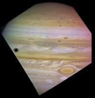
While browsing through the OPUS PDS archives, I came across this nice wide-angle view of Jupiter including the GRS and a moon shadow taken by Voyager 2:
Posted by: machi Mar 1 2012, 12:24 AM
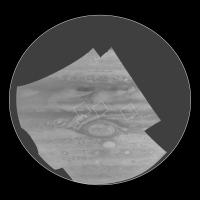
Hi-res (~10 km/pix) mosaic of Jovian northern whirls and some other images of Jupiter from Voyager 2:
http://my-favourite-universe.blogspot.com/2012/02/jovinalie.html
Posted by: elakdawalla Mar 1 2012, 01:49 AM
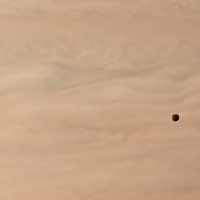
I love that little black dot at the right! It looks like a hole punched through the clouds. Great work, machi!
Posted by: machi Mar 1 2012, 05:31 PM
Thanks!
"It looks like a hole punched through the clouds"
I think, that it's actually hole punched through the clouds. Or possibly more accurately - eye of a storm (cyclone).
Posted by: AndyG Mar 1 2012, 07:23 PM
It looks a bit too dark and regular to me. I note it's about the same size as Amalthea's shadow would be ... a possibility?
Edit: No ... too far off the equator, I think, referring to the location photo placing this view on the wider globe. What about Himalia?
Andy
Posted by: ugordan Mar 1 2012, 07:26 PM
Hmm, it does look a bit too dark to be a cloud.
Posted by: john_s Mar 1 2012, 08:17 PM
Pretty sure it is a cloud (or cloud hole), though- it's at the center of subtle concentric features in the surrounding clouds.
John
Posted by: Bjorn Jonsson Mar 1 2012, 08:18 PM
"It looks like a hole punched through the clouds"
I think, that it's actually hole punched through the clouds. Or possibly more accurately - eye of a storm (cyclone).
Looking at the original images I agree. Also I'm pretty sure this can't be a satellite shadow anyway. The small inner satellites like Amalthea are too close to Jupiter to cast shadows this far from the equator and the more distant small satellites (e.g. Himalia) are too small and distant to cast dark shadows.
Very nice images.
Posted by: machi Mar 1 2012, 08:23 PM
Darkness of this feature is caused by contrast enhancing procedure. So it's relatively dark, not absolutely.
Based on shape of this feature and its surroundings, it's central part of cyclone (anticlockwise rotation in northern hemisphere, in North-North Temperate Belt).
Posted by: AndyG Mar 1 2012, 10:08 PM
Following a brief trip to Excel (and back) I am more than happy to accept this as a weather system!
Andy (still, a ~150km hole in a cyclone is something else!)
Posted by: JohnVV Mar 1 2012, 11:52 PM
a close up
[attachment=26501:Screenshot.png]
Posted by: dilo Mar 2 2012, 07:02 AM
Herebelow a mosaic zooming on the dark spot (I modified color dominance and smoothed John closeup):
Edit: added an intermediate image between last two...
Posted by: vikingmars Mar 7 2012, 12:14 AM
Well : this was just the beginning...
Posted by: Bjorn Jonsson Mar 29 2012, 12:10 AM
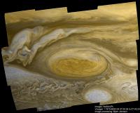
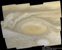
A new Voyager 2 mosaic of the Great Red Spot:
In the version at left contrast has been increased and the image sharpened to enhance the visibility of small scale details. The one at right has approximately natural color and contrast.
These images are created from the same source data as http://photojournal.jpl.nasa.gov/catalog/PIA00065 but the new version is better.
The mosaic is composed of six color images each of which is created from one set of orange, green and violet images, thus a total of 18 images was used.
The images were obtained when Voyager 2 was 2.7 million km from Jupiter's center. Earlier I posted http://www.unmannedspaceflight.com/index.php?s=&showtopic=6705&view=findpost&p=166978 obtained at closer range that covered a somewhat smaller area. This mosaic was obtained about 30 hours (3 Jovian rotations) earlier than the closer-range mosaic. It's interesting to compare the two mosaics - the changes in this short period of time are remarkable.
The processing is similar to the processing described earlier in the thread (perhaps slightly improved).
And finally a relatively quick and dirty color composite using wide angle context images obtained at the same time:
Color and overall contrast is natural but the visibility of small scale details has been improved a bit using an unsharp mask. Significant time passed between the orange/green images and the violet image. This made color processing a bit difficult and in fact I only did rather rudimentary color correction which means that the color near the terminator and also near the limb is a bit less accurate than the color near the center of the image.
Posted by: tedstryk Mar 29 2012, 01:46 AM
Simply incredible, Bjorn. That is the most beautiful Jupiter mosaic yet.
Posted by: eoincampbell Mar 29 2012, 04:48 AM
Brilliant and beautiful, thanks for sharing with this world ![]()
Posted by: Ian R Apr 17 2012, 10:07 PM
Here's an oldie I've had lying around, unfinished: the Voyager 2 approach sequence in color:
http://youtu.be/q0JKtAMmxAY?hd=1
Posted by: CAP-Team Apr 18 2012, 01:04 PM
Wow that must've been a lot of work!
Posted by: Bjorn Jonsson Sep 8 2012, 07:33 PM
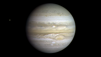
For completeness, here is the Voyager 1 global mosaic of Jupiter that recently appeared in the Planetary Society blog:
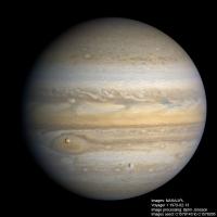
There are more details in the TPS blog but in summary this is a 14 frame mosaic from a range of 7.4 million km. The source images were obtained on February 27, 1979. This is the highest resolution global Voyager Jupiter mosaic I know of (in fact the only global Jupiter mosaic I know of where the resolution is higher is a Cassini mosaic where the resolution is ~15% higher).
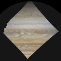
And here is a brand new global mosaic (much smaller) from images obtained at a range of 21 million km on February 13, 1979:
The lower half of this mosaic is from the same source images as http://photojournal.jpl.nasa.gov/catalog/PIA00144 but at this time Voyager 1 was obtaining 2x2 mosaics so a global mosaic was possible. The spacecraft was obtaining orange, green and violet filtered images so the color in this one should be slightly more accurate than in the big one where green images were not available.
Posted by: john_s Sep 9 2012, 11:43 PM
Thanks for that February 13th 1979 mosaic! Nice to see a fresh look at that iconic image, which blew my mind when it was first released- I think I first saw it in Time magazine shortly after it was taken. It's interesting that the full-disk view, while wonderful to see, is somehow less dramatic than the original crop- some of the excitement of the original version was that Voyager was now close enough that Jupiter would no longer fit in a single Voyager frame, which made Jupiter suddenly seem like a *place*. The rakish tilt of the original added some drama too.
Anyway, great work!
John
Posted by: Bjorn Jonsson Jan 20 2013, 10:06 PM
What is the highest resolution global Jupiter mosaic that includes a satellite transit that can be assembled from Voyager images?
Satellite transits are especially beautiful when the resolution is high enough for some details to be visible on the satellites so I decided to check this.
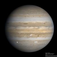
And I was remarkably lucky. It turns out that just a few hours before Voyager 1 ceased its 3x3 global imaging sequence and switched to targeted observations it imaged a double transit involving Io and Europa. Here is a global mosaic of this event. It shows Io and Europa silhouetted against Jupiter's vast disc:
A significant amount of details is visible on the satellites. Icy Europa looks very bright compared to Jupiter, mainly because it's silhouetted against a region not far from Jupiter's terminator. Some familiar features are visible on Io.
The images were obtained from a range of 7.3 million km on February 27, 1979. This is slightly closer than in the big mosaic above that includes the Great Red Spot and makes this the highest resolution global Voyager mosaic of Jupiter that I know of (there is a Cassini mosaic where the resolution is slightly higher though). Voyager 1 was imaging Jupiter through orange and violet filters so I had to make synthetic green and do some color processing to get something resembling an RGB image. I used 14 orange/violet image pairs (28 images). Overall the color and contrast should be fairly accurate.
The processing is similar to the processing of the earlier big mosaic from September 8, 2012. The main exception is that I had to fill a very small gap near the north pole by 'cloning' adjacent areas.
Posted by: nprev Jan 20 2013, 10:28 PM
![]() ...gorgeous, Bjorn.
...gorgeous, Bjorn.
Posted by: mhoward Jan 20 2013, 10:31 PM
Stunning. One of the best ever.
Posted by: Ian R Jan 20 2013, 11:17 PM
You just made my day, Bjorn! ![]()
Posted by: Decepticon Jan 21 2013, 12:40 AM
Nice!
My new wallpaper ![]()
Posted by: jamescanvin Jan 21 2013, 08:47 AM
Whoh! That is a truly unbelivable image. Amazing work Bjorn.
Posted by: RoverDriver Jan 21 2013, 12:14 PM
That is a stunning image. Thank you Bjorn!
Paolo
Posted by: tedstryk Jan 21 2013, 12:50 PM
Amazing. Looks like it could have been taken by Cassini.
Posted by: Tunglere Jan 21 2013, 06:48 PM
I love this. Thank you, Bjorn.
Posted by: iMPREPREX Jan 22 2013, 12:01 AM
This is... Mindblowing to say the least.
The moons are so perfectly visible! I love it! Thank you!!!!
Posted by: wildespace Jan 22 2013, 08:41 AM
Wow, my mind blown! I strongly suggest you submit the image to APOD, it needs to be seen by lots of people.
Posted by: dilo Jan 22 2013, 09:08 AM
I agree with wildespace, is absolutely worth to submit!
Posted by: djellison Jan 22 2013, 05:32 PM
APOD don't tend to take submissions. They see stuff they like and publish it themselves, without actually asking.
That's what they've done with a couple of things I've made, anyway.
Posted by: tedstryk Jan 22 2013, 06:54 PM
Ditto...in fact, they've taken my stuff without contacting me and erroneously declaring it in the public domain. My experiences have been decidedly mixed.
Posted by: JRehling Jan 22 2013, 07:47 PM
I'm particularly taken with the Europa portion of the image. Europa (among many other worlds) exhibits some pronounced phase angle effects, and the best imagery was collected at a variety of phase angles, making the best maps prone to artifacts, and most off-the-shelf rendering of those maps look false because they lack those effects. Very nice global images, even at this relatively low resolution, could be used to: characterize the effects; normalize higher resolution images into a more seamless global map; use the map for rendering views of the globe through arbitrary viewing geometries.
Maybe a big project, but for now, I certainly admire this view of Europa.
Posted by: djellison Jan 22 2013, 07:47 PM
And just to further things a little -they took a movie of mine, without asking, compressed it so badly it was ruined, improperly credited the source, improperly cited the source of the data, screwed up the description...etc etc etc..... APOD is not something to aspire to in my opinion.
Posted by: machi Jan 22 2013, 11:10 PM
Really gorgeous image Björn! ![]()
Posted by: nprev Jan 23 2013, 01:33 AM
No worries; Bjorn has done http://www.planetary.org/blogs/guest-blogs/2013/0121-jonsson-jupiter-mosaic.html with this one. ![]()
Posted by: Bjorn Jonsson Jul 18 2013, 05:38 PM
Jupiter from Voyager 2:
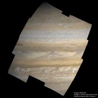
This is a mosaic of 12 color images obtained by Voyager 2 on July 5, 1979 beginning at 15:54 and ending at 16:29. At this time Voyager 2 was 4.5 million km from Jupiter's center; the resolution is 45 km/pixel. Each color image was composed from orange and violet images plus synthetic green. The end result is approximately natural color and contrast. Apart from minor improvements, the processing is similar to the processing of the earlier mosaics I posted here.
This mosaic shows a huge amount of interesting details. There are fairly irregular filamentary cloud structures in the north polar region, gravity waves at several locations near the equator, brown barges can be seen, big and bright plumes, various small spots and ovals and a turbulent region at lower right that is just west of the Great Red Spot. And perhaps most interesting: Amalthea is visible at lower left (it's very dark).
It's interesting how 'Cassini-like' the Voyager data can become with careful processing.
Compared to my other Voyager mosaics of Jupiter, this one is slightly unusual because I wasn't searching for any specific target (e.g. satellite transits, the Great Red Spot or something else). I decided to make a more or less random selection of source data to process. The only criteria were that I wanted images that could be mosaicked and a resolution of roughly 35-50 km/pixel.
Posted by: tedstryk Jul 18 2013, 05:50 PM
I love this mosaic! And I fully agree. Voyager is very competitive with modern imagery if you can successfully remove the layer of "gunk" on top of it without damaging what's "underneath."
Posted by: Ian R Jul 19 2013, 12:13 AM
Breathtaking work, Bjorn!
Posted by: geckzilla Jun 17 2014, 11:04 PM
Hi, I'm new here. I have mostly been processing Hubble data for the past couple of years but I sometimes check out Cassini or some other data. I try to focus on the less popular stuff that might never see the light of day and it seems like the planetary data gets a lot more attention from folks like you, so I avoid it a little. That, and planets move so much!
Anyway, I was searching for an image of a backlit Jupiter similar to Cassini's amazing backlit portraits of Saturn. I found http://nssdc.gsfc.nasa.gov/imgcat/html/object_page/vg2_p21779.html, which features an interesting picture of such a thing, although obviously not of such high quality. I'm sure you all are a lot more familiar with the problems some of the Voyager images have. You can see there are multiple images of the limb in the same channel for both color channels. Due to the nature of the image I decided it was possible to correct these errors somewhat and this is the result. Note the ring itself is still uncorrected but it's not so bad.
Do you know of any other pictures of Jupiter off hand which show the atmosphere illuminated from behind like this? There is another set in OPUS I am considering doing this with but I am very curious about just how accurate the colors for this image could possibly be. Obviously just working with orange and violet filters is a far cry from a nice RGB image, but the inferred color here interests me. On the far side of the limb away from the sunlight are some dimly illuminated cloud tops. It would seem that the higher clouds are redder while the lower parts are more blue. Is this right? I have no idea! I don't know if the stark difference in hue is an error by me or a real phenomenon. Maybe a little of both!
https://flic.kr/p/nV8bKx
Posted by: JohnVV Jun 17 2014, 11:55 PM
This is a Voyager thread
So the voyager data is here
search page
http://pds-imaging.jpl.nasa.gov/search/search.html
the Voy 1 and 2 data is at the bottom of the page
http://pds-imaging.jpl.nasa.gov/data/
using the atlas search for Voyager 1
leaving Jupiter "Voy 1 "
http://pds-imaging.jpl.nasa.gov/data/atlas_downloads//c1643603.jpeg
http://pds-imaging.jpl.nasa.gov/data/atlas_downloads//c1647952.jpeg
MAGE_TIME = 1979-03-14T14:45:33Z
http://pds-imaging.jpl.nasa.gov/data/atlas_downloads//c1666247.jpeg
this is the image you want ???
Voy2
IMAGE_TIME = 1979-07-11T00:03:58Z
http://pds-imaging.jpl.nasa.gov/data/atlas_downloads//c2069127.jpeg
wget -O c2069127.img_label 'http://pds-imaging.jpl.nasa.gov/pds/prod?q=OFSN+%3D+/data/voyager/vg_0008/extras/pds/jupiter/c2069xxx//c2069127.img+AND+RT+%3D+PDS_LABEL'
wget -O c2069127.img 'http://pds-imaging.jpl.nasa.gov/pds/prod?q=OFSN+%3D+/data/voyager/vg_0025/extras/pds/jupiter/c2069xxx//c2069127.img+AND+RT+%3D+RAW'
wget -O c2069127.img_label 'http://pds-imaging.jpl.nasa.gov/pds/prod?q=OFSN+%3D+/data/voyager/vg_0025/extras/pds/jupiter/c2069xxx//c2069127.img+AND+RT+%3D+PDS_LABEL'
Posted by: elakdawalla Jun 18 2014, 12:11 AM
John, the image posted above is based on Voyager data -- click it and you'll get to the Flickr page that says it's made of C2069131 and C2069127.
Nice work, geckzilla, and welcome to the forum. I have also struggled with high-phase Voyager images and am not sure how real or fake any color I produce is, but it's at least a visually pleasing product!
Posted by: geckzilla Jun 18 2014, 12:27 AM
Thanks for the tips, John, and the welcome, Emily.
I should have put the image ID's in the post, though, so my bad. I found that using http://pds-rings.seti.org/search/ was quite a bit friendlier than plain old PDS. Honestly, I don't even know what "OPUS" stands for. Outer Planet U? Search? Anyway, yeah, I am a total newb. I know easier when I spot it, though.
Posted by: 4th rock from the sun Jun 18 2014, 01:27 PM
The trouble with this kind of images is overexposure. You don't have the full dynamic range on any channel, so you can't balance them visually.
You can try to calibrate colors mathematically, but that is hard to do with vidicon based imagery.
Another possible option would be to use the rings as a "white balance target". Don't know if they are 100% white, but the principle is the same. You can use that part of the image to balance the original channel data. Something like doing image histogram equalization using that part as reference....
At least for the midrange tones, you should get relatively accurate results. Good enough to distinguish "more red" or "more blue" areas, certainly.
Posted by: geckzilla Jun 18 2014, 02:37 PM
That's exactly what I did. I should have been more careful because the whole thing is slightly too blue. Oops. Went ahead and fixed that. I guess there's not much more that can be done.
Posted by: Phil Stooke Jun 18 2014, 02:54 PM
Saturn's icy rings are white - pretty close to it anyway - but Jupiter's are made of dust knocked off small rocky inner moons, possibly polluted by sulfur and other material from Io's volcanoes. It would be dangerous to assume they are white. I have not looked up data on the rings but it must be out there.
Phil
Posted by: 4th rock from the sun Jun 18 2014, 03:12 PM
Looking at the image yes, both channels look linear over the rings. Perhaps there are some registration errors, at least I see some color banding in parts of the ring's edge.
You can run a median filter to discard any color variation smaller than 2 or 3 pixels.
The key here is to know the backlit color of the rings :-) and readjust the image for that :-)
Posted by: geckzilla Jun 18 2014, 10:45 PM
Is it typical to shift parts around to fit them? The rings are slightly off, but that is because I felt the limb was more important to have registered more closely because the rings are already kind of monotone (whatever color they are, curious question, that) and diffuse. I could have them both registered if I cut the rings out and shifted them a pixel or two. I don't know what kind of actions are looked down upon for scientific images like these. At some point it goes from truth to truthiness.
Posted by: 4th rock from the sun Jun 18 2014, 11:06 PM
You get mis-registration because spacecraft movement creates a parallax effect on sequential frames ![]()
You can also have geometrical distortions on the images (they come from vidicon cameras, not CCD imagers) that create apparent shifts, if the object moved across the field of view.
It's OK to shift parts manually in my opinion, but you must state that.
State what you corrected on each part, so that others can follow your steps and verify that you just didn't made things up ![]()
Posted by: Bjorn Jonsson Jun 19 2014, 12:15 AM
Geckzilla - welcome to the forum. This is interesting work and better than e.g. http://photojournal.jpl.nasa.gov/catalog/PIA01529 where the color channels aren't properly aligned.
I agree that it's OK to shift parts around a bit (or even 'warp' individual images a bit) to get things to fit as long as you clearly state that you did this. For satellite transits it's also common to process/shift the satellite images separately from the background planet when doing color composites - otherwise it would usually be impossible to get color images where both the satellite and the planet look OK.
The raw Voyager images are also a bit distorted and this can be a significant effect in some cases, especially when mosaicking but also when aligning color channels.
Posted by: meryon Apr 9 2015, 10:50 PM
Hello all !
This thread is totally insane ! Very beautiful photos.
I have a question about the color treatment.
I have downloaded the TAR file from the Voyage database. I presume that you work with IMG files.
But how do you extract the three colors from this file? When I open it in NASAView it is only in black and white and I don't find an operation mode to extract the three channels.
Thanks for all an specially for your amazing images !
Ben
Posted by: elakdawalla Apr 9 2015, 11:58 PM
Meryon, virtually all deep-space cameras have monochrome detectors. They produce grayscale images. For color imaging, they must take sequential photos through three different-color filters: red, green, and blue for approximately true color. http://www.planetary.org/explore/space-topics/space-imaging/ and http://www.planetary.org/blogs/emily-lakdawalla/2012/05041544.html
Posted by: JohnVV Apr 10 2015, 12:23 AM
to add to emiy 's post
NASAView outputs 8 bit indexed gif images
basically useless for converting the three red, green,blue images into a color image
i myself use ISIS3 but it dose NOT run on Microsoft Windows
http://isis.astrogeology.usgs.gov/index.html
you NEED RHEL6.6 or one of the free versions of that Linux operating system
( i use ScientificLinux 6.6 )
BUT Bjorn Jonsson has a cool tool that DOSE run on windows called "img2png"
but you NEED to use the Microsoft windows terminal "cmd.exe"
http://www.unmannedspaceflight.com/index.php?showtopic=4979
converting a "infrared" and "ultraviolet" and "green" images into "RED , GREEN , BLUE " image is a bit complex
besides the links above
http://www.unmannedspaceflight.com/index.php?showtopic=7671
some people use Matlab *.m files ( or the free GPL'ed Octave program) to recalculate the pixel values from what the camera sees to what the human eye sees
Matlab ( or Octave) is a GREAT mathematical program .
Posted by: meryon Apr 10 2015, 06:56 AM
OK! Thank you so much both of you.
I will read attentively these pages.
I'm graphist in VFX industry and my main program is Photoshop. Do you know if is there any plugin to process IMG file ?
See you soon ![]()
Posted by: JohnVV Apr 10 2015, 08:13 AM
10 years ago there was a photoshop plugin
if it is still around ?????
the voyager images are normally in a IMQ ( notice the Q is not a G )
a compressed image format
but not all of archives are
voyager1 &2 reworked cd's
http://pds-imaging.jpl.nasa.gov/data/voyager/VGISS_0028/SATURN/C3465XXX
is in img
but
http://pds-imaging.jpl.nasa.gov/data/voyager/vg_0028/saturn/c3465xxx
is in IMQ
BUT the good news is for MS windows GDAL will open and convert the img voyager file BUT you MUST !!! have the MATCHING pds lable the LBL file
http://www.gdal.org/
for example this image of saturn
http://pds-imaging.jpl.nasa.gov/data/voyager/VGISS_0028/SATURN/C3465XXX/C3465138_RAW.IMG
http://pds-imaging.jpl.nasa.gov/data/voyager/VGISS_0028/SATURN/C3465XXX/C3465138_RAW.LBL
once the Microsoft version of GDAL is installed and it works
You can do this in "cmd.exe"
-- for DEFAULT settings you can leave out some commands
both the img and lbl have to be in the same folder
you then get this 8 bit image
http://imgbox.com/R1Cx5hWS
but you still have the Reseaus marks ( the black dots )
and some lens distortion
Posted by: Phil Stooke Apr 10 2015, 05:49 PM
The LBL file will give image dimensions somewhere - it can take some searching. It might say 1024 lines, 1024 samples and 8 bits/pixel, for instance. So you can use Photoshop to open that file as a RAW image, entering those dimensions and using the guess function to guess the header size if necessary. I open IMG files all the time in Photoshop just as raw images.
Phil
Posted by: JohnVV Apr 10 2015, 07:27 PM
the issue with the voyager images is that on EACH line of the image there is a 224 byte prefix
to quote the lbl
the corresponding source image C3465138.IMQ as found on one of the Voyager ISS
CD-ROMs. It was expanded using VICAR routine VGRCDCOPY on a Compaq Alpha
running OpenVMS. It contains the raw image as an array of 800x800 unsigned
bytes, with a prefix of 224 bytes on each line.
See file DOCUMENT/PROCESSING.TXT for more information about the image
processing."
opining it as a raw in( photoshop,imagemagic,gmic,...) is not really a option
for each of the 800 lines you need to skip 224 bytes ( for each line)
as i recall the real to real tapes used a video image format
this was the 70's and 80's
the age of the TSR80 and commodore 64 and 8 inch floppy's
Posted by: djellison Apr 10 2015, 08:18 PM
http://isis.astrogeology.usgs.gov/index.html
you NEED RHEL6.6 or one of the free versions of that Linux operating system
No you don't. ISIS3 is also available for OSX.
meryon - if you're on a PC - you need to go IMG2PNG -> Photoshop. If you're on a Mac - then an ISIS3 pipeline is probably your best bet.
Posted by: meryon Apr 10 2015, 08:28 PM
Wow all these informations for me! Thanks ![]()
Maybe i can virtualize some system like Redhat or OSX to extract these files ?
Yes I work on Photoshop but I see that is not the best way for this kind of work. I read that there was a plugin for Gimp but it seems that it's not updated from a long time.
We keep in touch. Thanks again !
Posted by: Phil Stooke Apr 11 2015, 07:07 PM
Those compressed IMQ files are the older versions of the archive. If you go in through here:
http://pds-rings.seti.org/voyager/iss/calib_images.html
This site links through to the uncompressed IMG versions of the files, which should open as RAW images.
Here's an excerpt from a file header:
OBJECT = IMAGE LINES = 800 LINE_SAMPLES = 800 SAMPLE_TYPE = UNSIGNED_INTEGER SAMPLE_BITS = 8
Phil
Posted by: meryon Apr 12 2015, 01:49 PM
Just for fun.
https://www.youtube.com/watch?v=bf5QJ8iFxUs
I have created an animation based on all RAW images from volume VGISS_5101 to VGISS_5214.
I added the image name for each frame.
I don't know if it can be useful for you.
Now I have to work on the image processing. ![]()
Posted by: tasp Apr 12 2015, 05:01 PM
Best example of the difference between the narrow angle camera and the wide angle one, for sure.
Greater appreciation for the work of the JPL wizards in writing their imaging sequences, realizing virtually every shot the Voyagers took was discussed and planned and specific instructions for each image in regards to filters, pointing and exposure length had to be considered.
That was an ENORMOUS task planning and executing all those pictures, an amazing achievement.
And thank you very much for posting that !!
Posted by: meryon Apr 12 2015, 09:08 PM
Thank you !
I will do the same thing for Saturn and maybe Uranus and Neptune.
Posted by: tasp Apr 12 2015, 11:05 PM
I had no idea one picture returned from Jupiter every 44 seconds (and I'm neglecting all the other data streams in the bandwidth) when accumulated at the high frame rate you used would run over 10 minutes !!!
Even in the far approach phase, it was apparent Jupiter was covering more pixels and growing in size as the distance decreased. The 'ride along' aspect was fun.
Posted by: meryon Apr 14 2015, 11:22 AM
You will find the Saturn animation on this thread : http://www.unmannedspaceflight.com/index.php?showtopic=8003![]()
Posted by: jccwrt Jun 29 2015, 05:33 AM
I tried my hand at putting together one of the departure mosaics that Voyager 1 took a few days after closest approach. As far as I know, this was the largest one that captures most of crescent Jupiter. There's a few taken prior to this but it looks like they may be overexposed and/or have large data gaps along the limb.
https://flic.kr/p/v44KgH
https://flic.kr/p/v44KgH by https://www.flickr.com/photos/132160802@N06/, on Flickr
I really like the vantage point, and I'm planning to tackle a few more of the more distant two-frame mosaics that capture the entire crescent.
Posted by: machi Jun 29 2015, 11:28 AM
Fantastic work Justin!
Maybe little advice from the old nitpicking pixel peeper.
Voyager's images are stripy if contrast is enhanced. It's very easy to remove this by destriping.
For example GIMP has very nice filter for destripe of periodic vertical lines.
Horizontal stripes can be easily removed by deinterlace function.
Posted by: jccwrt Jun 30 2015, 02:12 AM
Thanks for the tip, machi! I'll have to try that out.
Posted by: jccwrt Jul 22 2015, 01:22 AM
Put together a mosaic of Jupiter's north polar hood taken by Voyager 1. I got a chill up my spine when these were all stitched together for the first time.
https://flic.kr/p/w2TAWW
https://flic.kr/p/w2TAWW by https://www.flickr.com/photos/132160802@N06/, on Flickr
I did attempt removing some of the stripes in the image, but since I'm using the geometrically corrected images from the Rings node they're all slightly warped. I did manage to reduce the intensity of some of those, but they're still visible in places if you go looking for them. I think the unsharp mask that I used to sharpen some of the detail may have hurt a little in that regard.
Posted by: Ian R Jul 22 2015, 01:44 AM
Magnificent, Justin! Immediately shared on Twitter to show just how good the Voyager data-set is.
Posted by: machi Jul 22 2015, 01:30 PM
Justin, it's flawless, beautiful, splendid! ![]()
Posted by: tedstryk Jul 22 2015, 04:30 PM
Excellent work, Justin!
Posted by: jccwrt Jul 28 2015, 02:11 AM
Thanks for the kind words, everyone. I have a couple more contributions to the thread before I take a break from working on Voyager pictures for a little while.
First up is a global mosaic taken by Voyager 2 on June 30, about 10 days before closest approach.
https://flic.kr/p/vx63WN
https://flic.kr/p/vx63WN by https://www.flickr.com/photos/132160802@N06/, on Flickr
The second one is a little more interesting, because it has a small mystery I've been unable to solve. I was looking for some high-res mosaics of Jupiter's clouds to put together, and in one of these sets I saw a small dot in the corner. At first it looked like a stray reseau mark that the Rings node calibration process missed, but comparing it to the next image taken, it moved:
It's a moon's shadow, but I haven't been able to determine exactly which one of the inner moons produced it. http://new-pds-rings-2.seti.org/work/viewer_jup_43160.jpg has narrowed it down to Amalthea or Adrastea. Any thoughts?
I've also assembled the frames from this imaging sequence into a mosaic, the shadow barely squeaks in at the top left corner when all is said and done:
https://flic.kr/p/wi1gMZ
https://flic.kr/p/wi1gMZ by https://www.flickr.com/photos/132160802@N06/, on Flickr
Posted by: Phil Stooke Jul 28 2015, 03:52 AM
This paper:
Synnott, S. P. "Orbits of the small inner satellites of Jupiter." Icarus 58, no. 2 (1984): 178-181.
probably has the information you need to identify the moon.
Phil
Posted by: jccwrt Jul 29 2015, 11:44 PM
Thanks for the tip! I did manage to track that paper down, but it appears that this wasn't a listed observation. However, at this point I'm leaning towards Amalthea, since it appears to be more consistent with the shadow's size than Adrastea.
Posted by: jccwrt Sep 17 2015, 03:21 AM
Another mosaic of Jupiter's southern hemisphere, capturing some white ovals and some turbulence they're creating in their wake.
https://flic.kr/p/yJFQW2
https://flic.kr/p/yJFQW2 by https://www.flickr.com/photos/132160802@N06/, on Flickr
Posted by: Ian R Sep 17 2015, 06:09 AM
Lovely stuff, Justin!
Posted by: jccwrt Sep 19 2015, 08:15 PM
Thanks, Ian!
Here's a narrow-angle mosaic of Jupiter's cloud tops about 10 hours prior to closest approach. To me this looks like one of the last high-resolution mosaics of Jupiter's cloudtops, after this Voyager switched to targeted observations and support imaging for a little while, and the phase angle was rapidly worsening so many narrow-angle images taken a few hours later ended up severely underexposed. The color was taken using orange and violet images from a wide-angle color set that was taken simultaneously.
https://flic.kr/p/yPC7Tp
https://flic.kr/p/yPC7Tp by https://www.flickr.com/photos/132160802@N06/, on Flickr
Posted by: Astroboy Oct 6 2015, 08:34 PM
UV version of the famous Voyager 1 GRS zoom movie. I believe these specific images haven't appeared online before in the form I've presented them in:
Posted by: Ian R Oct 6 2015, 11:54 PM
Wonderful!
Posted by: jccwrt Oct 7 2015, 12:11 AM
Excellent work!
Posted by: Astroboy Oct 7 2015, 07:00 AM
Thanks guys! It really means a lot to be praised by big leaguers like y'all when my processing capabilities are this limited; basically all I can do at the moment is take Planetary Rings Voyager and Cassini .jpegs and stabilize the targeted object in Final Cut Pro manually, frame by frame, because I can't access any professional photo editors and have no idea how to write command prompts. Plus I use a Mac, and maybe I haven't done enough reading but that also seems to limit the number of utilities potentially at my disposal.
If I could have one question answered, it'd be this: how do I know I'm mixing differently filtered images correctly? I know which images are supposed to fill in for which RGB channels, but I have no idea how much of each filter I'm supposed to mix, and so I've had Uranus come out looking white and basically like a cue ball, Neptune looking pale red, Saturn looking slightly purple, etc. And I've been using the highest level processed images - the cleaned up ones with geometrical corrections and calibrations. I know stuff like Voyager images will never feature the kind of color humans would see due to the wavelengths chosen for some of the filters, but I just get the feeling there's a proper way for these filters to be combined and I'm not doing it, because my color keeps coming out like nothing I've seen on here or anywhere else.
I'm not interested in getting color that is completely accurate to what a human eye would see, or in cleaning up images any more than they've already been cleaned in the processed versions, or in interpolating a very short, choppy series of frames - I just want to be able to stabilize and animate image sequences with color that is authentic to the data, using synthetic green channels if necessary. Then I can work on finding a way to warp the images to align different filters more accurately and create animations out of multiple mosaics!
Posted by: Ian R Oct 7 2015, 08:34 AM
Astroboy,
I wish I had the time to write a more detailed response, but if you need a helping hand to guide you through the process of producing color composites from archived data, you can't do much better than going through Emily's wonderful series of tutorials:
http://www.planetary.org/explore/space-topics/space-imaging/tutorials.html
Good luck! ![]()
Posted by: elakdawalla Oct 7 2015, 03:04 PM
Thanks, Ian, but Astroboy's question is beyond what I cover in my tutorials and is something I've had problems with on Voyager data as well. It's possible there are scaling factors and offsets in the calibrated data that are specified in the headers but are not getting applied when you do whatever you do to open the images. That's what I'd look at first. Astroboy, can you point to an example of a couple of files you're trying to use and are having color problems with? Since you mention JPEGs I wonder if you are downloading the "Browse" versions of the images, which are automatically contrast-stretched, instead of the archival versions.
Posted by: Herobrine Oct 7 2015, 09:08 PM
Modified Astroboy's nice GIF by filling in the missing pieces of Jupiter to give it more visual continuity. The 'filled-in' parts are not accurate; I just used garbage that looks decent in motion.
(Click for GIF)
Posted by: Gerald Oct 8 2015, 06:09 PM
In a somewhat similar scenario http://www.unmannedspaceflight.com/index.php?showtopic=2548&view=findpost&p=203770. Depending of the wavelengths passing through the filters, some appropriate weights may be recommendable.
With more channels available, interpolation with 2nd or 3d order parabola might be possible (I've never tried this with colors).
Higher-order polynomials oscillate too much to be useful.
Posted by: jccwrt Oct 24 2015, 02:04 AM
A 3x2 mosaic of a barge in the north equatorial belt. It's a narrow-angle clear filter mosaic, colorized with violet, orange, and synthetic green wide-field images. Taken on March 4, 1979 at a distance of approximately 157,900 km.
https://flic.kr/p/zSLagJ
Posted by: Astroboy Jan 27 2016, 06:01 AM
I put together 36 consecutive wide angle orange frames of one longitude from V1's 2x2 mosaic sequence and got another "zoom movie" I don't think has appeared anywhere before:
Posted by: jovianjohn Feb 19 2016, 10:40 AM
https://flic.kr/p/yJFQW2
https://flic.kr/p/yJFQW2 by https://www.flickr.com/photos/132160802@N06/, on Flickr
Congratulations and thanks for this superb mosaic. It really shows how good the Voyager imagery is, when optimally processed. --John R.
Posted by: jccwrt Jun 4 2016, 01:57 AM
I was putting together a high-resolution Voyager 1 mosaic taken late on March 4, when I noticed a little spot. At first I thought it was just a bad reseau removal on the OPUS calibrated images, but turns out it was a real object! My best guess is that this is the silhouette of Adrastea sailing over Jupiter's cloud tops, but I haven't found a way to rule out its shadow as the culprit. Io's shadow is following it at a slightly more leisurely pace.
Image times at 20:23:48z, 20:25:24z, 20:27:00z, and 20:28:36z.
I made this using the narrow-angle mosaic as the base image. All four positions of Adrastea's shadow are taken directly from narrow-angle images taken as part of the mosaic. Io's shadow only appeared in two narrow-angle images, so I resized a crop of the shadow in the wide-angle shot to match the narrow-angle frame. Then I figured out how much Io's shadow moved between the first two frames, and extrapolated forward in time. Aside from some issues with geometry (the imaged area was rotating towards the center of the disk, so it would have been distorting in shape a little) and movement of the wave clouds (these might have actually been propagating at speeds that would have shown up in a true video), this should provide a realistic view of the scene.
Here's the full mosaic:
https://flic.kr/p/GTEP9v
(This is actually a pair of separate 2x2 mosaics. They would have overlapped a lot better had an image in the second mosaic not been completely blown out.)
Posted by: Bjorn Jonsson Aug 13 2016, 01:24 AM
Here is an unusual high resolution Voyager 1 view of Jupiter:
This is a mosaic of two color frames. The color and contrast should be fairly accurate even though the source data consists of green and violet filtered images which is not optimal for producing highly accurate true color images. The images were obtained when Voyager 1 was ~840,000 km from Jupiter's center and the resolution of the original images is ~8 km/pixel (slightly oversampled here).
What's most interesting in this image is that just outside the limb, Jupiter's blue sky is clearly visible. It was somewhat difficult to align the original images (green and violet) accurately at the limb but this should be rather accurate. I got nearly identical results when I first aligned the images visually in Photoshop and when I later made another version where I aligned the images at the limb using color images of the Earth's limb as a guide (I compared the appearance of the Earth's limb in the red, green and blue channels and then compared this to the appearance of Jupiter's limb in green and violet light).
In this image, the phase angle is relatively low (~19°). This means that sunlight illuminates Jupiter's cloudtops at a fairly low angle near the limb. This is one factor that contributes to the limb darkening and makes Jupiter's sky brighter relative to the limb than it would be at higher phase angles (i.e. less pronounced limb darkening).
Posted by: Bjorn Jonsson Aug 15 2016, 03:48 PM
With the first Juno high resolution imaging soon coming up I decided several weeks ago to take a look at Voyager color images at various resolutions - mainly high resolution though (I ended up using 7-24 km/pixel). The idea was to get at least some idea of what might be expected. This resulted in several mosaics and what follows are several posts, one post per mosaic. The posts are ordered by resolution, starting with the lowest resolution mosaic. In all cases the distance from Jupiter's center and resolution is indicated. The approximate distance for JunoCam to achieve comparable resolution is also shown. This applies to JunoCam's resolution at the nadir - due to the very wide angle field of view the resolution will not necessarily be uniform across the hi-res images (this is different from Voyager which has a narrow angle camera).
With the exception of one mosaic (a white oval mosaic), the source images are in all cases green and violet filtered images. Most of the hi-res Voyager color observations were performed using this filter combination. This is not optimal for constructing true color images but I think I managed to get resonably realistic color. Here is a quick and dirty global image I used as a test - the two source images are orange and violet filtered.
Not bad but I suspect the color could be improved a bit. The color processing I used for the hi-res mosaics is comparable to what I did in this global view. The features shown in the mosaics are semi-randomly selected. In particular I'm not attempting to show all possible types of cloud features - I simply selected images where mosaics could be constructed, color was available and the images looked interesting in some way.
In all cases two versions of a mosaic are shown, one approximately true color/contrast version and a version where the color and contrast has been exaggerated and the image sharpened to better show various details. The contrast stretch varies for the different mosaics and depends on things like scene brightness and contrast. North is up in all cases. The mosaics are 10-15% bigger than the original data, i.e. they are slightly oversampled to avoid losing details. In all cases the indicated resolution applies to the original data. As usual I reprojected the images to simple cylindrical projection, did all of the mosaicking and color processing there and then rendered an image using the viewing geometry close to the mid-time of the mosaic's imaging sequence.
The image in the preceding post (posted two days ago) can be considered an 'appetizer'.
Posted by: Bjorn Jonsson Aug 15 2016, 03:53 PM
And here is the first mosaic:
This is a nine frame Voyager 1 mosaic showing mainly the North Equatorial Belt (NEB), the North Tropical Zone (NTrZ) and their turbulent boundary. This mosaic shows lots of various features. A jet stream is visible in central NTrZ and examples of the NEB plumes are also visible. Gravity waves can be seen near (1900,1980) in the mosaic. Notice that boundaries where there is a major change in the color and/or brightness of the clouds usually appear sharp at this resolution.
Range: ~2.4 million km from Jupiter's center. Resolution of original data: ~24 km/pixel.
JunoCam, corresponding height above Jupiter's cloudtops: ~42,000 km.
Posted by: Bjorn Jonsson Aug 15 2016, 04:01 PM
Mosaic 2:
This Voyager 1 mosaic shows the southern edge of the North Tropical Zone at the top and then the NTrZ/NEB boundary.
And this wide angle context image shows the location of the mosaic:
Range: ~1.4 million km from Jupiter's center. Resolution of original data: ~14 km/pixel.
JunoCam, corresponding height above Jupiter's cloudtops: ~25,000 km.
Posted by: Bjorn Jonsson Aug 15 2016, 04:05 PM
Mosaic 3:
A high resolution Voyager 2 mosaic showing the area near a brown barge in Jupiter's northern hemisphere. The barge is partially visible at upper right. These barges usually appear at the northern edge of the North Equatorial Belt (or sometimes within the North Equatorial Belt ) near 16°N.
Range: ~1.3 million km from Jupiter's center. Resolution of original data: ~13 km/pixel.
JunoCam, corresponding height above Jupiter's cloudtops: ~24,000 km.
Posted by: Bjorn Jonsson Aug 15 2016, 04:28 PM
Mosaic 4:
http://bjj.mmedia.is/images/voyager/c2036_grs_rgb_p_enhanced_8b.jpg
http://bjj.mmedia.is/images/voyager/c2036_grs_rgb_p_8b.jpg
About 20 hours before closest approach Voyager 1 took a 'cross sequence' of images across the Great Red Spot. This was among other things a supporting observation for the IRIS instrument which was observing the GRS at the same time. The IRIS observations can be seen in an image from a paper in the JGR special Voyager issue (the first page of the paper indicates that it is not subject to US copyright so I can safely post this here):
The 'cross' appears somewhat different from my mosaic above because it consists of both green and violet images but in the mosaic only areas covered by both green and violet are included.
Before and after the cross sequence the white oval southeast of the GRS was imaged together with a part of the GRS; this was used to determine wind vectors within the white oval. The oval is one of three similar ovals that were visible during the Voyager encounters - this one was named oval BC. At this high resolution the cloud features change noticeably in 30 minutes or less. This made it necessary to warp the oval images slightly to make it possible to mosaic them seamlessly into the GRS cross sequence. The result is a 28 frame mosaic showing most of the GRS, all of the white oval and some of the areas near the GRS.
Range: ~1.25 million km from Jupiter's center. Resolution of original data: ~12.5 km/pixel.
JunoCam, corresponding height above Jupiter's cloudtops: ~23,000 km.
EDIT: And here is a schematic view showing the size and location of the above mosaic on Jupiter's disc:
Posted by: Bjorn Jonsson Aug 15 2016, 04:39 PM
Mosaic 5:
Range: ~930,000 km from Jupiter's center. Resolution of original narrow angle camera data: ~9 km/pixel.
JunoCam, corresponding height above Jupiter's cloudtops: ~16,000 km.
And here is a wide angle context image:
Voyager 1 obtained this mosaic of a southern oval about 12 hours before closest appoach. In addition, two color frames obtained almost one hour earlier were used for the rightmost part of the image to get complete coverage of the easternmost part of the reddish oval that is conspicuous in this mosaic. The oval is located near latitude 60°S and is about 5000 km across. Like the Great Red Spot it is anticyclonic.
Farther south the south polar hood/haze is obvious. Its northern edge is usually near 66°S. It is bluish in the enhanced image here, both due to the stronger blue color (relative to red/green) in the polar hood and also because of Rayleigh scattering near the limb. Observations have shown that the top of the main cloud layer is lower in the polar regions than elsewhere.
When Voyager 1 obtained these images it was less than 1 degree south of Jupiter's equatorial plane while the oval is located near latitude 60°S. This makes the oval highly foreshortened; in reality it is much closer to a circular shape than the images above suggest. Here is an image showing the oval from directly above:
Posted by: Bjorn Jonsson Aug 15 2016, 04:55 PM
Mosaic 6. Here several high resolution (~8 km pixel) green filtered images have been merged into a lower resolution color image that Voyager 1 obtained with its wide angle camera:
Range: ~800,000 km from Jupiter's center. Resolution of original narrow angle camera data: ~8 km/pixel.
JunoCam, corresponding height above Jupiter's cloudtops: ~14,000 km.
About 10 hours before closest approach Voyager 1 acquired three 1x3 narrow angle green filtered mosaics of one of the three big, white ovals that were present in the South Temperate Zone at latitude 33°S during the Voyager flybys. These ovals formed in 1939-1941 and had been shrinking since then. They were named oval BC, oval DE and oval FA. In 1998, ovals DE and BC merged into a single oval that was named oval BE. In 2000, oval BE absorbed oval FA to form what was named oval BA. In 2006, the color of oval BA changed from white to red, similar to the Great Red Spot. It still has a strong, orange color. I'm hoping to see hi-res Juno images of this oval; its 'ancestors' were well imaged by Voyager.
This mosaic shows white oval DE. This oval is visible at lower right in http://www.planetary.org/multimedia/space-images/jupiter/high-resolution-voyager-1.html of Jupiter.
Here is an approximately true color/contrast wide angle context view:
And this is an enhanced version of the high resolution mosaic of narrow angle green filtered images that was merged into the wide angle data to produce the color image at the top of this post.
A single narrow angle violet image was also obtained showing the oval's southern boundary. This makes it possible to construct a higher quality color view of this area.
Notice that at this high resolution (~8 km/pixel) some of the boundaries between cloud features are getting more fuzzy compared to the lower resolution (~24 km/pixel) in mosaic 1.
Posted by: Bjorn Jonsson Aug 15 2016, 05:08 PM
Mosaic 7. This is the last mosaic, at least for the time being.
A Voyager 2 mosaic showing Jupiter's limb. Here the version with approximately true color and contrast actually looks more interesting/beautiful because hints of Jupiter's blue sky are visible above Jupiter's limb. The blue sky is less conspicuous relative to the cloudtops at the limb than in the http://www.unmannedspaceflight.com/index.php?showtopic=6705&view=findpost&p=232103 I posted two days ago. This is probably mainly because of the higher phase angle which in this case results in a higher solar elevation angle at the limb and more brightly lit cloudtops relative to the blue sky than in the more limb-darkened Voyager 1 view.
Range: ~745,000 km from Jupiter's center. Resolution of original data: ~7 km/pixel.
JunoCam, corresponding height above Jupiter's cloudtops: ~13,000 km.
EDIT: Later I added http://www.unmannedspaceflight.com/index.php?showtopic=6705&view=findpost&p=232632 to this series of posts.
Posted by: Gerald Aug 15 2016, 05:17 PM
Outstanding work!
Just another 2 weeks, and we might see this in stereo.
Another push of motivation to squeeze out the full quality of the JunoCam images. This is so exciting! Thanks!
Posted by: Brian Burns Aug 15 2016, 06:58 PM
These are great! I really like the white oval image - I've been looking through the Voyager 1 images also and have been amazed at how many beautiful cloud pictures there were. I don't have the ability to make the colors accurately so they've just been mixes of reds, purples, blues, and greens. Fitting them together must be quite a puzzle.
Incidentally, I recently came across some images of the original mosaic process here - i.e. tape pictures to a board - maybe they've been posted before...
http://imgur.com/a/SttsW
https://www.ucl.ac.uk/mathematical-physical-sciences/space-history/jupiter
Things have come a ways since then...
Posted by: Ian R Aug 20 2016, 01:26 AM
Bjorn,
I spent a whole half-hour sitting in a darkened room last night, exploring your Jupiter imagery on my Kindle. It was a spine-tingling experience, and I have never seen the King of the Planets look so good!!
I was inspired to work on geometrically correcting the PDS calibrated imagery—utilising your custom-made flatfields—to produce the best Jupiter composites I've ever rendered. Thanks to the tiepoint info, an Excel macro, and the Unwarp plugin for ImageJ, I finally succeeded in warping the cleaned CALIB frames to match the GEOMED products.
This is the final result: a color view made from orange and violet frames shuttered by Voyager 1 on March 2nd, 1979:
Posted by: JRehling Aug 20 2016, 02:05 AM
Perhaps the angular velocity between frames could answer this. Adrastea's shadow would move faster near Jupiter's terminator than Adrastea itself. Near the sub-Voyager point on Jupiter, the moon and its shadow would move at about the same angular velocity. Left as an exercise for the reader!
Amazing work! Beautiful images!
Posted by: Ian R Aug 20 2016, 01:21 PM
Another little offering of mine: a OBV Voyager 1 composite from February 1979:
Posted by: Bjorn Jonsson Aug 26 2016, 11:10 PM
Here are two very high resolution Voyager 1 images of Jupiter - the resolution is ~5 km/pixel (this corresponds to a JunoCam altitude of ~9000 km). The processing is probably best described as quick and dirty and the intention was to show two very different areas at very high resolution.
One of the images shows a lot of interesting features, including obvious cloud shadows and vertical relief (and maybe I should mention in passing that I have only been able to detect cloud shadows around bright clouds - probably a normal result since they would be more difficult to detect around darker clouds). The other image is rather uniform and shows no obvious small scale features. Both of these images are contrast enhanced, especially the one that lacks obvious small scale features.
Juno's closest approach occurs tomorrow and I'm looking forward to see the JunoCam images. As these images show the highest resolution JunoCam images might show lots of features or they could look relatively featureless - or we might see both 'kinds' of images (perhaps most likely). And of course we'll see color images (Voyager 1 was imaging with its clear filter only when the above images were obtained).
Note: I have edited http://www.unmannedspaceflight.com/index.php?showtopic=6705&view=findpost&p=232141 - the one showing the Great Red Spot. I added a schematic context view that I forgot to include when I posted the mosaic last week.
Posted by: Brian Burns Aug 27 2016, 12:35 AM
I've never seen a view like that showing the scale of the closeup images - I didn't actually realize how zoomed in some of the images are.
Well, before Juno starts sending back its close ups, here are some of my favorite Voyager 1 images - can't wait to see what JunoCam captures!
Posted by: JRehling Aug 27 2016, 04:06 AM
Bjorn, the image on the left shows detail shadows of higher clouds onto lower clouds that I have never seen in any Jupiter image, ever! Certainly a testament to your work, as well as a happy coincidence of the lighting and shot selection; perhaps the single-filter is a good choice as well. I suspect that the shadows are visible around the bright clouds because they are at a distinctly higher level than the clouds below them, like the tops of thunderheads on Earth, but that is just an educated guess.
I will look this image over in great detail interesting as well as beautiful!
Posted by: jccwrt Aug 29 2016, 12:20 AM
I had some time to work on Voyager images this weekend and it seems like there's a never-ending well of neat stuff to work on.
Here's a 4 frame mosaic made from orange/violet pairs taken on March 1. I've applied a white balance and a color correction to subjectively match what Jupiter looks like through a telescope.
https://flic.kr/p/KGfEnJ
https://www.flickr.com/photos/132160802@N06/28678861524/sizes/o
And a 5 frame narrow angle mosaic taken through the green filter and colorized with an orange/violet pair of wide-angle shots. This one hasn't been color-balanced.
https://flic.kr/p/LcMRDS
https://www.flickr.com/photos/132160802@N06/28678861524/sizes/o
Posted by: Bjorn Jonsson Sep 12 2016, 08:12 PM
Here is one final Voyager mosaic of Jupiter that (probably) finishes the sequence of seven mosaics I posted 4 weeks ago (the last mosaic back then http://www.unmannedspaceflight.com/index.php?showtopic=6705&view=findpost&p=232145). It is composed from narrow angle and wide angle Voyager 1 images.
Mosaic 8: Highest resolution pre-Juno Jupiter color data. The full size version is too big too post here, this is an enhanced image at 40% the original size:
And here are links to the full size versions (7400 x 5550 pixels):
http://bjj.mmedia.is/images/voyager/c1637_grs_wac_plus_nac_enhanced.jpg
http://bjj.mmedia.is/images/voyager/c1637_grs_wac_plus_nac.jpg
Range: ~650,000 km from Jupiter's center. Resolution of original data: ~6 km/pixel.
Juno, corresponding height above Jupiter's cloudtops: ~10,500 km (applies to the Voyager narrow angle data)
Less than 8 hours before closest approach Voyager 1 obtained a green and violet filter mosaic with its narrow angle camera (NAC) covering most of the Great Red Spot (GRS) - a total of 28 images. Here the effects of the varying illumination across the mosaic have been removed. At ~6 km/pixel this is the highest resolution pre-Juno color data for Jupiter (all of the higher resolution Voyager images are clear filter images). Lower resolution orange, green and violet images from Voyager 1's wide angle camera (WAC) are also used to show the GRS periphery and surrounding areas. The color in this mosaic was rather difficult to process. The WAC filters are significantly different from the corresponding NAC filters and the left/right edges are not covered by all three WAC filters. There are also some areas in the NAC mosaic where only green or violet was available (especially near the corners of the NAC area). The color is somewhat less accurate there.
The white box in the image below shows the area covered by the NAC images.
The NAC data has two times higher resolution than the http://www.unmannedspaceflight.com/index.php?showtopic=6705&view=findpost&p=232141 I posted earlier. Interestingly, large parts of this higher resolution mosaic do not show significantly more details than the GRS cross mosaic. It's rather as if that mosaic has simply been enlarged by a factor of two. Many of the cloud features become more fuzzy and the boundaries between dark and bright features do not appear as sharp as they appear at lower resolution. There are some exceptions from this, for example in the GRS's northeast periphery where relatively bright, elongated clouds are visible. These clouds change very rapidly and cast noticeable shadows when the illumination geometry is favorable and the resolution high enough. It would be interesting to see Juno images of the GRS northeast periphery and also of the bright convective feature that frequently appears northwest of the GRS.
Two other versions of the NAC data and some of the WAC data have been seen earlier (http://www.planetary.org/multimedia/space-images/jupiter/jupiters-great-red-spot-from-voyager-1.html and http://www.planetary.org/multimedia/space-images/jupiter/jupiter-great-red-spot-from-voyager-1.html). Despite this I decided to make my own version of this mosaic because this is the highest resolution pre-Juno Jupiter color data.
Posted by: Brian Burns Sep 12 2016, 09:07 PM
The color in this mosaic was rather difficult to process. The WAC filters are significantly different from the corresponding NAC filters
Wow, 41MP! I wish I had a bigger monitor - my laptop is just 1MP or so. I'm constantly amazed at the images Voyager was able to get with its one-shot flybys, and look forward to seeing what Juno is able to get when it comes across the great red spot.
I've also come to appreciate how difficult putting together mosaics like this can be, and I didn't even realize the WAC and NAC filters were different.
Do you use ISIS to help align and process these, or is it something you've developed? Or are these images flat enough that you can work on them in 2D? If it's a trade secret that's alright, just curious what your process is like.
Posted by: Bjorn Jonsson Oct 6 2016, 12:42 AM
No trade secrets here. I don't use ISIS much for processing images of gaseous targets, largely because the clouds change very rapidly in hi-res images. Instead I usually use a Windows command line utility I wrote using the SPICE toolkit. It takes as input a list of SPICE kernels, UTC, spacecraft and target name and outputs the viewing geometry. It can also be used to correct the pointing in a somewhat similar way to what the ISIS deltack program does. I usually determine the correction by using 3D software to render the target using the uncorrected viewing geometry from the SPICE kernels and then determine the correction in pixels using either limb fits or the location of features in the image/render (using the location of features works if I have already processed one or more images that overlap the image I'm processing - and of course this is necessary if the limb isn't visible). I also use homegrown software for reprojecting the images to e.g. simple cylindrical projection once the viewing geometry has been determined.
When I'm processing images of solid bodies (e.g. the Galileans or Saturn's major satellites) things are often different. In that case I use ISIS fairly frequently to refine the pointing in a bunch of images using deltack, qnet and jigsaw. The result is a C kernel.
One thing that has probably made me use ISIS less than I really should do is that I'm dual booting between Windows and Linux. However, I have noticed that apparently it is becoming common to use virtual machines instead of dual booting (the plus here is I wouldn't need to stop using Windows while I'm using ISIS). Somewhere in a different thread I noticed that you are using a virtual machine to run Linux/ISIS. Does this work well? I suspect graphical programs like qnet might be more affected than something like jigsaw but it is very important for qnet to work smoothly since it's used for creating/editing/measuring the control point networks.
Posted by: jccwrt Jan 3 2017, 03:07 AM
A few cloud mosaics from Voyager 2 about 3 days before closest approach:
https://flic.kr/p/QQSQgx
https://flic.kr/p/PBJ1Xp
https://flic.kr/p/QRkdne
Posted by: Astroboy Sep 6 2017, 04:43 AM
Late happy birthday, Voyager 1! Part of the Jupiter rotation movie stabilized, with each color record interpolated to include two synthetic frames, and then all three records layered on top of each other. My first fringe-free work!
Posted by: jccwrt Aug 28 2018, 10:19 PM
Serendipitous color image of Amalthea taken about 20 minutes prior to closest approach (and a set of targeted observations) around July 9, 1979 1900 UT. I'm not sure if this one has been processed before - I've certainly never seen it. Some of the color loss along the limb is due to the rapid rotation of Jupiter making a color trio very difficult to assemble here. Since the original photo set was pretty clear, I felt comfortable enlarging the image by 2x and applying some sharpening to compensate.
https://flic.kr/p/Nq5LD7https://flic.kr/p/Nq5LD7
Posted by: jccwrt Jan 17 2019, 06:15 PM
Decided to have a poke around some of the post-flyby images from Voyager 1. I think there are a few great photosets there to process.
One that really caught my attention was a view of Jupiter's south polar region. Although faint in the original data, you can see the high-altitude haze decks that were discovered once Juno started providing more direct polar views. I've produced a contrast enhanced version to highlight these features. Really interesting to me how obvious something can be once you know to go look for it!
https://flic.kr/p/2egFSHZ
Another image set I worked on was using some of the cloud/lightning monitor images taken over the month following closest approach. There are a couple of good color sets that include the moons. Here's one of the higher-resolution images, which includes Io. I carefully processed this one to highlight some of the terrain detail on the nightside, which is backlit by Jupitershine.
https://flic.kr/p/S8xizy
Posted by: john_s Jan 18 2019, 02:11 AM
Beautiful!
John
Posted by: jccwrt Jan 20 2019, 03:16 AM
Thanks, John!
I stumbled across the Amalthea encounter images from Voyager 2 again today. The narrow-angle images have the moon in silhouette against the clouds, and are severely overexposed. I had written them off as not worth working with, but I noticed that one image had some mottling within the silhouette. I took a closer look and realized that there was some detail there! I did some work to composite it into one of the properly-exposed frames and colorize the surrounding clouds with wide-angle OV pairs. I have also artificially colored Amalthea with an averaged global Galileo-derived color. Here are the results:
I also found a nice opportunity to make a composite "farewell" image of Jupiter from Voyager 1's perspective. Europa and Io transited across Jupiter within a few hours of one another on April 13, 1979 (the final day of the spacecraft's imaging campaign at Jupiter), so I made a composite image using the imaging data. This view is set at 1927UT, shortly after Europa had finished its transit across Jupiter and while the Great Red Spot was still visible on the limb. I composited in an image of Io taken a few hours later.
https://flic.kr/p/Sb7oqN
https://flic.kr/p/Sb7oqN
Posted by: jccwrt Jan 31 2019, 08:03 PM
A 3x3 mosaic image of Jupiter from Voyager 1 on Feburary 22, 1979. I really liked this one because it captures three of the Galilean satellites in close proximity to Jupiter, as well as the beginnings of an eclipse from Io. If you look carefully, Amalthea and its shadow are also visible! There is some moderate geometric distortion from Jupiter's rotation, since mosaic was acquired over a span of ~30 minutes. I also did not correct the moon locations relative to the central time of the mosaic, so those are slightly off as well. But still a decent representation of Jupiter, IMO!
https://flic.kr/p/2d8gXit
Posted by: john_s Feb 1 2019, 06:25 PM
That's an incredible image! I'm surprised I've never seen a version of it before.
Thanks,
John
Posted by: Ian R Feb 3 2019, 06:44 PM
Tremendous mosaic, Justin; I know how hard it is to work with the Voyager Jupiter data sets, so this is particularly satisfying!
Posted by: Bjorn Jonsson Mar 5 2019, 11:54 PM
Today is the 40 year anniversary of the Voyager 1 Jupiter closest approach. This was the start of a complete revolution in knowledge about the outer solar system (one interesting example: Before Voyager, all of the outer planet satellites were thought to be 'dead' but today it seems more typical for each giant planet satellite system to contain at least one geologically active body).
The Voyager spacecraft are well known for their many spectacular and beautiful color images of Jupiter. Some of these images or mosaics are well known. However, there is also a lot of 'ugly' black and white images. This post contains a selection of these ugly images. In the last 24 hours before closest approach, Voyager 1 took a lot of clear filter images with its narrow angle camera together with context images with the wide angle camera. There are also some orange, green and violet filtered narrow angle images from the first half of this period. Many of these hi-res images are low contrast, fuzzy and underexposed and in many cases their location on Jupiter is far from obvious despite the context images. The resolution is typically 5-7 km/pixel. I usually selected images that show something interesting; there are also many low contrast and almost featureless images that are not included.
Thanks to the many spectacular hi-res images from Juno, today many of these images are probably mainly of historical interest. Nevertheless it is interesting to take a detailed look at them. With the benefit of hindsight it turns out that many of the interesting small scale features visible in the JunoCam images are also visible in these Voyager 1 images. The resolution of the JunoCam images is typically higher though and the image quality far better. The color in the JunoCam images is also very useful for distinguishing between various features.
What follows is a series of posts containing 'ugly' hi-res Voyager 1 images of Jupiter. Global, schematic context renders of Jupiter are also included. There are two versions of each hi-res image, a version without any contrast enhancements or filtering and a version with contrast enhancement and in some cases also some sharpening. Unless otherwise noted the hi-res image are clear filter images.
Posted by: Bjorn Jonsson Mar 6 2019, 12:05 AM
A few of the images I'm posting have appeared in earlier posts here (see e.g. http://www.unmannedspaceflight.com/index.php?showtopic=6705&view=findpost&p=163825 and http://www.unmannedspaceflight.com/index.php?showtopic=6684 ) but most of them have not been posted here before.
This is a context image for the first three hi-res images. These hi-res images were obtained when Voyager 1 was about 1.3 million km from Jupiter's center.
[A] Image C1636530 (violet filter):
[B] Image C1636628 (green filter):
[C] Image C1636652 (green filter). In my opinion this is an especially interesting image; it will be discussed further in another post that includes a higher resolution image that probably shows related features.
Posted by: Bjorn Jonsson Mar 6 2019, 12:15 AM
The remaining hi-res images I'm posting (18 in total) all have significantly higher resolution than the images posted above. They are in the order they were obtained; during that time Voyager 1's distance from Jupiter's center dropped from 632960 km to 497580 km.
This is a schematic context render for these images. The images themselves appear in the following posts.
Posted by: Bjorn Jonsson Mar 6 2019, 12:42 AM
[A] Image C1638035. This is a very interesting image that looked extremely weird to me when I took my first really close look at it almost 10 years ago. The strange features in the upper half of the image near the right edge are located at planetographic latitude ~7.7 degrees south. I suspect these features are similar to the features in the lower resolution image [C] in the post that appeared above; the features in that image are located between planetographic latitudes 3 and 6 degrees south. It has been pointed out by John Rogers in his Juno PJ15 report that similar features probably appear at higher resolution in some of the JunoCam images (see e.g. JunoCam image PJ15_30).
[B] Image C1638047:
[C] Image C1638049. This image (and also images [B] and [D]) apparently shows some of the relatively small, bright high altitude clouds familiar from JunoCam images:
[D] Image C1638051:
[E] Image C1638055:
[F] Image C1638059:
Posted by: Bjorn Jonsson Mar 6 2019, 12:50 AM
[G] Image C1638101. Shows features familar from the JunoCam images, e.g. a spiral-shaped storm near top and some small-scale cloud shadows.
[H] Image C1638109. A relatively (but not completely) uniform and featureless image:
[I] Image C1638111:
[J] Image C1638117:
[K] Image C1638155:
[L] Image C1638159. Cloud shadows and a nice, spiral-shaped storm:
Posted by: Bjorn Jonsson Mar 6 2019, 01:02 AM
[M] Image C1638201. Of the thousands of Voyager Jupiter images, this is the image you want to look at if you want to see cloud shadows and obvious vertical relief in Jupiter's clouds:
[N] Image C1638321:
[O] Image C1638329.
[P] Image C1638333. Clearly shows some of the small, bright high altitude clouds:
[Q] Image C1638335. Here the context image is rather blurry so it's difficult to tell exactly what's going on here. I might look for a lower-res context image from images taken one Jovian day earlier:
[R] Image C1638337:
Posted by: Bjorn Jonsson Mar 6 2019, 01:05 AM
And this completes this series of posts containing 'ugly' high resolution Voyager 1 images. Later I might post additional discussion of some of these images. In particular it's interesting to compare some of them to the new and higher quality JunoCam images.
Posted by: john_s Mar 6 2019, 03:01 AM
Thanks Bjorn! Your "ugly" pictures are beautiful, and a browsing them was a perfect way to commemorate the anniversary. I spent that day, at a provincial UK university, being very frustrated that I didn't know what was going on- too bad we didn't have UMSF back then!
John
Posted by: Bjorn Jonsson Apr 17 2019, 08:11 PM
Ian Regan recently posted a blog entry at the Planetary Society website that contains lots of beautiful images processed from wide angle camera (WAC) image data:
http://www.planetary.org/blogs/guest-blogs/2019/voyager-wide-angles-jupiter.html
These are probably the best WAC Voyager Jupiter images I have ever seen; as mentioned in the blog entry, most of the images that previously have been processed are from the narrow angle camera (NAC) data. In a way these WAC images nicely complement the 'ugly' and 'postage-stamp' hi-res NAC images I posted here at UMSF in early March.
Posted by: Bjorn Jonsson Feb 23 2020, 01:50 AM
Many of Juno's images of Jupiter's high north/south latitudes have shown bluish-whitish bands of high altitude haze. What appears to be the faint shadow of the haze bands is also sometimes visible. Now I'm wandering if I possibly have found an example of haze bands in Voyager 2 images. This is Voyager 2 image C2042039, a violet filter image. Something that might be a haze band and its shadow is near the top. I don't know whether these bands have previously been identified in Voyager images.
Posted by: TrappistPlanets Apr 22 2021, 11:56 AM
i found some 2021 images of jupiter
https://www.thrillist.com/news/nation/juno-jupiter-image-february-2021
https://www.forbes.com/sites/jamiecartereurope/2021/04/20/in-photos-nasas-juno-spacecraft-returns-jaw-dropping-images-of-super-storms-on-jupiter-as-it-sets-course-for-giant-moon/?sh=359f700c1b1e
wander if its possible to turn any of these in a map?
---Wrong Topic---
i accidentally thought this was also for juno, sorry (i would delete this but idk how, i see no delete option any wear)
Posted by: Bjorn Jonsson Aug 11 2022, 10:57 PM
I recently finished a new global map of Jupiter from Voyager 1 images. Late last year it came to my attention that as far as I know, no really high resolution, high quality global Voyager 1 map of Jupiter existed. I found this a bit odd so I decided to create one. As an 'appetizer', a very small (1024x512 pixels) version can be seen below but the full size map (7200x3600 pixels) is available https://bjj.mmedia.is/data/jupiter_vgr1/index.html. Considering various source data properties, this may be the best planetary map I have ever made.
Posted by: Antdoghalo Aug 12 2022, 02:32 AM
That is amazing!!! Well done!!! Seeing the GRS next to one of the triplets is iconic!!! Are their plans to also do the Pioneers (When the then larger GRS went through one of its light color phases)?
Powered by Invision Power Board (http://www.invisionboard.com)
© Invision Power Services (http://www.invisionpower.com)
