Printable Version of Topic
Click here to view this topic in its original format
Unmanned Spaceflight.com _ Jupiter _ Galileo Imagery
Posted by: tedstryk Dec 9 2007, 07:50 PM
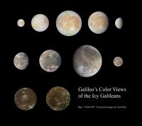
Here is a combination of all of Galileo's global color views of the Galileans. I have left out the large Europa mosaic because much of its color data is pulled from other orbits. I have also left out colorized views. Due to inconsistent filter selection, there some variation between images. I posted the Europa set in another thread, but I figured I would add the views of Ganymede and Callisto.
Posted by: ElkGroveDan Dec 9 2007, 08:47 PM
Galileo imagery?
http://apod.nasa.gov/apod/ap960830.html
Great work Ted, thanks for the new wallpaper.
Posted by: nprev Dec 9 2007, 09:59 PM
![]() ...wow, Ted! Thank you; that's an incredible montage. In particular, Ganymede looks more interesting then I've ever seen it before.
...wow, Ted! Thank you; that's an incredible montage. In particular, Ganymede looks more interesting then I've ever seen it before.
Watch out, though; you forgot to include Io among the Galilean moons, so VP's gonna be torqued... ![]()
Posted by: ugordan Dec 9 2007, 10:22 PM
Well, he did label the collage "Icy Galileans"
Posted by: tedstryk Dec 9 2007, 10:27 PM
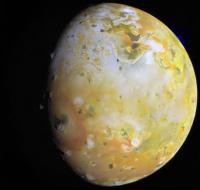
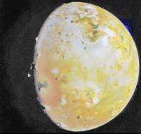
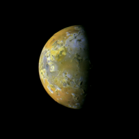
Actually, I didn't forget....There are so many Io images that I haven't gotten to all of them yet. Here are a few I have processed. (I should mention that the third image is two color (violet/IR), which is why it looks a little off compared to the other images. I am working on trying to formulate a better "synthetic green."
Posted by: tedstryk Dec 19 2007, 09:03 PM
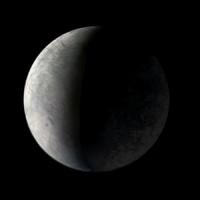
This one is actually from Voyager, showing Europa's night side.
Posted by: Tom Tamlyn Dec 19 2007, 10:07 PM
This seems like the right place to mention that Emily has posted an excellent http://www.planetary.org/blog/article/00001264/ of Ted's work on her blog, to mark the inclusion of his wonderful Gallileo images of the Galileans on the Planetary Society's web site.
A question for Emily: When you refer to your "image database," I think you mean something more voluminous than the "space topic" write-ups for each planet, but I'm not sure where on the site to find these images.
TTT
Posted by: nprev Dec 20 2007, 05:22 AM
Congrats, Ted; Emily's made you an international star! ![]() Well done & well deserved.
Well done & well deserved.
Posted by: elakdawalla Dec 20 2007, 03:17 PM
TTT -- I probably shouldn't refer to my image database in blog entries -- I mean the internal planetary.org image database that is used to populate our website with pictures. I'm proud of it because when we redesigned our website late in 2005 it's one of the things I demanded -- an image library where we can upload one copy of an image, with caption and credit, and it auomatically produces the three browse sizes we use, and spits out the formatted html code for our pages, and we never lose the files or have to rewrite captions, something we used to do regularly before the redesign. I suppose in a future redesign we ought to make this publicly searchable but, I'm very sorry to say, the idea didn't occur to me when we were doing the redesign.
--Emily
Posted by: tedstryk Dec 20 2007, 04:27 PM
That is a really cool feature. By the way Emily, I really like the description of the kind of work I do (the explanation of the difference between what I do and what scientists do - at least most of the time (you will understand in a month or two)). In trying to portray what an object in space looks like, there are often trade-offs. Planetary objects don't have big gores in the side of them and discolored sections where one or two filters didn't cover. So, for the sake of producing a nice picture, creating convincing gapfill is important. However, if such images were used for science, such methods could lead some unfortunate person to think that they had discovered a truly different region. I will admit that I am MUCH more pliable with what I am willing to do with Galileo images than with other probes, as its coverage is so spotty. Where I draw the line is cloning over gaps with fictional features or features from another region - I always use actual images of the missing region or a gray fill that is roughly keyed to the surrounding albedo features. I realize, however, that those folks who produce maps for renderings to be viewed at any angle really don't have a choice but to clone missing regions.
For Galileo, I have even tried to play around with some of the better Opnavs. Sometimes there is a rotation sequence as Galileo approached a moon (usually Ganymede) which allows one to build up. Here is Ganymede on orbit J0 (after insertion and approaching the G1 encounter).
Here is Europa on orbit G2 using the same technique.
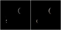
For the most part, these are tiny images (there are closer opnavs, but due to the compression formula, the data is so skeletal that recovery is impossible). The reason I bothered to figure out a recovery technique is that there are a handful of shots that would have been great "Kodak Moments" had the High Gain Antenna worked, but Galileo didn't have the luxury of taking such pictures. I wanted to test the technique before I bothered with some more difficult images. Here is one from orbit E4. On the left side, the only change I have made is to de-interlace Ganymede, which only has every third row (every fourth row near the top). I reconstructed the missing parts of Io using high phase data from other orbits and the hole in Ganymede from other shots in the sequence of opnavs. I colorized the images based on other orbits.
Posted by: tedstryk Apr 14 2009, 01:38 PM
I have re-reworked the closer I32 global view, and in the process I noticed something - you can see the planetshine - lit hemisphere. I know there are plenty of images showing this in much more detail, but I was mainly taken by the fact that I had worked with this dataset so much and never noticed this. The reason is probably that I was focused on making the image black in all areas off the limb except for the faint plume on the upper right. However, due to glow from the daylit hemisphere, the background is actually brighter than the planetshine on the right side of the image, so I probably destroyed it in earlier versions. I wiped out color in the planetshine area because it was not picked up in all filters, making for a very odd appearance. The first image is my new "regular" version, the second is with the planetshine area enhanced.
Posted by: PhilCo126 Apr 23 2009, 08:00 AM
Here's a special image of the Jovian moons:
http://sohowww.nascom.nasa.gov/pickoftheweek/old/27mar2009/
Why did you think that this fit in a Galileo imagery thread?
Posted by: DrShank Apr 23 2009, 07:10 PM
nice!
but Galileo image compression almost always wiped out any subtle details in any jupiter-shine imaging. wahhh!
Posted by: Bjorn Jonsson Apr 24 2009, 12:25 AM
Having seen what Cassini has done at Saturn I'm becoming surprised there aren't any really nice Jupitershine images of the Galileans (especially Io's Jupiter facing hemisphere). This shouldn't have been very difficult since Jupiter is much brighter than Saturn. Of course the downlink was severely limited but despite this I'm a bit surprised.
Posted by: stevesliva Apr 24 2009, 02:12 PM
Given the bandwidth limitations where they probably couldn't return every sunlit Io image they had, would Galileo have been focused on IR images of the volcanically active areas when Io was in eclipse and nearby? I'd think bandwidth coupled with Io looking interesting in non-visible wavelengths would but the nails in the coffin of visible Jupitershine images.
Posted by: Sunspot Apr 24 2009, 10:09 PM
It's a shame its going to be at least 30 odd years before we ever get a good look at Jupiter again.
Posted by: Phil Stooke Apr 24 2009, 10:15 PM
I expect the other things visible in sunlight were much higher priority than any potential earthshine images.
Posted by: DrShank Apr 24 2009, 10:37 PM
it would have been nice indeed. several things made it unlikely. The ccd on galileo was 8-bit, on cassini it is 16-bit (or is it 12, i can never remember). In any case, the cassini ccd has a significantly broader dynamic range and can capture low light images. even so, if the exposure isnt long enough even for cassini, compression artifacting begins to kick in. ive used quite a few of these and have seen a wide range of quality. given the lower sensitivity, and the severe restrictions on downlink and tape recorder, either you expose for the lit side or the dark side. galileo could usually do only one or the other, not both because it was not a high priority to take the same image twice. they were lucky to get 150 images of ALL targets during any given orbit. so nite side imaging took it in the teeth.
Posted by: ugordan Apr 25 2009, 12:40 PM
Yes, Cassini has 12 bit A/D converters and although it typically encodes images using an 8 bit lookup table, it's still able to capture the greater dynamic range 12 bit images produce, albeit with only 256 discrete levels.
I don't think Galileo having an 8 bit dynamic range to begin with gives you much to work with if the exposures are set for sunlit surfaces. Maybe some detail could be pulled out from higher phase sunlit surfaces since those inherently use longer exposures for rocky surfaces, otherwise the brightness difference is too great.
Posted by: Bjorn Jonsson Apr 25 2009, 01:42 PM
This is true and even long exposures might have been a problem due to scattered light unless the phase was relatively high. What I had in mind was something similar to Cassini's images of Iapetus (these are the best known Saturnshine images) of Io's subjovian hemisphere. The reason is that Galileo only obtained relatively low resolution images of this hemisphere. But possibly the flyby geometry was never suitable for this - it's probably time to get some SPICE kernels and start digesting them.
Posted by: Phil Stooke Apr 25 2009, 04:31 PM
Cassini at Iapetus was moving very slowly, but Galileo at Io was moving very fast, so motion blur was a problem and compensation more difficult. And the long exposure would result in really bad radiation effects on the image.
Phil
Posted by: ugordan Apr 25 2009, 04:39 PM
True, but Io also receives much more jupitershine being much closer to Jupiter (which in turn receives more sunlight) than Iapetus is to Saturn so that tends to cancel out greater flyby speeds somewhat.
Posted by: tedstryk Apr 25 2009, 08:12 PM
In these images, compression was not the worst problem. It was a horrible amount of noise.
Posted by: john_s Apr 27 2009, 10:23 PM
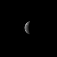
Actually there are a few low-resolution, global, Galileo images of Io's nightside in Jupiter shine, taken to look for condensing frosts. See Simonelli et al. 1998, Galileo Search for SO2-Frost Condensation on Io's Nightside, Icarus 135, 166-174. These are from that paper:
John.
Posted by: tedstryk Apr 27 2009, 11:53 PM
Sunspot, actually less than 20. The new mission is supposed to end in 2029, which is 20 years from now.
Posted by: tedstryk May 1 2009, 06:24 PM
Here is another nice view from Galileo, taken during the E15 orbit.
Posted by: DrShank May 2 2009, 04:09 AM
yes, this view is upside down with north at bottom. the clutch of mountains near the bright patch of Masubi (top)
is Hiiaki Montes, Shamshu Mons, plus a few others. Zal and Mongibello Mons are at bottom!
Posted by: machi Nov 9 2009, 06:06 PM
Beautiful images! Io is really very photogenic object.
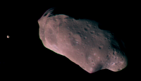
Here are some images from beginning of Galileo mission.
Posted by: djellison Dec 1 2009, 11:34 AM
False colour? really? I've stretched the saturation to the max in Photoshop on that image, and there's no colour at all, just a slight orange tinge across the entire image.
Posted by: machi Dec 1 2009, 11:40 AM
It's slightly colored (aproximately brown color). But this is a problem with adjusting colors on different monitors. On my old CRT it looks fine, but on LCD it looks completely different.
I tested this image on LCD and it's colored (try adjusting contrast).
Posted by: Phil Stooke Dec 1 2009, 01:28 PM
Since the original mosaic was monochrome, any colour is false! Looks good, though - probably fairly realistic.
Phil
Posted by: paxdan Dec 1 2009, 01:55 PM
I believe machi is using false colour to mean artifical colour, not spectral imaging that uses combinations of wavelengths that do not approximate what is seen by the human eye.
Posted by: machi Dec 1 2009, 02:33 PM
Full inline quote removed - ADMIN
Right. This is maybe little terminological problem. Color is entirely artificial. How Phil said, for this mosaic multispectral images don't exist.
For comparison, this is multispectral image maked from violet, green and IR images.
Posted by: djellison Dec 1 2009, 03:20 PM
A more appropriate phrase would have been 'colourised' rather than 'false colour'. 'false colour' infers that you made the image from multiple filters.
Posted by: jekbradbury Dec 25 2009, 08:54 PM
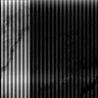
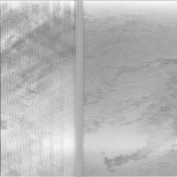
As Jason Perry http://gishbar.blogspot.com/2009/10/galileos-i24-flyby-of-io-look-back_11.html a couple months back over at the Gish Bar Times, we have recently passed the tenth anniversary of Galileo's I24 flyby, that probe's first close-up look at Io. However, many of the images collected during the flyby had at least one of two anomalies, which the team later characterized http://pds-imaging.jpl.nasa.gov/data/go-j_jsa-ssi-4-redr-v1.0/go_0022/document/ai8doc.htm. They were able to create an algorithm to correct the first and simpler of the two anomalies, but were unable to correct the second anomaly. Thus, about a dozen close-in images of Io have been lost. I made an initial attempt at correcting the second anomaly for the example image used in the characterization document, but, although it makes for an interesting exercise in image processing, it's completely useless in its current form for anything resembling scientific analysis...
original:
attempted restoration:
The images themselves are http://pds-imaging.jpl.nasa.gov/data/go-j_jsa-ssi-4-redr-v1.0/go_0022/i24/io/, with those containing an anomaly in the "garbled" directory and corrected versions of those with just the first anomaly in the "repaired" directory.
Posted by: tedstryk Dec 26 2009, 04:12 AM
Impressive!
By the way, I don't think I ever have seen the documentation for the second anomaly. Very interesting!
Posted by: tedstryk Dec 28 2009, 06:59 PM
I posted a short Europa-related blog entry yesterday.
http://planetimages.blogspot.com/2009/12/nice-little-view-of-europa.html
Posted by: ugordan Jan 7 2010, 11:53 AM
Here are two rough color views from Galileo. Valhalla impact basin on Callisto:
http://www.flickr.com/photos/ugordan/4187936017/
Ganymede mosaic consisting of 4 footprints:
http://www.flickr.com/photos/ugordan/4248059931/
That's the http://photojournal.jpl.nasa.gov/catalog/PIA01610 crater chain at lower right. There exists a fifth footprint that I *think* fits to the lower left one, but there's no overlap to match them and I omitted it here.
Posted by: volcanopele Jan 21 2010, 10:59 AM
What a difference rotating an image can make:
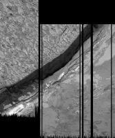
From http://gishbar.blogspot.com/2010/01/margin-of-chaac-patera-as-seen-by.html: The mosaic above shows a portion of the northeastern margin of Chaac Patera, a volcanic depression on the anti-Jupiter hemisphere of Io. Click the image for a full-resolution version. The terrain to the upper left is the hummocky plains that make up the upper level of the depression Chaac sits in. The terrain to the lower right is the floor of Chaac Patera, consisting of overlapping, thin silicate flows. The margin itself is quite steep, with slopes approach 70 degrees on the right hand side. On the left hand side, mass wasting has produced a two-tone talus apron at the base of the slope. This mass wasting seems to be the result of more extensive slope failure (see the broken off section of massive lava on the far left edge of the image).
These images were taken during the Galileo spacecraft's February 2000 flyby of Io. The pixel scale is 7 meters per pixel.
See http://photojournal.jpl.nasa.gov/catalog/PIA02551 to see how these images are normally shown... Rotate the image 90 degrees and suddenly the geologist part of my brain starts saying, "Oh now this makes A LOT more sense!"
Posted by: machi Jan 21 2010, 01:06 PM
Amazing! I'm not geologist, but I have seen this image many times (in raw form) and now it looks really more understandable to me. Fantastic cliff!
Let's Look at Io from a Different Angle!
Posted by: DrShank Jan 21 2010, 02:53 PM
or a slightly different take, simulating the view one might have out of a porthole on passing space cruiser . . .
Posted by: DrShank Jan 22 2010, 01:10 PM
this is the eroded plains shot north of the equator, for which we have no context imaging. it shows a dark smooth plataeu in the foreground
and complex plains surrounding it. these palins are probably overlapping flows and erosional debris slides of some sort.
Posted by: Explorer1 Mar 2 2010, 03:28 AM
On a related note, look at what made it onto Wikipedia's front page today!
http://en.wikipedia.org/wiki/Callisto_%28moon%29
Rather a coincidence considering the recent blog post by Emily.....
Posted by: volcanopele Mar 11 2010, 10:39 PM
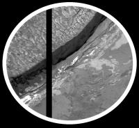
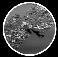
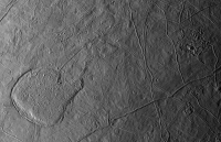
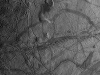
I had this on my blog a few days ago, but I've gotten around to putting together a few mosaics of Europa from 1998 and 1999 by Galileo:
http://pirlwww.lpl.arizona.edu/%7Eperry/io_images/15ESREGMAP01.png
http://pirlwww.lpl.arizona.edu/%7Eperry/io_images/15ESREGMAP02.png
Description at http://www.gishbartimes.org/2010/03/two-more-europa-mosaics.html
http://pirlwww.lpl.arizona.edu/%7Eperry/io_images/17ESREGMAP01.png
http://pirlwww.lpl.arizona.edu/%7Eperry/io_images/17ESAGENOR03.png
http://pirlwww.lpl.arizona.edu/%7Eperry/io_images/17ESSOUTHP01.png
http://pirlwww.lpl.arizona.edu/%7Eperry/io_images/17ESREGMAP02.png
Description at http://www.gishbartimes.org/2010/03/and-now-for-something-completely.html
http://pirlwww.lpl.arizona.edu/%7Eperry/io_images/19ESRHADAM01.png
Description at http://www.gishbartimes.org/2010/03/19esrhadam01-galileo-mosaic-of-europa.html
Posted by: stevesliva Mar 12 2010, 04:29 AM
Paging nirgal...
Posted by: nprev Mar 12 2010, 04:33 AM
Those are just mind-blowing, Jason.
I never knew that there were features like that on Io...(sorry, couldn't resist! ![]() )
)
Posted by: ugordan Jul 26 2010, 09:15 PM
Shamelessly stealing volcanopele's http://pirlwww.lpl.arizona.edu/~perry/io_images/c10.htm Io image and running it through CIE XYZ color calculation code based on Galileo's filter wavelengths (R 665, G 559 and V 413 nm):
http://i108.photobucket.com/albums/n15/ugordan/10ISIOGLOC03.png
It's also gamma-corrected (assuming the original composite is straight-up RGB substitution, judging by contrast and terminator line). Io's one of the few moons that doesn't really look bland this way.
Posted by: Decepticon Jul 27 2010, 12:29 AM
Oh wow Gold!
Posted by: JohnVV Jul 27 2010, 05:01 AM
I thought that this one was the correct color and gamma
and have been planing on redoing the color on my map ( i white balanced it )
{ http://celestiamotherlode.net/catalog/show_addon_details.php?addon_id=1110 }
[attachment=22188:21ISCOLOR_01.jpg]
http://pirlwww.lpl.arizona.edu/~perry/io_images/c21.htm
http://pirlwww.lpl.arizona.edu/~perry/io_images/21ISCOLOR_01.png
Posted by: eoincampbell Jul 27 2010, 06:04 AM
Really brilliant work here, much appreciated...
Posted by: volcanopele Jul 27 2010, 06:22 AM
and have been planing on redoing the color on my map ( i white balanced it )
http://pirlwww.lpl.arizona.edu/~perry/io_images/c21.htm
http://pirlwww.lpl.arizona.edu/~perry/io_images/21ISCOLOR_01.png
Yes, true color...umm... Well gamma, quite frankly, gamma correction has always made images looks too washed out and bright, which maybe more correct, but I don't know, you lose what you gain with our fancy CCD and CMOS detectors.
As far as true color. No it isn't. That uses an Infrared image centered at 756 nm for red, though I tried to not stretch the colors unnecessarily.
Posted by: JohnVV Jul 27 2010, 07:10 AM
color ???? "that is the question " when i did my map i did what i would do in the photo darkroom and balanced for white - then tweeked it for ascetics .I always thought that there was too much green in them
and used the
http://pdsimg.jpl.nasa.gov/data/cassini/cassini_orbiter/coiss_3002/data/images/SE_500K_0_0_SIMP.IMG
the eastern half
[attachment=22189:tx_1_0.jpg]
Posted by: volcanopele Jul 27 2010, 07:17 AM
Wow, yeah, that is WAYYYY too red and dark.
Bjorn has a decent tutorial on Io's color at http://www.mmedia.is/bjj/3dtest/io/index.html .
Another true color approximation that is quite good is at http://photojournal.jpl.nasa.gov/catalog/PIA02308
Posted by: ugordan Jul 27 2010, 12:53 PM
It is indeed more correct. The images look more washed out because the objects of interest really are that washed out in reality. If you want to scrutinize the surfaces, higher contrast is great, but if you want more realistic looking images you need to apply gamma correction. I personally don't like the way the terminator appears in higher phase, uncorrected images. It's barely visible and erodes much of the visible disc toward the sunlit terrain.
It's actually more demanding of those fancy CCDs as it exposes any low level noise that would otherwise be drowned out in the darks. Voyager 8 bit is barely workable this way, Galileo is a bit better.
It's hard to illustrate what gamma correction does or why it's important with these distant objects as it's hard to relate to them. I'll give a more down to "Earth" example with a Phoenix image. The left side is uncorrected data, the right side is sRGB correct gamma, same calibrated image, click to enlarge:
http://www.fileden.com/files/2007/9/14/1431389//phx_gamma_comparison.jpg
You'll notice that apart from vastly higher contrast, there is color shifting present - the surface is redder (not simply more saturated color). It makes talking about "true color" uncorrected images sort of moot.
Posted by: tedstryk Jul 27 2010, 02:18 PM
Not true. On any computer monitor, the dynamic range is much smaller than in real life. Because of this, the "washed out areas" would not appear that way to the eye. These gamma corrected versions are not "more realistic" than other versions. It is simply a matter of picking your poison and deciding which trade-offs you are willing to make.
Posted by: ugordan Jul 27 2010, 05:33 PM
Based on what? The original data is 8 bit. That means a difference of 1 DN translates into 1/256 of total dynamic range covered - determined by exposure, etc. There isn't dynamic fidelity that the eye might otherwise be able to pick out in the original data to begin with.
You are mixing display brightness output and target object contrast. The fact a monitor can not display true luminance of anything other than perhaps Uranus or Neptune systems does not diminish the value of accurate contrast portrayal. Looking at a gamma correct display of a bright target on a monitor is equal to looking at the target through a neutral density filter that dims the object. There is no such filter for the effect straight up RGB substitution gives because it's not a natural effect. It's an artifact of the processing just as incomplete calibration would be.
sRGB gamma was introduced with the sole purpose of mapping more DNs to lower brightness levels because that's where the eye is more sensitive and banding would otherwise be present with 8 bit data. Gamma correction is just a inverse of that so that linear radiometrically calibrated data is presented in the proper way on the screen. It doesn't change the contrast, it brings the actual contrast on screen to par with reality.
You're telling me the above left Phoenix image is just as real as the right one because the computer screen is too dim? All your digital camera images are sRGB gamma correct by default, even though the things you take pictures on Earth are vastly brighter than even Io. So how come they don't appear washed out? Cramming wider dynamic range into a computer screen output is the domain of HDR processing and even it doesn't inherently affect contrast. See example in http://www.dpreview.com/learn/?/Glossary/Digital_Imaging/tonal_range_01.htm.
The irony is that if the sRGB standard never introduced gamma, i.e. if it left the linear 8 bit approach, we wouldn't be having this discussion. We'd be talking about either natural color and/or contrast-enhanced or saturation-enhanced versions. When an image would be produced and it looked too bland (most of the time), it would be deliberately contrast-enhanced and clearly labeled as such.
Posted by: tedstryk Jul 27 2010, 06:56 PM
I'm not confusing anything. Not only is the monitor not as bright, the darkest blacks aren't all that dark. As for the two Phoenix images, yes, I am saying that. One is faithful to the brightness of the reflection, one suppresses it in the name of preserving more interesting parts of the image.
Posted by: 4th rock from the sun Jul 28 2010, 01:44 PM
My non technical argument would be that we use monitors to view every day photographs and video (of ordinary subjects) and the images look correct and "as it should be".
So if we replicate the same processing that our normal digital cameras do and apply it to raw image data, the results should in practice be the same as is if the images were originally taken with that camera.
As for the Phoenix image posted, I'm forced to say that the right version does look like a normal digital photo taken on Earth. Therefore, it's as real as any photo viewed on a PC screen. But this is just my opinion of course.
But more technically speaking, the left Phoenix image is NOT faithful to image reflexion values unless you forced your monitor to display also with a linear response!
If the monitor is sRGB, it will apply gamma to that image, resulting in a non-linear display. So the right version has the correct linear response.
Posted by: DrShank Jul 28 2010, 04:24 PM
and used the
http://pdsimg.jpl.nasa.gov/data/cassini/cassini_orbiter/coiss_3002/data/images/SE_500K_0_0_SIMP.IMG
the eastern half
[attachment=22189:tx_1_0.jpg]
nice job! what was the color data source / images?
Posted by: ugordan Jul 28 2010, 05:51 PM
Neither are they dark on the monitor in the non-corrected images, yet it makes areas that are actually not that dark in the real scene darker than they are - terminator region and darker albedo features.
I would once again echo 4th rock's technical argument in that the left image is not technically correct. The same argument holds for every day images as it holds for planetary objects, be it bland objects like Venus or highly dynamic range like Earth.
I maintain my point that the gamma-correct version is more correct. It preserves brightness, contrast and hence color relationships of the real world object. Anything else is either a contrast enhancement or dilution by definition. Other, enhanced versions are certainly helpful to show minute detail, I use them a lot myself too, especially for low phase bland objects, but that doesn't change the fact those objects are visually bland (i.e. low albedo differences and those details really are minute differences). I would also add a point that having a monitor with a really bright output, sufficient to mimic the real scene would not make the images much more detailed to the eye because the eye is more sensitive to low light changes not bright objects - the reason gamma was introduced in the first place.
Posted by: volcanopele Jul 28 2010, 06:03 PM
My biggest issue at this point seems to be that the way my images look in Photoshop CS4 looks quite a bit different when displayed in a browser. In Photoshop, the display looks non-linear, with my image not washed out by any stretch of the imagination, but the terminator region is quite as dark as my images appear in a browser.
So I would like to find a way to make the images that I make in photoshop show up the exact same way in a browser (even on the same computer).
Posted by: ugordan Jul 28 2010, 06:10 PM
You could have a custom color profile for your PS different from sRGB. Have you tried seeing if you're allowed to do Edit->Convert to profile-> then select sRGB IEC... ?
EDIT: Need to read more carefully what you write...
Posted by: volcanopele Jul 28 2010, 06:27 PM
hmm, that doesn't seem to work, but then again, Firefox has always been a bit odd for a while in the way it handles color.
I'll give you a good example. Compare the thumbnail version of 10ISIOGLOC03 on http://pirlwww.lpl.arizona.edu/~perry/io_images/c10.htm with the full size version at http://pirlwww.lpl.arizona.edu/~perry/io_images/10ISIOGLOC03.png . On my browser, I like the way the thumbnail looks because it looks exactly the same way in Photoshop, and that is how I prefer it to appear. But in the full-size version, the terminator is way too dark.
And converting to a different profile (or using JPEG rather than PNG) didn't seem to work.
Posted by: ugordan Jul 28 2010, 06:38 PM
Hmm. I'm stuck with a laptop right now with lousy contrast so can't make out any differences in the way the terminator appears, though the thumbnail image does seem to appear slightly more greenish compared to the full res. It could be the two have different embedded profiles. Do you generate both in Photoshop or?
I think there was a thread somewhere here about browser issues with color profiles, maybe one of the images is stuck with a profile (even though it's sRGB and FF can't handle it properly or something) instead of bare data.
Edit: yeah, I can see the difference in Photoshop if I resize the thumbnail. When opening the JPG thumbnail it says there's no embedded profile, but when opening the full PNG it says nothing.
Posted by: JohnVV Jul 28 2010, 07:59 PM
oops i posted the wrong link
-- i am going to have to check the README i made an make sure it is correct - gives the correct reference to the orig.
http://astrogeology.usgs.gov/Projects/JupiterSatellites/io/Io_SSI-only_color_merge_SIMP0.cub.gz
http://astrogeology.usgs.gov/Projects/JupiterSatellites/io.html
the 3 band isis cub file
ran "explode" on it then exported each to tiff( gdal) and recombined R,G,B in Nip2
then in gimp cleaned the seams ( that is normal for me - i dislike seams )
the old colors of io , i think have to much green and a bit to much yellow
then AFTER i did the map i came across this
http://pirlwww.lpl.arizona.edu/~perry/io_images/c21.htm
i do need to lighten it up and add back in some of the yellow
Posted by: 4th rock from the sun Jul 28 2010, 08:48 PM
Regarding image color profiles and the Web:
My personal opinion is to disable any color corrections in Photoshop and if really needed always specify sRGB for saved files.
What you should correct is your monitor or graphics board (sometimes the only option for laptops) using the sliders normally present on the control panel. These are hardware adjustments and will bet you correct display for everything.
Forcing color space correction on browser or on a program basis is always inconsistent. Here's a nice link about color profiles with interactive examples : http://www.gballard.net/psd/go_live_page_profile/embeddedJPEGprofiles.html
Posted by: JohnVV Jul 28 2010, 09:09 PM
well there is
AdobeRGB1998.icc
HP5000_UVDuraImageGlossMaxQ.icc
sRGB.icm
on my system and i have everything set to sRGB.icm
pick one and calibrate EVERYTHING to it
printer , monitor , photoshop, gimp, Firefox ,( IE 8 ??? ) do not about that one
Posted by: ugordan Jul 28 2010, 09:22 PM
Perhaps this digression should be extracted into a different thread instead of contaminating this (unrelated) one?
Posted by: ugordan Aug 30 2010, 06:51 PM
An 8-footprint, roughly natural color Galileo mosaic of crescent Jupiter, taken on September 10th, 1997:
http://www.flickr.com/photos/ugordan/4942095653/
There's also a contrast-enhanced version http://farm5.static.flickr.com/4077/4942699784_dc89893e1a_o.png for those so inclined.
Posted by: tedstryk Aug 31 2010, 04:24 PM
Nice. I have a http://planetimages.blogspot.com/2009/09/despite-its-antenna-problems-galileo.html about that data set that I posted last year.
Posted by: machi Apr 1 2011, 07:21 PM
Little animation experiment with two Jupiter's images from Galileo.
Darkening at right side is caused by rotation of Jupiter between time
when these two images were taken.
http://www.youtube.com/watch?v=IqKwWB8xKHg
Posted by: Bjorn Jonsson Apr 2 2011, 02:46 PM
Wow...
When doing these morphed animations, are you using Sqirlz Morph (that you discussed http://www.unmannedspaceflight.com/index.php?showtopic=4550&view=findpost&p=166265) or the MSU Frame Rate Conversion Filter (discussed by Ian R http://www.unmannedspaceflight.com/index.php?showtopic=6705&view=findpost&p=166494) or both, depending on the scene and number of frames?
I've been experimenting with the MSU stuff and it works very well for the Voyager 1 Jupiter approach movie (one exception: I need to cut away a few frames at the start of the tweened animation file to avoid 'jumps' in the cloud motion). In contrast, it does not work well for a Cassini animation of Saturn where the time between frames varies a lot and where I sometimes need to interpolate between two adjacent frames before assemling everything into one big tweened animation. I suspect in the Saturn case Sqirlz Morph is the way to go.
Posted by: machi Apr 2 2011, 03:39 PM
Normally I'm using Sqirlz Morph, because of big differences between used images.
I think, that MSU Frame Rate Conversion Filter is usable only for small differences.
Sqirlz M. is usable nearly every time (if images contains enough corresponding details),
but it's time consuming process for every pair of input images.
Posted by: machi Jul 30 2011, 04:24 PM
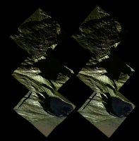
Cross-eye 3D view of 11 km high Tohil Montes and Radegast Patera (dark lava lake).
Resolution is approx. 150 m/pix. Color from lower resolution images from orbit C21 observations.
BTW, Radegast Patera has almost same diameter as Endeavour crater.
Posted by: elakdawalla Jul 30 2011, 06:28 PM
![]() that is very cool, Machi!!
that is very cool, Machi!!
Posted by: algorimancer Jul 30 2011, 08:39 PM
That's gotta be the most dramatic view of Europa that I've seen. Very nice.
Posted by: volcanopele Jul 30 2011, 09:43 PM
Okay, breathe, Jason, breathe..... No, that's Io...
Posted by: tedstryk Jul 30 2011, 10:25 PM
Yeah, you won't find topography like that on Europa.
Posted by: Phil Stooke Jul 31 2011, 01:02 AM
Unless it's Europa in Philovision.
Phil
Posted by: algorimancer Jul 31 2011, 01:54 AM
Oops. Okay, Io makes more sense. Still, very cool
Posted by: machi Jul 31 2011, 10:43 AM
It's my fault, I forgot "Ionian" before Tohil, which is btw correctly Tohil Mons (mountain), not Tohil Montes (mountains), but I still think, that Montes would be more appropriate for such complex structure.
Posted by: machi Aug 2 2011, 05:53 PM
Now, more stereoscopic images (BW and color anaglyphs + enhanced cross eye version) of Ionian Tohil Mons and Radegast Patera are available on my http://my-favourite-universe.blogspot.com/2011/08/vysoke-stity-ionske.html.
Powered by Invision Power Board (http://www.invisionboard.com)
© Invision Power Services (http://www.invisionpower.com)
