Titan PDS Image Products |

Titan PDS Image Products |
 Oct 4 2012, 01:11 AM Oct 4 2012, 01:11 AM
Post
#1
|
||
 IMG to PNG GOD  Group: Moderator Posts: 2251 Joined: 19-February 04 From: Near fire and ice Member No.: 38 |
Following recent discussion in this thread on Titan's polar vortex and visible atmospheric features (including what looks like faint 'cloud belts') I decided to take a look at the PDS data. The main reason is that it's possible get get much better results for low contrast targets like Titan by using the PDS data than the raw JPGs. I found some interesting images obtained on April 19, 2011; rev 147. This rev was previously discussed here when the Titan flyby was happening.
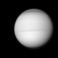
Here is a sharpened BL1 WAC image obtained at a range of 137,000 km. The subspacecraft latitude is 0.2 degrees:
North is up. Different parts of the image have been processed with different unsharp masks. Low contrast east-west 'cloud belts' are apparent and these are definitely real features. Interestingly, they are not perfectly east-west oriented but instead appear a bit 'curved'. This is not a perspective effect and also Cassini was only 0.2 degrees north of Titan's equator. It might be possible to squeeze even more details out of comparable VIO images. The problem is that they appear awfully mottled and my 'standard' calibration/flatfielding didn't remove this. I probably need to make extra flats to get rid of this effect. |
|
 |
 
|
|
 |
|
Oct 7 2012, 07:41 PM
Post
#2
|
||||||
|
IMG to PNG GOD Group: Moderator Posts: 2251 Joined: 19-February 04 From: Near fire and ice Member No.: 38 |
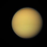
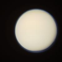
It turns out that this is a very interesting set of images to work with. Here is an RGB composite from the same sequence as the BL1 image in the first message in this thread (actually the blue data here is from that image):
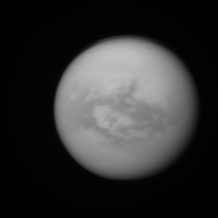
Not too impressive but looking closely there are some very low contrast features near the center of the disc that are actually surface features. This becomes evident when looking at a CB3 image from the same sequence for comparison:
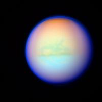
There are also some subtle color differences in the RGB image. By processing the RGB image to make the average color of the central ~75% of the disc gray and then greatly boosting the color saturation these color differences become obvious and the surface features become more apparent as well:
The southern hemisphere is bluer than the northern hemisphere and the color transition is remarkably sharp and distinct. Also the north polar region is significantly redder than other parts of the disc, including the south polar region which is remarkably different from the north polar region. This image may also suggest that in the southern hemisphere the atmosphere is less transparent at visible wavelenghts but I'm not sure because of the following versions which is the RGB image sharpened with an unsharp mask - no attempt was made to bring out color differences:
This image also reveals that the dark features are darker than the bright terrain at red wavelengths but at green and blue wavelengths the difference is negligible. I don't know if this is simply a 'side effect' from Rayleigh scattering (the surface features are much easier to see at long wavelengths). And to end this, a very different version of the RGB image. This one has been processed to show the limb haze more clearly:
A really fascinating dataset. |
|||||
|
|
|
|||||
|
Nov 6 2012, 01:41 PM
Post
#3
|
||
 Member Group: Members Posts: 611 Joined: 23-February 07 From: Occasionally in Columbia, MD Member No.: 1764 |
QUOTE (Bjorn Jonsson @ Oct 7 2012, 02:41 PM)  There are also some subtle color differences in the RGB image. By processing the RGB image to make the average color of the central ~75% of the disc gray and then greatly boosting the color saturation these color differences become obvious and the surface features become more apparent as well:
A really fascinating dataset. Well, quite. Modern tools make this kind of color visualization nice and easy, but of course the fact that the surface is faintly visible at red wavelengths, and that the limb-darkening varies with wavelength, etc. was quantitatively established with Voyager and HST quite some time ago.... |
|
|
|
|
|
 Bjorn Jonsson Titan PDS Image Products Oct 4 2012, 01:11 AM
 remcook It is known that the rotation axis of the stratosp... Oct 4 2012, 12:14 PM
 TheAnt Oh drat! That image just had be reclassify Tit... Oct 4 2012, 03:42 PM
 JRehling QUOTE (TheAnt @ Oct 4 2012, 08:42 AM) Cou... Oct 4 2012, 05:29 PM TheAnt QUOTE (JRehling @ Oct 4 2012, 07:29 PM) T... Oct 5 2012, 03:35 PM Bjorn Jonsson QUOTE (remcook @ Oct 4 2012, 12:14 PM) It... Oct 4 2012, 07:31 PM Juramike One of the really difficult things about Titan che... Oct 5 2012, 04:10 PM Eyesonmars An observation/question.
I would assume Titan do... Oct 5 2012, 04:43 PM remcook I think this paper is what you are looking for:
h... Oct 5 2012, 05:52 PM ugordan The high altitude haze has become much more pronou... Nov 4 2012, 03:11 PM JRehling The complexity of that image, the non-monotonic va... Nov 5 2012, 07:11 PM Juramike Titan's chemical complexity goes waaaaay beyon... Nov 6 2012, 08:39 AM Bjorn Jonsson Here are two semi-randomly selected narrow angle R... Jan 9 2014, 12:31 AM
JRehling QUOTE (TheAnt @ Oct 4 2012, 08:42 AM) Cou... Oct 4 2012, 05:29 PM TheAnt QUOTE (JRehling @ Oct 4 2012, 07:29 PM) T... Oct 5 2012, 03:35 PM Bjorn Jonsson QUOTE (remcook @ Oct 4 2012, 12:14 PM) It... Oct 4 2012, 07:31 PM Juramike One of the really difficult things about Titan che... Oct 5 2012, 04:10 PM Eyesonmars An observation/question.
I would assume Titan do... Oct 5 2012, 04:43 PM remcook I think this paper is what you are looking for:
h... Oct 5 2012, 05:52 PM ugordan The high altitude haze has become much more pronou... Nov 4 2012, 03:11 PM JRehling The complexity of that image, the non-monotonic va... Nov 5 2012, 07:11 PM Juramike Titan's chemical complexity goes waaaaay beyon... Nov 6 2012, 08:39 AM Bjorn Jonsson Here are two semi-randomly selected narrow angle R... Jan 9 2014, 12:31 AM |

|
Lo-Fi Version | Time is now: 5th June 2024 - 02:33 AM |
|
RULES AND GUIDELINES Please read the Forum Rules and Guidelines before posting. IMAGE COPYRIGHT |
OPINIONS AND MODERATION Opinions expressed on UnmannedSpaceflight.com are those of the individual posters and do not necessarily reflect the opinions of UnmannedSpaceflight.com or The Planetary Society. The all-volunteer UnmannedSpaceflight.com moderation team is wholly independent of The Planetary Society. The Planetary Society has no influence over decisions made by the UnmannedSpaceflight.com moderators. |
SUPPORT THE FORUM Unmannedspaceflight.com is funded by the Planetary Society. Please consider supporting our work and many other projects by donating to the Society or becoming a member. |
|