MSL data in the PDS and the Analyst's Notebook, Working with the archived science & engineering data |

MSL data in the PDS and the Analyst's Notebook, Working with the archived science & engineering data |
 Feb 27 2013, 07:22 PM Feb 27 2013, 07:22 PM
Post
#1
|
|
|
Solar System Cartographer  Group: Members Posts: 10227 Joined: 5-April 05 From: Canada Member No.: 227 |
"February 27, 2013. MSL Release 1, part 1, Sols 0-89.
The first release of MSL data takes place in two parts. Part 1, February 27, 2013, includes raw data products (EDRs) acquired on Sols 0 through 89, August 6 through November 5, 2012, for these instruments: APXS, ChemCam, DAN, Hazcam, Navcam, and REMS, along with SPICE data. Part 2, March 20, 2013, will include the derived data products (RDRs) for Sols 0 though 89 for the APXS, ChemCam, DAN, Hazcam, Navcam, and REMS instruments, along with both the EDRs and RDRs for the CheMin and RAD instruments, and the RDRs for the SAM instrument. Release 1 does not include data from the MAHLI, MARDI, or Mastcam instruments. These instrument teams have not yet delivered data products to PDS. Some documents in the MSL archives are awaiting clearance by JPL Document Review and/or the JPL Import/Export Control Office. They will be posted online as soon as clearance has been received, and announced on this web site." Phil -------------------- ... because the Solar System ain't gonna map itself.
Also to be found posting similar content on https://mastodon.social/@PhilStooke Maps for download (free PDF: https://upload.wikimedia.org/wikipedia/comm...Cartography.pdf NOTE: everything created by me which I post on UMSF is considered to be in the public domain (NOT CC, public domain) |
 |
 
|
 |
|
Apr 15 2013, 11:17 AM
Post
#2
|
|||
|
Senior Member Group: Members Posts: 2346 Joined: 7-December 12 Member No.: 6780 |
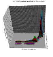
A small step towards a better assessment of Brightness Temperature B:
Take a (cartesian) coordinate system with two axes, one for Brightness Temperature A, one for Brightness Temperature B. Now take the Sol 89 data and add a point for each record of the data at the respective (Brightness Temperature A / Brightness Temperature B ) position. Tile the coordiante system parallel to the axes. Count the points in each rectangle and take that count as the respective position on a third axes. The result is a sequence of histograms. They may be drawn in the following way as "slices":
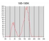
Looking just at one such "slice" (for a fixed Brightness Temperature A interval) at a time, and repeating this for the first 20 slices may result in an animated gif like this one, as a different way to represent the same data:
(Link to the gif) The headline indicates the considered Brightness Temperature A interval. The horizontal axis describes Brightness Temperature B. The vertical axis shows the number of entries near the respective Brightness Temperature B. (I allowed neighbouring slices to overlap.) The diagrams show clearly, that for low Brightness Temperature A there are two peaks for Brightness Temperature B. That's not at all a Gaussian distribution. So the concern about averaging correctly is justified based on actual data. |
||
|
|
|
||
 Phil Stooke MSL data in the PDS and the Analyst's Notebook Feb 27 2013, 07:22 PM
 Phil Stooke "Mars Science Laboratory (MSL) #1 On HOLD by... Feb 27 2013, 08:29 PM renee MSL Release 1 Announcement:
The NASA Planetary D... Feb 28 2013, 12:03 AM Phil Stooke Yes, folks, now the nav and haz images are in the ... Feb 28 2013, 12:49 AM jmknapp The recent PDS release included some NAIF files fo... Mar 1 2013, 12:57 AM elakdawalla Oh that is cool. You can see them imaging the cal ... Mar 1 2013, 01:06 AM Phil Stooke Nice! And I see that the rock Jake Matijevic ... Mar 1 2013, 01:14 AM fredk Joe, could you compare an actual mahli image that ... Mar 1 2013, 03:29 AM jmknapp Well, I don't have a way as yet to automatical... Mar 1 2013, 12:17 PM fredk Nice job! Did you spin the model wheels manua... Mar 1 2013, 03:00 PM djellison So as of now, img2png + MSL Navcam IMG's = no ... Mar 1 2013, 04:32 PM Airbag I'm just lost in the flood of information avai... Mar 1 2013, 06:55 PM
Phil Stooke "Mars Science Laboratory (MSL) #1 On HOLD by... Feb 27 2013, 08:29 PM renee MSL Release 1 Announcement:
The NASA Planetary D... Feb 28 2013, 12:03 AM Phil Stooke Yes, folks, now the nav and haz images are in the ... Feb 28 2013, 12:49 AM jmknapp The recent PDS release included some NAIF files fo... Mar 1 2013, 12:57 AM elakdawalla Oh that is cool. You can see them imaging the cal ... Mar 1 2013, 01:06 AM Phil Stooke Nice! And I see that the rock Jake Matijevic ... Mar 1 2013, 01:14 AM fredk Joe, could you compare an actual mahli image that ... Mar 1 2013, 03:29 AM jmknapp Well, I don't have a way as yet to automatical... Mar 1 2013, 12:17 PM fredk Nice job! Did you spin the model wheels manua... Mar 1 2013, 03:00 PM djellison So as of now, img2png + MSL Navcam IMG's = no ... Mar 1 2013, 04:32 PM Airbag I'm just lost in the flood of information avai... Mar 1 2013, 06:55 PM
 Greenish QUOTE (Airbag @ Mar 1 2013, 01:55 PM) Que... Mar 1 2013, 08:58 PM elakdawalla You can do it via FTP, right? http://geo.pds.nasa.... Mar 1 2013, 07:59 PM Airbag Well, only to some extent it seems - for instance,... Mar 1 2013, 08:25 PM elakdawalla I usually don't use FTP; I download the INDEX.... Mar 1 2013, 08:30 PM Airbag An INDEX.TAB file would work (for instance I see o... Mar 1 2013, 08:39 PM kemcab2012 Interesting. A quick look reveals that the headers... Mar 1 2013, 09:18 PM Airbag Ah yes, thanks, the Atlas Search has exactly what ... Mar 1 2013, 09:34 PM Greenish The MSL .IMG files do seem to be viewable with the... Mar 1 2013, 10:27 PM Airbag This is the kind of thing I was looking for (just ... Mar 2 2013, 12:15 AM JohnVV QUOTE NAVCAM .IMG files don't start with the s... Mar 2 2013, 01:57 AM Greenish I was careful to say you could see the images, not... Mar 3 2013, 02:48 AM kwan3217 The EDL spice kernels are not up yet. Perhaps thos... Mar 3 2013, 10:04 PM Gerald I wonder, whether these visualized sol 80 Boom 1 W... Mar 8 2013, 07:43 PM Phil Stooke
This is a comparison of the route map in the Ana... Mar 10 2013, 07:25 PM Gerald Based on REMS data:
"REFERENCE_COORD_SYSTEM_I... Mar 10 2013, 08:33 PM Phil Stooke Yes, I expect so - the basic idea being that dead ... Mar 10 2013, 10:04 PM Gerald Next error near Sol 58? There seems to be the swit... Mar 10 2013, 10:12 PM Phil Stooke No, the offset at sol 29 is 'corrected' by... Mar 10 2013, 11:01 PM jmknapp They released some more sol 0-89 data to the PDS t... Mar 20 2013, 07:13 PM PaulH51 QUOTE (jmknapp @ Mar 21 2013, 03:13 AM) T... Mar 21 2013, 12:10 PM Gerald The ground temperature may most likely be provided... Mar 21 2013, 12:22 PM jmknapp Haven't looked at it closely myself yet, but I... Mar 21 2013, 07:16 PM PaulH51 QUOTE (jmknapp @ Mar 22 2013, 03:16 AM) .... Mar 21 2013, 09:43 PM jmknapp OK, here's a taste of some calibrated REMS dat... Mar 25 2013, 04:47 PM mcaplinger QUOTE (jmknapp @ Mar 25 2013, 09:47 AM) N... Mar 25 2013, 05:04 PM jmknapp That would explain how it's a bit high.
Acco... Mar 25 2013, 05:40 PM Gerald You'll be close to a solution by dividing the ... Mar 26 2013, 11:52 AM jmknapp I had a feeling calculus might be involved--a more... Mar 27 2013, 01:37 PM mwolff If you are after ground temperature, then the Zorz... Mar 27 2013, 02:11 PM jmknapp The thing is, the emissivity can't be determin... Mar 27 2013, 04:11 PM mwolff QUOTE (jmknapp @ Mar 27 2013, 10:11 AM) T... Mar 28 2013, 03:14 PM Gerald The paper can be read online here.
Now I understan... Mar 27 2013, 05:02 PM jmknapp Just going by some comments in the Zorzano paper.
... Mar 28 2013, 11:59 PM Gerald Planck's function isn't linear, and it... Mar 29 2013, 02:42 PM Gerald Here the simplified theoretical principle for the ... Mar 30 2013, 11:57 AM jmknapp Have you tried this on the time series yet? In one... Apr 1 2013, 03:11 PM Gerald QUOTE (jmknapp @ Apr 1 2013, 05:11 PM) Ha... Apr 2 2013, 10:45 AM Gerald QUOTE (jmknapp @ Apr 1 2013, 05:11 PM) In... Apr 3 2013, 11:37 PM Gerald I'll answer the easy questions first:
Most of ... Apr 1 2013, 08:39 PM Gerald Here the sol 89 results, based on the two-color py... Apr 3 2013, 11:53 AM PaulH51 Gentlemen,
Not sure if you are aware, but the Spa... Apr 11 2013, 03:57 AM Gerald Thanks! This may help more people to access th... Apr 11 2013, 10:15 AM PaulH51 QUOTE (Gerald @ Apr 11 2013, 06:15 PM) I ... Apr 11 2013, 01:17 PM Gerald Here one of the charts that shows UV oscillations,... Apr 11 2013, 12:05 PM Gerald Thanks for your interest!
There are ways to go... Apr 11 2013, 03:46 PM Gerald The official statement regarding the noise of ther... Apr 16 2013, 03:00 PM Gerald Here a regression polyline (consisting of 20 Kelvi... Apr 17 2013, 09:57 AM Gerald This diagram shows qualitatively, how REMS UV RDR ... Apr 20 2013, 04:54 PM Gerald There are ways to further reduce the discrepancy b... Apr 24 2013, 09:07 AM Gerald The REMS data don't comprise the same observat... Apr 27 2013, 03:50 PM Gerald A summarized list of ChemCam targets of the first ... Apr 28 2013, 05:49 PM Gerald This is a "blink" gif between some raw S... Apr 29 2013, 10:17 AM Gerald A new summarized list of ChemCam targets, first 18... Jun 10 2013, 04:28 PM Phil Stooke "MAHLI, MARDI, and Mastcam data are still und... Jun 10 2013, 05:07 PM mcaplinger QUOTE (Phil Stooke @ Jun 10 2013, 10:07 A... Jun 11 2013, 02:04 AM mcaplinger QUOTE (mcaplinger @ Jun 10 2013, 07:04 PM... Jun 11 2013, 04:24 AM CosmicRocker QUOTE (Phil Stooke @ Jun 10 2013, 12:07 P... Jun 11 2013, 05:33 AM mcaplinger QUOTE (CosmicRocker @ Jun 10 2013, 10:33 ... Jun 11 2013, 05:54 AM Ant103 Yay ! Finally the Mastcam and MaHLI images rel... Jun 11 2013, 12:41 PM mcaplinger QUOTE (Ant103 @ Jun 11 2013, 05:41 AM) So... Jun 11 2013, 01:37 PM mcaplinger QUOTE (Ant103 @ Jun 11 2013, 05:41 AM) Bu... Jun 11 2013, 04:13 PM Ant103 This is weird. I can't open also Navcam IMG fi... Jun 11 2013, 11:16 PM mcaplinger QUOTE (Ant103 @ Jun 11 2013, 04:16 PM) Bu... Jun 11 2013, 11:28 PM Ant103 Okay :/
This is sad because this plugin was simpl... Jun 11 2013, 11:38 PM mcaplinger QUOTE (Ant103 @ Jun 11 2013, 04:38 PM) Th... Jun 12 2013, 12:51 AM fredk QUOTE (Ant103 @ Jun 11 2013, 11:38 PM) Ed... Jun 12 2013, 07:22 PM Ant103 Okay, this new PDS Reader plugin for ImageJ run li... Jun 12 2013, 01:12 AM PaulH51 QUOTE (Ant103 @ Jun 12 2013, 09:12 AM) Ok... Jun 12 2013, 04:03 PM mhoward Thanks for all the tips on this. One thing I'm... Jun 12 2013, 03:26 PM mcaplinger QUOTE (mhoward @ Jun 12 2013, 08:26 AM) O... Jun 12 2013, 04:03 PM Ant103 Yes Paul
http://pds-imaging.jpl.nasa.gov/data/ms... Jun 12 2013, 05:41 PM Gerald A list of APXS targets, first 180 sols:
CSV-file... Jun 17 2013, 07:22 PM Greenish Nice, Gerald. Here is MAVOR, the one from Sol 158... Jun 18 2013, 02:58 PM Gerald Thanks, Greenish!
Mavor APXS data are consist... Jun 18 2013, 05:50 PM Gerald For convenience, here the PDF version of the MSL m... Jul 7 2013, 01:51 PM Gerald The elemental composition determined by APXS analy... Jul 26 2013, 03:13 PM Gerald Here an annotated version of the Ekwir_1 APXS spec... Jul 28 2013, 03:32 AM jmknapp Here's the UV irradiance data from the PDS dis... Aug 25 2013, 11:50 PM Gerald QUOTE (jmknapp @ Aug 26 2013, 01:50 AM) T... Aug 26 2013, 08:47 AM jmknapp Interesting. I changed the data files to use relea... Aug 26 2013, 09:06 AM elakdawalla One does not simply....find UV data in MODRDR.
(S... Aug 26 2013, 12:09 AM jmknapp It is a barren wasteland, riddled with fire and as... Aug 26 2013, 12:21 AM Gerald PDS data of Sols 180 to 269 are going to get onlin... Aug 30 2013, 03:35 PM Gerald PRELIMINARY(!) CheMin analysis results for Joh... Aug 30 2013, 05:13 PM Gerald Mission summary update, sols 167 to 269 (site 6, a... Aug 30 2013, 10:40 PM elakdawalla The mission summaries are now available through so... Dec 13 2013, 10:44 PM xflare I still cant find any Mastcam images. Mar 13 2014, 10:10 AM
Greenish QUOTE (Airbag @ Mar 1 2013, 01:55 PM) Que... Mar 1 2013, 08:58 PM elakdawalla You can do it via FTP, right? http://geo.pds.nasa.... Mar 1 2013, 07:59 PM Airbag Well, only to some extent it seems - for instance,... Mar 1 2013, 08:25 PM elakdawalla I usually don't use FTP; I download the INDEX.... Mar 1 2013, 08:30 PM Airbag An INDEX.TAB file would work (for instance I see o... Mar 1 2013, 08:39 PM kemcab2012 Interesting. A quick look reveals that the headers... Mar 1 2013, 09:18 PM Airbag Ah yes, thanks, the Atlas Search has exactly what ... Mar 1 2013, 09:34 PM Greenish The MSL .IMG files do seem to be viewable with the... Mar 1 2013, 10:27 PM Airbag This is the kind of thing I was looking for (just ... Mar 2 2013, 12:15 AM JohnVV QUOTE NAVCAM .IMG files don't start with the s... Mar 2 2013, 01:57 AM Greenish I was careful to say you could see the images, not... Mar 3 2013, 02:48 AM kwan3217 The EDL spice kernels are not up yet. Perhaps thos... Mar 3 2013, 10:04 PM Gerald I wonder, whether these visualized sol 80 Boom 1 W... Mar 8 2013, 07:43 PM Phil Stooke
This is a comparison of the route map in the Ana... Mar 10 2013, 07:25 PM Gerald Based on REMS data:
"REFERENCE_COORD_SYSTEM_I... Mar 10 2013, 08:33 PM Phil Stooke Yes, I expect so - the basic idea being that dead ... Mar 10 2013, 10:04 PM Gerald Next error near Sol 58? There seems to be the swit... Mar 10 2013, 10:12 PM Phil Stooke No, the offset at sol 29 is 'corrected' by... Mar 10 2013, 11:01 PM jmknapp They released some more sol 0-89 data to the PDS t... Mar 20 2013, 07:13 PM PaulH51 QUOTE (jmknapp @ Mar 21 2013, 03:13 AM) T... Mar 21 2013, 12:10 PM Gerald The ground temperature may most likely be provided... Mar 21 2013, 12:22 PM jmknapp Haven't looked at it closely myself yet, but I... Mar 21 2013, 07:16 PM PaulH51 QUOTE (jmknapp @ Mar 22 2013, 03:16 AM) .... Mar 21 2013, 09:43 PM jmknapp OK, here's a taste of some calibrated REMS dat... Mar 25 2013, 04:47 PM mcaplinger QUOTE (jmknapp @ Mar 25 2013, 09:47 AM) N... Mar 25 2013, 05:04 PM jmknapp That would explain how it's a bit high.
Acco... Mar 25 2013, 05:40 PM Gerald You'll be close to a solution by dividing the ... Mar 26 2013, 11:52 AM jmknapp I had a feeling calculus might be involved--a more... Mar 27 2013, 01:37 PM mwolff If you are after ground temperature, then the Zorz... Mar 27 2013, 02:11 PM jmknapp The thing is, the emissivity can't be determin... Mar 27 2013, 04:11 PM mwolff QUOTE (jmknapp @ Mar 27 2013, 10:11 AM) T... Mar 28 2013, 03:14 PM Gerald The paper can be read online here.
Now I understan... Mar 27 2013, 05:02 PM jmknapp Just going by some comments in the Zorzano paper.
... Mar 28 2013, 11:59 PM Gerald Planck's function isn't linear, and it... Mar 29 2013, 02:42 PM Gerald Here the simplified theoretical principle for the ... Mar 30 2013, 11:57 AM jmknapp Have you tried this on the time series yet? In one... Apr 1 2013, 03:11 PM Gerald QUOTE (jmknapp @ Apr 1 2013, 05:11 PM) Ha... Apr 2 2013, 10:45 AM Gerald QUOTE (jmknapp @ Apr 1 2013, 05:11 PM) In... Apr 3 2013, 11:37 PM Gerald I'll answer the easy questions first:
Most of ... Apr 1 2013, 08:39 PM Gerald Here the sol 89 results, based on the two-color py... Apr 3 2013, 11:53 AM PaulH51 Gentlemen,
Not sure if you are aware, but the Spa... Apr 11 2013, 03:57 AM Gerald Thanks! This may help more people to access th... Apr 11 2013, 10:15 AM PaulH51 QUOTE (Gerald @ Apr 11 2013, 06:15 PM) I ... Apr 11 2013, 01:17 PM Gerald Here one of the charts that shows UV oscillations,... Apr 11 2013, 12:05 PM Gerald Thanks for your interest!
There are ways to go... Apr 11 2013, 03:46 PM Gerald The official statement regarding the noise of ther... Apr 16 2013, 03:00 PM Gerald Here a regression polyline (consisting of 20 Kelvi... Apr 17 2013, 09:57 AM Gerald This diagram shows qualitatively, how REMS UV RDR ... Apr 20 2013, 04:54 PM Gerald There are ways to further reduce the discrepancy b... Apr 24 2013, 09:07 AM Gerald The REMS data don't comprise the same observat... Apr 27 2013, 03:50 PM Gerald A summarized list of ChemCam targets of the first ... Apr 28 2013, 05:49 PM Gerald This is a "blink" gif between some raw S... Apr 29 2013, 10:17 AM Gerald A new summarized list of ChemCam targets, first 18... Jun 10 2013, 04:28 PM Phil Stooke "MAHLI, MARDI, and Mastcam data are still und... Jun 10 2013, 05:07 PM mcaplinger QUOTE (Phil Stooke @ Jun 10 2013, 10:07 A... Jun 11 2013, 02:04 AM mcaplinger QUOTE (mcaplinger @ Jun 10 2013, 07:04 PM... Jun 11 2013, 04:24 AM CosmicRocker QUOTE (Phil Stooke @ Jun 10 2013, 12:07 P... Jun 11 2013, 05:33 AM mcaplinger QUOTE (CosmicRocker @ Jun 10 2013, 10:33 ... Jun 11 2013, 05:54 AM Ant103 Yay ! Finally the Mastcam and MaHLI images rel... Jun 11 2013, 12:41 PM mcaplinger QUOTE (Ant103 @ Jun 11 2013, 05:41 AM) So... Jun 11 2013, 01:37 PM mcaplinger QUOTE (Ant103 @ Jun 11 2013, 05:41 AM) Bu... Jun 11 2013, 04:13 PM Ant103 This is weird. I can't open also Navcam IMG fi... Jun 11 2013, 11:16 PM mcaplinger QUOTE (Ant103 @ Jun 11 2013, 04:16 PM) Bu... Jun 11 2013, 11:28 PM Ant103 Okay :/
This is sad because this plugin was simpl... Jun 11 2013, 11:38 PM mcaplinger QUOTE (Ant103 @ Jun 11 2013, 04:38 PM) Th... Jun 12 2013, 12:51 AM fredk QUOTE (Ant103 @ Jun 11 2013, 11:38 PM) Ed... Jun 12 2013, 07:22 PM Ant103 Okay, this new PDS Reader plugin for ImageJ run li... Jun 12 2013, 01:12 AM PaulH51 QUOTE (Ant103 @ Jun 12 2013, 09:12 AM) Ok... Jun 12 2013, 04:03 PM mhoward Thanks for all the tips on this. One thing I'm... Jun 12 2013, 03:26 PM mcaplinger QUOTE (mhoward @ Jun 12 2013, 08:26 AM) O... Jun 12 2013, 04:03 PM Ant103 Yes Paul
http://pds-imaging.jpl.nasa.gov/data/ms... Jun 12 2013, 05:41 PM Gerald A list of APXS targets, first 180 sols:
CSV-file... Jun 17 2013, 07:22 PM Greenish Nice, Gerald. Here is MAVOR, the one from Sol 158... Jun 18 2013, 02:58 PM Gerald Thanks, Greenish!
Mavor APXS data are consist... Jun 18 2013, 05:50 PM Gerald For convenience, here the PDF version of the MSL m... Jul 7 2013, 01:51 PM Gerald The elemental composition determined by APXS analy... Jul 26 2013, 03:13 PM Gerald Here an annotated version of the Ekwir_1 APXS spec... Jul 28 2013, 03:32 AM jmknapp Here's the UV irradiance data from the PDS dis... Aug 25 2013, 11:50 PM Gerald QUOTE (jmknapp @ Aug 26 2013, 01:50 AM) T... Aug 26 2013, 08:47 AM jmknapp Interesting. I changed the data files to use relea... Aug 26 2013, 09:06 AM elakdawalla One does not simply....find UV data in MODRDR.
(S... Aug 26 2013, 12:09 AM jmknapp It is a barren wasteland, riddled with fire and as... Aug 26 2013, 12:21 AM Gerald PDS data of Sols 180 to 269 are going to get onlin... Aug 30 2013, 03:35 PM Gerald PRELIMINARY(!) CheMin analysis results for Joh... Aug 30 2013, 05:13 PM Gerald Mission summary update, sols 167 to 269 (site 6, a... Aug 30 2013, 10:40 PM elakdawalla The mission summaries are now available through so... Dec 13 2013, 10:44 PM xflare I still cant find any Mastcam images. Mar 13 2014, 10:10 AM |

|
Lo-Fi Version | Time is now: 24th September 2024 - 10:05 AM |
|
RULES AND GUIDELINES Please read the Forum Rules and Guidelines before posting. IMAGE COPYRIGHT |
OPINIONS AND MODERATION Opinions expressed on UnmannedSpaceflight.com are those of the individual posters and do not necessarily reflect the opinions of UnmannedSpaceflight.com or The Planetary Society. The all-volunteer UnmannedSpaceflight.com moderation team is wholly independent of The Planetary Society. The Planetary Society has no influence over decisions made by the UnmannedSpaceflight.com moderators. |
SUPPORT THE FORUM Unmannedspaceflight.com is funded by the Planetary Society. Please consider supporting our work and many other projects by donating to the Society or becoming a member. |
|