Printable Version of Topic
Click here to view this topic in its original format
Unmanned Spaceflight.com _ Image Processing Techniques _ Reprocessing Historical Images - II
Posted by: tedstryk Aug 29 2008, 03:34 PM
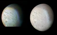
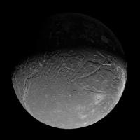
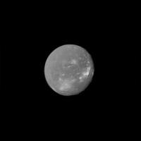
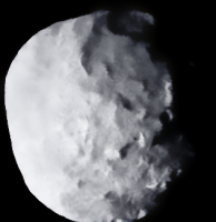
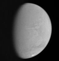
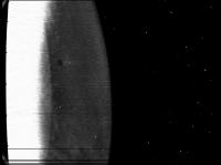
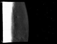
I figure that it is time for another thread like this. I still find it astonishing to see the versions of a lot of images that are reproduced over and over again. For example, this is the last mosaic of Triton taken before the close encounter began. The version on the Planetary Photojournal is on the left, my version on the right. Clearly, this image was produced as part of the "instant science" campaign. They did a superb job getting images to the public in a speedy manner, but they are extremely rough, since the team was busy running the spacecraft. However, it is this version that keeps being recycled. Worse, the version on the photojournal is clearly scanned from a printed copy, causing further degradation.
|
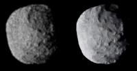
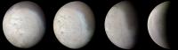
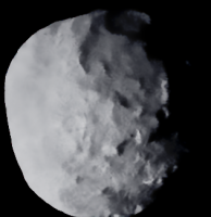
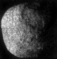
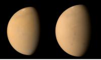
Here is a similar comparison, this time using Proteus (still 1989N-1 on the Planetary Photojournal!).
|
This discussion started in the thread about Viking crescents but was getting off topic, so I thought I would start a new thread here.
Posted by: Decepticon Aug 30 2008, 01:17 AM
WOW! Love it.
More!
Posted by: Juramike Aug 30 2008, 02:21 AM
Got any tips or tutorials with before and after pix?
I've been trying to work with the MEX VMC images and have found it pretty rough going.
(I got adjustment layers and other stuff all over the place).
-Mike
Posted by: ElkGroveDan Aug 30 2008, 02:23 AM
I can't get enough of this kind of thing. Thank you.
What is the source of your Triton data Ted as compared to the scanned print you are comparing it to?
Posted by: CAP-Team Aug 30 2008, 07:16 AM
Wow that Proteus result is stunning! So much sharper and much more detailed!
Posted by: Stefan Aug 30 2008, 02:34 PM

Ted, let me first say that I greatly enjoy and admire your work. But I wonder why sometimes it has a bit of a "painted" look (it's almost as if I see "brush strokes"). You can see it clearly in your Borrelly image (saw that one on Emily's blog), and also here on Proteus. Here I actually prefer the original Proteus image on the left, which I think is closer to what I would see with my own eyes. How do you achieve this effect, and are you convinced that all the detail on the right is "real"?
Love your Triton image!
Stefan.
Posted by: tedstryk Aug 31 2008, 10:56 PM
Love your Triton image!
Stefan.
The painted look is from severely underexposed raw data. As a result, high contrast detail is sharp, low contrast detail is not, and is sometimes lost entirely. I am on vacation, but I have a sequence of Proteus that I will post when I get home that shows the Protean features rotating, confirming that they are real. The version on the left hides the problem by blurring the image, but the high contrast fine detail is wiped out in the process.
In the case of Borrelly images (and also in the case of out of focus images), a similar problem is created by desmearing.
ElkGroveDan, I make these from the raw frames on the PDS. The "official" versions came from the Planetary Photojournal.
Posted by: chiron Sep 1 2008, 05:39 PM
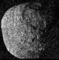
Hi Ted
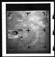
I have to agree what Stefan says. I think the normal Images does not contain so much detail. Its easy to say it for Proteus, since there is only one image where this moon is bigger on an image than about 100-150 pixels. Its the frame number C1138920.
A simply Conversion of the PDS Data to the png format without any change is here:
http://www.bernd-leitenberger.de/download/C1138920.png
Proteous is very dark, nearly at the same level as the background, therefore you have much noise on the picture. The planetary photojourna made out of this noise structures and your pictures made much more details out of it - but i think they are not in the original image.
I think you should test your method and validate the results. You can do this by example, if you use the same method with an old viking or mariner 9 image and compare it with an image with better resolution by mex or you work on voyager iamge of the moons of saturn and compare with an cassini image. Without validation, that you really show hidden details and not create only new details from noise, the images are nice to watch but scientific worthless.
|
Posted by: tedstryk Sep 1 2008, 06:57 PM
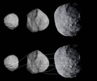
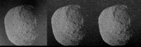
Here is an example of the sequence.. Chirin, the image you posted is not calibrated. I tested my methods extensively using Voyager Saturn data since I had Cassini data to verify accuracy. The detail is very consistent. I wasn't confident of it until I saw the features in the second closest set, which is a multi-frame sequence that I could stack to reduce noise.
|
Here is the full sequence (Plus Larrissa at the upper left).
|
Posted by: tasp Sep 1 2008, 07:37 PM
Would another means of validating the image be to plausibly explain the 'brushstrokes' as expected surface wrinklage froman object on cusp of being sufficiently massive to spherize itself ??
My first reaction to the 'brushstrokes' was along those lines, but since it has come up as possibly an artifact, well, we need to discuss them. I still think they are plausibly an expected surface feature on an object in the Proteus size/temperature/composition orbiting close to Neptune, but I am eager to hear what others think they are.
I recall the picture being deliberately underexposed as the capabilities of Voyager II to implement the image motion compensation at the time the picture was shot wasn't feasible, hence to get an unblurred picture, they had to shoot a quick exposure.
I was not aware a series of images were taken of Proteus, nice surprise and a big 'attaboy' for having them here for us!
Posted by: Stefan Sep 1 2008, 08:38 PM
Now, I have not worked with Voyager images, and unfortunately lack the time to dive into that. So I simply took that raw GIF image and carefully stretched it:
|
I also inspected the intensity profile across the moon and noticed that any "detail" on the left side of Proteus is of the same order as the noise in the adjacent dark space. Now I'm sure that careful dark current subtraction and flat fielding will extract more detail from this image, and I would be eager to see the intermediate results.
The middle, stacked image looks perfectly natural, and I trust all detail to be real. The image on the right, however... from what I see in the raw image I suspect that most of the fine details on the left side of the moon are artifacts. Did you apply some sort of sharpening algorithm or (I hesitate to use the word) deconvolution?
Stefan.
Posted by: tedstryk Sep 1 2008, 09:28 PM
If you notice, there aren't interpretable features on the left side except at the very top. There are tantalizing hints, but much less can be seen.
Tasp, it is pretty straightforward. When you process an underexposed image, when you deconvolve an out of focus image, or when you desmear an image, high contrast details are recovered but low contrast ones that are simply not in the data are lost. Hence, high contrast detail is sharp, and low contrast detail is lost. Add to that the fact that in some cases, particularly when you are dealing with an underexposed image, some lower contrast detail can be recovered by binning it 2x2 or even 4x4. However, binning costs spacial resolution. Hence, lower contrast details that are recovered appear amorphous when compared to the high contrast details. That is why the limb looks sharp, as does the area where the illumination angle makes for nice shadows. However, the features look amorphous on the left side because there are no high-contrast features (in other words, no shadows). That is what creates that brush-stroke like effect.
Posted by: tedstryk Sep 1 2008, 09:40 PM
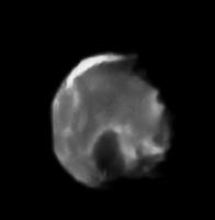
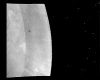
Here is an example of a mosaic that combines a lot of things. The lower part of the mosaic uses nice, sharp frames. The portions toward the terminator are from two smeared frames. The one on the left-hand side is severely smeared. The brush-strokey texture begins to emerge. The night side regions, being severely underexposed, are affected even more. This mosaic, especially the nightside coverage, was very well received at this year's LPSC.
|
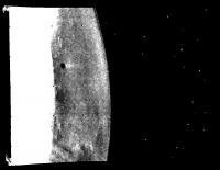
This set, in some places a stack of four images although not all images cover the whole limb or to the top, 4x4 binning was required to bring out the unlit areas which, just like in the above case, were blended back into the image but look much blurrier (in this case, even the limb wasn't detectable without binning. Hence, it isn't sharp either.
|
Here is a more distant view showing more territory.
|

|
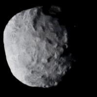
Posted by: tedstryk Sep 1 2008, 10:14 PM
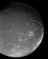
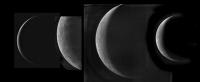
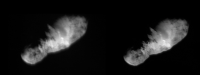
More related to my original post, here is the Triton approach sequence I put together. The upper quarter or so of the last image is reprojected from earlier frames as it was clipped. Some of the sets are underexposed, which leads to some of the effects discussed earlier.
|
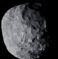
I am presently working on the receding views.
Here are some of them in progress.
|
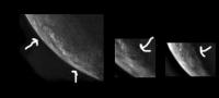
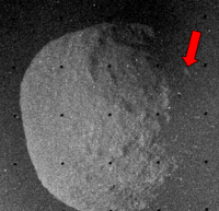
Also, here is an extract with an apparent crater in three of the images (lower arrow in the first image, only arrow in the other images). There is also a strange, spiral feature marked with the upper arrow in the first image.
|
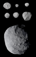
Also, here are some Saturnian shots.
Enceladus (best OGV shot)
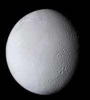
|
Highest resolution mosaic
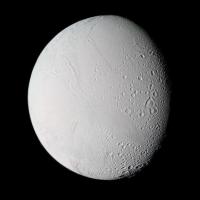
|
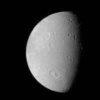
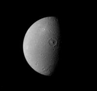
Dione - second highest resolution view (Voyager 1)
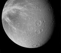
|
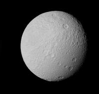
Highest resolution mosaic.
|
Voyager 2
|
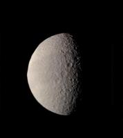
Tethys Voyager 1
|
Voyager 2
|
Posted by: ugordan Sep 2 2008, 08:07 AM
Great work, Ted! I especially like the Triton color sequence. It's a fascinating moon.
Posted by: tedstryk Sep 2 2008, 09:51 AM
Thanks. I eventually hope to do more of the images, both before and after closest approach.
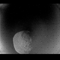
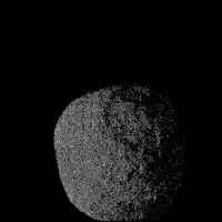
Posted by: Stefan Sep 2 2008, 09:53 AM
Back to the Proteus image... I did some "poor man's dark correction" by subtracting the average of images C1241506 and C1241758 from C1138920 and removed the reseaus. I got the following result:
|
At left the raw image, in the center the raw minus dark, at right a median filtered version of the center image. All images are stretched (the center and right images by the same amount). If you smooth the right image it would look very much like the official version from the Planetary Photojournal. Ted, I do not see any of the subtle features visible on the left side of your Proteus, and I am now convinced your method introduces artifacts (the "brush strokes") on single, underexposed images like this one. I still prefer the official version of Proteus, although on that one details on the left side are not real either (amplified noise).
One more thing. The images shows very clearly an illuminated feature on the right (dark) side of Proteus:
|
This must be part of the moon (i.e. the far rim of the big crater), but does not show up in any version I have seen so far! One must be careful when forcing "empty" space to be black.
Stefan.
Posted by: tedstryk Sep 2 2008, 11:11 AM
It is there, and I have brightened it in this version. It may have been lost in the 16-to-8 bit conversion. I have stretched it in this version. Stefan, you have every right to your opinion, but beyond some faint light and dark features, I am not sure what features are on the left part of my version of the image. All I see is a small, faint possible crater in the center and a long dark albedo feature stretching across the disk from top to bottom (has been interpreted as groves, but that is a guess). Given how well the features matched up in the common areas between the images, I decided not to suppress other little mottlings in the limb area any more than I would the overlapping areas. Stefan, what is frustrating is that you are not responding at all to my explanation of how I did it.
|
Here is a slightly earlier version, before I attempted to reconstruct the gamma curve. Stefan, the fact of the matter is that your averaged version kills the sharp, high contrast details. I have preserved them, while binning data to pull a bit more out of the images. You don't actually know that the how much of the left-hand detail is amplified noise and how much of it is detail right on the threshold of detection - that is why I chose not to wipe it out. It is also before reconstructed the bottom tip.
|
One more thing...Stefan, I have explained the effect you describe as brush stroking.
Posted by: djellison Sep 2 2008, 11:27 AM
I would agree - Stefan, you're not reading what Ted has posted in response to your initial scepticism and doubts. To be honest, my patience would have evaporated long ago.
Posted by: tedstryk Sep 2 2008, 12:02 PM
This is another image that I find interesting. I have always wondered why some areas, even under low solar illumination, look very smooth on a fine scale, while some areas do not. I had always faulted the image data, but given the smoothness of portions of some of the small Saturnian moons, I have come to question that.
|
Posted by: Stefan Sep 2 2008, 02:28 PM
This discussion is obviously going in the wrong direction, so this will be my last contribution.
Doug, I do not understand why you interfere. In science, scepticism and doubt are accepted, and often lead to more understanding, sometimes on both sides. I was interested in discussing one aspect of Ted's work, and I believe I did this in a respectful manner.
You are right, I see it now. It is almost invisible on my TFT monitor, and perhaps even my eye rejected it automatically as a dust speck.
That is the point: I do not know how you got from the raw image to the end product, and I do not get the story from your posts. Binning? Smoothing? How do you treat empty space? You say that my averaged version (I presume you refer to the median filtered one) kills contrast details. True, but it also kills some noise. Binning is a form of averaging, so you kill contrast details too. And you preserve some noise. I believe these are all worthy topics for discussion, and I regret frustration has crept in.
I was interested in discussing your approach. How can I agree that your Proteus image is an improvement over the original version if I do not understand what you did? These images are so important, they will be the only ones for a very long time.
Stefan.
Posted by: Tayfun Öner Sep 2 2008, 02:48 PM
I must agree with Stefan's skepticism. Ted's images have been bothering me for sometime. I do not want to offend him as I admire his work and enthusiasm, but Ted, as I have told you in our private conversation it is sometimes better to leave the noise removal to the human brain. Your method removes real information from well exposed images and adds non-existant information to noisy ones and it could be misleading for people outside this forum. Your images are already great without noise removal.
Posted by: tedstryk Sep 2 2008, 05:11 PM
Stefan, I discussed this earlier in the thread, but I will add that I convert the images to 16-bit before binning to reduce damage.
Tayfun, the Mariner 6 and 7 images are a very different breed in there are some areas of the images that are totally saturated in analog and are therefore only available in the undersampled digital format, which makes part of the images better than others. I think that is what you are getting at there, but if not, I would appreciate your showing me (I am not saying that to be sarcastic - I literally mean it, I respect your work and knowledge, and I would like your input). However, on some images, there is the fact dealing with desmeared/deconvoluted and underexposed images can lead to a sort of terracing effect is something I have worked to find ways to get rid of that did not wipe out the high contrast details as well. As a result, low contrast features are less distinct than high contrast features. I never thought of someone thinking this is real.
Posted by: Tayfun Öner Sep 2 2008, 06:10 PM
Ted, let's take your Proteus image as an example, due to its low DN values and high noise ratio there is a mathematical limit to the information that this image can hold. When I look at the NASA version my brain realizes that this is a noisy picture and interprets it accordingly. When I look at your version which looks perfect and as if taken under ideal conditions, my brain interprets all the details as real and that is the problem. Not only the real craters, but also any chance alignment of light and dark pixels looks like real features.
Also some of the real information that our brains would have no difficulty seeing it from the noisy background is also lost in the softening process. Try removing noise from Cassini SAR images, you will not be able to see many of the fine details.
This is a little bit like restoring historical artefacts to the limit that will make them look newly made. You will both lose information and add false information at the same time. Maybe you can make the noise removal only at the last stage of your processing workflow and display two versions.
Posted by: tedstryk Sep 2 2008, 06:21 PM
Are you referring to the smallscale 'features" on the left side? Perhaps because I dealt with them all the way through, I never really thought of them as looking like real features. Perhaps this is why when I was debating this with Stefan, he kept mentioning the features on the lower left side of the image and my reply was always to the effect of "what features on the left side of the image?"
Posted by: Tayfun Öner Sep 2 2008, 06:47 PM
Yes I am, I have no problem with the features that you have identified.
Posted by: tedstryk Sep 2 2008, 07:58 PM
This is an alternate take in which I tried to wipe that out, but it never looked quite right.
|
Edit: Here is a slightly improved version.
|
Posted by: tedstryk Sep 2 2008, 09:53 PM
Here is my Borrelly image at its original size. The other version was made to enlarge well for a size comparison Emily was doing. Both original frames for this image are smeared, which also creates some effects. This is the image at 133% of its original size. The left hand side is raw, the right hand side is my version before I worked to make it bigger for the comparison image. The right hand image has a partial overlay from the next closest image to reduce noise.
|
Posted by: 4th rock from the sun Sep 2 2008, 10:08 PM
Hi,
Just my small contribution to this topic. Here's a quick processing of the Proteus image. I was completelly conservative on appliying gausian blur filters to reduce noise and levels adjustment. There's some cliping of the darkest parts of the image in an atempt to reduce uncertain details at high noise levels.
The general details visible on Ted's images are present, and a hint of the finer ones.
I think that the issue here is the balance between further processing and the introduction of processing artifacts. It's a complicated decision and is related to image scale and sampling. 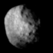
Posted by: elakdawalla Sep 2 2008, 10:29 PM
I think it's fascinating to see a comparison of the results of different people's efforts to process a single image, especially one of such marginal quality but such great significance as this one shot of Proteus (honestly, when does anybody think we'll get another chance to look at Proteus?) You each have a slightly different approach and a range of goals, as well as a range of willingnesses to accept the possible introduction of artifacts in order to generate a pleasing product. Yet all the approaches appear to be systematic (in that they should be reproducible -- no actual subjective painting, for instance). Anybody else want to try? 
--Emily
Posted by: PDP8E Sep 2 2008, 10:46 PM
Emily,
I'll give it a shot !! (and thanks for throwing down the velvet gauntlet)
(designing non-linear programs for noise reduction and focus is my preferred way to relax!)
Ted <wizard!> where would a humble programmer obtain the calibrated source images of Proteus?
stay tuned
Posted by: elakdawalla Sep 2 2008, 11:18 PM
In the spirit of teaching a man to fish...
http://old-pds-rings.seti.org/catalog/vgriss.html
Select "PROTEUS" from the dropdown menu in the Neptune targets line, and I recommend you select "detailed" from the "Listing type" dropdown menu under the Query Results header at the bottom of the page, and also ask to see preview gifs. I get 42 records returned; you'll need to go back to the query form and tell it to skip the first 32 records to see the image you're after. (Alternatively, here's http://old-pds-rings.seti.org/volumes/VG_0011/1989N1/C1138920.IMQ, which you can convert from PDS format using IMG2PNG or NASAView.)
These data are pretty raw. The rings node is working on developing calibrated and geometrically corrected Voyager data sets, but to date they have only done so for Uranus and Saturn, and even those data sets aren't quite through peer review yet.
--Emily
Posted by: tedstryk Sep 3 2008, 12:01 AM
I'll give it a shot !! (and thanks for throwing down the velvet gauntlet)
(designing non-linear programs for noise reduction and focus is my preferred way to relax!)
Ted <wizard!> where would a humble programmer obtain the calibrated source images of Proteus?
stay tuned
I am not sure what you are asking. If you are asking for mine, I will post it.
Edit: I have posted my version in my post after the next one.
Posted by: tedstryk Sep 3 2008, 12:04 AM
Just my small contribution to this topic. Here's a quick processing of the Proteus image. I was completelly conservative on appliying gausian blur filters to reduce noise and levels adjustment. There's some cliping of the darkest parts of the image in an atempt to reduce uncertain details at high noise levels.
The general details visible on Ted's images are present, and a hint of the finer ones.
I think that the issue here is the balance between further processing and the introduction of processing artifacts. It's a complicated decision and is related to image scale and sampling.
4throck, what I have basically done is combined that with the sharp high contrast features (such as the limb and terminator features) that did not require any blur to make clear.
Posted by: tedstryk Sep 3 2008, 01:05 AM
Here is my calibrated base. Keep in mind that in this version, the sections of the Proteus frame that were not transmitted look awkward due to the fact that they were filled in with pure black on the PDS raw image.

|
Posted by: tedstryk Sep 6 2008, 09:53 PM
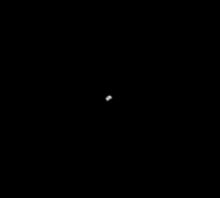
Here is another image that is shown in a very odd form, the HST Venus image. First of all, it is given a garish false color. Second, its contrast is stretched beyond reason, creating a false crescent.
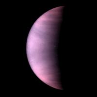
|
I have avoided colorizing the image, and left a more appropriate curve while enhancing the UV details.
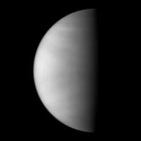
|
Posted by: tasp Sep 7 2008, 01:15 AM
If this suggestion involves much work, my apologies, but if it is just some click and drags (and no one has tried this yet) go for it;
would it help to verify an image processing technique to try it on, for instance, a Voyager Encedalus image, and then compare the enhancement to a subsequent Cassini image of the same area ??
If a particular technique makes particular details stand out in a Voyager image that are verified in a Cassini image, then perhaps if the same were done to, for example, a Voyager Uranus Puck image, then we might have some expectation the technique is worthwhile.
I might then suggest using the technique on some Cassini images . . .
(heh, heh)
Posted by: tedstryk Sep 7 2008, 02:34 AM
The data issues with those are totally different. tasp, I find your snide "if it involves too much work" comment interesting....why don't you do it if it is so easy?  There isn't a dataset out there (to my knowledge) like the Proteus image. So sharp, so close, and yet so underexposed. The fact that the major features all corresponded to the other images is good enough for me. I realize that noise is still a factor, but my position versus Tayfun Oner's is basically one of being willing to leave salt and peppering noise to cue a viewer that the picture is noisy or create a clean looking product that might lead an uninformed viewer to mistake noise for a real feature. When I am trying to make pretty pictures, the later is my choice. I would be much more careful if I was working on an image for scientific purposes, such as on my work with Ariel.
Posted by: tasp Sep 7 2008, 03:37 PM
I have no way of knowing how much effort is involved in processing an image once a technique is developed. I have (don't laugh) HP image Zone on my PC and you just select a picture and click various settings on it and view the result. I am sure all of you are doing things much more advanced than that, and I have absolutely no idea how much effort is involved in restoring a particular picture once you have written some software to do it, nor could I have any idea unless specifically informed about a specific process.
I did not want to have anyone go to a lot of effort on one of my suggestions, but if it is easy to do, like I said, go for it. Don't anyone put themselves out on my account. I would never request someone put hours into trying out something I came up with, but if it s just a few seconds operation involving a click and drag, why not give it a try ?
Was not trying to be snide (just skirting topic of how dumb I am in regards to how computer image processing works) so apologies if that is how it came across.
Posted by: PDP8E Sep 18 2008, 01:53 AM
Well....it has been about 2 weeks...two weddings, one funeral, one tropical storm, and the start of school again...but I did promise I would take a swing at the Proteus image.
First, my congrats go to Ted and the NASA people who have tried to work with this image. There are only a half dozen or so of actual DNs in the image. I took each DN level and processed it and then merged them. The eastern limb is a WAG ( wild a** guess) but there are faint impressions of a crater in the northwest and an elongated crater, centered in the due west bright area.
Warning: for obvious reasons, this is a highly processed image.....your mileage may vary...
(thanks to Emily for teaching an old angler to fish, and Ted for someone to aspire too!)
|
Posted by: tedstryk Sep 18 2008, 03:13 AM
One thing that I wanted to emphasize. The thing that bothers me about the NASA version is that it is a quick-n-dirty from right after the encounter. There are better versions from the science teams of this and a lot of these images.
Posted by: jekbradbury Sep 19 2008, 12:39 AM
I decided to take a look at the Proteus image as well. My goal when processing these is aesthetic in nature: create an image that looks like a moon, not a flat bumpy rectangular thing. The main difference between this image and better images is in the frequency histogram, aka the Fourier Transform. Correct that, and the image looks a lot more real. Therefore, the main operation I used was a low-pass filter to enhance the feeling of sphericalness and decrease noise, all while keeping enough small-scale details. Below is an animated gif showing three steps: a stretched, dereseaued, and deposterized (is that a word?) version of Ted's calibrated base, a sharpened and medium-pass enhanced version of the base, and the final product.
|
Below is an upscaled (SmartEdge algorithm) version.
|
Posted by: 4th rock from the sun Feb 3 2009, 06:13 PM
Hi all,
I wrote a small program in Actionscript 3 (Flash) that performs linear interpolation to 8 bits on images with low bit levels originally. It's very basic and only works in one axis, but i can get around that simply rotating the original image 90º and averaging the results with the non rotated interpolation.
I tried it on the Voyager 2 Proteus image discussed in earlier posts. I must say I like the results.
The raw image was histogram stretched and cleaned of noise before interpolation. The interpolated image was then processed in Photoshop.
What I got is the image bellow. 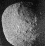
Any ideas regarding other good images to test the program, besides the Viking sunset/sunrise images that I've already thought about?
Posted by: tedstryk Feb 4 2009, 02:46 AM
That looks like a good result, but could you explain your use of "interpolated." Usually it is used to remove missing lines and pixels, but I am assuming this is used to reduce the "stair-stepping" effect. Am I correct?
Posted by: 4th rock from the sun Feb 4 2009, 11:13 AM
"I am assuming this is used to reduce the "stair-stepping" effect."
Yes, that's it. I'll try to explain better:
Let's imagine that he have an image with pixel values, along a row, something like this:
100 110 110 110 120 120 110 100
What the program does is reading each pixel value and counting for how many pixels is that value the same as the previous pixel.
It's just like saying, in common language: there are 3 pixels in a row with a value of 110, and then the next pixel's value is 120.
Then the program divides the total pixel value difference (in this example 120-110=10 levels) by the amount of pixel the value stayed the same (3 pixels).
These 3 pixels with the same value are then replaced by a gradient (110 113 116).
So the resulting image data would be something like:
100 110 113 116 120 120 110 100
Hope this makes things a little clearer. I've tried it on the viking images, and it does give a smooth sky, but noise creates artifacts. So i need more time to optimize the code and try to ignore level changes due to isolated pixels.
Posted by: ugordan Feb 4 2009, 11:48 AM
So it's something similar to deblocking algorithms for MPEG video decoders. It's somewhat of a black art - you ignore too many "isolated" noise pixels and all of a sudden you realize you're starting to destroy valid details too...
EDIT: That sort of thing could be helpful with problems described in http://www.unmannedspaceflight.com/index.php?showtopic=5777, namely color banding after massively enlarging a Titan image. If done with 16 bit color, dithering down to 8 bits could remove the banding effects.
Posted by: tedstryk Feb 17 2009, 09:53 PM
I have completed the Mariner-7 Meridiani mosaic. Please note that due to the nature of the images, certain portions of each frame are better than other areas. The first set is the complete black and white mosaic. The second set is a combination of RGB color with two color (red-blue with green synthesized by averaging the two and green-blue with red synthesized by altering green images to resemble red). The images were then tweaked to minimize differences stemming from different filter sampling. The right hand image is the RGB image. Please note that the "Red" is more of a far orange than a true red. While the wide angle cameras on Mariner 6 and 7 constantly cycled through their filters, this is the only mosaic (other than late far encounter data) in which there is significant overlapping colors.
|
Posted by: dvandorn Feb 18 2009, 01:37 AM
Ted -- is it true that Endeavour Crater is resolved in these mosaics?
-the other Doug
Posted by: mhoward Feb 18 2009, 01:51 AM
I can see a slight darkening where Endeavour is, I think. The craters in the neighborhood which are either slightly larger or more distinct all show up quite well.
It's a great view.
Posted by: tedstryk Feb 18 2009, 02:36 AM
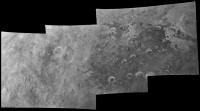
Yes, it is a barely detectable smudge. However, while the Mariner 7 view is in my estimation prettier, Mariner 6 got a better view of this region and it is much clear in this mosaic.
|
Posted by: Phil Stooke Feb 18 2009, 07:58 PM
Yes, the trio of craters, with Endeavour at the north end, is clearly visible.
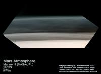
Here's another historic image:
|
It's a Mariner 9 image of Mars taken during approach. The planet is covered in a rover-killing dust storm (good job there were no rovers present at the time). Contrast enhancement has revealed the Valles Marineris full of dust. The south polar cap is visible as well as a few other features. Doesn't it look like Titan?
Phil
Posted by: tedstryk Feb 18 2009, 09:29 PM
Yes, it does, especially in color. The image on the left is a true tri-color, the image on the right is only colorized.
|
Posted by: vk3ukf May 23 2009, 11:16 PM
Hi, thanks for these pics, love them.
I had to have a go at an oldie myself.
I know its been done before.
What do you think?
http://www.vk3ukf.com/Mars/Mariner/Mariner4Redone_page_01.htm
Posted by: tedstryk May 24 2009, 02:45 AM
What did you use as your data source?
Posted by: vk3ukf May 24 2009, 09:35 AM
The sources were all from the net from various places, I was trying to find all the Mariner 4 frames, which I eventually all found on a NASA cd somewhere, but prior to that, there were a few versions of the same image at various websites on my PC, I didn't know which was the original until I went to NASA and got the lot. Anyway, the other versions, perhaps one from one of your own sites, if you have done this before, were different contrast levels, one was bw way stretched, to see the max extent of the atmosphere.
The filenames weren't changed much, MA4-01e.gif become MA4-01d.gif on another example and a MA4-01h.gif as well.
So I played around with making different bands from the one image, using the contrast levels to separate them.
I used a mix of the different contrast versions from various paces on the web, I'm sorry, I can't remember from where, and the original image MA4-01e.gif from NASA.
edit:
I had a look around the hd and found,
The original NASA filename is Ma4-01E.gif
The high contrast version is m04_01h.gif, it's a bit different. ? a replaced with 0.
Did a google search for m04_01h.gif
Found it and m04_01d.gif at
http://library.thinkquest.org/19455/mariner_4_image_gallery.htm
and looking at it, I have no idea how they got that from the original.
There isn't any detail about how the images were made.
Perhaps the person that made it, did it from a print out of the original numbers.
Do those files of the numbers for the images exist anywhere accessible to the public.
It would be like having a RAW file.
All I had to play with is the NASA gif and what I found elsewhere.
I found another image the same as m04_01d.gif
It is named nssdc_MR_Mrnr_m04_01d.gif
Well, whomever did the job on those numbers did it pretty good, (drool)
Google could not find a nssdc_MR_Mrnr_m04_01d.gif nor a nssdc_MR_Mrnr_m04_01h.gif
I have no idea where nssdc_MR_Mrnr_m04_01d.gif came from. But it is the same image as m04_01d.gif from thinkquest.
I'll try and reproduce what I did.
Edit again:
I put all the images I found on the same page as the colour pic.
http://www.vk3ukf.com/Mars/Mariner/Mariner4Redone_page_01.htm
Posted by: tedstryk May 24 2009, 12:17 PM
I think they come from http://nssdc.gsfc.nasa.gov/imgcat/html/object_page/m04_01d.html
Posted by: vk3ukf May 24 2009, 12:36 PM
Yes, that's the d version alright, the h version looks like a top end stretch of the numbers, a variation of 1 in brightness stretched in that area.
I recently found python code, had a go and made a XP gui for Bill Allen's PDS *.img file display, save and header scripts.
I found that manipulating images in python is easier than using delphi 7, but I still need delphi for the gui.
I liked the LIDAR imaging, if you played those in a movie, is it like a waterfall display, such as I have seen on some audio and HAM software.
Edit: thanks for the URL, I updated the references.
So what did I make?, is it a good mix or a bit of a furphy?
Posted by: peter59 May 24 2009, 03:56 PM
Picture #1
|
Image source:
NSSDC - 35 mm microfilm
Used scanner:
Drum scanner - CROSFIELD CELSIS 6250 CASC
|
Used scanner:
Drum scanner - CROSFIELD CELSIS 6250 CASC
Processing:
Image - scanned, contrasted and blurred
Inset - original digital data with contrast enhancement factor four
Picture #11
|
Inset - original digital data.
Posted by: vk3ukf May 27 2009, 06:42 PM
Hi Peter59,
nice images.
A 35mm film archive. Can these still be obtained?
Are they consisting of each image processed in several different ways?
Is this the original archive of all image data products from the spacecraft data?
Posted by: jasedm Jun 30 2009, 08:12 PM
Not strictly reprocessing, more updating...
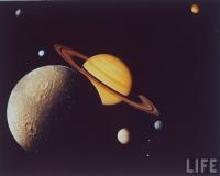
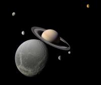
I recently stumbled across the familiar Voyager montage of Saturn and selected moons that was almost omnipresent in periodicals and textbooks in the early eighties (very nostalgic!)
Attached are the original, and my updated version using Cassini data.
|
|
Posted by: Stu Jun 30 2009, 10:03 PM
Genius! Love it!
Posted by: lyford Jul 1 2009, 12:58 AM
Very cool! 
Posted by: tedstryk Aug 13 2009, 05:22 PM
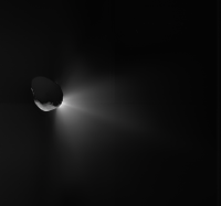
I've been fooling around with some really convoluted stuff lately. Here is an image of Comet Tempel-1 I have been working on.
|
Also, here is Toutatis from Hubble (WFPC/1). You can make out that it is elongated and maybe two lobes, which is about what was described in the paper written about the observation. However, I have never seen a cosmetically "nice" version, which is why I fooled with it a bit.
|
Posted by: Stu Aug 13 2009, 05:41 PM
Very nice... that's the kind of thing I was expecting to see on the BBC's coverage of Giotto's Halley's Comet fly-by in 1986, not that psychedelic, migraine-inducing... thing... they actually showed! I know now it was a false colour image, and very exciting scientifically, but at the time I was gutted, and very embarrassed by the "Is that IT?" reaction from my family, who I'd told to gather around the TV with me to see the "amazing" and "historic" pictures of Halley's Comet...
Posted by: Phil Stooke Aug 13 2009, 06:59 PM
Fantastic, as usual, Ted. The Tempel 1 departure view leads me to wonder, do the earliest approach views look any different from the closeup images? Any visible rotation?
Phil
(PS I'm looking at Icarus...)
Posted by: tedstryk Aug 13 2009, 10:07 PM
I would have to look more carefully...I am tempted to say yes, but it is easy to be fooled by spacecraft motion.
Posted by: Stu Sep 10 2009, 09:17 PM
He'll be far too modest to plug it himself, so I'll point you all towards Ted's relaunched blog... http://planetimages.blogspot.com where you will find some truly stunning images. The "new views" of Ganymede are breathtaking - it's like watching images come in from a probe sent to an alien solar system, and seeing one of its worlds for the first time.
Go. Look. And shake your heads in wonder...
Posted by: tedstryk Sep 12 2009, 03:34 AM
I have added some updated versions of Galileo's global crescent views from 1997.
http://planetimages.blogspot.com/2009/09/despite-its-antenna-problems-galileo.html
|
Posted by: machi Nov 8 2009, 08:04 PM
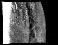
Hello
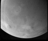
I send some mosaics from Mariner 9. And so it is uploading test .
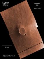
|
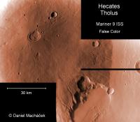
|
Posted by: 4th rock from the sun Nov 9 2009, 10:34 AM
Nice Mariner 9 images, really smooth. Good work.
Posted by: tedstryk Nov 9 2009, 05:02 PM
Nice work!
Posted by: machi Nov 10 2009, 08:30 PM
Thanks!
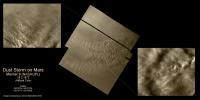
Now for something completely different from Mariner 9.
|
Posted by: cbcnasa Nov 11 2009, 12:32 AM
Machi very excellent work
Posted by: machi Nov 11 2009, 11:14 AM
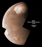
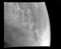
Global mosaic from Mariner 9. Recent work.
|
Posted by: ugordan Nov 11 2009, 11:54 AM
How much enhanced/processed is that image? Because it looks so spectacularly unreal!
Posted by: machi Nov 11 2009, 01:02 PM
I send one original image from Mariner 9 (mosaic is from three images), so you can compare original and result.
Images are improved so, that I'm trying preserve original usefull information and remove noise and reseau marks. Especially in widefield Mariner 9 images is problem with horizontal errors. Color is entirely artificial, just for better look.
|
Posted by: ElkGroveDan Nov 11 2009, 02:09 PM
What is your source for the raw data? The one above looks much better than any scan of a print I've seen.
Posted by: machi Nov 11 2009, 02:21 PM
My personal archive is converted from http://pds-imaging.jpl.nasa.gov/Admin/resources/cd_m71.html#m71EDR by img2png (thanks to Bjorn Jonsson and PDS!) to png.
Posted by: ElkGroveDan Nov 11 2009, 02:49 PM
I didn't realize that the data that old was available electronically. Good work. I wish I had the time to try some of that.
Posted by: machi Nov 11 2009, 03:04 PM
I think that these images are oldest electronically available on internet.
Posted by: john_s Nov 11 2009, 09:10 PM
I remember that mosaic well! I think it was on the cover of New Scientist at the time. It was the first ever full-disk (almost) image of another planet which showed dramatically more detail than a telescopic view, so it made a big impression on my 15-year-old self- it made Mars suddenly seem very real. It never looked this good back then though- nice restoration job!
John
Posted by: Phil Stooke Nov 12 2009, 02:47 PM
"I think that these images are oldest electronically available on internet."
No, the digital Mariner 6 and 7 images are available here:
http://ser.sese.asu.edu/M67/mar67.html
Phil
Posted by: machi Nov 12 2009, 03:46 PM
Fantastic! Thank you very much. I didn't know about this.
Posted by: tedstryk Nov 13 2009, 03:26 AM
The Mariner 6-7 images on that site have a few issues, but they are pretty good. If I ever actually have time to work on an image again, I need to finish my Mariner 6 and 7 set. Here is my recent blog post related to this http://planetimages.blogspot.com/2009/09/meridiani-in-1969.html
Posted by: machi Nov 13 2009, 04:09 PM
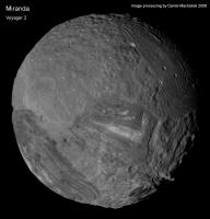
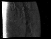
Another variant of Miranda mosaic.
|
Posted by: tedstryk Nov 14 2009, 04:02 AM
Excellent work!
Posted by: machi Nov 14 2009, 08:32 PM
Thanks!
Especially in this case, I have strong inspiration from your images. Your works based on Voyager 2 images are amazing!
Posted by: peter59 Dec 25 2009, 02:00 PM
I have many objections to this web page, image gallery is incomplete and unsystematic. For example, I can not understand why there no picture 6N01. Secondly, images 6N02 and 6N03 (for example) are at different stages of processing. Properly it should look like this, showing the successive stages of processing:
6N01
|
|
|
|
6N02
|
|
|
|
If they are presented only selected images, all images in the gallery should be on the same stage of processing. You can see how great the differences in the various stages of processing.
Posted by: peter59 Dec 25 2009, 02:03 PM
6N03
|
|
|
|
.. and bonus
|
IMAGE 6N3 CAMERA A GRN2 FILTER
MICOR ORTHOGRAPHIC PROJECTION (processed by JPL/IPL)
PROJ CNTR L=671 S=800 LAT=8 S LONG=315 E SCALE=2.311 KM/PXL
Posted by: tedstryk Dec 25 2009, 04:07 PM
Peter, I strongly agree.
Posted by: machi Jan 7 2010, 07:40 AM
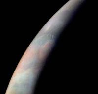
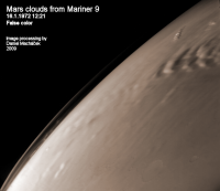
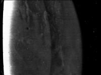
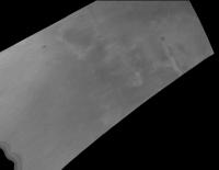
"New" images from Mariner 9.
|
|
Posted by: Bjorn Jonsson Jan 12 2010, 12:39 AM
That first image is great - one of the best images of Mars' limb that I have seen.
Powered by Invision Power Board (http://www.invisionboard.com)
© Invision Power Services (http://www.invisionpower.com)