Emily's KBO diagram, under development and open for discussion |

Emily's KBO diagram, under development and open for discussion |
 Feb 17 2012, 08:49 PM Feb 17 2012, 08:49 PM
Post
#1
|
|
|
Senior Member  Group: Members Posts: 3516 Joined: 4-November 05 From: North Wales Member No.: 542 |
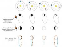
In this post Emily demonstrates an interesting way to depict the movements of Kuiper Belt objects: http://www.planetary.org/blog/article/00003381/
I like this diagram. It reminds me of lissajous figures on an oscilloscope screen in the case where the x and y signals have the same frequency but differing phase relationships. I agree with the idea of reducing the size of the objects' position and direction markers. Perhaps tiny triangles could serve in both capacities by being oriented to point along the 'orbits'. I would like to see Sedna included since the (so far) unique nature of its motion would stand out well. I think its trajectory during at least the second half of the 600 year timespan in question would fit on the diagram. |
 |
 
|
 |
|
Feb 28 2012, 10:00 AM
Post
#2
|
||
|
Member Group: Members Posts: 247 Joined: 17-February 07 From: ESAC, cerca Madrid, Spain. Member No.: 1743 |
I like your diagram, Emily. It just depends who your audience is, I guess. To me, it isn't intuitive. It is really nice, but requires some figuring out. And of course, making something obvious and intuitive is always the hard part. Plus, no single diagram works for everyone, so I could be in a minority. I tried to put here a screen shot of one section of the Venus Express long term planning poster I use. We like to show relative positions using the standard orbit diagrams, Sun centric. It isn't fancy, or even accurate; but it is intuitive.
I was wondering about using a form of the orbit diagram, coupled with the orbit in different colors. One could show the orbits from above, to give you the relative distance from the Sun. To add a second dimension, you could color code the orbit ellipses to show relative distance from the ecliptic. If one used a spectrum, from minus-a-lot degrees through zero degrees to plus-a-lot degrees, going from red to green to blue, you might see more intuitively both how the eccentricity of the orbit changes as well as the distance from the ecliptic. Pair that with a shot of the orbits taken from 'the side', in the ecliptic, showing the relative elevation of the orbits above the ecliptic. The two together, with duplicated information reinforcing each other, might make it more intuitive. I hope the idea is clear. I also hope it isn't stupid. But I'd settle for just clear. Stupid ideas, I have lots of those. -------------------- --
cndwrld@yahoo.com |
|
|
|
|
|
 ngunn Emily's KBO diagram Feb 17 2012, 08:49 PM
 elakdawalla Ooh, the idea of just using triangles to represent... Feb 17 2012, 10:05 PM
 Leither QUOTE (elakdawalla @ Feb 17 2012, 10:05 P... Feb 18 2012, 08:02 PM ngunn One other suggestion. How about replacing heliocen... Feb 18 2012, 04:44 PM Juramike Trying to do the mental gymnastics here, but I thi... Feb 18 2012, 05:07 PM ngunn OK I could have been clearer. I'm suggesting p... Feb 18 2012, 07:07 PM remcook Looks like another fun project!
Perhaps you c... Feb 20 2012, 12:57 PM elakdawalla Today I fiddled around with the most common reques... Feb 21 2012, 05:48 AM Eluchil Thanks for the updated view. It's quite nice.... Feb 27 2012, 03:44 PM vikingmars Emily wrote a very nice article in the last S... Feb 10 2014, 11:48 PM
Leither QUOTE (elakdawalla @ Feb 17 2012, 10:05 P... Feb 18 2012, 08:02 PM ngunn One other suggestion. How about replacing heliocen... Feb 18 2012, 04:44 PM Juramike Trying to do the mental gymnastics here, but I thi... Feb 18 2012, 05:07 PM ngunn OK I could have been clearer. I'm suggesting p... Feb 18 2012, 07:07 PM remcook Looks like another fun project!
Perhaps you c... Feb 20 2012, 12:57 PM elakdawalla Today I fiddled around with the most common reques... Feb 21 2012, 05:48 AM Eluchil Thanks for the updated view. It's quite nice.... Feb 27 2012, 03:44 PM vikingmars Emily wrote a very nice article in the last S... Feb 10 2014, 11:48 PM |

|
Lo-Fi Version | Time is now: 26th April 2024 - 11:41 AM |
|
RULES AND GUIDELINES Please read the Forum Rules and Guidelines before posting. IMAGE COPYRIGHT |
OPINIONS AND MODERATION Opinions expressed on UnmannedSpaceflight.com are those of the individual posters and do not necessarily reflect the opinions of UnmannedSpaceflight.com or The Planetary Society. The all-volunteer UnmannedSpaceflight.com moderation team is wholly independent of The Planetary Society. The Planetary Society has no influence over decisions made by the UnmannedSpaceflight.com moderators. |
SUPPORT THE FORUM Unmannedspaceflight.com is funded by the Planetary Society. Please consider supporting our work and many other projects by donating to the Society or becoming a member. |
|