Printable Version of Topic
Click here to view this topic in its original format
Unmanned Spaceflight.com _ Jupiter _ Reprocessing Galileo Io Images
Posted by: volcanopele Mar 27 2007, 07:59 AM
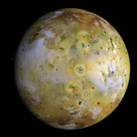
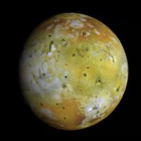
The New Horizons images of Io that have come down over the last month have gotten me interested in Io again, and with Galileo images of Io. So I've decided to go back through and reprocess some of the color views of Io, particularly global views. I will post some of the more interesting ones here with the goal of rebuilding at least some of my Io website to host them in the long term.
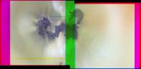
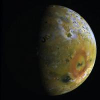
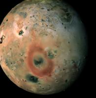
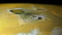
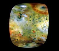
The first view I'd like to present has a bit of a mystery. This is a two-frame, three-color mosaic of the Prometheus volcano from I27. The filters used are violet (in the blue channel), green (in the green channel), and IR-7560 (in the red channel). This mosaic has a resolution of 170 meters per pixel. I'm still working on the color registration (I'm doing all the present processing in Photoshop, so I hope no one minds).
|
Okay, so what's this mystery? Well, as I was attempting registration, I noticed something funny. I noticed this odd rainbow-colored patch to the southwest of Prometheus Patera. When you flip through the individual color frames, as you can see in the animation linked to below, you can see that this feature is actually a dark feature that moves from southeast to northwest from frame to frame. So what is this feature? The frames are separated in time by about 17 seconds. Could it be an optically thick...chunk in the plume? Any other...sane thoughts? Just thought I would throw this up there.
|
Well, I hope to post additional Io images over the next few days.
EDIT: I have uploaded a new version of the Prometheus mosaic and have updated the version in this post.
Posted by: volcanopele Mar 27 2007, 08:44 AM
Here are some random Io images before I head off to bed. I'll post details in the morning.
|
|
|
|
|
|
|
|
Posted by: ugordan Mar 27 2007, 09:35 AM
Regarding the mystery question, it might be a dark plume patch. Are you using calibrated images? If so we can rule out flatfield effects on the CCD especially if the dark feature actually isn't static on the CCD but follows the ground features. I assume parallax effect would be sufficient to explain movement of a high plume here?
Regarding the images, nice composites, are you maybe thinking about producing some "true" color ones? They'd be dull, I know, but I'm always interested in an accurate color look.
You mentioned IOs color showed high phase angle dependency, is this the effect of the much more pronounced bluish (violet?) regions at higher phases, while otherwise it's a more subdued appearance?
Posted by: Bjorn Jonsson Mar 27 2007, 12:21 PM
Io's brightness and color is highly variable with phase angle. There are areas near the equator that appear whitish at low phase angles and much brighter than the areas at higher latitudes. At higher phase angles they get much darker and and appear grayish (they can even get darker than the polar areas). And at least some of the dark/black spots (e.g. Loki Patera) brighten a lot at high phase angles.
I remember a paper in Icarus or JGR several years ago that had rather interesting global maps of Io showing the Henyey-Greenstein g parameter. Many of Io's major albedo/color features were easily recognizable in the maps.
Posted by: JRehling Mar 27 2007, 03:55 PM

I had a sane thought, but it didn't check out. I wondered if it might be the shadow of a smaller jovian satellite moving across in eclipse. Racing to the solar system simulator, I found that Io was on the sunward side of Jupiter at the time of I27, so it couldn't be Metis, Adrastea, Amalthea, or Thebe. The shadow explanation would only work if a small satellite had an orbit between Io and Europa. Not only is no such body known, but I suspect such an orbit would not be stable (?).
So, I've given up on sane ideas; back to the asylum.
Posted by: volcanopele Mar 27 2007, 07:27 PM
Unfortunately I haven't had a chance to calibrate the images. The program I use for that, ISIS, seems to have developed problems with Galileo images since the last time I processed Galileo images (almost 3 years now). However, I fairly confident the dark patch is real, and not a flat field artifact.
In terms of creating "true" color images, I don't really intend on doing that. The filters used don't really support that and I'm not going finagle with the images beyond what I already have done.
Posted by: belleraphon1 Mar 28 2007, 01:48 AM
Beautiful, volanopele!!!!!
Always loved the Prometheus imaging. Correct if I am wrong, but is the plume caused by silicate lava flowing over fields of sulphur dioxide ice dunes and causing them to explode into vapor?
Love the textures of the dunes in this image.... tryng to imagine in my minds eye what it would be like to hike these deposits.... THAT would also make a great visual simulation....
thanks for these ...
Craig
Posted by: PhilHorzempa Mar 28 2007, 03:53 PM
Thank you for those Io images. However, I do recall that
one member of the UMSF had a GIANT image of Io on his website
about a year ago. I do not remember his name. So could he step
forward and post either his web image page address or a link to that
incredible Io image. As I recall, the Io image in question was the one
in which the background is the surface of Jupiter itself.
Another Phil
Posted by: Malmer Mar 30 2007, 04:16 PM
Could be me... I have stitched together one really big one:
http://www.syndicate.se/image/space/io_big.jpg
its not the best processing in the universe but its ok.
one member of the UMSF had a GIANT image of Io on his website
about a year ago. I do not remember his name. So could he step
forward and post either his web image page address or a link to that
incredible Io image. As I recall, the Io image in question was the one
in which the background is the surface of Jupiter itself.
Another Phil
Posted by: MizarKey Mar 30 2007, 04:52 PM
Malmer - that's a sweet image of IO. Thanks for posting that.
Posted by: 4th rock from the sun Mar 30 2007, 05:48 PM
The best approach with these filters would be to create an appropriate color space (something like an extra extra wide-sRGB) and then convert the final balanced result to a normal sRGB JPG. That way proper color hues can be generated, while getting a good approach to the correct saturation. If I can, I'll do it and post the results here.
Posted by: tedstryk Mar 30 2007, 06:35 PM
Why a jpeg? I almost always work in png mode. The problem is that when I process an image, I compulsively go back and rework it at some point. Each time, the jpeging loss would build. Also, I like to work in 16-bit mode - it is more forgiving.
Posted by: 4th rock from the sun Mar 30 2007, 07:40 PM
I mentioned JPG as the format to upload the final image to this forum, for example. While working on a image, I prefer 16bit TIF files 
Posted by: elakdawalla Mar 30 2007, 09:34 PM
Wow.
 That is hard core, but that's clearly a rigorous way to do things. Is this something that you could explain to a moderately educated person (i.e., me) how to do, or does it require software that I'm not likely to have access to? Or, once you had developed your Galileo color space, would you be able to produce a "recipe" of the appropriate proportions to use to mix common sets of available filters to produce approximate true color images?
--Emily
Posted by: volcanopele Mar 30 2007, 09:48 PM
Bjorn has a good write-up on how to create "true" color images of Io:
http://www.mmedia.is/bjj/3dtest/io/index.html
I never really like the results this produces and far prefer my false color images...
Basically, the quick and simple way of doing this is to use "Channel Mixer" in Photoshop, and for the output channel select blue, then set the percentages as 61% Green, 39% Blue.
Posted by: 4th rock from the sun Mar 30 2007, 10:00 PM
Well, you should start by looking into something that's called the sRGB color space. It's a relationship between wavelengths and two X,Y values. Photoshop has a function to define and convert between colorspaces. The best thing is that you can edit the image in it's native color space. This means that once it's defined and applied, a Violet filter image becomes... well, violet on your screen, so you can balance histograms, keeping all the original data while seeing the correct output.
The "magic" of this is that the data that fall outside of our normal visible screen color space are discarded, so false colors are reduced.
The tricky part is to create the Galileo color space. I just find the appropriate XY values from the CIE diagram wavelength line. Some of them (like IR) aren't marked, so there's some guessing involved.
So I don't know if its really 100% accurate, but it's better than simples channel mixing if you are missing a Red or Blue filter.
For Galileo IR756, G and V my XY values are:
gl_IR756 1,00 0,10
gl_g 0,08 0,83
gl_v 0,17 0,01
I've attached the result of this processing to Volcano Pele's image (reduced 50%). The only thing I did after color space conversion was a general histogram manipulation for a general sulfur yellow on the brightest parts as opposed to white.
|
Posted by: JRehling Mar 30 2007, 10:04 PM
http://www.mmedia.is/bjj/3dtest/io/index.html
I never really like the results this produces and far prefer my false color images...
With places like Venus and Uranus (and above-the-haze Titan), it's just obvious that the more informative images aren't true color. So no one confuses the "informative" presentation of the data with the true color one. With Europa or the Moon, it doesn't much matter which wavelength you pick I guess we can say that Io is in between the extremes: a discrepancy is there, but it's less extreme so that the true color might seem like a plausible option for scientific scrutiny.
It seems to me that HST images do a good job of "ground truthing" the true colors. The data set that led to http://www.seds.org/HST/JupiterIo.html image could do a decent job of giving us the answers (ie, mapping the Galileo observations onto the "true" colors). At a decent spatial resolution, anyway.
Posted by: elakdawalla Mar 30 2007, 10:38 PM
gl_IR756 1,00 0,10
gl_g 0,08 0,83
gl_v 0,17 0,01
Cool. I just played with this and before your histogram fudging, the image does look quite a bit more like Bjorn's versions.
One question -- when I tried to set the X and Y values for the red channel to 1 and 0.1 as you specified above, Photoshop told me they couldn't add up to more than 1. (Why not?) Just wanted to check that those were the numbers you meant to write.
And another question -- I don't suppose you have X and Y values handy for Cassini IR1/GRN/UV3? Those are 752 nm, 568 nm, and 338 nm...my guess based on the CIE diagram would be something like:
IR1 0.95 0.05
GRN 0.45 0.55
UV3 0.18 0
Would you concur?
--Emily
Posted by: volcanopele Mar 30 2007, 10:47 PM
Okay, this goes beyond what I know to do in Photoshop. Any pointers on how to make the changes?
Posted by: elakdawalla Mar 30 2007, 11:10 PM
I'm just barely comprehending it myself, but this is a big help:
This is a diagram of the CIE color space (it's also got a line on it showing where a black body at various temperatures, in Kelvin, would plot).
In Photoshop CS2, which is what I have, to make these changes I go to Edit > Color Settings and then under Working Spaces > RGB I selected Custom RGB. Under Primaries, there are boxes where you can plug in the x and y values listed above.
Basically, a color space on your monitor can be described by a mix of three primary colors. The three primary colors that are the default in Photoshop have these values:
red .64 .33
green .3 .6
blue .15 .06
You can see where these plot on the CIE diagram above. The only colors you can get on your monitor are the ones that plot inside the triangle defined by those three spots. Here's a much cruddier diagram showing that: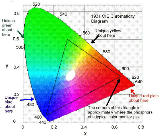
What you're doing by changing the x and y values is to define a new triangle, saying where your three new primaries are on the CIE diagram. (In the case of the infrared channel, it's off the colored-in area; you have to make a guess as to the best spot to pick.) When you convert the image back to sRGB, Photoshop will recalculate the pixel values in the channels to match the sRGB color space.
What I'm not at all sure about is that I'm making these conversions between color spaces happen correctly. There are menu commands in Photoshop saying "Edit > Assign Profile" and "Edit > Convert to Profile" but I'm not sure when to change the profile in the color settings, when to assign, and when to convert. I need to download that full-globe image of Io and see if I can make it look yellow with the regular filter combination and more like Bjorn's with this fancy color space manipulation....
EDIT: 4th rock: I just answered my own question on the values for the red channel. Looking at the first CIE diagram, you can see that the color space is asymptotic to a line with slope -1 tracing from corner to corner across the graph. It appears you can't have points plotting above that line, or in other words the X and Y coordinates must add to less than 1. I'm still not sure why that is, but it seems you have to pick a point below that line.
--Emily
Posted by: djellison Mar 30 2007, 11:10 PM
I thought the same 
Edit > Convert to Profile > Custom RGB...
what Emily said 
I've only just discovered that....I'm thinking it might be a better way to do home-grown L257 to true-ish-colour conversions for MER data than channel mixer..hmmm....
BJORN....HELP
Posted by: elakdawalla Mar 30 2007, 11:24 PM
Can I just comment on how great UMSF is? Where else could I be in an instant conversation with a few of the only other people in the world who actually care about this stuff?
--Emily
Posted by: ugordan Mar 30 2007, 11:29 PM
This is certainly an interesting way to do color, might try that myself. As for x+y being >1, that might be a problem with extreme filters such as IR756 or Cassini's UV filters where their intrinsic "color" can't be fit into the sRGB colorspace. Whether this method would work then I don't know, I'm guessing there would be problems with any filter that has a substantial amount of spectral transmittance outside the visible wavelength range that's integrated through the CIE XYZ matching functions.
I'll try running Cassini IR1, RED, GRN, BL1 and UV3 filter response curves through my VIMS code tomorrow to see if I can get "empirical" values for X and Y.
I'm intrigued about the way color composites will turn out this way. RED, GRN, BL1 and IR1 seem to be pretty well contained inside the 400-800 nm window important for CIE XYZ functions. UV3 is a little iffy, running straight from 300 to 400 nm, but it might be okay too.
Posted by: ugordan Mar 31 2007, 01:04 PM
OK, this probably warrants another thread since it's running a bit off-topic.
Here are the results I got for Cassini's often used narrow-angle filters when I ran their transmittance curves through my color matching code:
----------------
RED 0.627 0.373
GRN 0.435 0.539
BL1 0.135 0.065
IR1 0.731 0.268
UV3 0.171 0.009
This is not necessarily correct and it assumes the D65 whitepoint, so leave that at 6500 K in Photoshop. The numbers above are pretty similar to default sRGB ones, with one exception of GRN X value, which I'll address below.
I haven't yet tried to see what this produces when one uses the IR1/GRN/UV3 combo, but here's the result I got for Enceladus NAC RGB (it's a white body so it's pretty illustrative):
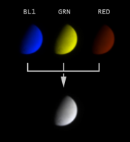
|
The most striking difference w/ respect to classic RGB channels is the "green" filter isn't exactly green. Neither is the red filter all red. The reason to this is these two have a substantial amount of bandpass overlap, 40% I'd say. The fact is nicely shown in this graph:
|
This alone is the reason I'm a bit wary of CICLOPS processing techniques where they stuff 3 RGB filters together and basically call it "natural" color. The fact the green filter is actually yellowish accounts for the unusual X value above.
Note that if you want to get "accurate" color this way, you still need calibrated images that retain physical relationship of relative target brightnesses throughout each filter used. Raw stretched images just don't cut it here.
I'll have to play around with Saturn and Jupiter images a bit, but the results I got so far seem even duller than my usual processing. I'm not entirely sure this is the right way to get accurate colors, but the above results at least show the intrinsic color the filters would look to human eyes.
EDIT: Here are two quick-n-dirty results with this concept:
|
|
Compare to http://ciclops.org/view.php?id=676 and http://ciclops.org/view.php?id=672.
Posted by: PhilHorzempa Mar 31 2007, 04:37 PM
Thank you Malmer for that Big Io image -- that is truly amazing!
I believe that that was the one that I had seen before. You've done
some great work stitching that together and allowing one to "fly" over
the surface of Io. The number and variety of volcanoes on Io is astounding.
Do you have a website with more space images?
Another Phil
Posted by: scalbers Mar 31 2007, 05:54 PM
|
|
|
|
I'll try to look more closely as to whether your two images I'm quoting might improve the lower res areas on my map, say the NE part of Media Regio near 50W longitude. The current version of my map (once the server comes up) is here:
http://laps.noaa.gov/albers/sos/sos.html#IO
A separate idea I'm entertaining is adding in some higher res B&W images of Tvashtar to the existing lower res color.
Posted by: Malmer Mar 31 2007, 10:54 PM
Do you have a website with more space images?
Another Phil
Thanx!
Well, I dont really have a real homepage for my images. But I have this "folder" on my company webpage where i dump space images that are in different states of work in progress to show friends and stuff. Some of the pictures are really cool. the venus pictures are my favorites.
www.syndicate.se/image/space/
the good the bad and the ugly...
please dont link directly to those pictures because they are not intended for a wider audience just yet...
(stupid thing to say on the net i guess...)
Mattias
Posted by: Malmer Mar 31 2007, 11:12 PM
used some data on the NH site to make a slightly more interesting color image.
lowres color from mvic
highres luminance from lorri
|
/M
Posted by: volcanopele Mar 31 2007, 11:31 PM
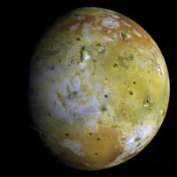
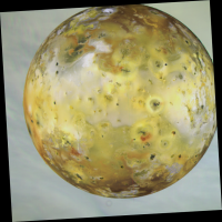
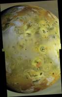
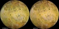
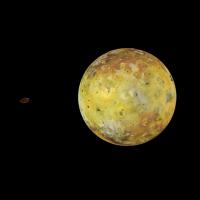
Here are a couple of additional RGV color views of Io:
|
This image is from the 2nd Galileo orbit (G2). This image is composed of a full-frame green filter image and summed red and violet filter images. Compare this image to the press released version of this image: http://photojournal.jpl.nasa.gov/catalog/PIA00494 . This color view was taken on September 7, 1996 from a distance of 486,800 km. This view has a pixel scale of 4.9 km/pixel.
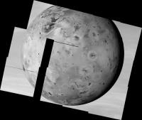
|
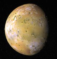
This 2-frame, 3-color mosaic is from the 14th Galileo orbit (E14). This image is compared of three mosaics consisting of violet, green, and red filter images. Compared this image to the press released version of this sequence: http://photojournal.jpl.nasa.gov/catalog/PIA01604. This color view was taken almost 9 years ago today, on March 29, 1998, from a distance of 295,800 km. This view has a pixel scale of 2.96 km/pixel.
Posted by: 4th rock from the sun Apr 1 2007, 01:50 AM
IR1 0.95 0.05
GRN 0.45 0.55
UV3 0.18 0
Would you concur?
--Emily
Sorry I couldn't help help with this sooner, I'm really really buzzy right now, but I'll look for a file I have somewhere with some calculated values... I guess that there might be a formula for accurate results, I'm just making educate guesses anyway.
From you posts I see that you got it anyway ;-) One thing to consider is that filter bandpass is not considered, that is, we are finding XY values for the peak filter transmittance disregarding how broad in the spectrum that transmittance is. This will affect color saturation I guess. Anyway, when I have time I'll try to post my values and processing results with them.
For now, I'll just leave you with a Voyager OGB image of the Great Red Spot processed with colorspace transformation (Ok, this is going very very off topic but at least is Jupiter related!).
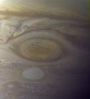
|
Posted by: 4th rock from the sun Apr 1 2007, 02:01 AM
From my small experience, the only really major improvement is with images generated from filters that are different from "generic" RGB but still covering much of the visible spectrum. Voyager OGB or OGV, Galileo RGV or IRGV render nicely and don't show saturated areas or predominant casts.
As for material that's originally very close to sRGB I agree there isn't much change.
Posted by: elakdawalla Apr 5 2007, 06:56 PM
Well, I've messed about with some Galileo images and I've come to the conclusion that attempting to get the color "right" in some technical way, like transforming the coordinates in CIE space, is just silly if I'm not working with calibrated data to begin with. And it looks like the only way to calibrate the Galileo images is to use ISIS, which I don't have access to.  So I think I'll probably go back to my old method, which is just to combine filters willy-nilly, and make no claims as to the "true"ness of the color, and send people to Bjorn's website if they want a more rigorous idea of the true colors of Io.
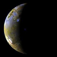
For no reason at all, here's a global view from I24, with the green and violet mixed into the blue channel as Bjorn suggests.
|
--Emily
Posted by: ugordan Apr 5 2007, 07:08 PM
Actually, I've found that even Cassini's RGB filter combo gives weird results, even though it covers the entire visible spectrum (and only that). The fact the GRN filter is actually yellow makes Photoshop unable to represent a very big color space. Here's the color spectrum from the color picker that the RED/GRN/BL1 filters apparently can represent:

As you can see, only 3 distinct colors can be represented, I suspect this is a limitation of insufficient GRN/RED filter color separation.
You don't even want to know what IR1/GRN/UV3 gives... (green Hyperion, anyone? Iapetus, curiously, appears practically the same as in ordinary RGB)
Posted by: tedstryk Apr 5 2007, 07:26 PM
As you can see, only 3 distinct colors can be represented, I suspect this is a limitation of insufficient GRN/RED filter color separation.
You don't even want to know what IR1/GRN/UV3 gives... (green Hyperion, anyone? Iapetus, curiously, appears practically the same as in ordinary RGB)
Only on very rare occasions do I not simply colorshift. Frankly, with Io's strange coloration, I wouldn't be too trusting of anything made from a bunch of narrowband filters.
Posted by: ugordan Apr 5 2007, 07:40 PM
Aren't Galileo's IR,G,V filters broadband?
Posted by: tedstryk Apr 5 2007, 09:29 PM
I don't think so, but I could be wrong (I am at work right now but I can look it up later).
Edit: You are right, Red, Green, and Violet are broadband. I never knew that!
Posted by: elakdawalla Apr 5 2007, 10:30 PM
Here's the full description of the Galileo SSI filters (it took me a while to track this down, so I thought it was worth quoting):
Posted by: volcanopele Apr 6 2007, 04:00 AM
That new site is now up and is located at http://pirlwww.lpl.arizona.edu/~perry/io_images/
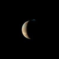
Posted by: Stu Apr 6 2007, 04:21 PM
Some beautiful images on there, thanks... especially impressed by the images showing Io as a crescent, never seen those before... 
Got me thinking about how cool it would be if a modern probe took new images of Mars as a crescent, looking back at it after a fly-by, maybe en-route to a comet or something. Then they could be used to inspire a whole new generation of space enthusiasts and...
Oh, wait...
Posted by: tedstryk Apr 6 2007, 08:04 PM
Got me thinking about how cool it would be if a modern probe took new images of Mars as a crescent, looking back at it after a fly-by, maybe en-route to a comet or something. Then they could be used to inspire a whole new generation of space enthusiasts and...
Oh, wait...
Well, maybe DAWN will do it
Posted by: edstrick Apr 7 2007, 07:56 AM
Viking Orbiter 2 got an entire Mars rotation sequence of moderately fat ?115 deg phase? images during it's approach to mars orbit insertion. The pics have never been reprocessed into a movie.. it would take some work as they are at maybe 15 or so degrees planetary rotation. One pic, press released and widely reproduced, had a structured cloud (not volcanic) plume extending off one of the 3 tharsis volcanoes.
Posted by: Bjorn Jonsson Apr 8 2007, 12:50 AM
This is fascinating stuff.
Regarding Io, as discussed earlier in the thread, creating synthetic B from G and V results in more accurate color than using V. The main reason is that V images are far more contrasty than the B images. To determine how to do this I used Voyager B images as a guide (this is described on my webpage http://www.mmedia.is/bjj/3dtest/io/index.html). I'm convinced the resulting color is more accurate than what you get using RGV. However, there are some caveats:
* I haven't done a careful comparison of the Voyager and Galileo filters (this needs to be done for G and V).
* I haven't checked the 'real' color of these filters, for example whether the G filter is actually closer to yellow as seems to be the case with Cassini's G filter (see ugordan's messages above).
* I wasn't using calibrated Galileo images but simply 'tweaked' the brightness of the raw PDS images using publicly released color images as a guide. This isn't as bad as it sounds because calibrating Galileo images doesn't result in big changes, unlike for example Cassini (many of the Cassini images need to be scaled nonlinearly from 8 to 12 bits and dust rings and other blemishes are more obvious in the Cassini images). Now my software can calibrate Galileo images (it couldn't when I originally did this) so the accuarcy can be improved slightly.
I haven't tried sRGB yet but doubt it would be effective when you're using IR7560 instead of R. The problem is that the reddish areas brighten significantly with increasing wavelength. This can't be seen in G images but is obvious in R images. This is also the reason the Voyagers didn't 'see' this, the O images are more similar to G than R images in this respect (in other words, it's impossible to use O and G to create realistic, synthetic R). This also means that you cannot create true color images by using IR7560 instead of R. Synthetic R is needed. Using a linear combination of IR7560 and G yielded bad results in the examples I tried. In particular I wanted a 'true color' version of the well known C21 global mosaic. However, only IR7560 is available. So using G2 images (where both R and IR7560 are available) as a guide I came up with the following nonlinear formula:
R=(IR + abs(d)^s * sign(d) * 255 x w) * m
where
w=0.582
s=1.462
m=1.092279
IR=The IR7560 intensity (0-255)
d=(G-IR)/255
(255 because the intensity range is 0-255).
What's remarkable is that this resulted in an almost perfect R image. However, the values of the coefficients probably need to be modified for use with images of the Jupiter-facing hemisphere (the values here apply to the anti-Jupiter hemisphere).
A comparison using the C21 mosaic:
|
The version at right is more realistic in that the the red areas appear more subdued. It can be improved further using synthetic blue and by adjusting the color balance a bit.
I haven't tried this (sRGB colorspace processing) yet (obviously I need to try it ASAP) so it would be interesting to see this image.
For now, I'll just leave you with a Voyager OGB image of the Great Red Spot processed with colorspace transformation (Ok, this is going very very off topic but at least is Jupiter related!).
|
|
This looks great, the color is probably more realistic than in most of the Voyager color images I have seen of Jupiter. It would be interesting to see a global Voyager 1 or 2 image of Jupiter processed this way.
Posted by: JRehling Apr 8 2007, 01:37 AM
Regarding Io, as discussed earlier in the thread, creating synthetic B from G and V results in more accurate color than using V. The main reason is that V images are far more contrasty than the B images.
Just a wacky idea here...
Presumably, the quirks of Io and narrow filters is that the spectrum of some of the terrain types is somewhat psychopathic. I wonder, then, if it would be superior to take a MIN(x, y) of G and V rather than a weighted mean of them. Or a weighted mean of the MIN and the G and the V. In other words, kill the blips that come from a sharp reflection feature. Or, try MAX if NIMS showed those terrains to have sharp absorption features -- which seems more likely.
Posted by: Bjorn Jonsson Apr 8 2007, 03:34 PM
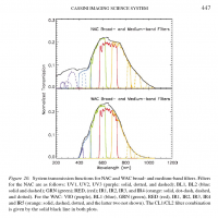
I managed to dig up some information on Galileo's SSI. This was originally at http://flora.tuc.noao.edu/gllssi/index.html but apparently that site is no longer available - I found these documents on my computer: gll_ssi_info.zip ( 155.02K )
: 565
gll_ssi_info.zip ( 155.02K )
: 565
This ZIP file contains several files and one directory.
I made this spectral response graph from one of the HTML files:
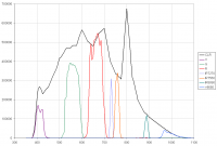
|
Not unexpectedly, a lot of color information between 400 and 500 nm is 'missing'. There is another 'gap' near 600 nm.
Posted by: elakdawalla Apr 8 2007, 04:36 PM
Hi Bjorn, it's quite possible I was just fooling myself; in any case I got so lost trying to figure out how to save the image with the adjusted color profile that I didn't keep it. I'm encouraged by the fact that the calibration issues aren't that big a deal with Galileo images, so perhaps I'll try it again.
--Emily
Posted by: ugordan Apr 8 2007, 04:41 PM
Emily, what I used to do was create a new blank image and convert it to the user profile before pasting the three channels in and afterwards convert it again to the regular sRGB profile and save it. That is the default profile and the colors will then look correct on other computers as well. Conversion from user to sRGB should not change the colors in the image in PSP if you're doing it right.
EDIT: Bjorn, if calibrated images aren't strictly important, shouldn't at least one important factor be the exposure between filters and also the transmitted spectral power of each one (area below the curve) to normalize each filter to the same brightness "unit"? If SSI had other settings such as gain, that should technically also be taken into account.
Posted by: volcanopele Apr 17 2007, 10:09 PM
I have gone ahead and updated my page of Galileo Io images so that images from all available orbit are included. I may add some additional images from some of the close flybys over the next few weeks:
http://pirlwww.lpl.arizona.edu/~perry/io_images/index.html
Posted by: Phil Stooke Apr 18 2007, 03:22 PM
A very useful resource. Thanks, vp.
Phil
Posted by: volcanopele Feb 7 2008, 11:30 PM
I am currently going through the process of updating the above page to include calibrated images. Previously, I had problems with ISIS and Galileo images so I wasn't able to properly process Galileo stuff in a few years. The issue has now been been resolved so now I can properly process these again. I've worked on the E14, I31, and I32 color images today and hope to properly work on the other color image sets over the next few months, plus add Voyager, New Horizons, and Hubble images to the above page.
I particularly like :
http://pirlwww.lpl.arizona.edu/~perry/io_images/14ISPOLAR_01.png
Posted by: tedstryk Feb 8 2008, 12:29 AM
I really look forward to seeing this. If you are including Hubble images, you might consider adding some of the Cassini images showing the Tvashtar eruption as well.
Posted by: 4th rock from the sun Feb 8 2008, 10:05 AM
Nice work :-) I really like the mosaics, and some of them really look new to me, such as this : http://pirlwww.lpl.arizona.edu/~perry/io_images/32ISTELGNS01.png
The calibrated global views look consistent and realistic. I'd like to see a global map made of those :-)
Posted by: ilbasso Feb 9 2008, 03:53 AM
Amazing image, it really leaps out at you! Io is the one place in the solar system that, whenever I see an image of it, I think, "That can't be REAL!!"
Posted by: 4th rock from the sun Feb 19 2008, 09:09 PM
Here are some of VolcanoPele's mosaics integrated with lower resolution color data.
|
|
The images were high passed for a better merge and colors balanced to my personal taste. Io looks striking like this!
Posted by: tedstryk Feb 19 2008, 09:20 PM
Beautiful work! What background data did you use? I am wondering if the C-21 might provide a better backdrop.
Posted by: ngunn Feb 19 2008, 10:16 PM
Those are just amazing. Hearty thanks to you, and everybody else who made those pictures possible.
Posted by: remcook Feb 20 2008, 09:23 AM
looks really cool! the combination of hi-res and low-res makes it look like your seeing something very small through a microscope
Posted by: mgrodzki Mar 2 2008, 03:36 AM
|
|
|
|
The images were high passed for a better merge and colors balanced to my personal taste. Io looks striking like this!
DAMN!
Posted by: volcanopele Mar 10 2008, 03:17 AM
Here are a few of the observations I've finished up in the last few weeks:
http://pirlwww.lpl.arizona.edu/~perry/io_images/27ISCAMAXT01.png - Medium resolution mosaic across the Chaac-Camaxtli region of Io's anti-jovian hemisphere
http://pirlwww.lpl.arizona.edu/~perry/io_images/27ISCAMAXT01-color.png - Above mosaic combined with color from the "true" color C21 mosaic
http://pirlwww.lpl.arizona.edu/~perry/io_images/27ISPROMTH02.png - Medium resolution color mosaic across the Prometheus flow field
http://pirlwww.lpl.arizona.edu/~perry/io_images/10ISIOGLOC03.png - Color observation showing the Pillan eruption deposits
http://pirlwww.lpl.arizona.edu/~perry/io_images/10ISIOGLOC01-VGRcolor.png - Color observation of Io's trailing hemisphere (areas with only RED and VIOLET filters in "Voyager" color)
http://pirlwww.lpl.arizona.edu/~perry/io_images/G2ISSRFMON01.png - Io with Jupiter in the background
Posted by: nprev Mar 10 2008, 03:40 AM
...Jason, all I can add is another "DAMN!!!!"
Very impressive; stirring, even. You might just make me a focused Ioniphile yet...
Posted by: Stu Mar 10 2008, 07:44 AM
Wow... the "Pillan deposits" image is simply stunning. Don't think I've ever seen Io looking more.. diseased!
Can I ask you a question Jason? What fascinates you so much about Io? I'm always struck by how different people here have passions for different moons or worlds. I mean, I'm a martian to the core, it has called to me for as long as I can remember, but I know some people aren't that interested in it. And personally - and you'll thwack me on the head for saying this, but hey, it's all about personal attraction! - I am much more fascinated by Europa than I am by Io; no offence to Io or your interest in it - Io's volcanoes and sulphurous plains are intriguing and dramatic, no doubt - but that icy, fractured landscape Europan absolutely fascinates me, and I would love to stand on the ice, coloured a thousand different shades of tan, caramel, orange and gold by shattered reflections of Jupiter, and wonder if there was ice beneath my feet, whilst I simply can't summon up that much passion for Io, you know? So, just wondering, what is it about Io? Scientific reasons? Aesthetic reasons?
( BTW: anyone else who wants to, feel free to chip in with why you feel so fascinated by your particular fave moon or world or whatever. )
Posted by: 4th rock from the sun Mar 10 2008, 03:30 PM
Beautiful! Some fascinating images there. Nice colors too. I really like the way the landscape changes on Io from a smooth plain to a mountain of volcano!
Posted by: volcanopele Mar 11 2008, 04:05 AM
So, just wondering, what is it about Io? Scientific reasons? Aesthetic reasons?
I guess a little bit of both. I first became interested in Io for aesthetic reasons. It is, dare I say, a beautiful place. Europa and the other Galilean never really appealed to me. And my scientific interest grew out of that, into an interest in active geologic processes, Geology you can watch.
Posted by: ugordan Mar 11 2008, 08:39 AM
Indeed, it is a visually striking place, even in natural colors where it doesn't look like a pizza. From a visual standpoint it's definitely in my top 4 Galileans list.
Posted by: tedstryk Mar 17 2008, 09:29 PM
Here is my take on the e11 image. Amalthea's color here is a mess, Io is generated from the three available filters, with the one non-binned image used to bolster the grayscale.
|
Posted by: ugordan Mar 17 2008, 09:42 PM
Impressive! Funny how these narrow-angles can play tricks on the eye in combination with the lack of http://en.wikipedia.org/wiki/Atmospheric_perspective in space. You could almost swear Amalthea's orbiting Io if you didn't know better.
Posted by: tedstryk Mar 17 2008, 10:42 PM
Not only is there a lack of atmospheric perspective, but there is a lack of any familiar frame of reference to assess relative size and distance.
Posted by: volcanopele Mar 21 2008, 08:08 AM
I've added six mosaics from the I24 encounter to my Galileo Image page. These mosaics make use of the scrambled images (that were later reconstructed at JPL) from that encounter. As far as I know, the full mosaics from these observations were never publically released, though snippets of a few of them were (though one was released as part of an anaglyph). These mosaics include some over the Pillan, Zamama, and Prometheus flow fields and over the mountains: Ot Mons, Tohil Mons, and Dorian Montes.
The images can be found at http://pirlwww.lpl.arizona.edu/%7Eperry/io_images/i24.htm
A more extended description of these images can be found in the first two posts on the front page of my blog: http://gishbar.blogspot.com/
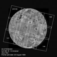
Posted by: volcanopele Mar 23 2008, 09:40 AM
24ISSTEREO01
Full-resolution image: http://pirlwww.lpl.arizona.edu/~perry/io_images/24ISSTEREO01.png
Description: http://gishbar.blogspot.com/2008/03/three-more-mosaics-from-i24-flyby.html
|
Posted by: ugordan Mar 23 2008, 10:48 AM
What happened to the two fotprints that got displaced and caused gaps in coverage there?
Posted by: Ian R Mar 23 2008, 12:15 PM
Could the high radiation levels caused the pointing errors Gordan?
Posted by: tedstryk Mar 23 2008, 01:47 PM
Possibly. The targeting of the whole mosaic is slightly off the plan, and the gap is certainly not there.
|
Posted by: DrShank Mar 27 2008, 02:34 PM
There are occasional hickups throughout the Galileo sequences. On rare events, frames are offset from plan by 1/4 frame or so.
here is a rendering of the color sequence from I29 showing the tvashtar plume. note the cylidrical map projection!
paul
|
Posted by: tedstryk Mar 27 2008, 06:24 PM
That is really cool!
Posted by: tedstryk Apr 7 2008, 08:55 PM
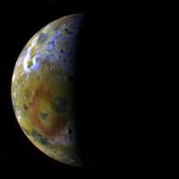
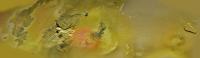
Here is a view I recently finished showing Loki on the terminator using I32 data.
|
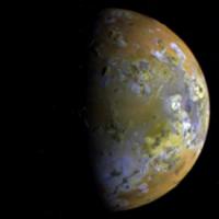
Here is one with some high pass filtering mixed in. The downside is that it looks less realistic, the upside is that the terminator is easier to view.
|
Powered by Invision Power Board (http://www.invisionboard.com)
© Invision Power Services (http://www.invisionpower.com)