Eight Years. |

  |
Eight Years. |
 Jan 24 2012, 11:24 PM Jan 24 2012, 11:24 PM
Post
#31
|
|
 Senior Member  Group: Admin Posts: 3108 Joined: 21-December 05 From: Canberra, Australia Member No.: 615 |
|
 |
 
|
|
Jan 25 2012, 02:50 PM
Post
#32
|
|
 The Poet Dude Group: Moderator Posts: 5551 Joined: 15-March 04 From: Kendal, Cumbria, UK Member No.: 60 |
Nice one!
 But 8 years... still really having a hard time believing it's that long... 
-------------------- |
|
|
|
|
Jan 27 2012, 03:32 AM
Post
#33
|
|
|
Member Group: Members Posts: 813 Joined: 29-December 05 From: NE Oh, USA Member No.: 627 |
Eight years. Marvelous!
Sleep well Spirit. Rest easy Opportunity. We love you. Humany Wumany Craig |
|
|
|
|
Jan 27 2012, 04:37 AM
Post
#34
|
|
 Member Group: Members Posts: 754 Joined: 9-February 07 Member No.: 1700 |
Opportuniverse Today
|
|
|
|
|
Jan 27 2012, 11:30 PM
Post
#35
|
|
|
Member Group: Members Posts: 866 Joined: 15-March 05 From: Santa Cruz, CA Member No.: 196 |
I finally downloaded the full-res version, great work photoshop-ing the figure eight, sure fooled me!
Poem typo alert: "..in all their restored gory.." (not in the poster, just the article) |
|
|
|
|
Feb 9 2012, 10:51 AM
Post
#36
|
|||
|
The Poet Dude Group: Moderator Posts: 5551 Joined: 15-March 04 From: Kendal, Cumbria, UK Member No.: 60 |
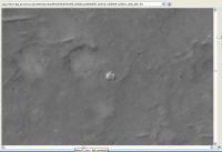
For those who haven't seen it yet, a new HiRISE image has just ben released showing Spirit's Lander off to the side of Bonneville Crater...
http://hirise.lpl.arizona.edu/ESP_025815_1655 (Was that a HiWISH of yours Doug?) Here's what the lander looked like on 29 Jan...
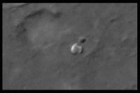
Wouldn't it have been great if we'd had a HiRISE portrait of the lander and rover just after landing? It might have looked something like this... (I've tried to get the scale right by cloning Spirit from the same image)...
(Note: taken from: http://roadtoendeavour.wordpress.com/2012/...ories-of-spirit ) -------------------- |
||
|
|
|
||
|
Feb 9 2012, 03:04 PM
Post
#37
|
|
|
Founder Group: Chairman Posts: 14434 Joined: 8-February 04 Member No.: 1 |
QUOTE (Stu @ Feb 9 2012, 02:51 AM)  (Was that a HiWISH of yours Doug?) Yup. They didn't QUITE get it right - they were about 140 meters east of what I was asking for....as they didn't quite get the backshell and parachute in color as well. I have the same request submitted for Meridiani, Color over Eagle Crater. |
|
|
|
|
Feb 9 2012, 06:26 PM
Post
#38
|
||
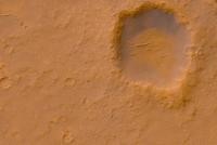
 Senior Member Group: Members Posts: 3648 Joined: 1-October 05 From: Croatia Member No.: 523 |
Here's an attempt to tweak the color to look similar to what an overhead view might look like:
-------------------- |
|
|
|
|
|
|
Feb 13 2012, 12:27 PM
Post
#39
|
|
|
The Poet Dude Group: Moderator Posts: 5551 Joined: 15-March 04 From: Kendal, Cumbria, UK Member No.: 60 |
Beautiful colours, ugordan, as ever...
The new HiRISE image inspired a new astropoem, which is here if anyone wants to have a look... http://astropoetry.wordpress.com/2012/02/13/freeing-spirit -------------------- |
|
|
|
|
Feb 13 2012, 01:20 PM
Post
#40
|
|
|
Member Group: Members Posts: 153 Joined: 4-May 11 From: Pardubice, CZ Member No.: 5979 |
QUOTE (ugordan @ Feb 9 2012, 07:26 PM) Here's an attempt to tweak the color to look similar to what an overhead view might look like And here is color interpretation from NASA: http://www.nasa.gov/mission_pages/MRO/mult...a/pia15038.html |
|
|
|
|
Feb 13 2012, 03:52 PM
Post
#41
|
|
|
Member Group: Members Posts: 507 Joined: 10-September 08 Member No.: 4338 |
QUOTE (pospa @ Feb 13 2012, 05:20 AM) And here is color interpretation from NASA... Natural or not, those earthy brown tones from the NASA rendering are more pleasing to my eye than the orange-red versions. |
|
|
|
|
Feb 13 2012, 04:07 PM
Post
#42
|
|
|
Senior Member Group: Members Posts: 3648 Joined: 1-October 05 From: Croatia Member No.: 523 |
QUOTE (pospa @ Feb 13 2012, 02:20 PM) And here is color interpretation from NASA That's actually the source image I used. -------------------- |
|
|
|
|
Feb 13 2012, 06:26 PM
Post
#43
|
||
|
Member Group: Members Posts: 293 Joined: 22-September 08 From: Spain Member No.: 4350 |
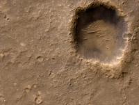
I'm not an expert at all in optics, but I suppose that even if the ambient light is very red, in low light levels the black and white vision (rods) is more efficient that the color vision (cones). So, when displaying an image with normal Earth brighness levels, lower saturation may preserve better the original visual experience.
Here's my version:
In GIMP: 1. Go to Balance color and slide the tree balances +10 towards red and -10 towards yellow. 2. In Hue and saturation, drop saturation -40. 3. In Brightness and contrast, +20 brightness and +30 contrast. |
|
|
|
|
|
|
Feb 13 2012, 10:39 PM
Post
#44
|
|
|
Founder Group: Chairman Posts: 14434 Joined: 8-February 04 Member No.: 1 |
Or, in other words - we're guessing and it's just an artistic judgement call.
|
|
|
|
|
Feb 14 2012, 12:14 AM
Post
#45
|
|
 Senior Member Group: Members Posts: 1089 Joined: 19-February 05 From: Close to Meudon Observatory in France Member No.: 172 |
QUOTE (Fran Ontanaya @ Feb 13 2012, 07:26 PM) I'm not an expert at all in optics, but I suppose that even if the ambient light is very red, in low light levels the black and white vision (rods) is more efficient that the color vision (cones). So, when displaying an image with normal Earth brighness levels, lower saturation may preserve better the original visual experience . This is it... tested and approved on VL1 and VL2 images at JPL-IPL in 1981-1982 
|
|
|
|
|

|
Lo-Fi Version | Time is now: 21st September 2024 - 06:52 PM |
|
RULES AND GUIDELINES Please read the Forum Rules and Guidelines before posting. IMAGE COPYRIGHT |
OPINIONS AND MODERATION Opinions expressed on UnmannedSpaceflight.com are those of the individual posters and do not necessarily reflect the opinions of UnmannedSpaceflight.com or The Planetary Society. The all-volunteer UnmannedSpaceflight.com moderation team is wholly independent of The Planetary Society. The Planetary Society has no influence over decisions made by the UnmannedSpaceflight.com moderators. |
SUPPORT THE FORUM Unmannedspaceflight.com is funded by the Planetary Society. Please consider supporting our work and many other projects by donating to the Society or becoming a member. |
|