Feedback sought on Triptik-style maps for Curiosity traverse |

  |
Feedback sought on Triptik-style maps for Curiosity traverse |
 Aug 3 2014, 03:30 AM Aug 3 2014, 03:30 AM
Post
#1
|
|||
 Administrator  Group: Admin Posts: 5172 Joined: 4-August 05 From: Pasadena, CA, USA, Earth Member No.: 454 |
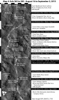
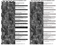
I'm working on the maps that I'll be including in my book and am looking for some feedback. My goal with these maps is to include as much information at a glance as possible. Another goal was to make something substantially different from what's in Phil's book
 And I have to work within the limitations of the Springer-Praxis page, which dictates maximum image sizes of 117mm wide by 198mm tall. The text that accompanies it will not go into every bit of sol-by-sol detail (you'll need to buy Phil's book if that's what you want) -- I'm taking a slightly more "zoomed-out" view of the operational proceedings in the text. Here is a first draft of one of my maps: And I have to work within the limitations of the Springer-Praxis page, which dictates maximum image sizes of 117mm wide by 198mm tall. The text that accompanies it will not go into every bit of sol-by-sol detail (you'll need to buy Phil's book if that's what you want) -- I'm taking a slightly more "zoomed-out" view of the operational proceedings in the text. Here is a first draft of one of my maps:
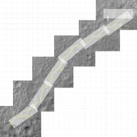
It may take a moment to orient yourself. North is not up. The inspiration for this style of map is the American Automobile Association Triptik that my family used to take with us for long road trips. Triptiks are books for a road trip made out of long skinny maps, each one of which takes you from one city to another along a major highway. Here's an example of what a typical Triptik page looks like. The maps are not oriented north-south -- instead, they were oriented to be parallel to the route of the highway. I decided to try the same thing here, orienting the map parallel to Curiosity's route, with time increasing from top to bottom of the page, which allows me to accompany each narrow strip of map with a timeline of sorts. The black-and-white bars running down the left side are 50 meters long, while the ones running along the top are 20 meters long. The grid is a 100-meter grid. One thing that differs between my approach and the AAA Triptik is that I plan to hold the map scale constant throughout. (It's 1:3000.) Here's a zoomed-out view showing how I'm dividing the first part of the Curiosity traverse into linear segments. (This map is the one I use for my planning -- it's not laid out appropriately for the book.)
The base map is an image taken after Curiosity passed through, so I didn't need to draw in the route at all -- I just highlighted the rover's tracks. I located the site dots based on Phil's maps. Each site is marked with the sols that Curiosity acquired data in that location. To the right of the map is an abbreviated list of the targeted science done at each site. It includes ChemCam targets (which always have Mastcam context images), plus any standalone Mastcam targets, and notes about other activities. I don't include astronomical observations -- I'm maintaining a separate list of those. Information on targets is compiled from midnightmarsbrowser.com and the SOWG reports from the Analyst's Notebook. One goal with this is to have the PDF be searchable on target names. Between the sites there are black bars for each drive. All the drive information is copied from curiositylog.com. In one location there was some mid-drive imaging, so I included that in the drive bar. I'm not sure if that was the best way to do that. Some of the sites have special symbols -- a triangle where they did contact science, and the wheel symbol is intended to indicate 360° panoramas. Any other suggestions for what ought to be indicated on the map? I would LOVE to be able to show the locations of DAN active measurements, but I don't know how to figure out where they occurred. I'm thinking about ways to indicate the location and heading of partial panoramas. It's frustrating that the Mastcam team often doesn't name their panoramas very succinctly -- there are a lot of panoramas described with words like "possible contact on distant hill". Finally, I should mention that this is a first draft, and I have *not* double-checked my work on the facts on this map. It very likely contains errors. Caveat emptor! I hope this map makes some sense to people! Feedback welcome. -------------------- My website - My Patreon - @elakdawalla on Twitter - Please support unmannedspaceflight.com by donating here.
|
||
 |
 
|
||
|
Aug 3 2014, 04:34 AM
Post
#2
|
|
 Senior Member Group: Admin Posts: 3108 Joined: 21-December 05 From: Canberra, Australia Member No.: 615 |
Nice Emily.
A few thoughts and questions. On Sol377 which I presume had the mid-drive imaging, personally I'd have the MCam information in the white area and just marked with an asterisk/footnote explaining it. On the time code. Are the dates and times US, UTC, local Mars time? What is the time of day referring to? Start of drive, end of drive, science activity? I'm wondering about the value of the 50m and 20m scales when there is a 100m grid on the map and you note the driving distances in the side bar. Does it add anything to the information you are providing? If your maps are all the same scale, then perhaps just a standard 'the map on each page is this big' reference. Could there be a 'progress' tally on the page? Total drive distance covered vs number of sols (this map and overall journey). Maybe the % distance covered of journey to Murray Buttes. Could the white path marker over the tracks be lightened further? The tracks themselves are more exciting/interesting to see. It's a huge job Emily. Best of luck as it progresses. Can't wait to buy it and read it
|
|
|
|
|
Aug 3 2014, 06:33 AM
Post
#3
|
|
 Senior Member Group: Members Posts: 2425 Joined: 30-January 13 From: Penang, Malaysia. Member No.: 6853 |
Emily, Did you consider including the relative elevation of each or selective way points to give readers a feel for the descent into Yellowknife from Bradbury Landing or the steady climb out of the Bay towards the present location? Joe publishes all that data on his page..
|
|
|
|
|
Aug 3 2014, 07:50 AM
Post
#4
|
|
|
Senior Member Group: Members Posts: 3516 Joined: 4-November 05 From: North Wales Member No.: 542 |
When using a conventional map most people would orient it so the direction of travel is up the page. That way, left is left and right is right. I find travelling 'downward' disorienting so I'm wondering why you chose it? Otherwise I like the presentation.
|
|
|
|
|
Aug 3 2014, 09:24 AM
Post
#5
|
|
|
Senior Member Group: Members Posts: 2346 Joined: 7-December 12 Member No.: 6780 |
An overview of the DAN measurements can be found in this PDS index file with the according lbl file.
It contains, e.g. type and time interval of the measurements. Geographic positions are encoded in the individual binary dat files, according to the fmt files, data set description here. Files should be readable with NASAView. Edit: Here a csv file with the rows and columns you may be most interested in:  dan_index_AVERAGE_ACTIV_reduced2_eng.txt ( 30.33K )
Number of downloads: 803
dan_index_AVERAGE_ACTIV_reduced2_eng.txt ( 30.33K )
Number of downloads: 803I've added an additional column for the durations calculated as the difference of stop and start time, and a headline for the labels. To get the precise locations, either the start/stop times need to be matched with the drive data, if they are readily available, e.g. by Joe, or the SPICE locations of the dat files need to be extracted. Btw.: If someone of the DAN team is reading this, there appears to be a minor flaw in the index.lbl file: Column 5, DESCRIPTION should explain PRODUCT_VERSION_ID. |
|
|
|
|
Aug 3 2014, 11:43 AM
Post
#6
|
|
|
Member Group: Members Posts: 140 Joined: 20-November 07 Member No.: 3967 |
QUOTE (ngunn @ Aug 3 2014, 02:50 AM)  When using a conventional map most people would orient it so the direction of travel is up the page. That way, left is left and right is right. I find travelling 'downward' disorienting so I'm wondering why you chose it? Otherwise I like the presentation. I'm with ngunn on this one. I know we read a page of text from top to bottom, and the map is consistent with that, but when you ride in a car and look out the windshield and look at the map in your lap, you instinctively orient the map to read from bottom to top, so it orients with your view forward. I realize your book will have no windshield, but the instinct, I think, transfers. You might try one or two -- give the flip-the-map idea a test drive, so to speak -- and see how it works. As for the black-and-white scale bar, I like it very much as a visual reference. When I'm thinking pictorially (looking at a map) I can glance at the scale bar and get a suggestion of distance without having to access the other side of my brain and perform some mental computation to know distance. BUT, the trouble with these is proportion. At that width, they scream "look at me!" They'll work better if you slim them down, say 50%. (maybe more; it's a judgment call . . .) Generally, I agree your use of the Triptik approach is an excellent strategy. I'm presuming you are also going to include the key map (your second image above?). Many atlases use a similar approach. I prefer the pale (low-opacity) white line because it shows underlying detail. Skinnying up the scale bars will help the relative appreciation of the pale white line. Consider the scale bars (appropriately narrowed) on all four sides. Great start! EDIT (checked your post): Your key map ("not laid out appropriately for the book") is an excellent image. North is up, and the triptik locations are shown in context. You should show this map! The graphical composition problem of how to rescue the white space now "wasted" in the corners (presuming you keep the proper, north-up, orientation [as an Atlas would]) is a secondary concern. Titles, legends, explanatory text boxes and elaborative footnotes could profitably fill these areas. This issue gets slightly more severe because your page proportion (117 x 198) is rectangular and this map is square, so (assuming the map fills the page width) you'll also have a white bar across the top or bottom, but that additional white space could be relegated to the overall Figure Caption. Page proportion is close to a golden mean rectangle, so locating a square map on one end of the page (at top, probably), should look real nice. The tertiary concern will be keeping the supportive space-fillers visually subordinate to the key map. One atlas I have (rats, can't seem to dig it out quickly to check the title) employs gray text to good effect for this problem. The text is larger than usual (there's not a lot to say on their key-map page), for easy reading, but the gray tone keeps it from dominating the subtle shades in the key map. You'll have more to say on your key map page (a la your post), but the gray-tone trick may nevertheless be useable. SECOND EDIT (closer study of Triptik map): I see now what you doing with the black-bar-with-white-font Headings. I abandon the suggestion for wrapping the scale bar on four sides -- consider wrapping the scale bar on THREE sides (left, top, and bottom). I realize this is only a first draft, but I miss seeing white space to the outsides of the image, as it would appear on the page. This is vital to juding how much to slim down (if any) the scale bar width. But, more importantly, to my eye the heavy-black Heading bars, as the scale bars, also overwhelm the subtle grays of the image. I realize the strong black horizontal Header makes the Drive category distinct, and agree that this is a desirable organizing objective, but consider ways to reduce the Bar's visual impact. Right now, again to my eye, the Header bars are too strong. What happens if you, say, eliminate the bars and change the font to bold? My guess, probably not quite strong enough to visually separate each Drive as nicely as the pure geometry of the black bar does, but, given the bold font, you could reintroduce the bar in a gray tone and not loose readability of the text. Choice of gray tone is probably three: darker, equal to, or lighter than the average gray of the base map. I'd try lighter, first. Keep us posted . . . |
|
|
|
|
Aug 3 2014, 11:48 AM
Post
#7
|
|
|
Member Group: Members Posts: 154 Joined: 21-April 05 From: Rochester, New York, USA Member No.: 336 |
One way to indicate the direction of a partial pano is to just edit the symbol you are already using to remove the part of the wheel, thus the remaining part will indicate the direction.
|
|
|
|
|
Aug 3 2014, 03:31 PM
Post
#8
|
|
|
Solar System Cartographer Group: Members Posts: 10145 Joined: 5-April 05 From: Canada Member No.: 227 |
Really nice! I wish I had had this to refer to when I made my maps... now, if I could just get you to do the same for 6000 sols of MER activities!
I might have put the mid-drive image note in the white box instead of the black bar, though I see why you did it that way. The partial panorama suggestion from craigmcg is a good one, but might be quite a bit of work. I'm not sure about orientation. A test of one drawn in the other direction might be interesting, but I think I prefer the text bar to read top to bottom. Phil -------------------- ... because the Solar System ain't gonna map itself.
Also to be found posting similar content on https://mastodon.social/@PhilStooke NOTE: everything created by me which I post on UMSF is considered to be in the public domain (NOT CC, public domain) |
|
|
|
|
Aug 3 2014, 03:49 PM
Post
#9
|
|
|
Member Group: Members Posts: 910 Joined: 4-September 06 From: Boston Member No.: 1102 |
Had the primary drive direction been anything North, East or West, the selection of drive direction up would have seemed obvious. The problem is that the major drive direction is south, so it flips all these segments. I would pick up as the orientation but do see that it adds some minor confusion to a predominantly southern trip.
-------------------- |
|
|
|
|
Aug 3 2014, 04:57 PM
Post
#10
|
|
|
Senior Member Group: Members Posts: 2346 Joined: 7-December 12 Member No.: 6780 |
QUOTE (elakdawalla @ Aug 3 2014, 05:30 AM) I would LOVE to be able to show the locations of DAN active measurements, but I don't know how to figure out where they occurred. If all else fails, I happened to find this zip file on my computer, containing a very draft of a Win32 exe which should be able to convert a PDS RDR DAN .dat file of the "raa" type to a csv file, including longitude and latitude data:  msl_dan.zip ( 42.42K )
Number of downloads: 555
msl_dan.zip ( 42.42K )
Number of downloads: 555Be sure to check for viruses first. Password is "dan". |
|
|
|
|
Aug 3 2014, 06:46 PM
Post
#11
|
|
 Senior Member Group: Members Posts: 4246 Joined: 17-January 05 Member No.: 152 |
QUOTE (elakdawalla @ Aug 3 2014, 04:30 AM) I plan to hold the map scale constant throughout. How would you handle stretches like 692-706, when we travelled only roughly 100 crow-flies metres in 6 drives? With the same map scale and font size you probably wouldn't have room for all of the text sidebar descriptions. One solution would be to show only a portion of the map on the left, with few enough drives so the text descriptions fit on one page. But that may not be the best use of space on the map side. Or, of course you could occasionally change the map scale. In fact, maybe you were thinking of that for times like waypoints (eg Kimberly)? |
|
|
|
|
Aug 3 2014, 08:04 PM
Post
#12
|
||
 Senior Member Group: Members Posts: 1465 Joined: 9-February 04 From: Columbus OH USA Member No.: 13 |
Nice metaphor with AAA. One cosmetic point: I find the alternating black and white along the edges a little distracting. How about making it gray and white a la:
Maybe just a matter of personal preference. -------------------- |
|
|
|
|
|
|
Aug 3 2014, 08:57 PM
Post
#13
|
|
|
Administrator Group: Admin Posts: 5172 Joined: 4-August 05 From: Pasadena, CA, USA, Earth Member No.: 454 |
Everybody, thanks for your suggestions, lots of good ideas here.
QUOTE (PaulH51 @ Aug 2 2014, 10:33 PM) Emily, Did you consider including the relative elevation of each or selective way points to give readers a feel for the descent into Yellowknife from Bradbury Landing or the steady climb out of the Bay towards the present location? Joe publishes all that data on his page.. What I really wanted to do was to include contour lines on these maps to indicate elevation, but I think that would make it unworkably busy. Your suggestion is a good one.QUOTE (Gerald @ Aug 3 2014, 01:24 AM) An overview of the DAN measurements can be found in... I had already looked at that and the problem is that there is only one entry in the index.tab file for each sol, so the time information isn't directly applicable to when the actual active measurements were taken. I may give the executable a try, but I'm also now checking to see if there's someone mapping things on the MSL team who might have some data in a format I could use...QUOTE (craigmcg @ Aug 3 2014, 03:48 AM) One way to indicate the direction of a partial pano is to just edit the symbol you are already using to remove the part of the wheel, thus the remaining part will indicate the direction. This idea had occurred to me and I've been puzzling over ways to make it less onerous. I think I won't include drive-direction or workspace panos, just ones of specific targets. There actually aren't that many of those -- I'm just working on a relatively painless way to convert information from Joe's roversynth site into an appropriately sized and oriented partial pano icon. Can anybody think of an intuitive way to indicate if a panorama is stereo? That seems like information that would be useful to people.QUOTE (fredk @ Aug 3 2014, 10:46 AM) How would you handle stretches like 692-706, when we travelled only roughly 100 crow-flies metres in 6 drives? With the same map scale and font size you probably wouldn't have room for all of the text sidebar descriptions. One solution would be to show only a portion of the map on the left, with few enough drives so the text descriptions fit on one page. But that may not be the best use of space on the map side. Or, of course you could occasionally change the map scale. In fact, maybe you were thinking of that for times like waypoints (eg Kimberly)? Yes, I was planning on including detailed location maps for the waypoints at a much zoomed-in scale. There may be other sections of the map that will be hard, though, because drives were short -- I'll try one of those next and see what happens!I agree with Joe & Chuck that the black bars of various types are distracting. I tried some things to fix it but gave up fiddling with it -- one of the reasons I asked for advice here. Chuck, I had already tried bolding the drive text and it wasn't sufficiently different from the site text. Thanks everybody for your ideas on how to address this problem; I'll experiment with them and see if I can produce something more pleasing. I really like the look of the gray and white bars. I find the consistency of the suggestion to flip the orientation interesting. I would much, much rather read from top to bottom, myself, just like with the text for the book; but the fact that several people suggested reversing it suggests I should at least try it. -------------------- My website - My Patreon - @elakdawalla on Twitter - Please support unmannedspaceflight.com by donating here.
|
|
|
|
|
Aug 3 2014, 09:45 PM
Post
#14
|
|
|
Member Group: Members Posts: 140 Joined: 20-November 07 Member No.: 3967 |
jmknapp's gray scale bars and gray Header bars look good.
|
|
|
|
|
Aug 3 2014, 11:18 PM
Post
#15
|
|
|
Senior Member Group: Members Posts: 2346 Joined: 7-December 12 Member No.: 6780 |
QUOTE (elakdawalla @ Aug 3 2014, 10:57 PM) ... I'm also now checking to see if there's someone mapping things on the MSL team who might have some data in a format I could use... While trying to match DAN data with Joe's drive log and Analyst's Notebook, I first found a coincidence for Sol 402 of the pause within the drive shortly after second 1800 with the first active DAN on the same sol from 11:36:38 to 11:42:02 LST. (Last two columns in the converted Sol 402 dna_433155384raa04020000000_______p1.dat file) The SOWG Documentarian uplink report of Analyst's Notebook for Sol 402 then confirmed a mid-drive science block consisting of "Mid-drive DAN_Active" and "Hazcam_Rear". The Hazcam_Rear explains, why the pause took longer than the about 5 1/2 minutes for active DAN. A second active DAN has taken place from 15:52:39 to 16:08:11 LST at the same sol. (Additional activities, "Post-drive DAN_Active", in AN.) ... The pieces are going to match together. |
|
|
|
|

|
Lo-Fi Version | Time is now: 16th April 2024 - 11:06 AM |
|
RULES AND GUIDELINES Please read the Forum Rules and Guidelines before posting. IMAGE COPYRIGHT |
OPINIONS AND MODERATION Opinions expressed on UnmannedSpaceflight.com are those of the individual posters and do not necessarily reflect the opinions of UnmannedSpaceflight.com or The Planetary Society. The all-volunteer UnmannedSpaceflight.com moderation team is wholly independent of The Planetary Society. The Planetary Society has no influence over decisions made by the UnmannedSpaceflight.com moderators. |
SUPPORT THE FORUM Unmannedspaceflight.com is funded by the Planetary Society. Please consider supporting our work and many other projects by donating to the Society or becoming a member. |
|