Printable Version of Topic
Click here to view this topic in its original format
Unmanned Spaceflight.com _ Juno _ Combining data from many perijoves
Posted by: Bjorn Jonsson Apr 6 2018, 09:08 PM
This thread is for images/mosaics that combine data from more than one perijove pass or compare data (e.g. the appearance of specific features on Jupiter) from two or more perijoves. In other words, it is for images and related stuff not specific to a single perijove.
It is possible to use the JIRAM infrared images to attempt to guess what areas not imaged by JunoCam might look like at visual wavelengths.
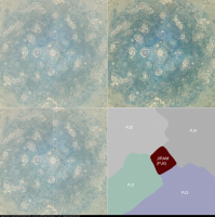
Below is a montage showing versions of a mosaic of JunoCam images from perijoves 1, 3, 4 and 5. The effects of the varying global illumination have been removed. The mosaic shows Jupiter's north polar region in orthographic projection from directly above. Because the north pole is in darkness, an inverted, heavily processed and colorized JIRAM mosaic was used to fill the gap at the north pole. This represents an attempt to guess what this area might look like in visible light. Small scale details in the cloud morphology should be fairly accurate/realistic but the overall contrast, brightness and color are based partially on a visual comparison of the JunoCam and JIRAM data farther from the pole where useful data from both instruments is available. It is difficult to guess how accurate this is but it is definitely far better than leaving this area blank! The JIRAM data appears a bit different from the JunoCam data in the mosaic but this is mainly because the JIRAM images suggest that the overall color and brightness in the area very near the pole (including the central cyclone) really are different from areas farther from the pole. Another factor is that the JIRAM data is of somewhat higher resolution. Also unlike JunoCam, the difficult illumination conditions in the polar region do not affect the JIRAM images. And here is the montage:
|
The montage shows the following:
Upper left: An approximately true color/contrast mosaic of Jupiter's north polar region.
Upper right: A mosaic of Jupiter's north polar region with enhanced colors and contrast.
Lower left: The approximately true color/contrast version with a latitude/longitude grid. Latitudes are planetographic.
Lower right: A diagram showing the areas covered by the different source images/data. Unless otherwise noted the data is from JunoCam.
Posted by: Glenn Orton Apr 6 2018, 09:33 PM
Hey, Bjorn,
May I show this at a Juno team meeting?
Do you have anything similar for the south pole (no relying on JIRAM results necessary).
Glenn
P.S. Feel free to email me directly, of course.
Posted by: Gerald Apr 6 2018, 09:49 PM
That's maybe the thread where I should provide http://junocam.pictures/gerald/merged_maps/index.html.
Posted by: Bjorn Jonsson Apr 6 2018, 10:16 PM
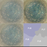
Here is a comparable montage featuring a mosaic covering the south polar region. This is from JunoCam data; it is a mosaic of two perijove 6 images, one perijove 7 image and one perijove 8 image. The color very near the pole might be somewhat inaccurate due to the very low illumination levels near the pole in the original images. The position of the circumpolar cyclones during PJ6 was used as a reference when creating the mosaic, however this is of minor importance since their movement is negligible. In contrast, the areas farther from the pole change a lot more and seams between the different perijoves were originally obvious in the mosaic. These seams have been removed for cosmetic reasons.
|
Like the north polar montage, this montage shows the following:
Upper left: An approximately true color/contrast mosaic of Jupiter's north polar region.
Upper right: A mosaic of Jupiter's north polar region with enhanced colors and contrast.
Lower left: The approximately true color/contrast version with a latitude/longitude grid. Latitudes are planetographic.
Lower right: A diagram showing the areas covered by the different source images/data.

May I show this at a Juno team meeting?
Do you have anything similar for the south pole (no relying on JIRAM results necessary).
You are welcome to show these mosaics at a Juno team meeting.
Posted by: Glenn Orton Apr 6 2018, 11:27 PM
I got the second one, too. Thanks for your email. For some reason, my reply to your email is bouncing back.
Posted by: Bjorn Jonsson Apr 6 2018, 11:33 PM
My Internet service provider has been having problems today, this address should work if needed:
[image removed, it is no longer of significance]
(posted as an image to avoid spam)
Posted by: Bjorn Jonsson May 15 2018, 11:36 PM
A big map of Jupiter that combines the Juno polar data with a map made from Cassini data:
http://www.planetary.org/blogs/guest-blogs/2018/0514-juno-meets-cassini-a-new.html
Of course this is strictly speaking fictional but should nevertheless be far more realistic than using featureless and smooth looking dummy data at the poles as I did before Juno.
Posted by: PaulH51 May 16 2018, 12:49 AM
Lovely processing, and an informative blog, many thanks for sharing. I hope you get your wish for additional data from future missions. Meanwhile I hope we will soon see some 3D projections of your map

Posted by: Sean May 16 2018, 11:45 AM
Here are some portraits rendered with Bjorn's wonderful new map...
https://flic.kr/p/24sJL93
http://www.gigapan.com/gigapans/208297
https://flic.kr/p/K5xFih
http://www.gigapan.com/gigapans/208298
Jupiter Rotation 001
https://flic.kr/p/HyYuFn
https://youtu.be/UnOaS15v0-g
Jupiter Rotation 002
https://flic.kr/p/24tq6z9
https://youtu.be/O2Eb-jw-FRU
Jupiter Rotation north pole
https://flic.kr/p/25RuS2x
https://youtu.be/bfeK9FtXlZc
Jupiter Rotation south pole
https://flic.kr/p/K6eAaS
https://youtu.be/NjRYWgJ6unw
Jupiter Rotation GRS
https://flic.kr/p/25TGVyr
https://www.youtube.com/watch?v=dPT0jqIxq_4
...finally a portrait with a little artistic license.
https://flic.kr/p/K6rP5q
Posted by: Brian Swift May 30 2019, 11:15 PM
PJ00 through preliminary downlink of PJ20 animated gif.
|
Posted by: Brian Swift Jun 6 2019, 08:18 PM
I've uploaded as set of 8K by 4K equirectangular images for PJ "0" through 20 to missionjuno site:
https://www.missionjuno.swri.edu/junocam/processing?source=all&ob_from=&ob_to=&users%5B%5D=9440&perpage=72
Posted by: Bjorn Jonsson Jul 7 2019, 10:08 PM
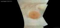
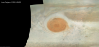
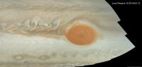
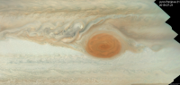
So far the Great Red Spot (GRS) has been well imaged during four of Juno's perijoves (there are additional perijoves where lower resolution images were obtained). Below are approximately true color/contrast map-projected mosaics from these perijoves showing how the GRS and nearby areas have changed. The mosaics cover planetographic latitudes 4.7 to 38 degrees south.
|
|
|
|
A lot more of the reddish stuff is flowing out of the GRS recently than in the PJ7 and PJ12 mosaics. Reddish 'flakes/blades' can be seen in the PJ17 and PJ18 mosaics. These events have also been extensively imaged with Earth-based telescopes. http://pvol2.ehu.eus is a great source of information for anyone interesting in Earth-based images of the planets.
The resolution of the source data is highly variable and this can be seen in some of the mosaics. The viewing geometry also varies a lot. Some of the images were obtained almost directly above the GRS (in particular some of the perijove 7 images) whereas other images were obtained at an oblique viewing angle (in particular the perijove 17 images).
These are approximately true color/contrast mosaics but there may be some inaccuracies in areas where the original images were obtained at a highly oblique angle. The contrast is also lower in these areas.
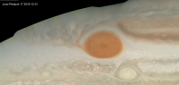
Posted by: Bjorn Jonsson Aug 13 2019, 10:03 PM
Below is the latest addition to the series of Great Red Spot (GRS) mosaics in the above post, a mosaic from PJ21 images:
|
This mosaic has the same resolution as the earlier mosaics and also covers planetographic latitudes 4.7 to 38 degrees south. It is obvious that the GRS is now smaller than it was at the time of the perijove 18 images (or at the very least the red area is smaller). Interestingly, the size of the Red Spot Hollow seems to be similar to the size it has in the PJ18 images.
Posted by: Gerald Aug 21 2020, 01:11 AM
Recently, John Rogers showed, that the north polar region is illuminated well enough now, that it's possible to derive multi-perijove composites including the north polar cyclone, see https://www.missionjuno.swri.edu/junocam/think-tank?id=45, Philosophia-47 2020-08-16 23:04 UT.
The version below tries to stay fairly seemless, but accepts some overlap of features, especially of some FFRs. It's composed of stacked maps derived from PJs 25, 26, 27, and 28, similar to John's version.
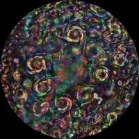
|
But the long-lived structures are shown unambiguously: The north polar cyclone (NPC), the eight northern circumpolar cyclones (CPCs), and the two anticyloncic white ovales (AWOs) inside the CPC octagon. The latter appear to distort the ditetragonal shape of the octagon into a slightly rhombic geometry by their opposite or "para" position relative to the NPC.
The map is equidistant azimuthal planetocentric from 75 to 90 degrees north.
Powered by Invision Power Board (http://www.invisionboard.com)
© Invision Power Services (http://www.invisionpower.com)